On the basis of the reference images found the designer needs to recreate some of them in the studio. Hence mixing different liquids, dropping things from varying heights, studying the size and spread of the spatter are essential. Using the element of accident and chance effectively are key to getting a creative typeface finally. Here are some images captured during such trials made by the students.

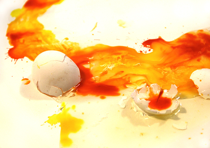
A broken egg, swimming in yolk and egg shell bits is very reflective of Oops! when the egg is accidently dropped, while waiting to be used for your morning breakfast.

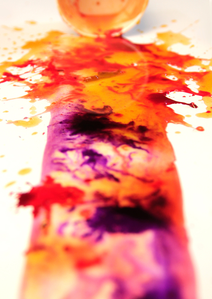
A split cup - of colours - in this case is significantly Oops! in nature. But accidents like these are also visually satisfying. On a reflex we are taught to react and clean up the mess. But there is something satisfying about anything liquidy spreading across a surface smoothly and slowly. Such incidences can be used and recreated over again, to finally shape the font.

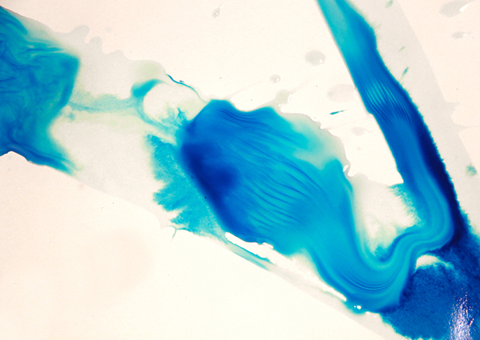
When ink meets water, it forms beautiful unthought-of patterns. Is there a way to control the spreading of the ink in such a way, that within the boundaries of the letterform it is allowed to flow freely?

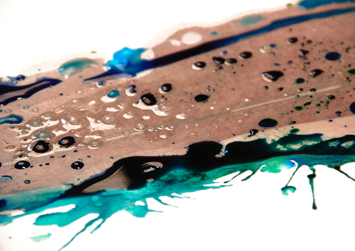
Although oil and water have marked territories refusing to mix, they producing interesting results when spread together. As each one stubbornly refuses to blend - coloured water soaks into the paper and refuses to spread across the areas which the oil has touched. Oil and water has been a great visual inspiration for fine artists, film makers and animators across the world.

