Here are two images of a cobra. Can you guess the size of the cobra?
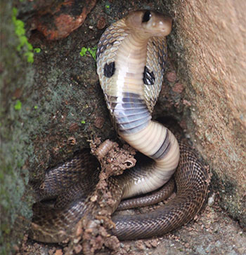
Figure 7.1.a
Source: Shraddha Prabhu
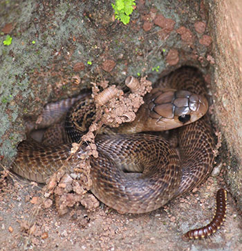
Figure 7.1.b
Source: Shraddha Prabhu
Is it not easier to guess the size of the cobra in the second image compared to the first? Why is it so? Even though the texture of the background in the first image may lead us to believe that the cobra is small, there are no distinct distance or depth cues to suggest its actual size. However, in the second picture, we have a yardstick; we have a millipede which we can use as a reference. The millipede present nearby is a clue that gives us an estimate of the cobra's approximate size. Therefore, the cobra seems much bigger in the second picture. What are the factors that affect our size perception?
Visual angle is one factor that affects our size perception, and it is the angle of an object relative to the observer's eye. The visual angle depends on the size of the stimulus and its distance from the observer. The closer the stimulus is to the observer, the greater the visual angle. For example, you will be able to see the entirety of a monument from afar, but as you go near the monument, you will only be able to see parts of it. The below are from the Sun Temple in Konark, Odisha.

Figure 7.1.c, d, e
Source: Sravan Sridhar
However, at certain times a small object that is near can have the same visual angle as a large object that is further away. For example, the picture of what looks like a boy being picked up by a fork. To take this picture, the photographer adjusted the distance between the fork and the boy such that the fork which is closer to the camera looks like it is picking up the boy. The fork had the same visual angle as the boy in this photograph.
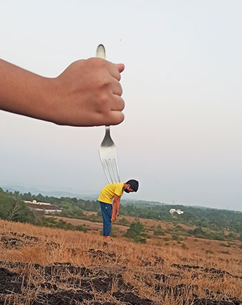
Figure 7.1.f
Source: Shraddha Prabhu
The examples above also demonstrate the relationship between size and depth perception, and particularly it asserts that accurate size perception fosters good depth perception (also related to the previous section). And while our impression of size is not always accurate, it was good enough for psychologists to suggest the size constancy principle. This principle asserts when we observe an item from different distances, the size of the object's picture on the retina varies; however, our impression of its size remains relatively constant.
For example, when walking toward your friend in a mall, the size of your friend will constantly change on your retina as you move towards them (see Appendix A); however, your perception of their height will not change. When you are nine feet away, they don't seem to be 3 feet tall as opposed to appearing 6 feet tall when they are 3 feet away.
Another source of size constancy is relative size. We frequently use known object sizes as a yardstick for judging the size of other objects. This can be seen in the case of the cobra; even though we did not know the actual size of the cobra, we perceived it to be large once there was a millipede for comparison. We can guess the size of the millipede from our experience and use it as a yardstick to measure the size of the cobra.
This concept that nearby things influence our perceptions of object sizes can be used in various ways while designing a poster. As a designer, for creating effective communication, size and relative scaling play an essential part in structuring the objects in a poster.
Another great example of relative size is displayed in the picture below. The object closer to us will occupy more field of view than an object farther away. From previous experience, we can judge the size of a human being. Therefore, instead of perceiving the boy to be standing on the girl's palm, we perceive the boy to be standing much farther away than the girl.

Figure 7.1.g
Source: Shraddha Prabhu
The picture below looks like the girl exhaling smoke out of her mouth. The picture is taken at such an angle that the cloud in the sky seems like smoke coming out of her mouth. This illusion largely works because of the absence of depth cues in the picture. Familiar objects like the sun, moon, and clouds give away the illusion as we have information about their size from past experiences. Using this information, we tend to evaluate the distance between surrounding objects. There are no such cues in the picture below; therefore, we perceive it as the girl exhaling smoke through her mouth.
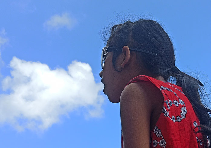
Figure 7.1.h
Source: Shraddha Prabhu
It is also important to ensure that the background is not cluttered due to the abovementioned points. A cluttered background can diminish the illusion as it may contain a lot of depth cues. In the example below, the image on the left has a lot of depth cues, like the tiles on the floor, the railings, and their reflection on the floor. Moreover, the door in the picture acts as a familiar object, which allows us to perceive the little girl's height in the background. When the photo is cropped (the image on the right), these cues are eliminated, making the illusion more plausible.
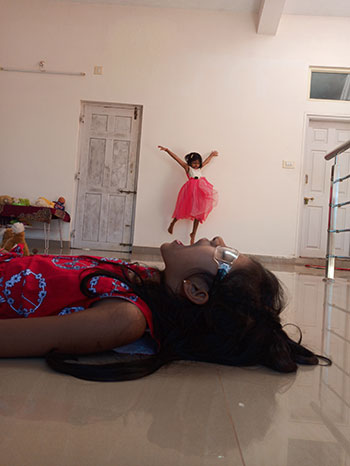
Figure 7.1.i
Source: Shraddha Prabhu
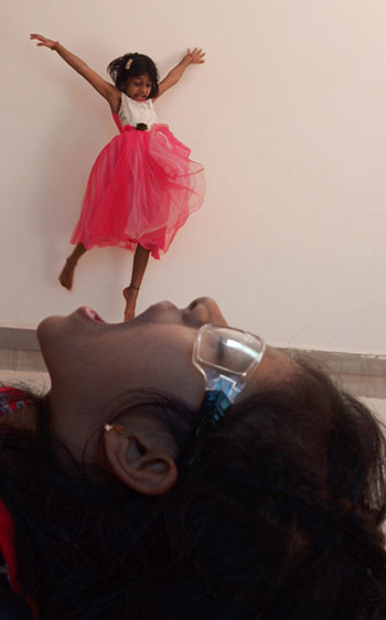
Figure 7.1.j
Source: Shraddha Prabhu

Figure 7.1.j1
Source: Shraddha Prabhu
Relative height is another source that helps us maintain size constancy. Even though the image is meant to look like a girl being crushed by two small vehicles, the relative heights in the image diminish the illusion. We view an object (in this case, the girl) to be closer to us if the point of contact between the object and the ground is lower, and when it rises, we perceive the object (the bus) to be farther away.
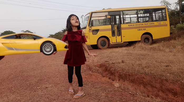
Figure 7.1.k
Source: Shraddha Prabhu
Similarly, the point of contact between the boy and the ground is lower than the point of contact between the bus and the ground, giving the impression that the bus is further away.
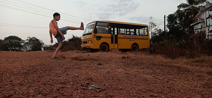
Figure 7.1.l
Source: Shraddha Prabhu
Changing camera angles can also help enhance the size distance illusion by correcting the relative height. For example, when the camera angle is lowered, it helps shorten the distance between the point of contact between the girl and the ground. It also helps shorten the distance between the people at the back and the ground, intensifying the illusion.
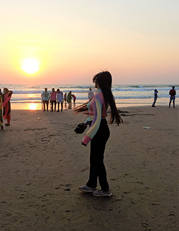
Figure 7.1.m
Source: Shraddha Prabhu

Figure 7.1.n
Source: Shraddha Prabhu
Another source of size perception is the relationship between the texture on the ground and the object. For example, there was an attempt to create an illusion where the boy looks like he is hanging onto the umbrella's edge in this picture. However, this illusion does not work because of the textural cues on the ground (grass). The grass on the ground is a significant indicator of depth in this situation. The grass is tall and sparse around the girl's feet. It eventually becomes shorter and denser around the boy, causing us to perceive their distance. Moreover, we can tell they are the same size because their bases (legs) cover the same grassland area.
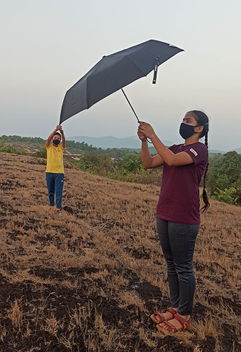
Figure 7.1.o
Source: Shraddha Prabhu
Another example is when the camera angle is changed to reduce the texture gradient, and the illusion works better. There is an illusion of the boy being picked up on a fork in the picture below. The illusion does not work well in the first picture, but the effect is aided by shifting the camera angle to decrease the noisy background. The gradient on the ground is reduced in the bottom image due to the shift in camera angle. The size-distance illusion gets stronger as the depth cues are removed.

Figure 7.1.p
Source: Shraddha Prabhu

Figure 7.1.q
Source: Shraddha Prabhu
Texture gradient occurs when elements in a picture that are evenly spaced appear to be more closely packed as the distance between them increases. For example, here is an instance when this is not the case. Although the intention was to create an illusion where the flower is as big as the person standing next to it, it fails because of the flowers in the background. The repetition of similar objects across the image functions as a gradient, allowing us to feel the depth in this image. Closer to the camera, the marigold flowers are larger. And even though farther away, the flowers continue to get smaller and closer, the illusion does not work because they are not evenly spaced. Therefore, texture is an essential cue in perceiving size and distance.
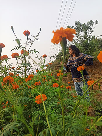
Figure 7.1.r
Source: Shraddha Prabhu
Due to the lack of cues like depth, surrounding objects gradients, etc., we may fail to perceive the actual distance of an object. This false perception of an object's distance from the observer might make the item appear larger or smaller than its actuality. This is referred to as the size-distance illusion. What are the various cues that give away size distance illusion?
The difference in clarity or focus of the picture is essential for this illusion to work. The girl is “in focus” in the image on the left, while the Rubik's cube is out of focus. The Rubik's cube is “in focus” in the image on the right, while everything else is blurred. These images are meant to give the impression that the girl is placing her index finger on an unusually large Rubik's cube. But why doesn't it appear so? We perceive a substantial distance between the Rubik's cube and the girl because of the change in focus, which works as an obvious depth cue in an image.
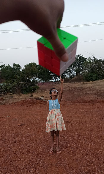
Figure 7.1.s
Source: Shraddha Prabhu
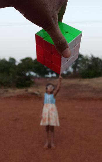
Figure 7.1.t
Source: Shraddha Prabhu
Reflection while taking the picture is also an important clue. The attempt was to create an illusion that looks like an infant standing on a lady's palm. However, two distinct reflections can be seen in the photograph. The two reflections are also of different sizes, where the lady's reflection is substantially bigger than the toddler's reflection. Therefore, the illusion is quickly dispelled since the reflection in the water does not match what we perceive.
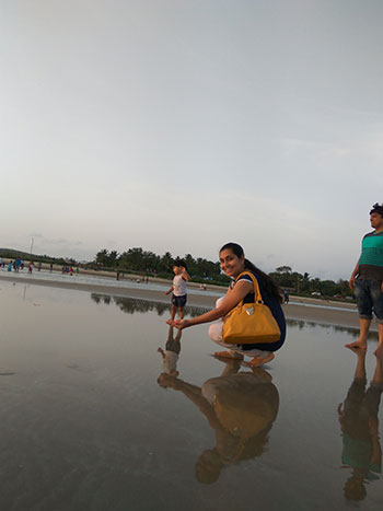
Figure 7.1.u
Source: Shraddha Prabhu
Similarly, shadows play a role in the perception of these illusions. Shadow plays a vital role when we try to create an illusion of two connected entities, like in the example of a woman dangling from the man's hand. In the first picture, it is apparent that they are standing at different distances because of the shadow. But the illusion seems to work once the shadows are removed, and the picture's brightness and contrast are increased.
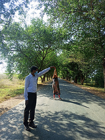
Figure 7.1.v
Source: Shraddha Prabhu
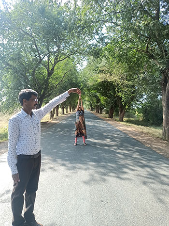
Figure 7.1.w
Source: Shraddha Prabhu
However, shadows do not hinder as much if the entities are separate from one another as opposed to the entities being together, as can be seen in the pictures below. This is because shadows and reflection work as a cue that lets us know the distance between the two entities, where the smaller the shadow/reflection, the farther away the object from the camera. Therefore, it is vital to ensure there are no shadows or reflections when trying to create a size distance illusion.
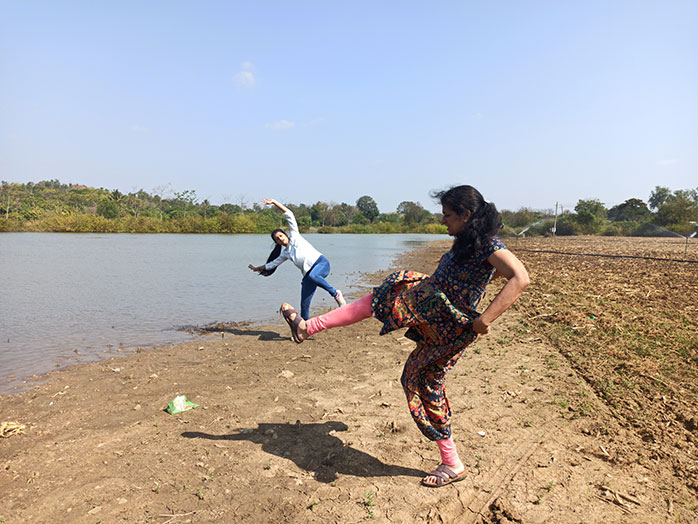
Figure 7.1.x
Source: Shraddha Prabhu

Figure 7.1.y
Source: Shraddha Prabhu
Does having the same colour cues enhance or facilitate the perception of the illusion? In the example below, the toy car and the school bus are of the same yellow shade and are against the same contrasting background. According to the gestalt law of similarity and grouping, we should put these two together and perceive them to be of similar sizes, thereby ignoring other depth cues like texture. However, that is not the case because of the uneven texture of the ground. Moreover, the toy car is slightly out of focus, greatly diminishing the illusion.
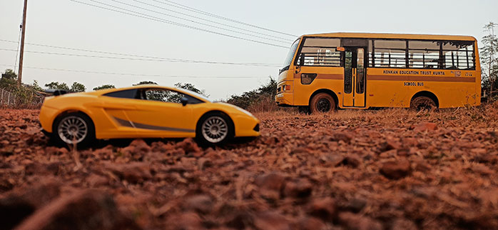
Figure 7.1.z
Source: Shraddha Prabhu
However, the example below works even when some parts of the picture are occluded. The lady in the picture is wearing an outfit that is the same colour as the brinjal, which helps us group them. The occlusion in the picture facilitates the illusion because we cannot see the texture of the ground where the lady is standing, which makes the grouping in the images easier and the illusion more plausible.
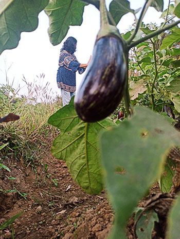
Figure 7.1.aa
Source: Shraddha Prabhu
Depth cues play a vital role in our perception of these illusions. Is it the same case when we remove the colour? Would it make a difference if the photographs were in black and white? Here are examples of two explorations.
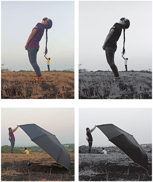
Figure 7.1.ab
Source: Shraddha Prabhu
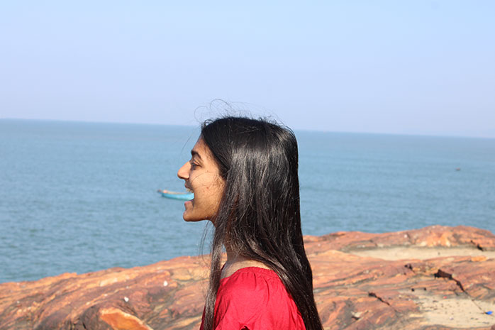
Figure 7.1.ac
Source: Shraddha Prabhu
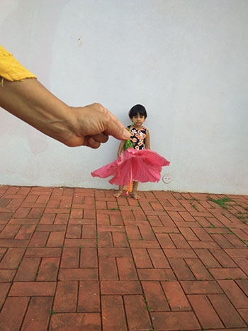
Figure 7.1.ad
Source: Shraddha Prabhu
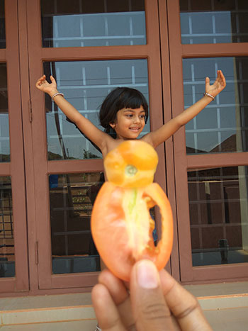
Figure 7.1.ae
Source: Shraddha Prabhu
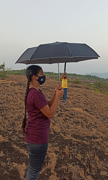
Figure 7.1.af
Source: Shraddha Prabhu
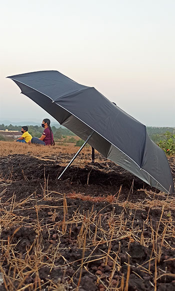
Figure 7.1.ag
Source: Shraddha Prabhu

Figure 7.1.ah
Source: Shraddha Prabhu
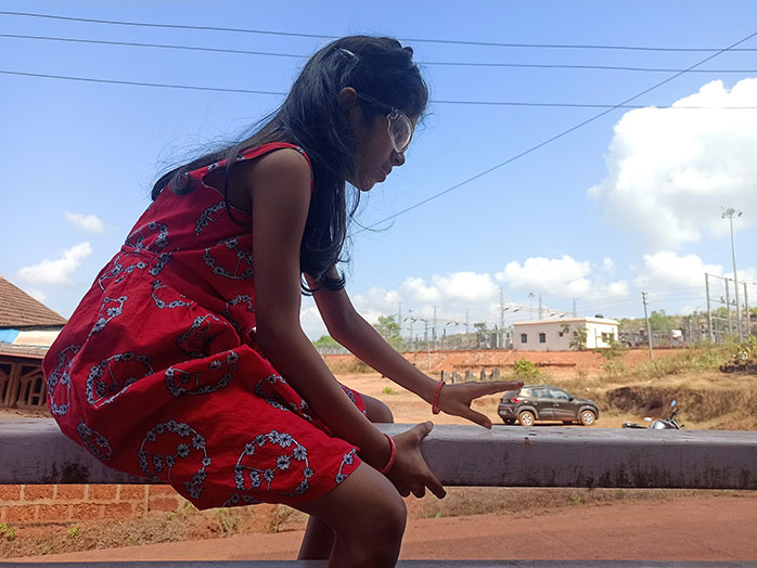
Figure 7.1.ai
Source: Shraddha Prabhu
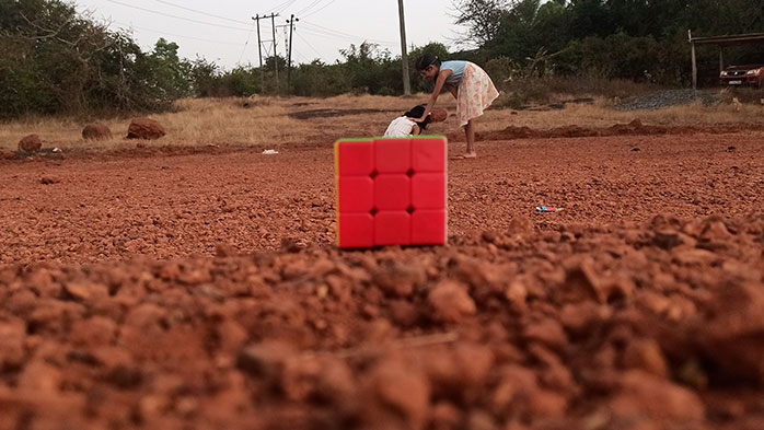
Figure 7.1.aj
Source: Shraddha Prabhu
The depth cues are much more prominent in color images when compared to black and white pictures. Therefore, the illusions work better in black and white as depth cues are not as noticeable.
Here is the pdf exploring this phenomenon:
• Size and Distance Perception......

