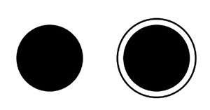
Figure 7.4.a
Source: Dishant Mehlawat
Would you say the black circles in the picture above are the same size? Doesn't it look like the circle on the right is slightly bigger than the circle on the left? This is the Delboeuf illusion, and it involves size perception. It was described in 1865 by the Belgi Joseph Remi Leopold Delboeuf. In the Delboeuf illusion, the presence of a bigger concentric circle can alter the perception of the size of a target circle. In other words, when two circles of the same size are placed next to one another, and one of the circles is surrounded by a concentric ring, there will be a difference in the size perception of the two circles due to the presence of the larger ring (Figure 7.4.a).
The size disparity between the inner and outer circle produces various effects. There are two factors for this illusion: assimilation and contrast. One may overestimate the target's size if the outer circle is slightly larger than the target; this is known as size assimilation (Figure 7.4.c). However, one will underestimate the target circle if the outside circle is much larger than the target circle; this is known as size contrast Figure 7.4.b).
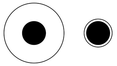
Figure 7.4.b
Source: Dishant Mehlawat

Figure 7.4.c
Source: Dishant Mehlawat
Why does this illusion take place?
Delboeuf offered one potential explanation in 1865. Delboeuf suggested that the eyes are physically moved over a greater distance when scanning the inner circle because they are drawn to the outer circle when it is close to the inner circle. The size of the central circle is perceived differently due to the eyes' increased muscular effort. The Delboeuf illusion provides an understanding of visual correction required for designing typefaces.
Here are some explorations of the Delbouef illusion using Latin alphabets.
In Figure 7.4.d, two lowercase 'A's are placed next to each other. One on the right is edited, where the stem is made bolder. But the counter of both the 'A's look similar, and the Delboeuf illusion cannot be observed.
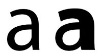
Figure 7.4.d
Source: Dishant Mehlawat
Similarly, in Figure 7.4.e, two lowercase 'A's are placed next to each other. One on the right is edited, and the stem and terminal are both made bolder. The counter of the 'A' on the right looks smaller because of the Delboeuf illusion.
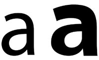
Figure 7.4.e
Source: Dishant Mehlawat
In Figure 7.4. f, all the glyphs of the 'A' on the right-hand side are made bolder, and the counter looks smaller.
Increasing the boldness of the strokes causes an underestimation of the counters in Latin alphabets, given that the stroke width increases without affecting the counter size.

Figure 7.4.f
Source: Dishant Mehlawat
In Figure 7.4.g, two lowercase 'D' are placed next to each other. One on the right is edited, where only the stem is made bolder. But the counter of both the a's look similar, and Delboeuf illusion cannot be observed.
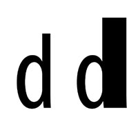
Figure 7.4.g
Source: Dishant Mehlawat
Similarly, in Figure 7.4.h, two lowercase 'D' are placed next to each other. One on the right is edited, where the stem and bowl are made bolder. The counter of the 'A' on the right looks smaller because of the Delboeuf illusion.

Figure 3.5.5.h
Source: Dishant Mehlawat
In Figure 7.4.i, two 'O's are placed next to each other and their apertures are unconventional. One on the right is edited and made bolder. Even after having an abstract shape as a counter, the counter of the 'O' one on the right side looks smaller, and the Delboeuf illusion can be observed.

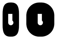
Figure 7.4.i
Source: Dishant Mehlawat
Interestingly in Figure 7.4.j, the Delboeuf illusion can be observed by increasing the stroke width, but the counter of the 'O' on the right side looks elongated, whereas the size of both the counters is equal.
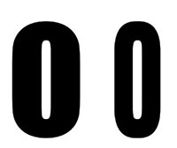
Figure 7.4.j
Source: Dishant Mehlawat
In Figure 7.4.k, two 'O's are placed next to each other. The 'O's are calligraphic and have contrasting stroke widths. One on the right is edited and made bolder. Even after contrasting stroke width, the counter of the 'O' one on the right side looks smaller, and the Delboeuf illusion can be observed.
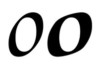
Figure 7.4.k
Source: Dishant Mehlawat
Here is another example of the Delboeuf illusion when an intentional slant of 12° is added to the 'O' (Figure 7.4.l).

Figure 7.4.l
Source: Dishant Mehlawat
In Figure 7.4.m, two dotted 'D' are placed next to each other. One on the right is made bolder. But here, the counter looks exactly similar because we can count the small circles that form the counter, forcing our brains to think more logically and eliminating any illusion.
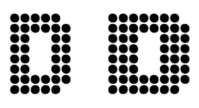
Figure 7.4.m
Source: Dishant Mehlawat
In Figure 7.4.n, two' D' made out of lines are placed next to each other. One on the left is made up of more lines than the 'D' on the right, making it look much denser and bolder. The increased density of the 'D' on the right makes the counter look smaller, and the Delboeuf illusion can be observed.
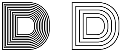
Figure 7.4.n
Source: Dishant Mehlawat
Here are some explorations with Devnagari characters
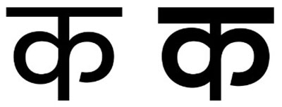
Figure 7.4.o
Source: Dishant Mehlawat
In Figure 7.4.o, two 'क's are placed next to each other. One on the right is edited, and the Sherorekha and the stroke width are increased. The counter and aperture of the 'क' on the right look smaller because of the Delboeuf illusion.

Figure 7.4.p
Source: Dishant Mehlawat
Similarly, in Figure 7.4.p, two' ठ's are placed next to each other. One on the right is edited, and the Sherorekha and the stroke width are increased. The counter of the 'ठ' on the right looks smaller because of the Delboeuf illusion; however, they are similar in size.
Please look at the pdf below to learn more about these explorations:
• Delboeuf Illusion......

