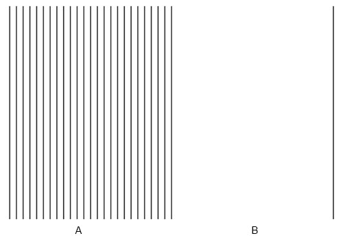
Figure 7.5.a
Source: Midhun Mohan
Would you say that the distance covered by segment A is the same as that of segment B in Figure 7.5.a? Most people would judge the blank segment to be smaller/shorter compared to the line-filled part. This is the Oppel-Kundt illusion (OKI). Oppel-Kundt illusion can be described as a section of visual field broken up into /filled with several visual components that appears larger than an undivided space of equivalent size. They are helpful when thinking about designing grids and optical correction.
Even though the illusion is termed the Oppel-Kundt illusion, history suggests otherwise. Neither J.J. Oppel nor A. Kundt discovered the illusion as we know it today. Kundt did not discover the illusion but was likely the first to investigate it quantitatively. Oppel described a phenomenon comparable but not identical to the form of the OKI observed today. Several distinct writers are responsible for the stimulus figure’s reduction to a one-dimensional array of visual components, which became the OKI known today.
Let us study the illusion in detail, try to understand how it works and explore how changes in characteristics of the filled and unfilled spaces affect the illusion created.

Figure 7.5.b
Source: Midhun Mohan
Look closely at the two spaces shown in Figure 7.5.b. One can see that the space on the left is filled with lines while the right is unfilled. Are both the spaces equal or does one appear larger than the other?
First, let us construct similar spaces by dividing space in half and filling one of the halves to find roughly when the illusion becomes apparent.
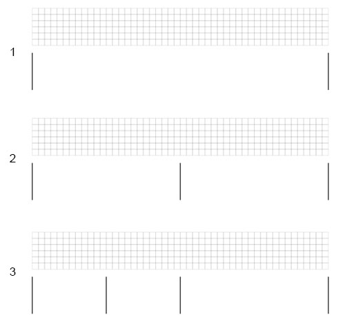
Figure 7.5.c
Source: Midhun Mohan
As can be seen in Figure 7.5.c, the illusion is not apparent in steps 1, 2, and 3. However, the illusion becomes evident from step 4 and gets stronger as the space is divided/filled even further (until 9).
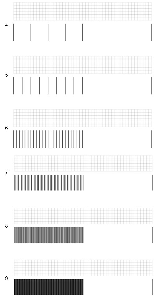
Figure 7.5.d
Source: Midhun Mohan
There have been several explanations for the phenomenon, but none thoroughly explain the illusion. The most compelling explanation was provided by H.G. Speigel (1937). He suggested that the illusion resulted from an attractive “Z- force” acting between visual field objects with similar appearances, balanced by an opposing repulsive force between objects that are interpolated. According to this view, the impact results from the “shrinking” of the empty part relative to the unfilled part. Instead of operating on a peripheral (retinal) level, Spiegel proposed that the organizing “forces” operate in the central (cortical) representation.
Apart from the various explanations, from a designer’s perspective, what are the components of making a robust OK illusion? Below, these various elements are explored. These explorations include spaces of varying lengths and heights that are created to understand their effect on the illusion.
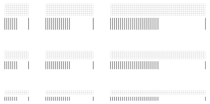
Figure 7.5.e
Source: Midhun Mohan
As seen in Figure 7.5.f, the illusion becomes more evident when the length of the spaces is decreased. Also, the illusion appears to get weaker when the height of the spaces is reduced.
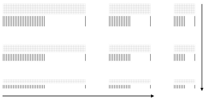
Figure 7.5.f
Source: Midhun Mohan
What if we optically balance the two spaces? Let us understand how much optical correction needs to be done so that the two spaces appear to have the same length (Figure 7.5.g).

Figure 7.5.g
Source: Midhun Mohan
Visual adjustment added is highlighted in yellow in Figure 7.5.h.

Figure 7.5.h
Source: Midhun Mohan
As shown in Figure 7.5.i, adding an adjustment roughly equivalent to the length highlighted appears to balance the filled and unfilled spaces.
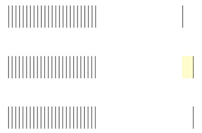
Figure 7.5.i
Source: Midhun Mohan
What happens when the space is divided horizontally compared to vertical divisions?

Figure 7.5.j
Source: Midhun Mohan
The illusion persists even when the space is divided horizontally. Let’s try to visually balance the spaces created.
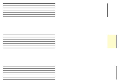
Figure 7.5.k
Source: Midhun Mohan
As shown in Figure 7.5.k, visually balancing both spaces would require optical adjustment in length, as highlighted here. What about a different direction of lines being filled?
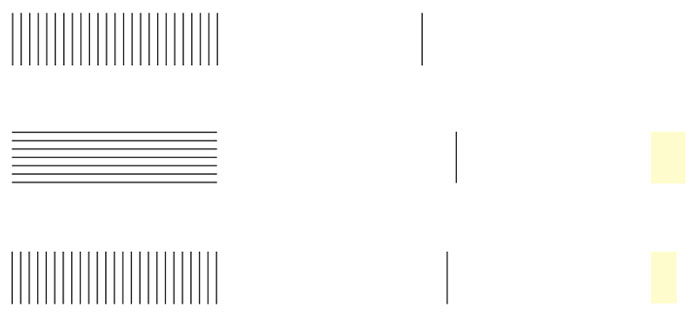
Figure 7.5.l
Source: Midhun Mohan
Interestingly, the optical adjustment required for horizontal subdivisions is slightly more than that of vertical divisions. What happens when the space is filled in with different styles?

Figure 7.5.m
Source: Midhun Mohan
When both spaces are well defined with a boundary, the illusion seems to be reduced (Figure 7.5.m).
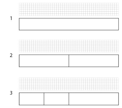
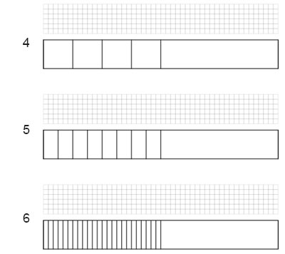
Figure 7.5.n
Source: Midhun Mohan
This is an interesting case since the strength of the illusion is vastly reduced when a boundary wall defines the spaces. Let us again construct the spaces with defined boundaries and try to identify the point where the illusion becomes apparent. As can be seen in Figure 7.5.n, the illusion becomes somewhat evident in step 5 and gets stronger in step 6. But there is a twist!
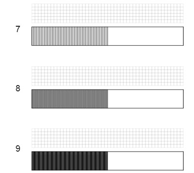
Figure 7.5.o
Source: Midhun Mohan
The illusion appears to weaken as the space is further filled and closer to a solid fill state (Figure 7.5.o). What happens when the space is filled in with a solid colour?

Figure 7.5.p
Source: Midhun Mohan
When one of the spaces is given a solid fill, and an outline bounds the unfilled space, the illusion seems to be reduced to such an extent that it is almost non-existent. What if even the “empty” space is filled with colour?

Figure 7.5.q
Source: Midhun Mohan
When both spaces are given a fill, the higher value side can be considered as the unfilled space. The length of such an unfilled space appears to get longer as it gets lighter (increased value).
What happens when the space is filled in different styles?
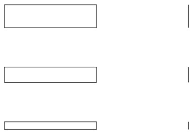
Figure 7.5.r
Source: Midhun Mohan
Here, again the illusion comes into play, and the space on the left appears longer. The same happens when the space is given a solid fill (Figure 7.5.s).

Figure 7.5.s
Source: Midhun Mohan
What if it is filled with a pattern?
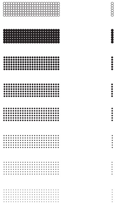
Figure 7.5.t
Source: Midhun Mohan
This exploration uses uniform patterns to divide and fill the space. As one can see here, using patterns as fill doesn’t seem to have much effect on the illusion. The unfilled space might appear to be getting progressively longer as the size of dots in the pattern becomes smaller.
The various types of ‘fills’ can be seen to vary the strength of the illusion. For example, the illusion seems to reduce when the space boundaries are more defined in ways such that it gives more visual cues for our eyes to pick up the length of spaces more strongly.
What effects do different types of gradation to the fill bring to the illusion?
The illusion is present when the gradation is even or uneven. But as the gradation becomes more irregular and starts having larger gaps (which makes it look less filled), it affects the illusion. The more ‘unfilled’ the filled space appears due to gradation, the weaker the illusion gets.
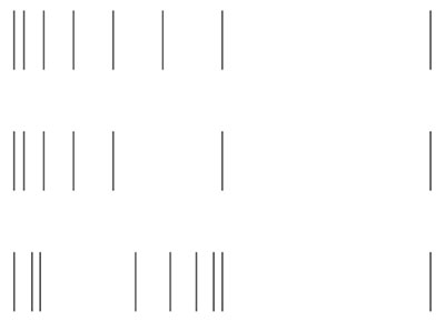
Figure 7.5.u
Source: Midhun Mohan
What if the thickness of the gradation is increased or decreased?
In this case, depending on the direction of uniform gradation, the unfilled space may appear longer or shorter than the unfilled space in the example without gradation.
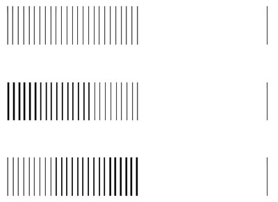
Figure 7.5.v
Source: Midhun Mohan
What if the filled space is non-uniform?
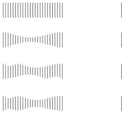
Figure 7.5.w
Source: Midhun Mohan
The illusion is still present when the filled space is non-uniform.
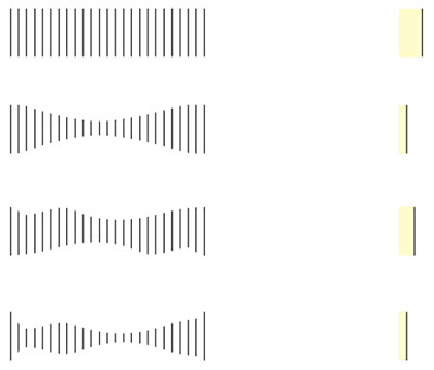
Figure 7.5.x
Source: Midhun Mohan
The optical correction added to balance the two spaces are found to be lesser when the filled space is non-uniform (Figure 7.5.x).
What will happen when the starting and ending of both spaces are more defined?
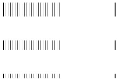
Figure 7.5.y
Source: Midhun Mohan
Defining the two extreme ends of the overall space does not seem to make much difference (Figure 7.5.y).
Let’s take it a step further and define the centre where the two spaces meet (Figure 7.5.z).
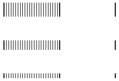
Figure 7.5.z
Source: Midhun Mohan
In this case, the spaces appear to create confusion regarding the filled space being longer or if they are equal. Yet, it is more probable that one might find the filled space to be longer.
What about the orientation of the entire segment? Will that affect the illusion?

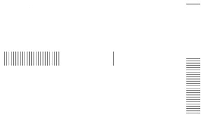
Figure 7.5.za
Source: Midhun Mohan
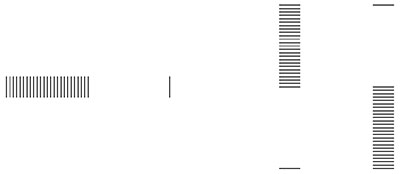
Figure 7.5.zb
Source: Midhun Mohan
The illusion can be seen when the spaces are in a vertical orientation. One interesting thing to notice is that the unfilled space in vertical orientation appears to be longer than the horizontal.
Then what about when the positions of filled and unfilled spaces are reversed? Does the unfilled space look smaller when it is at the bottom than when it is at the top?
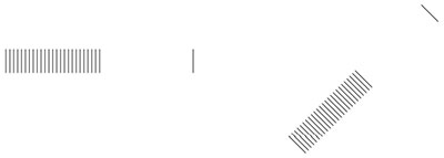
Figure 7.5.zc
Source: Midhun Mohan
Diagonal orientation does not affect the illusion much, as seen here.
One can download the complete set of explorations here:
• Oppel Kundt Illusion......

