Communication Design
2019-onwards
(76 items)
2009-2018
(272 items)

1999-2008
(92 items)
1989-1998
(59 items)
1979-1988
(20 items)
Communication Design
2019-onwards
(76 items)
Redesign of Immunisation Card
by Prof. Mandar Rane
by Prof. Mandar Rane
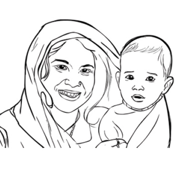
Redesign of the immunisation card by Prof. Mandar Rane. The Universal Immunisation Programme (UIP), run by the Government of India, makes essential immunisation available for free to children between the ages of 0 to 5 years. The mother and child protection card that contains demographic and health information as well as the immunisation status of a child is an important part of UIP. For every child immunised under this program, there exists a home-based physical record as well as a clinic-side copy of the same. The language, content, and design of the immunisation card vary from state to state. Analysis of immunisation cards from three states—Bihar, Gujarat, and Maharashtra as well as contextual inquiries conducted at a primary healthcare centre in Mumbai revealed several issues faced by three types of stakeholders in the immunisation process: healthcare service providers, parents, and caregivers of the child. Surveyors and policy-makers also rely on information from such cards for gathering data about the population. The redesigned card addresses problems of comprehension, the needs of various stakeholders while entering and retrieving data, and practical issues such as the durability of the immunisation card.
Details >>
The Photographer The reality of imagination | Success story of Navi Mumbai Film on the sanitation project | Traditional Indian Art and Animation in India Exploring the roots for an Indian style
by Prof. Mazhar Kamran
by Prof. Mazhar Kamran
The Photographer and The Reality of Imagination projects were done by Prof. Mazhar Kamran. With the mystic poems of Rumi working as dialogues that the characters speak, "The Photographer" is a film that explores the realm of imagination and what it means to a person who, in order to create, lives much of the time on the boundary between the real and the imagined. The story is about a photographer who shoots a model one day, and it turns out she is visible only to him. He had walked into another time. "The Photographer" had its premiere on the Foundation Day of the Film and Television Institute of India, Pune. It was shown internationally at the Cannes Film Festival, Short Film Corner. The second project of Prof. Mazhar Kamran was the success story of Navy Mumbai Film on the Sanitation Project. Clean water and sanitation is a sustainable development goal of UN. To communicate the difference that modern sanitation methods can make to a city’s water and sanitation needs, the film presents the "success story" of Navi Mumbai in this context. Taking a cinematic approach, the film communicates without commentary or interviews, relying purely on visuals and sounds, with minimal text. The film was commissioned by the Asian Development Bank Institute, Tokyo. It will be used for advocacy and leadership-building programmes of ADBI. Another project of Prof. Mazhar Kamran was Traditional Indian Art and Animation in India Exploring the roots of an Indian style On the one hand, we have a rich heritage of traditional Indian art forms that are rooted in the different regions. They embody the culture of the people. The colours, the shapes and forms are distinct, and they tell equally rich stories of the people. On the other hand, we have a contemporary medium, Animation, born in modern times, it has roots in an industrial environment which is increasingly technology-driven. Between these two is a gulf, a rich space full of creative possibilities. What the research seeks to do is study this space systematically and formulate key concepts and ideas in this space. It seeks to articulate and codify all that is involved in the transformation of an art form from one tradition, one origin, into another, more contemporary form. The study will also reflect upon the issues—social, ethical, and aesthetic—that crop up when such a transformation happens.
Details >>
Art @IITB | National Salt Satyagraha Memorial Dandi | Learning from Nature and from the Indigenous Collaborative project with Bidyut Roy and Sandeep Manchekar | Understanding visual art traditions Collaborative projects with practitioners of indigenous art traditions
by Prof. Raja Mohanty
by Prof. Raja Mohanty
Prof. Raja Mohanty’s one of the best projects was Art @ IITB. IIT Bombay’s vision is to be a leading global technology university that provides a transformative educational experience to create leaders and innovators and generate new knowledge for society and industry". The arts enrich our aesthetic imagination and help to shape how we perceive ourselves and our surroundings. A visible display of works on the IIT Bombay campus that combine technical and artistic creativity could aid in the integration of education. This project envisaged a road-map for arts education at IIT Bombay that includes the creation of traditional and contemporary works of art on the campus; residencies, seminars, and talks by visiting artists; and mentorship to encourage students to develop an aesthetic sensibility. His other important project was the National Salt Satyagraha Memorial, Dandi. This memorial to the 80 marchers who accompanied Gandhi in upholding "Right against Might" was conceptualised by Prof. Kriti Trivedi. The beginning of an engagement with handloom weaving is an interesting "side effect" of this memorial. In 2019, Shivani Nayak, one of the graduating students from IDC School of Design, wove her own convocation scarf. The weaving initiative encourages more students to do the same. Learning from Nature and from the Indigenous Collaborative Project with Bidyut Roy and Sandeep Manchekkar project was a residency space for visiting faculty was created at Wighavali using local materials such as bamboo, mud, fired bricks, traditional terracotta tiles, and dried pipal leaves. This space is envisaged as an extension of classroom walls to spaces outside cities that enables students to come into contact with alternate realities and learn from indigenous ways of doing things and from nature. Raja Mohanty’s other important project was Understanding Visual Art Traditions. collaborative projects with practitioners of indigenous art traditions. The traditions studied included patachitra art from Orissa; Gond art from Madhya Pradesh; Madhubani from Bihar; and Pichhwai from Rajasthan. Collaborative projects took the shape of books for children and "grown-up" children! Ghanshyam Sharma from Nathdwara, Radhashyam Raut from Bhubaneswar, Durgabai, and Mansingh Vyam from Bhopal, and Sharwan Paswan from Mithila were the artists with whom the collaborative projects were done. "The Circle of Fate" published by Tara Books, Chennai, was shortlisted for the Anderson Prize, 2009. "The Enigma of Karma" was a sequel to this. "Machaan Masti", "On Inheritance", and "Cycle Ka Sapna" are some of the other learning materials for children that were created as the collaboration continued as a part of the Damroo Project, funded by the Navajbai Ratan Tata Trust.
Details >>
Govandi arts festival- Projection mapping with Jerry Antony
by Abhijith K S
by Abhijith K S
This report provides an overview of my experience working on the project, including the tasks I was assigned, the challenges I faced, and my learnings. The projected animated film Afsaana is a stunning visual masterpiece that tells the story of the people of the Natwar Parekh Colony (NPC). The film consists of animation created by the children from the colony, such as claymation, paper cutout, live-action conversations, and footage of NPC. The projection mapping technique was used to bring the film to life by projecting it onto a large building wall in the middle of the festival. It was synced to the music, creating a mesmerising, immersive experience for the audience. I was assigned to work under animator Mr. Jerry Antony. Jerry completed his master's in design in animation from NID Ahmedabad two years ago. He previously worked in advertising and is currently a freelance designer. Jerry was one of the resident artists for the event and had already conducted stop-motion animation workshops for the children in Kitaab Mahaal (community library of Natwar Parekh Colony).
Details >>
Birds I view- An illustrated field fuide to the Birds of IIT Bombay
by Abhijith K S
by Abhijith K S
“Birds I View” is an illustrated field guide to the birds of the IIT Bombay campus. The book acts as an interactive storybook for an audience new to the field of birdwatching by explaining the birds' characteristics, behaviour, and how to spot them. It also acts as a quick field guide and reference book for birdwatching. I grew up in Kerala and was surrounded by a wide variety of flora and fauna at home. Growing up, I was always fascinated to see new birds and animals and the plants that my mom brought after her evening walks. Even though my childhood consisted of interactions with a lot of varieties of birds seen commonly around Kerala, I never took this seriously and never bothered to observe and learn more about these species. After joining college, my friend introduced me to the world of birdwatching on a weekend walk through the lakeside road. I was still boasting about my childhood and growing up with many of these species. But spotting an Indian paradise flycatcher changed everything. I was mind blown. It was magical. I had seen nothing yet, and a whole new world opened up. After that day, I started looking out for these cute creatures, which teach us a lot through their interactions with nature. I knew nothing about the birds I had seen as a child. More people should know about these fantastic creatures. This project was started on this idea. This is a collection of my experiences and learnings from the IIT Bombay campus.
Details >>
Context-based learning materials for English at a foundational level
by Abhijith K S
by Abhijith K S
This project aims to create context-based learning materials to teach English to first- and second-grade students in the Kumaon region of Uttarakhand. The learning materials are designed to be engaging and interactive by introducing the language through activities that encourage inquiry-based learning. Through this project, three activities were created for foundational-level classes using visuals familiar to the students and stories from the region. The activities went through several rounds of testing over four schools in the Nainital district with the help of Siksha Sahayaks. The project is being carried out in collaboration with an NGO called Aarohi in Uttarakhand.
Details >>
AR For Institute Events- Use Of AR For Project Display During Exibitions
by Akshata Khare
by Akshata Khare
By employing augmented reality, information such as advertisements, posters, and announcements regarding upcoming events, launches, festivals, and more can be communicated without the need for printing posters, pamphlets, and other physical materials that result in waste generation. Our objective through this project is to propose an alternate solution that employs AR to disseminate information, not only reducing waste but also paving the way for further advancements in the digital space.
Details >>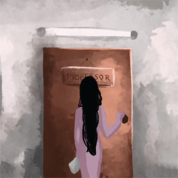
Understanding varied perception on Gender Cell And how to (re)solve them
by Akshata Khare
by Akshata Khare
Any unpleasant or unwelcome behaviour or action that is sexual in nature or connected to the person’s gender and sexual orientation is considered sexual harassment. People who are the targets of sexual harassment experience a hostile atmosphere that affects their ability to learn, find work, and maintain their mental and physical health. IIT Bombay’s Gender Cell investigates sexual harassment complaints through the Internal Complaints Committee and conducts events to spread awareness. It is important that the students/staff/residents of IITB have trust in the organisation and approach when faced with sexual harassment or any sexual discomfort. This project aims to understand the various perceptions, especially among students (focus group), and how we can build the trust so that students can go to the right place run by the trained professionals and get access to resources like counselling and security when needed. It takes a lot of courage to stand up and speak for yourself and, more so, to launch a complaint and have faith in an organisation where you don’t know anyone. Perceptions of people around the victim play a crucial role in deciding what steps the victim takes. By taking interviews and being part of meetings and discussions with IITB gender cell members, I tried to understand the perceptions and how we can (re)solve them. What is the best way to talk about a sensitive topic? How can it be most effective? Do students/staff face sexual harassment on campus? How do they deal with it? Who do they first approach? Do they know about gender cells? Do they know how to approach it? Do they know about the process and the members? Do they trust the organization? If not gender cell, where do they go? Why do culprits do what they do? What happens when the victim gets wrong advice? Is it harmful? These are some of the questions that I tried solving for this project.
Details >>
Game design for Inclusivity
by Akshata Khare
by Akshata Khare
There is a noticeable lack of games that allow sighted individuals and people with visual disabilities to play together. When asked, individuals with visual disabilities often struggle to name games that accommodate both groups. It raises the question of why game development tends to focus on creating games exclusively for the sighted or solely for the blind. Perhaps this tendency stems from the belief that catering to the diverse needs of both sighted and visually impaired players simultaneously is complex or requires significant modifications to game mechanics. There may also be a lack of awareness and understanding about how to design inclusive and accessible gameplay experiences that can be enjoyed by everyone. However, it is vital to recognise the importance of inclusivity in game design. By creating games that are accessible and enjoyable for individuals with visual disabilities and sighted individuals, we can foster social interaction, promote empathy, and bridge the gap between different abilities. The objective of this project is to develop a game that is accessible and inclusive for both players with visual disabilities and those without. By considering the needs, preferences, and abilities of both groups throughout the game design process, we can create an engaging and enjoyable experience that transcends barriers and allows for meaningful participation from all players. Through promoting inclusivity and accessibility in game design, we contribute to a more diverse gaming landscape, where individuals with varying abilities can come together, have fun, and share memorable experiences.
Details >>
Interactive Short Film for Teaching Moral Education in Schools
by Anubhav Nagpal
by Anubhav Nagpal
This project explores an advanced concept of teaching moral education in schools with the help of meticulously designed interactive short films utilising choice architecture and the Soviet montage theory. The final output of this project is a short film, prototyped online with interactive capabilities for teaching values. The students’ all-round performance in schools is inversely related to the amount of bullying and violence faced in the schools (OECD, PISA 2015 Database), and the introduction of moral education in schools drastically reduces the instances of bullying and violence (MEXT 2007-2012). In this project, research was done on the education systems, moral education curriculum, and teaching methods in schools in several countries to find scope for improvement in the moral education imparted in Indian schools. Analysing their curriculum and upon primary research with current school students, a new curriculum is designed for class VII. Research to understand choice architecture and Soviet montage theory, along with in-depth analysis of several interactive films, was done to understand the medium and its potential. The insights were used to make an interactive short film for imparting moral education.
Details >>
Last Light Experimental Short Film- A live action experimental short film inspired from personal experiences
by Anubhav Nagpal
by Anubhav Nagpal
This project is an exploration of the process of weaving narratives by documenting dreams and the craft of communicating the surreal narratives through the medium of audiovisual. In this project, a live-action experimental short film has been produced as the final outcome. The film attempts to communicate various perspectives to a narrative with a layered story and, at the same time, maintain a surreal, dreamlike look to it, which may carry the viewers to an imaginative journey. At its core, the narrative is derived from extremely personal experiences and events from both dreams and reality. It has then been processed to form a compelling and impactful narrative in the form of a film.
Details >>
A typographically-led campaign addressing overfishing of endangered marine species
by Dishant Mehlawat
by Dishant Mehlawat
The global seafood industry significantly impacts the world’s oceans and its wildlife, particularly the Atlantic and Pacific bluefin tuna, which have seen a reduction of 80% and 90%, respectively, due to overfishing. The consumption of bluefin tuna, a delicacy in sushi, is particularly prevalent in countries such as Japan, Italy, Spain, and France. Several campaigns have been launched to raise awareness about the dangers of overfishing, including Seafood Watch, Fish 2 Fork, Good Fish Guide, and the Marine Stewardship Council (MSC). These campaigns aim to educate consumers about the importance of responsible seafood consumption and encourage businesses and consumers to make choices that are less harmful to the environment. With this in mind, we propose to create a typography-led campaign for social activism as part of the D&AD New Blood Awards, with the brief given by Google and H_M_C_T. Our campaign will aim to raise awareness about the impact of overfishing on the world’s oceans and wildlife and encourage individuals to make conscious choices about their seafood consumption. Using typography, we will create a powerful visual message that will resonate with consumers and encourage them to act.
Details >>
Devanagari body text font for applications with constrains spaces
by Dishant Mehlawat
by Dishant Mehlawat
Packaging is a major sector that uses regional languages in various sizes. Devanagari, being one of the important scripts, is used in small sizes for printing instructions and information on labels. However, the readability in such cases is very low. Out of the available ones specially designed for smaller sizes, the major ones are owned by organisations or not free for commercial use, making brands choose the economical choice of using less readable fonts for the instructions and packaging of the product. The project aims at creating an open-source Devanagari body text font for application in packaging design for sizes smaller than 9 pts (3.175002 mm).
Details >>
Experimental Variable Devanagari Display typeface
by Dishant Mehlawat
by Dishant Mehlawat
Indic scripts have a rich history and have been used for centuries in the Indian subcontinent. However, designing typefaces for these scripts presents unique challenges compared to Latin scripts. In recent years, Indian type designers have significantly progressed in developing complete and refined solutions for Indic scripts. With the expansion of digital media and the growing number of audiences, the demand for Indic fonts continues to rise. The digitisation of Indic fonts with Unicode has significantly increased usage across multiple devices for various applications. With the advancements in font technology, a single optimised font can efficiently work in print and digital media. The project investigates the diverse forms and styles of the Devanagari script through the development and experimentation of a variable font. The project utilises innovative variable font technology to create two axes—the weight axis and the decorative axis. Unlike conventional variable fonts that merely alter the width or weight of a typeface, this project takes it a step further by incorporating the decorative axis. The decorative axis adds a new dimension to the font by changing its visual grammar, allowing for more flexible usage across various media and applications.
Details >>
The Right Path?- Graphic Novel on underprivileged Artists and their Dreams
by Hemant
by Hemant
The graphic novel tells about the reality of so many underprivileged artists who are all trying to achieve their goals and making efforts to complete their dreams. Taking two stories, for example this graphic The novel includes the struggle, moments, and the journey of an artist passionate about dance and how they are putting effort into making their dreams come true, as well as questions to all those strugglers who left their homes to pursue their dreams if they have chosen the right path. This report describes the design process involved in the creation of the graphic novel.
Details >>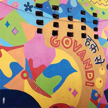
Rebuilding a Life and a Community- A Documentary Film on Parveen shaikh and her journey
by Hemant
by Hemant
This Film tells about a person who is a remarkable woman who faced numerous challenges in her life. She lived on a footpath for a long time until the government intervened and rehabilitated her. Despite the difficulties she faced, she never lost her spirit and remained committed to her goal of serving society. She became an inspiration to many, proving that it is possible to turn your life around with the right mindset and support. Through her work, she continues to make a significant impact and inspire others to overcome adversity and work for the betterment of society.
Details >>
Arrival of First Printing Press in India
by Jinal Jignesh Shah
by Jinal Jignesh Shah
As a kid, I was very attracted to storytelling, comic books, and illustrations. I still remember the storyline and plot of “Merchant of Venice,” an English prose story written by William Shakespeare and taught to us in school. Stories of Shivaji Maharaj fighting Mughals and the fight of India for independence against the Britishers were my favourite topics in school. When I read books, I was always curious to know what happens next, what the other character is thinking, how the sequence of the story goes, and how come small actions taken by some people decide the fate of many. Many times I tried reimagining some stories from different points of view, and the activity kept me busy for multiple hours. I also enjoyed drawing moustaches and funny expressions on the portraits of famous personalities made in our textbooks.
Details >>
Re-designing the NCERT Textbooks
by Jinal Jignesh Shah
by Jinal Jignesh Shah
At the start one might feel that a very small change does not make a huge difference. But as time goes on, the seemingly small change makes a very small difference. And then it slowly leads to bigger differences. And then it slowly leads to bigger differences. The theory of the butterfly effect is what gives us the hope that any small attempt by us will carry the potential to eventually impact society. My final project for the semester is inspired by the current scenario in the education system of the country. And I have utilised this opportunity to bring a small change to this seemingly vast system.
Details >>
Teaching How To Develop Anthropomorphic Characters
by Kunal Khawaskar
by Kunal Khawaskar
This project focusses on creating anthropomorphic characters by studying the famous symbols of Indian states, which will later be used to teach how to develop such anthropomorphic characters by converting them into a guidebook that explains the step-by-step process of anthropomorphic character creation to the students who are interested in character and mascot design. The concept of anthropomorphic characters is very popular and widespread in other countries like the USA, Germany, Sweden, Japan, China, etc., where they use the same approach of character design in mascot design not only to represent a brand but also to represent TV shows, events, cities, states, and even countries. Where an anthropomorphised character becomes the face of that subject (an event, brand, city, state, country, etc.), But the culture of mascots is very limited when it comes to India. Most of the iconic mascots that we have seen in India that represent a brand or a service (Bholu the elephant, MoneyKumar mascot for RBI, Amul girl, Chintamani, Maharaja, etc.) are all used for commercial purposes only. There is no such representative character of Indian states that will act as a mascot. This is where my project topic comes in. I will be working on the creation of anthropomorphic characters, which will serve as mascots for the Indian states, which can represent a particular state for which it is most popular for. Also, another benefit of these characters is that they can be used later in a variety of other applications, like in sports events, or Jhaki on 15 August, or to promote tourism in the state, etc.
Details >>
Revival of Ganjifa card game
by Kunal Khawaskar
by Kunal Khawaskar
I discovered that the traditional card game of ganjifa was at risk of being forgotten. This realisation inspired me to find a solution to revive this beautiful, hand-painted card game in India. As my project progressed, I decided to focus on creating a design solution that would make Ganjifa gameplay more accessible so that more people can play it. Because the best way to revive a game is to play it. However, one major obstacle with the ganjifa card game was that very few people actually knew how to play it. Fortunately, I was able to connect with Jue Taware, a researcher at INTACH in Pune, who helped me understand the gameplay better. After much consideration, I decided to create a video to help provide games rules for Ganjifa in India.
Details >>
Change- A Visual tribute to the Adventures of Vijayan and Mohana
by Lakshmi Chandran
by Lakshmi Chandran
Change is a web graphic novel that captures the essence of what Vijayan has left behind with Mohana. Vijayan and Mohana are a couple of tea shop owners from Kochi, Kerala. Until their late 60s, they travelled the world to around 26 countries. The story attempts to portray the influence their journeys had on them, their family, and also the people around them. The narrative tells the story from Mohana’s point of view to show how the journeys changed her as a person who had never travelled until she met Vijayan.
Details >>
There is a Kokaachi in my house
by Lakshmi Chandran
by Lakshmi Chandran
The southern Indian state of Kerala is well known for its vibrant and rich culture, which is rooted in customs, greenery, festivals, legacy, history, architecture, mythology, and legends. The state is home to a wide variety of people, each of whom has their own distinctive customs and practices, adding to the state’s rich cultural legacy. The state is also renowned for its colourful celebrations, such as Onam, which is widely observed throughout the state. Beautiful historical landmarks like the Mattancherry Palace and the Padmanabhapuram Palace, which offer a look into the state’s illustrious past, can be found in Kerala. A number of historic temples, churches, and mosques that display the artistry and ability of the state’s craftspeople are among the state’s remarkable architectural structures. Several fascinating tales that have been passed down through the decades may be found in Kerala, which is also rich in myths and legends. Kerala is a wonderfully unique and intriguing place to visit and explore because of all of these factors. I could go on and on about how rich the culture is.
Details >>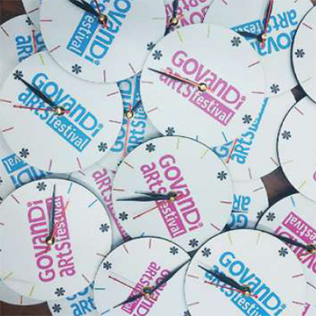
Govandi Arts Festival: Merchandise
by Madhuri Chandrasekhar
by Madhuri Chandrasekhar
Govandi Arts Festival as a DES project was a group project; volunteering for the festival was conducted for the artistic awakening of the youngsters and kids of Natwarparekh Compound, Govandi, Chembur, Mumbai. Eight students from IDC, IITB, volunteered for the same. My project was to work under the co-curator of the Govandi Arts Festival, Natasha Sharma. I dealt with the making and in charge of the festival tote bags, badges, certificates, T-shirts, stamps, flags, and mementos. Mostly all these wanted materials were bought and made within 5 km of the happening place at Govandi. The Govandi Arts Festival is a community-based initiative led by the Community Design Agency (CDA), Mumbai. This initiative aims to break the existing negative bias towards this place and people by giving them a platform for their artistic expression: theatre, rapping, photography, filmmaking, and public art, respectively. In this exploratory project I got to work with designing and executing the merch (tote bags, clocks, T-shirts, and flags), along with badges, certificates, layout, and stamps.
Details >>
Illustrations for the Novel: The Palace of Illusions
by Madhuri Chandrasekhar
by Madhuri Chandrasekhar
This project is a humble attempt at bringing the visuals of the novel The Palace of Illusions to life through the same perspective the book is written in. This Novel is the Mahabharata told from the perspective of Draupadi. Although the intent was to give visuals to the novel, along the process, the project developed into a standalone set of illustration cards specifically showing what Draupadi, the central woman character of the Mahabharata, felt and went through.
Details >>
Churul chronicles
by Madhuri Chandrasekhar
by Madhuri Chandrasekhar
Churul Chronicles is a graphic novel about a girl’s hair and its journey towards self-acceptance. Before curly hair became trendy/pretty enough for the mainstream, most of the curly heads dreaded their hair because of its lack of acceptance for its unruly nature. Stories of their ridicule, unsolicited advice on hair straightening, hacks, and tricks that failed terribly to have society-approved ‘beautiful’ hair came together to weave a story about two individuals: a girl and her hair, where the hair transforms from society-approved ‘beautiful’ hair to unruly, wild, curly hair when she hits puberty, and their journey to make peace with the new change. The visual narrative follows two characters’ worlds, one inside and through the frames, and the other running around and outside the frames. They also coincide, meet, or switch places at certain points as per the demand of the story. This project is an attempt at story writing and visual narrative design in static visual storytelling.
Details >>
3090kms: Graphic narrative on a long distance relationship
by Midhun Mohan
by Midhun Mohan
Is there anyone who has not fallen in love? Many who did are fortunate enough to be with their special person. At the same time, many others, including me, have to live our lives counting days until the next time we get to meet each other, since our life decisions have brought about a geographical separation between us. Long-distance romantic relationships pose their own challenges, mostly caused by the various miscommunications that may happen between the individuals as well as other hurdles that they need to fight against and overcome almost on a daily basis to keep their relationship together and strengthen their bond. The narrative here shares the story and experiences of a couple (me and my special person) who have been in a long-distance relationship for over 3 years, ever since they committed to it. The content does not intend to be a guide on how to lead a long-distance relationship or to give tips on the same. What the content intends to do is to create a moment of retrospection for the reader, to think about their own relationship, one in the past or one they are currently going through, and cherish the memories. If the relationship did not work out for them, think for oneself about what went wrong. Even if not these, if the content makes a person who comes across it think about their special someone, it is serving a purpose.
Details >>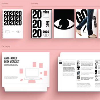
Reducing desk work fatigue through positive work habits
by Midhun Mohan
by Midhun Mohan
Unhealthy habits at workspaces could lead to a lot of physical and mental exhaustion. Desk work that demands people to sit in one place, working on a desktop or a laptop for a prolonged period, could cause so much strain that it, in turn, affects their productivity. Overexertion at work without giving proper care to one’s health could end up being more counterproductive, even when the intention was otherwise. It is important to take timely breaks at regular intervals, in between work, to relax and refresh the body and mind that has been working continuously to keep you going. This project explores the possibilities of reducing health hazards from fatigue caused by unhealthy habits built specifically around desk work by giving constant nudges and visual cues that would remind people to care for their health as well as suggest how to do the same by providing relevant information on how to act upon and avoid them.
Details >>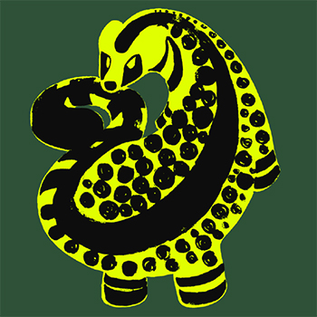
Wildlife conservation awareness illustrated book
by Mohak Gulati
by Mohak Gulati
This project is a documentation of an illustrated book of poems on endangered animals, traversing the theme of wildlife conservation. The book is an anthology documenting the story of 10 threatened species indigenous to India. Each book spread captures a distinct species whose story is depicted in a short poem and an illustration of the creature. The narrative thread charted across the book is human encroachment. Human involvement, direct or indirect, is consistently the leading factor in ecological disruptions. In writing, I leverage a tone of macabre humour to depict the grim reality of the state of each species. The concluding poem depicts humans themselves as one of the animals that face extinction, thus rounding out the narrative, which starts with human interference and ends with our demise. This project is motivated by my drive towards wildlife conservation. I wish to serve the cause as best as possible with my skill set while still pushing myself to learn new things.
Details >>
AXB 1344 Plummeting Down The Tabletop
by Nidhin Joseph
by Nidhin Joseph
Accidents that take place in the world of modern aviation are among the most catastrophic of all possible occurrences in the case of various transportational accidents. These mishaps not only result in the death of people and the destruction of property, but they also have far-reaching repercussions for families, communities, and even entire industries. In light of the significance of aviation to both the global economy and our way of fast-paced life, it is of the utmost importance that these accidents be investigated in great detail in order to ascertain the underlying reason for them and to prevent future incidents of a similar nature. The crash of Air India 1344, the flight plummeting down the Calicut airport’s tabletop runway on August 7, 2020, was a terrible event that sent shock waves through the aviation industry. This graphic-illustrated book tries to explain, from a human factors point of view, storytelling, that glance through the chain of events that led to this terrible accident. With the help of pictures and easy-to-understand language, readers can learn more about the contributory factors that led to this tragic accident. This book initiates discussions on the human factors and socio-technical aspects behind the contributory factors that led to the accident. This book thereby becomes an essential read for the people linked to the aviation industry; at the same time, it is curated to also cater to the general public who are curious to know more about the accident dynamics behind the incident.
Details >>
Peculiar World of Charles Bonnet syndrome- A 360 VR Immersive Film based on rare medical condition of CBS
by Nidhin Joseph
by Nidhin Joseph
“PECULIAR WORLD OF CHARLES BONNET SYNDROME” is a ground breaking 360-degree VR film that provides an immersive journey into the mind of a 70-year-old person suffering from Charles Bonnet Syndrome (CBS). Utilising cutting-edge technology like Twinmotion 2022 and Da Vinci Studio, the project crafts a narrative-driven experience guided by retrospective voice-over. It recounts the detailed hallucinations and how they affect the subject’s mental health, creating a bridge of understanding and empathy between the viewer and the condition. The film represents an evolution from an initial concept of an AI-generated graphic novel to a more powerful and impactful VR experience. It aims to enlighten families of CBS patients and the broader audience about this rare medical condition, providing insights that transcend clinical explanations. Its innovative approach sets new benchmarks in medical education, combining technological prowess with artistic storytelling. The project demonstrates the potential of VR in fostering human connections and empathy, opening doors for future explorations in healthcare, technology, and education.
Details >>
AXB 1344 : Virtual Reality Training Experience for Aviation Accident Investigators: Featuring Case Study on Air India 1344 Accident, 2020 Calicut
by Nidhin Joseph
by Nidhin Joseph
An innovative approach aimed towards aviation accident investigation training through the development of a Virtual Reality (VR) training module. This project specifically focusses on the Air India 1344 aircraft accident that occurred in Calicut in 2020, recreating the incident in a VR environment to enhance learning and understanding of accident dynamics. The primary objective of this project is to leverage the immersive and interactive capabilities of VR technology to simulate real-world accident scenarios of the Calicut tabletop runway crash and plummeting down the tabletop of Air India 1344.To curate and create an impactful training module for aviation accident investigators. By doing so, the project seeks to offer a comprehensive, experiential training solution that goes beyond traditional learning methods. The VR module encompasses several key features, with overarching chapters with a narrative structure in the form of three virtual reality doorway journeys: Investigate AXB 1344, Explore AXB 1344, and Understand AXB 1344. This experience includes a realistic 3D environment replicating the accident site, interactive investigation procedures, and immediate feedback mechanisms and an interactive graphic novel unveiling that can deepen the understanding of the user about the events that led to the accident. The training module is designed to improve the problem-solving skills of aviation professionals, enhance their decision-making abilities under stress, and better prepare them for real-world accident investigations with a better understanding of human factors and sociotechnical system factors linked to the Air India 1344 accident.
Details >>
Govandi Arts Festival- Crafts and Skills Mapping with Meera Goradia
by Reshma Issac
by Reshma Issac
Natwar Parekh Compound (henceforth referred to as NPC) is home to over 10,000 people residing in 53 buildings. It hosts a diverse population of people rehabilitated from all over Mumbai and is among the most marginalised in the city. These people are involved in various vocations for their daily bread. It comes as little surprise then that NPC is also home to people with varied skill sets and those who have mastered unique crafts. While a majority of people are involved in basic, easy-to-learn but in-demand skills such as sewing, a craft mapping of the area (carried out by Shireen and Shahista, volunteers from the community) reveals a number of people who have developed and are masters at rare skills and crafts. An emerging pattern across the skills within the community is that it is very evidently subject to the circumstances of the smaller cultural and social subgroups within the larger network that makes up the community. For instance, almost all of the women who are mehendi artists are Muslim. Or that most people involved in sewing or beadwork are women.
Details >>
THISPLACE- A narrative on the forced displacement of an indigenous community
by Reshma Issac
by Reshma Issac
Forced Displacement or Forced Migration is an involuntary or coerced movement of a person or people away from their home or home region. But the UNHCR (United Nations High Commissioner for Refugees) puts it more accurately as (people or communities) displaced as a result of persecution, conflict, generalised violence, or human rights violations. Forced displacement is not a concept that is alien to the Adivasis, the indigenous communities of India. In fact, having to deal with land alienation, being outcasted—treated as literal aliens in rehabilitated land, loss of access to and control over forests—is still very prevalent in our country to this day. One of the major causes of enforced migration is development and resource extraction projects. These vulnerable adivasi populations who have lived in the forests are traditionally dependent on forest resources for their subsistence, and displacement impacts their life and health and, most importantly, uproots their identities, much like the trees of their forests are in the case of many of these development projects.
Details >>
Crumbling Mountains, Mighty Women- A tale of sisterhood from the sinking city of Joshimath
by Reshma Issac
by Reshma Issac
Crumbling Mountains, Mighty Women - A Tale of Sisterhood from the Sinking City of Joshimath—is a 15-minute documentary film that tries to capture the human story of the native pahadi women of Joshimath who are facing eviction from their homes due to the threat to their lives imposed by the unstable lands of which they are inhabitants. While a lot of the sinking of Joshimath is attributed to it being located on a seismically active zone, it is said to have been further accelerated in recent years due to unchecked, extractive human activities in the region, such as tunnel boring for mega power projects. The brunt of this is borne, as per usual, by the most marginalised of people in the region, the indigenous pahadis. The documentary is an attempt at making the mainstream discourse revolving around the topics of extractivism, climate change, etc., inclusive of the people directly affected (and how it affects them exponentially more than those who stand to gain from extractive activities).
Details >>
Concerns of Sign Design
by Sanskruti Landage
by Sanskruti Landage
The design of a graphical sign involves its creation by the designer followed by testing for its interpretability using established testing methods.But the results of these tests can be misleading due to inexplicable factors like cultural knowledge, immediate environment, and ability to process information at the user’s end, and thus they can demonstrate agreement even for ambiguous signs. This points out another problem in the test results: they do not guarantee the quality of the sign. Signs that aim to become international standards, especially, should achieve maximum possible clarity in their message and quality in their design. which is also why it’s important to ensure that the sign submitted for testing represents the designer’s finest work. This study further investigates the designer’s process of creating a sign and presents a method to achieve a reasonable level of confidence in the designer of its comprehensibility. Then, additional testing of such a sign will be necessary to verify the designer’s prediction.
Details >>
Mapping Mumbai
by Sanskruti Landage
by Sanskruti Landage
Urban planning is a complicated, comprehensive process that necessitates a thorough grasp of a space’s ecology, history, and cultural importance. The precise integration of these factors is required to define not just a region’s physical environment but also its cultural fabric. Nestled upon Malabar Hill, the Banganga tank stands as a testament to the intricate interplay between nature’s embrace and the enduring legacy of human heritage. A symbol of historical significance predating the city itself, this venerable landmark whispers tales of a bygone era. The serene surroundings of this hallowed sanctuary, however, are on the verge of extinction as irrational concrete surges out, indifferent to the delicate web constructed within the ecology. A link, an unseen tie, exists under the surface between the reclamation effort and the natural spring that gives life to this holy ground. A delicate equilibrium teeters on the brink of collapse as waters pour down the shore, replenishing the Banganga tank. The natural spring’s voice may soon be muffled, as its flow is obstructed by the continuous march of reclamation. The state must recognise and value this delicate balance between a location’s physical and cultural traits, and it must take an integrated approach towards urban development. A long-term and deliberate approach may preserve a place’s past while addressing the needs of a rising population, assuring a brighter future for everybody.
Details >>
Graphic Novel: Plight of Kids Raised by Single Parents
by Shreyas Vernekar
by Shreyas Vernekar
Through this project, I intend to narrate the life experience of an individual brought up by a single parent. I aim to touch upon the issues faced, psychological coping mechanisms, and changes in mannerisms. Establish an emotional connection towards the single-parent child life and sensitise the readers towards single-parent children missing out on particular niches of skills generally learnt by observing parental figures in their life. The outcome of this project is a graphic novel with black-and-white, detailed, and stylised illustrations with selective colour pages. This book is divided into three chapters, each dealing with different issues faced in childhood, the teenage years, and the adulthood of a single-parent child's life. As the book focuses on single-parent children with an absent parent, I've decided to use a black-and-white colour palette reflecting the "present" and "absent" reality of the protagonist's parent.
Details >>
An Unusual Guardian- Interactive Storytelling through Digital Game Design
by Shreyas Vernekar
by Shreyas Vernekar
“While walking down the road the other day, I heard a thumping noise and a rattling of ghoongroos. Instantly, I knew he was patrolling his village, and I dared not cross his path,” the person recounted. “He’s 10 feet tall and would squish anyone walking on his route with his long legs.” Another individual shared a contrasting experience: “He helped me reach home. I thought he was someone from the village.” They described a recent incident: “The other day, I was extremely drunk and passed out. I remember someone lifting me and dropping me at my house.” Rakhandar, the mythical protective spirit of the area, demonstrates a fascinating duality in its identity. It can be mischievous, unforgiving, or fiercely protective towards the region’s residents. This multi-faceted nature adds depth and intrigue to the legends surrounding Rakhandar, making it an enigmatic figure in local folklore. This project aims to bring the rich folklore and mythology of the Konkan region to a broader audience, focussing on the fascinating and enigmatic figure known by various names such as Rakhan dar, Rakhnau, Naas, Rakhno, Devchar, Daivata, and more. These names represent a consistent spirit god believed to patrol villages, protect their inhabitants, and assist those in need. The project seeks to create an interactive and immersive environment that transports users to rural Konkan, with abundant coconut trees, shimmering springs, and numerous Rakhandar shrines. By sharing these local stories on a broader platform, the project aims to preserve and celebrate the cultural heritage of the Konkan region while fostering a deeper understanding and appreciation of its mythology and traditions.
Details >>
Instructional design for 10th Graders on 3D drawing with a focus on One Point Perspective
by Stuti swamiwal
by Stuti swamiwal
This project aimed to ignite children's curiosity and boost their confidence in art, especially in an area like 3D object rendering. Perspective drawing is a tricky subject for newcomers, particularly those between ages 13 and above, since they just begin to learn complex problems that require spatial visualisation at that stage of their educational journey. This project addressed this by making the perspective drawing instruction and learning more engaging, interesting, interactive, and easy to be taught in a school setup.
Details >>
Learning Independence
by Swati Yadav
by Swati Yadav
This project is a proposal for introducing same-language karaoke-based subtitles for all the videos within YouTube to facilitate effective and engaging reading activity for the viewers. The objective for this project is to alleviate the English learning experiences, build confidence, and create positive change by improving English literacy skills in Indian citizens and cultivating a culture of lifelong learning. This project helps build conducive learning for everyone irrespective of their exposure and access to printed reading materials. Post re-affirming the problem space by doing a pilot interview with four adults and several ideations for sustainable solutions, this project is situated to use the findings from Brij Kothari’s research on Same Language Subtitling as a jump start and explore the kind of interventions that can be deployed. A literature review is done as part of secondary research that introduces the topic and situates this project. Qualitative research is done to understand how Indian users, specifically women, face challenges while learning the language and whether the proposed design interventions will lead to desired outcomes. The report includes a summary of the ideas generated and the iterative process to create the layouts with feedback from different stakeholders. And it is concluded with feedback from the learners and experts on the prototype along with future steps for evaluation and web integrations.
Details >>
Society on a Scroll: A reflection on the mindsets of young individuals and their complex relationship with Social Media
by Swati Yadav
by Swati Yadav
This project explores the complex relationships individuals have with their screens in the age of the internet and social media. AI and machine learning techniques are used to curate personalised content for users, resulting in varied effects of mindless browsing on different individuals. Through interviews with 20 individuals of diverse age, profession, and demographics, 8 unique personas were identified. Their stories were then transformed into illustrations that depict the emotions and relationships they have with social media. The project utilises conversations and a satirical visual approach to portray the chaotic emotions they experience on a daily basis. The project's findings shed light on the negative impacts of social media on individuals, including feelings of isolation, anxiety, and addiction. The illustrations created for this project aim to capture those implications and concerns in a humorous and thought-provoking manner. The project also captures behavioural insights from their social media usage patterns that may be helpful in exploring digital wellbeing strategies to help people address problematic digital behaviours, manage distractions, and improve their autonomy around how they spend their time.
Details >>
Devanagari Display Font
by Vedang Pathre
by Vedang Pathre
An imbalance can be seen in the availability of fonts for the Devanagari script as compared to the Latin script. The disparity increases when we narrow this down to display fonts. It is essential to create newer fonts specifically for the Indian context so that the script can win the graphic design community and meet the demand for creative type design applications in a native script. We can observe a gap in the typefaces used by newspapers for their headlines, where a space-efficient font can help with the layout and other needs of publication houses, as pointed out by Prof. G. V. Sreekumar. This project aims to create an open-source Devanagari display typeface for the primary application in newspaper headlines.
Details >>
Shore- Spreading Awareness using Location Based AR
by Vedang Pathre
by Vedang Pathre
Amidst the vast expanse of our oceans, where mysterious depths await exploration, there exists a realm of wonder hidden within our reach—the enigmatic shores. These coastal realms, brimming with life, offer a gateway to the extraordinary. Yet, in the urban tapestry of Mumbai, we often overlook their allure, blind to the treasures they hold. Such is the grandeur of our coastal ecosystems that goes unrecognised, and this effort seeks to put light on this exquisite domain. Shore is a location-based AR app that aims to increase awareness of coastal biodiversity while also luring individuals to see these lifeforms for themselves. The app presents users with a thrilling journey of exploration, with narratives and assistance, by fusing the digital and physical worlds. This initiative not only showcases Ar's potential as a digital activism tool, but it also emphasises the need for increased awareness and action to conserve our fragile marine ecosystems.
Details >>
Animal depiction in Indian Art throughout history: Cattle (Cows, Oxen and Buffalos)
by Yash Vardhan Singh
by Yash Vardhan Singh
This report examines the depiction of cattle in Indian art over various periods, from the Indus Valley civilisation to the colonial era. The portrayal of cattle in Indian art is an important aspect of the country’s cultural heritage, as cows have been a symbol of wealth, fertility, and agricultural abundance in Indian society for centuries. The report delves into the different styles and techniques used to represent cattle in art during different time periods, such as the stylised and geometric depictions in the Indus Valley civilisation and the more realistic and detailed representations in Mughal art. It also discusses the religious and social significance of cattle in Indian society and how this is reflected in their portrayal in art. Finally, the report examines how the depiction of cattle changed during the colonial era, as Western influences began to shape Indian art. Overall, this report provides a comprehensive overview of the representation of cattle in Indian art and its evolution over time, offering valuable insights into the cultural and historical significance of these depictions.
Details >>
City For All: Living together with animals
by Yash Vardhan Singh
by Yash Vardhan Singh
The project explores the relationships between stray animals, people, and their spaces. Through storytelling, we spread awareness about caring for street animals and showcase the beauty of animal-human coexistence in cities. This children’s book features three captivating stories, blending photographs and illustrations to engage young readers. The first story captures the bond between humans and community animals, highlighting the joy of harmonious living. The second tale emphasises the importance of compassionately caring for injured animals, inspiring children to handle and interact with them with kindness. Lastly, the power of adoption takes centre stage, showcasing the transformative journey of a stray finding a loving home. As strays become part of our communities, it is essential, especially for children, to learn how to coexist with them. Join us on this captivating journey where photographs and illustrations weave stories promoting empathy, kindness, and the well-being of street animals. Together, let’s create a world where every animal is cherished and cared for.
Details >>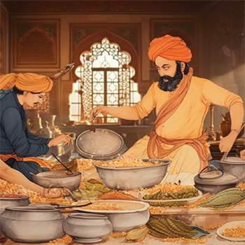
The Awadhi Delight: Visual Representation of Cuisine of Awadh
by Yash Vardhan Singh
by Yash Vardhan Singh
This report delves into the fascinating world of Awadhi cuisine, unravelling its rich history, cultural significance, and unique flavors. The project aimed to generate interest and appreciation for Awadhi cuisine by presenting it through various mediums, including animations, visuals, and storytelling. By exploring iconic dishes such as Dumpakht, Dum Biryani, Nihari, and Tundey Kabab, the project aimed to showcase the culinary heritage of Awadh. Overall, this project serves as a testament to the vibrancy and allure of Awadhi cuisine. By capturing its essence through visual mediums and storytelling, it endeavours to preserve and promote the culinary heritage of Awadh for future generations to cherish and explore.
Details >>
KALA Cast- An audio podcast of talents among us
by Stuti swamiwal
by Stuti swamiwal
Every second person is, in today's time, in some way or the other, connected with creativity, but what sets all of us apart are our unique stories. Whether you're an art lover or simply curious about the people behind what they do, "Kalacast" offers something for everyone. It is a celebration of diverse and multi-talented artists who exist among us or can be found hustling, creating, and passionately working around us. Every episode takes a deep dive into these creative individuals' personal paths and hard work, delving into their artistic journeys, inspirations, drive, and experiences that are moulding them into becoming even more accomplished and distinctive humans of tomorrow. Kala means ART, and we cast artists in this podcast. For this project series, Kala Cast, which focuses on musicians who come from totally different backgrounds, provides the introduction to diverse artists whose stories should be heard.
Details >>
Mayel Lyang- A game inspired by Lepcha folklore
by Aaron Chen Lepcha
by Aaron Chen Lepcha
The Lepchas are the indigenous people of Sikkim, whose population has gradually diminished over the years, leading to the erosion of their rich tribal culture in the face of modernization. This project aims to educate and introduce people to the unique heritage of the Lepchas through a narrative-driven game. Instead of relying on textual or motion-based storytelling, the project employs an interactive experience to ensure greater engagement and better retention of information. Through the game’s narrative, players are introduced to the everyday lifestyle, traditions, and cultural practices of the Lepcha community while exploring the environment. The project seeks to raise awareness about the Lepcha tribe and contribute to preserving and promoting their cultural identity.
Details >>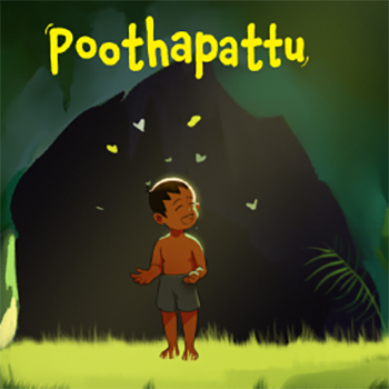
Enchanting Tales- Kerala Folklore Unveiled through Parallax Scrolling Comics
by Abhinav S
by Abhinav S
The search for the perfect story for this project draws inspiration from Aithihyamala, a remarkable compilation of Kerala’s timeless folklore by Kottarathil Sankunny. This collection brings together captivating tales and legends that reflect the rich cultural heritage and storytelling traditions of Kerala. Alongside literary exploration, oral accounts and local legends shared by elders and community members provided helpful information regarding the region’s diverse folklore. Among these, the story of Poothapattu emerged as a particularly compelling narrative. Blending elements of love, adventure, and the supernatural, Poothapattu stands as a significant piece of Kerala’s cultural legacy. Its depth and emotional resonance make it an ideal choice for reinterpretation through the parallax scrolling comic format, celebrating both tradition and creativity.
Details >>
Kuttichathan- A choose your own adventure comic
by Abhinav S
by Abhinav S
The search for the perfect story for this project draws inspiration from Aithihyamala, a remarkable compilation of Kerala’s timeless folklore by Kottarathil Sankunny. This collection brings together captivating tales and legends that reflect the rich cultural heritage and storytelling traditions of Kerala. Alongside literary exploration, oral accounts and local legends shared by elders and community members provided helpful information regarding the region’s diverse folklore. Among these, the story of Poothapattu emerged as a particularly compelling narrative. Blending elements of love, adventure, and the supernatural, Poothapattu stands as a significant piece of Kerala’s cultural legacy. Its depth and emotional resonance make it an ideal choice for reinterpretation through the parallax scrolling comic format, celebrating both tradition and creativity.
Details >>
Cancer disease management system- Simplifying the chemotherapy journey
by Abhishek Yadav
by Abhishek Yadav
The project was formed by discovering the challenges patients and their caregivers encountered during chemotherapy. Insights gathered from the participants during interviews helped provide a foundation around the problem, further guiding the solution. The approach during the project included brainstorming ideas, generating scripts with different stories, developing visuals, and crafting a video solution. The content was tested during the process and revised based on the feedback. Real-life stories narrated during the interviews were integrated, and elements of hope were added along with the data. The outcome of an explainer-illustrated video simplifies the journey. It reduces confusion by providing essential information along with common myths and misconceptions woven together with the patient's story to give them hope, making it an understandable resource, easy to locate, and with information straightforward to digest in narrative format.
Details >>
Health Shield
by Abhishek Yadav
by Abhishek Yadav
Health Shield seeks to dispel common myths & misconceptions about health insurance and empowers Indian consumers with easily understandable information by addressing regular problems. The project's output includes an explanation video and a collection of icons designed to help customers understand and navigate the insurance process. These icons in the explainer improve the entire process—from the foremost explanation to the last payment stage—by increasing recall value and creating a unique style through their consistent visual design. User feedback and iterative revisions provided the final video helped user preferences and requirements, building a more appealing, consistent, approachable, and explanatory tool. For Indian users, Health Shield effectively demystifies the health insurance procedure, making it better, i.e., more accessible and understandable.
Details >>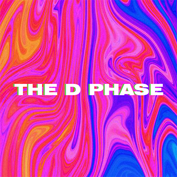
The D Phase- A Graphic Novel Chronicling my Personal Journey through Depression
by Akashnath M
by Akashnath M
“The D Phase” is a graphic novel that explores the emotional landscape of depression through a deeply introspective narrative. Rather than presenting a conventional account of mental illness and intervention, the story follows the journey of Adhi, a once-vibrant college student whose life is upended by a sudden change in environment. Struggling with grief, isolation, and fading connections, Adhi’s experiences reflect the complexities of living with depression. The narrative vividly portrays his daily battles with insomnia, lethargy, and emotional detachment, while also tracing his gradual progression through the five stages of grief. Through expressive visuals and evocative storytelling, “The D Phase” offers a compelling portrayal of mental health, resilience, and the path toward acceptance and recovery.
Details >>
The Malabar Hookah
by Akashnath M
by Akashnath M
This design project aims to narrate the captivating story of the hookah makers of Malabar through the engaging medium of motion graphics. It highlights the lesser-known fact that the iconic brass hookahs, often associated with Arab culture, were crafted in the coastal regions of Malabar, Kerala. The project explores the history of the Malabar hookah, from its origins and manufacturing beginnings in Kerala to its growth and eventual decline. It examines the cultural significance of the hookah and its symbolic connection to both local and Arab lifestyles. Additionally, the project addresses the decline of this craft, analyzing economic, social, and global factors contributing to its near extinction. It provides insights into the current state of the Malabar hookah, the challenges faced by remaining artisans, and efforts to revive this traditional craft.
Details >>
Just One Dress- A short film unleashing Life Stories
by Anisha Verma
by Anisha Verma
The "Just One Dress" project is a live-action short film inspired by a real-life experience of a friend. Her story became the foundation, evolving through ten iterations to shape the desired narrative. After rough storyboarding and auditions, the chosen protagonist had to cancel at the last minute. Faced with a challenge, I stepped in as the protagonist since others were occupied with their own projects. Throughout production, I directed all scenes, grateful for the support of friends and juniors who made the movie a reality. The report covers the ideas generated and the iterative journey from screenplay to post-production and concludes with feedback from learners and personal insights gained during the process.
Details >>
Mind your steps @IDC- Exploring how individuals discover methods to communicate and make relationships
by Anisha Verma
by Anisha Verma
The culmination of this research is an illustrated artifact, created using a blend of digital and traditional watercolors. These illustrations are designed to be both humorous and thought-provoking, depicting the various gestures and methods individuals adopt to improve communication. By employing satire, this project not only critiques the current communication practices but also aims to inspire self-reflection and encourage a more engaged and connected community at IDC. This project underscores the opportunity to redefine IDC's culture. Embracing new communication styles can lead to greater engagement and stronger relationships, fostering a sense of belonging and support for all members of the IDC community. Through this creative exploration, the project aims to set new standards for communication and interaction, paving the way for a more vibrant and interconnected future at IDC.
Details >>
Creating Financial Literacy to Empower Indian Youth- A core life skill in 2023
by Aparajita Prasad
by Aparajita Prasad
Despite global efforts to enhance financial literacy, India struggles due to interstate disparities and a lack of formal training and awareness. With only 27% of its adult population being financially literate, the country faces significant challenges, especially given its low overall literacy rates and a large population outside the formal financial system. To tackle this, the project targets young adults aged 18-26, a demographic that includes college students and soon-to-enter-workforce bachelors. Recognizing their preference for brief and engaging content, the initiative utilizes animated reel videos as the primary educational tool. These videos, tailored for distribution on social media platforms such as Instagram, LinkedIn, and Twitter, aim to pique interest in financial literacy. By serving as an introduction to more comprehensive resources, the project seeks to spark wider discussions among youth, thereby enhancing their understanding and accessibility to financial literacy.
Details >>
Designing The Look of The Games for Ahmedabad 2036
by Aparajita Prasad
by Aparajita Prasad
This project aims to create a compelling visual identity for the 2036 Olympics, potentially to be hosted in Ahmedabad, India. The “Look of the Games” is a pivotal aspect of any Olympic event, serving as a unifying thread that weaves together athletes, spectators, and viewers from around the world. It offers an extraordinary platform to celebrate India’s cultural richness and modern dynamism, crafting a visual narrative that resonates on a global stage. By blending Indian elements with contemporary design, the visual identity will capture the essence of India’s diverse heritage and vibrant present. This cohesive visual identity aims to showcase Ahmedabad’s unique character, highlighting its journey from a storied past to a promising future. The project underscores the significance of a strong visual identity in enhancing India’s global presence in sports, fostering national pride, and promoting unity. By encapsulating the spirit of the games and the host city, this visual identity will create a memorable and impactful representation of India’s culture and contemporary spirit, leaving a lasting impression on the global audience.
Details >>
The ordinary and the Extra Ordinary- AR-Based Graphic Novel
by Banasmita Das
by Banasmita Das
Augmented reality (AR) is a technology that overlays a computer-generated image onto what a user sees in the actual world, forming a combined view. AR holds the promise of transforming the art of storytelling through the creation of immersive and interactive experiences in the real world. Incorporating AR for storytelling opens new avenues of creative expression, providing an immersive and interactive narrative experience. This exploratory project aims to create a storytelling experience with marker-based Augmented Reality (AR). The narrative initially follows a young boy's playful escapades, anticipating the consequences of his academic struggles as he delays returning home. In the AR adaptation, the story transforms, offering insight into the boy's altered perspective. The project goal is to leverage AR to unveil a distinct version of the story, clarifying the original narrative. The scope of this project includes exploring various methods such as motion and sound design, as well as portal effects, to enhance the storytelling experience.
Details >>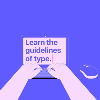
Legibility-The guidelines of type- An explainer video
by Banasmita Das
by Banasmita Das
This report delves into the fundamental importance of typographic guidelines in design and focuses specifically on the aspect of legibility within typography. Legibility refers to the ease with which individual characters can be distinguished within a typeface. This aspect is crucial for readability, especially for long multiple sentences. Understanding this fundamental guideline is paramount for young design students as they lay the groundwork for effective visual communication. Prioritizing legibility ensures better user experience and accessibility, contributing to the overall effectiveness of design communication. The objective of this project is to emphasize the significance of legibility in design education and to make learning about these principles engaging and enjoyable. While initially aiming to produce a series of instructional videos covering various typographic guidelines, the project's scope was refined to focus on creating a single video due to time constraints. Through scriptwriting, storyboarding, voiceover recording, and video production, the project culminated in an informative motion graphic explainer video on typographic legibility.
Details >>
Treads of Toil
by Biswajit Das
by Biswajit Das
“Threads of Toil” is a compelling narrative that delves deep into the human spirit, revealing its unyielding resilience in the face of adversity. At its core, the story showcases the remarkable strength that can be found within individuals when they are driven by shared dreams and the unwavering pursuit of a better life. This project is a testament to the enduring power of hope, resilience, and the human spirit. It reminds us that no matter where we come from or what challenges we face, our dreams and our capacity for friendship can illuminate even the darkest of paths. It underscores the idea that the threads of our shared humanity are unbreakable, weaving a tapestry that connects us all in our pursuit of a better life.
Details >>
Impact of Indian Government Welfare Schemes on Handloom Weavers
by Biswajit Das
by Biswajit Das
Handloom weaving, a vital part of India’s cultural and economic heritage, supports millions of artisans across the country. This study focuses on the weavers of Yeola, Maharashtra—renowned for their Paithani sarees—to examine the impact of government welfare schemes on their livelihoods. Through a cross-sectional descriptive approach involving 106 weavers, the research found that while many benefited from initiatives like the Yarn Supply Scheme, Integrated Handlooms Development Scheme, Marketing & Export Promotion Scheme, Health Insurance Scheme, and Mahatma Gandhi Bunkar Bima Yojana, nearly one-fourth remained unaware of these programs. The findings highlight that, despite positive outcomes for informed weavers, bureaucratic hurdles and limited outreach continue to impede progress. The study emphasizes the need for greater awareness, simplified procedures, and stronger implementation to ensure the sustainable upliftment of Yeola’s weaving community and preservation of India’s handloom tradition.
Details >>
Kasheer- A motion comic on the plight of kashmiris
by Himanshu Bagati
by Himanshu Bagati
This project explores the aftereffects of Kashmiris post exodus. Through strong visuals and a compelling story arc that follows a Kashmiri pandit kid trying to find out more about his homeland. And on the other hand, he makes a friend who's a Kashmiri Muslim, and he tries to explain his new friend's situation to his family to ease the conflict and invoke empathy. And even though the conflict isn't resolved within, the bond of Kashmiriyat flourishes again at the end. The whole story underscores the power of empathy and friendship in bridging divides and fostering understanding between people scarred by their history.
Details >>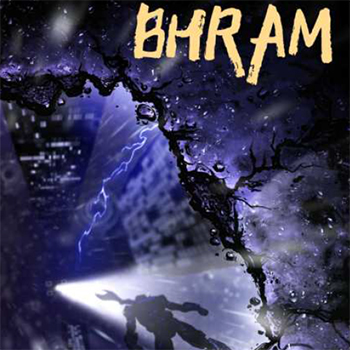
Bhram- Form comic origins to action figure
by Himanshu Bagati
by Himanshu Bagati
The project comprises two components: an origin comic and an action figure. The comic's narrative delves into prevalent anxieties surrounding AI uprising, reshaping the conventional hero's journey with a moral compass attuned to contemporary concerns. Ending with a tantalizing cliffhanger, it invites users to delve deeper into the story through interaction with the action figure. Users can manipulate the figure, capture photographs, animate scenes, or simply envisage new adventures. Ultimately, this project endeavors to foster an immersive and participatory user experience, encouraging creativity and exploration within its narrative universe.
Details >>
The Invisible People of Manipur- Stories of the Zo Descendants
by Joy Zenhinsang
by Joy Zenhinsang
“The Invisible People of Manipur: Stories of the Zo Descendants” explores the experiences of the Zo tribal community following ethnic clashes in Manipur. Through in-depth interviews with five individuals directly impacted, the book sheds light on the human cost of conflict, highlighting themes of identity, displacement, and resilience. The report details the book’s creation process, emphasizing the use of sensitive in-person interviews to capture the interviewees’ experiences. It acknowledges the challenges associated with this methodology, including dealing with trauma and limited access to comprehensive information. The book’s structure is outlined, showcasing its exploration of diverse perspectives and its aim to raise awareness about the plight of the Zo community.
Details >>
Hey Whats that smell?
by Joy Zenhinsang
by Joy Zenhinsang
Northeast Indian cuisine, though rich in diversity and cultural depth, remains one of the least documented regional food traditions in India. This project emerged from the recognition of the limited resources and public awareness surrounding it. Initially conceptualized as an exploration of the region’s culinary heritage, the focus was later refined to a specific state or aspect of Northeast Indian food to allow for deeper study. An initial survey conducted among individuals unfamiliar with the cuisine revealed significant gaps in understanding and perception, including instances of bias and stereotyping related to food habits. This observation reflects broader issues of cultural misunderstanding and discrimination faced by the North-eastern community in other parts of India.
Details >>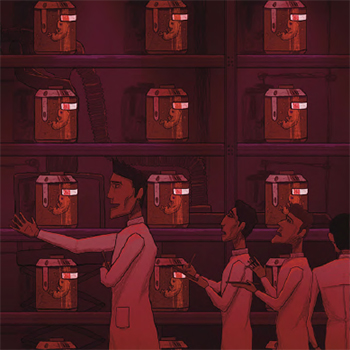
Concept art book design for Brave New World by Aldous Huxley
by Harsh Karani
by Harsh Karani
This project is an attempt to understand the challenges that are faced in visualizing a world based on a piece of text and generating concept art for the same. The text chosen here is a sci-fi novel, ‘Brave New World,’ by Aldous Huxley. The aim of the project is to create concept art for an animated movie/series that aims to capture the essence of ‘Brave New World’ with a thorough reading and understanding of the text and sticking to the source text as written by Aldous Huxley in 1932.
Details >>
The Search for the Extra(Ordinary)- Imagining the Food of the Future
by Muskan Bagaria
by Muskan Bagaria
This project explores the concept of the ‘Spirit of Mumbai’, capturing the city’s complexities and contradictions through an experimental short documentary film. It seeks to portray the essence of Mumbai using sound and visuals, moving beyond traditional narrative structures and dialogue-based storytelling. The focus lies in mastering non-verbal forms of expression to create an immersive and thought-provoking experience. By experimenting with the audio-visual medium, the project investigates the nuances of abstract storytelling and aims to evoke the dynamic rhythm and multifaceted spirit of the city.
Details >>
Storytelling for children with dyslexia
by Muskan Bagaria
by Muskan Bagaria
The Search for the (Extra)Ordinary is a fictional children’s book that presents a vivid and imaginative portrayal of the future of food and dining. In this world, food is no longer just food, and restaurants are no longer merely places to eat. Instead, they have evolved into art forms and experiences, influenced by innovation and technology. At the same time, the book illustrates the seriousness and potential trends of future food. The project focuses on exploring creative possibilities rather than predicting actual future trends. It aims to be an engaging and thought-provoking visual presentation, inviting audiences to contemplate the fascinating prospects of the 'Food of the Future.'
Details >>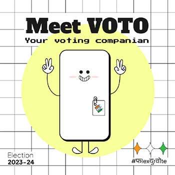
Engaging First Time Voters How to make an informed voting choice ?
by Pallavi Soni
by Pallavi Soni
Dyslexia is a learning disability that affects individuals with average or above-average IQs, presenting challenges in reading and decoding words. This project aims to engage dyslexic children in reading and understanding stories & poems. Often, dyslexic children struggle to comprehend the meaning of texts they read. My goal is to help these children connect words (text), sounds (pronunciation), and meanings. The project uses visuals that are literal representations of words, enabling children to associate each sentence with its meaning. Through a digital and interactive medium, the project also allows children to see the words broken into smaller words and hear them when they encounter difficulties in reading.
Details >>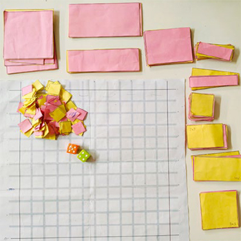
Tactical Tiles- A Board Game
by Pallavi Soni
by Pallavi Soni
This project addresses the widespread lack of awareness and engagement among young first-time voters regarding the electoral process. Many students feel uninformed, uncertain, or disconnected, often relying on external influences rather than independent judgment when voting. By examining these gaps in knowledge and confidence, the project aims to promote informed participation and empower youth to make conscious, unbiased electoral choices. Ultimately, it emphasizes the importance of equipping young voters with the right tools and understanding to foster responsible citizenship and strengthen democratic participation for the nation’s progress.
Details >>
Empowering young Minds for effective First-aid Managements
by Puja Saha
by Puja Saha
In today’s fast-paced world, unexpected emergencies can occur at any moment. For young individuals, having the knowledge and skills to respond effectively in emergencies is a valuable life skill and a potential lifesaver. This project addresses a critical gap in formal first-aid education among adolescents. Focusing on their unique needs and capabilities, this project intends to prepare them to respond confidently and efficiently to emergencies, ultimately contributing to safer communities.
Details >>
Macher Dhara- a narrative exploration if fish in Bengali life and tradition
by Puja Saha
by Puja Saha
Macher Dhara, meaning "flow of fish" in Bengali culture, is a vibrant children's book exploring the vital role fish play in Bengal. Through stunning illustrations, the story follows a fish's journey from the river depths to Bengali plates, highlighting its significance in everyday life, rituals, and art forms. Dive into bustling fish markets, witness traditional Pattachitra artwork, and discover the spiritual connection Bengalis have with the river. This book celebrates the cycle of life intertwined with the river's bounty. Macher Dhara is a visual and narrative journey showcasing fish as not just food but a symbol woven into the fabric of Bengali culture—from cuisine to spirituality and art. Extensive research brings these stories to life through engaging illustrations. This project deepened my understanding of Bengali culture and the power of storytelling in preserving traditions.
Details >>
Unknown
by Shivangi
by Shivangi
This project highlights the often-overlooked significance of the Government Museum, Mathura, in enriching the city’s cultural and tourist experience. While Mathura is widely known for its temples and association with Lord Krishna, many visitors remain unaware of the museum’s valuable collection of historical sculptures and artifacts. The project aims to raise awareness about the museum’s heritage through accessible and engaging mediums, encouraging visitors to appreciate its historical importance alongside the city’s religious sites. By doing so, it seeks to transform the museum from a hidden gem into a recognized and integral part of Mathura’s cultural identity.
Details >>
Expressions of Elephanta Cave
by Shivangi
by Shivangi
This project involves extensive research and creative work to illustrate the narratives carved into the Elephanta Caves. Through both primary and secondary research, the project aims to produce a series of five illustrations, each depicting key scenes from the Shiva-Parvati stories. These illustrations will be integrated into an immersive display designed to enhance viewer engagement and understanding of the stories and the bond between them. While visitors often perceive these sites as representations of Hindu gods and their stories, my goal is to present these sculptures from a different perspective. I intend to create an environment where I can interpret these sculptures from my viewpoint, highlighting what we can learn from the Elephanta Cave environment. historical and cultural contexts.
Details >>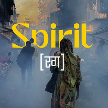
Experimental short documentary film: Spirit (Rag)
by Harsh Karani
by Harsh Karani
This project explores the concept of the ‘Spirit of Mumbai’, capturing the city’s complexities and contradictions through an experimental short documentary film. It seeks to portray the essence of Mumbai using sound and visuals, moving beyond traditional narrative structures and dialogue-based storytelling. The focus lies in mastering non-verbal forms of expression to create an immersive and thought-provoking experience. By experimenting with the audio-visual medium, the project investigates the nuances of abstract storytelling and aims to evoke the dynamic rhythm and multifaceted spirit of the city.
Details >>2009-2018
(272 items)
Nirmal Toys
by Ashoka Chary M
by Ashoka Chary M
India has a great tradition of making toys with wood. And this toy making is a skillful craft. Especially for the children, these toys help a lot to children with playing different play objects and they completely live in a different world with different traditional toys. Toys are used as decorative elements in Indian houses. Most of the houses will have the showcase with various toys in Andhra Pradesh. In Andhra Pradesh apart from Nirmal there are other places also do these toys such as Etikoppaka and Kondapally. I went to know the toy making in Nirmal, which are traditional wooden toys and beautifully carved by craftsmen. During this project I have learned how the craftsmen make the toys from wood to final shape.
Details >>
Summer Internship Under PG VINDA Director and Cinematographer
by Ashoka Chary M
by Ashoka Chary M
"I wanted to work with PG Vinda, Director and Cinematographer who is the great skilled and dedicated cinematographer from Hyderabad. Vinda’s work for Grahanam received major attention and a National Award nomination for Cinematography. Vinda earned a distinction of master of digital format in Telugu cinema. Many critics appreciated his works. Now PG Vanda engaged with three to four Telugu films. PG Vinda made a film “Lotus Pond” as a writer, director and Cinematographer. I got an opportunity to work with PG Vinda for couple of Telugu films. “Aa Aiduguru” and “Anthaku Mundu Aa Tharvatha” . I got an apportunity to explore and observe and learnt so many things in cinematography in all aspects like easthetics, creating lighting and the process of film making."
Details >>
Beyond the Bangle
by Ashoka Chary M
by Ashoka Chary M
This project is about women’s traditional wear, "the bangle," and its making process in the Laad bazaar in Hyderabad. In this documentary project, I attempted to investigate various aspects of Bangles, such as how they are made, where they are made, what their circumstances and working conditions are, the bangle market, people in that market, various communities involved in making and purchasing bangles, and the Bangle-making tradition in Hyderabad. The aim of this documentary is to communicate the working conditions, the skill of the bangle-making craftsmen, the process of that bangle-making, and the ambience of Laad Bazaar, which is the place the bangles are made. I have tried to communicate the bangle-making process to people in the Laad bazaar. How they bargain with the sellers and how the bangle market looks like In order to communicate all these elements, I have used the required camera techniques and other equipment to capture the visuals and the sound. I had explored the techniques and aesthetics of visual grammar, like exposures and points of interest, by pulling focus, using the required depth of field, and maintaining continuity in the actions. In some places, I wanted to emphasise the visuals, whereas the craftsmen embellishing the stones on the bangle and selecting the stones I used the reversal lens technique to achieve the macro lens effect; additionally, for sound recording, I used a Zoom H1 recorder, which is an external recorder for recording Foley sounds from the locations. In order to communicate the visuals about the bangle making, the Laad bazaar, and the people, in this film there are 5 chunks, which are the Hyderabad introduction by establishing wide shots of the Charminar and Golkonda fort, and the Laad bazaar ambience through the market and the people visuals, Since I have seen three different bangle making processes in the Laad bazaar, I have shot and presented those three processes separately in the film. Then the second chunk of visuals is process number 1, which is the heating of the lacquer and the process of making lacquer ready for the bangles, as well as bangle making. Then there's the third chunk, which is a completely different process than the first. Then the fourth chunk is also another process, which is the old process of using pot. Then the fifth chunk is the Laad Bazaar, with people and the ambience of the night. Because lacquer bangles are well-known for bridal bangles, I attempted to connect the film with a bangle being made in stages and a bride being decorated with suggestive shots.
Details >>
Balaram
by Ashoka Chary M
by Ashoka Chary M
"Balram, Short Film" is a project about treasure hunters and their beliefs about treasures. In this narrative fiction project, I attempted to investigate various aspects of visual storytelling and filmmaking, such as preproduction, production, and postproduction. I have made this short film based on news from various places in India and experiences from my village. In this story, Balram is the main character who believes in the treasures and wants to earn money through shortcuts. Though I have drawn inspiration from the real events in my village, I have also added fictional characters to this film. How the Balram fell into the treasure-hunting trap—in the process of rescuing his friend—and finally, he drags his son into the treasure hunt. The aim of this short film is to communicate Balram's character and the journey towards the treasure.
Details >>
Writing with (Available) Light: Amol Gole Cinematography
by Chinmay Bhave
by Chinmay Bhave
With an academic background in mass communication and professional experience in the news and consumer research domains, I was keen that I acquire a new skill during the internship; more importantly, a skill that would add up to my professional objectives. Though I have wandered along different paths, one thing has always remained common. It was my interest in observation of social behaviour and using visual methods to capture that to be able to tell the story vividly. A medium like TV news demands the storytelling to be pithy and lucid, and the production time available is very limited. Though this is a very effective way of communicating information in packages, it leaves little scope for reading between the lines and expressing complex ideas like human emotions. This is where I felt the need to break free. I wanted to understand the cinematic style of storytelling and fuse it with the non-fiction work that I am interested in to make it engaging. I believe that storytelling becomes effective when it is experiential and one makes the most of the medium of communication. Filmmaking has the potential to transport the viewer into the world of images and sounds and create a real experience.
Details >>
Seoul Curry
by Chinmay Bhave
by Chinmay Bhave
This project was inspired by the travel accounts of ancient travellers like Marco Polo, Xuan Zhang, and Ibn Battuta, etc., who travelled to new lands and wrote vivid accounts of their experiences. These travelogues became bodies of knowledge pertaining to the regions explored and were important exploratory ventures for the countries these travellers represented. Burton Holmes, who is credited with coining the term "travelogue," monetized his skills by conducting travel lectures. These travellers satiated the curiosity of their countrymen about the new cultures they visited. Today, these documents are landmark reference points for exploring the cultural history of the regions these travellers explored. I intend to create a visual travelogue that presents a point-of-view account of my experiences in the land of the morning calm. The travel writings of noted Marathi writer P. L. Deshpande are known for his deep cultural and behavioural observations. Whether he travelled within India or abroad, his writings described the cultural landscape as well as interesting personalities within these contexts. I wanted to "see things differently," and P. L. Deshpande was an important reference point for me. Any comprehensive ethnographic project requires much longer fieldwork as well as familiarity with the language. These two qualities are critical to gaining ethnographic authority. My project is an exploratory first step that borrows from concepts of visual anthropology in order to break the mould of structured journalistic methodology and see beyond what travel guides tell you. This would require focusing on visual culture, interactions, and going off the beaten track. As a designer, I would like to create a tool that can use cameras as a research tool to unravel cultural insights. I want to present my travel experiences and stories with dual temporality. While the book sums up the experience of travelling across South Korea and living there as a student, the blog would be a collection of images where each experience in South Korea has its own unique perspective. The book is a picture story that gives a holistic description of what South Korea was like for me. On the other hand, the blog viewer can enjoy each image separately as a work of art or design. It allows the photographer in me to present stories of journeys within a journey. I have explored the duality in the photo-word relationship as well. In book form, my notes supplement my images, allowing me to say exactly what I want to say and elaborate with precision. In the blog, words are kept to a minimum, and I expect the viewer to interpret and react.
Details >>
Stick to Dreams- A cinema verite film from the world of Indian hockey
by Chinmay Bhave
by Chinmay Bhave
It is a film about dreamers! It is about the lives of people who are not afraid of
going against the flow, norms and chase their dreams. Though the inspiration for
my film came from my passion for hockey; this film is not about the game. It is
about the mad zeal with which hockey aficionados like Andrea Thumshirn work
relentlessly to realize their dreams in foreign land full of challenges. Hockey is
merely the turf on which the story unfolds. The film aims to peek into lives of
people at the hockey village who have come together, woven their dreams together
and trying to work towards a common goal in spite of socio-cultural differences.
Their dreams, aspirations are completely different but what brings them together
is the hunger to make things happen against the tide. Stick to Dreams seeks to use
cinema verite approach to peek into the lives of these dreamers with an aim to
understand them in an engaging yet empathetic manner. While the mainstream
media regularly produces feel good stories about such dreamers; it seldom has
the patience and wherewithal to go beyond the headlines. My curiosity about
the process of social change juxtaposed with individual motivation to see things
differently motivated me to make this film.
Details >>
Happy Hands Foundation
by Divya Bharadwaj
by Divya Bharadwaj
The stated purpose of a summer internship at IDC was to expose oneself to different design firms in rural and urban sections of society and to understand how design can intervene to bring about constructive changes as per the socioeconomic and cultural context. As a Visual Communication student, I wanted to work with an organisation that is motivated to work for society and uses design intervention to change lives and make a positive social impact rather than just for commercial gain. Working as a designer in the past, I have often been exposed to several Indian crafts and folk arts and have had the privilege of working with them, even on small projects. Ever since, I have been really keen on learning more about them. I wanted to use this internship as a chance to explore this possibility as well. Happy Hands Foundation and The People's Project brilliantly combined these two interests and requirements, while also meeting IDC's criteria.
Details >>
Sight of Sound - an expression of emotions
by Divya Bharadwaj
by Divya Bharadwaj
Abstract art, which people would perhaps consider the most emotionally subjective form of art, is actually completely objective. The emotional objectivity of abstract art lies in the characteristics of the colours and their interactions with one another. To know what kind of colour palette can express the chosen emotions and to substantiate the reason for using movement in colours, as well as to understand which elements of art or visuals play a vital role in evoking emotions in the viewers, I created a survey. The inferences were made from 50 complete responses and around 76 partial surveys, where 16 of the surveys had data for 6 or more than 6 questions and thus were considered in the inferences.
Details >>
Animation for Industrial Safety
by Kailash Gharat
by Kailash Gharat
India is a country that was known for agriculture, but after industrial development, maximum employment depends on industries, and industries depend on manpower. But the manpower that is required for the jobs also requires proper education. Accidents are more likely if proper safety education and training are not provided. Government industrial organisations and public-sector companies are making lots of effort to minimise occupational accidents. But existing awareness materials such as safety posters, stickers, banners, and informative messages are not as effective. Technology has brought enough advancement into the life of the common man. One of the major benefits of information technology is computer graphic animation. The industrial environment is dangerous, and safety is a major concern. Animation generated information can explain scenarios before and after accidents and prevent employees from experiencing similar incidents in the future. Animation can help to understand safe procedures for handling hazards operation Education and training are the keys to maintaining a healthy atmosphere at any hazardous workplace. There are many ways to educate workers in the workplace, such as the display of safety posters, safety messages at factory entrances, canteens, work floors, and worker gathering areas. It’s important that workers fully understand the potential health effects that may occur after a long period of time. Maintaining safety awareness among workers is the key to controlling accidents at the workplace. Safety awareness is critical in many hazardous work environments.
Details >>
Constructive Approach of Devanagari Calligraphy
by Kailash Gharat
by Kailash Gharat
The report presents the understanding constructive approach
of Devanagari Calligraphy, basic fundas of the script, proportion
and character of the alphabets, such tasks completed during
summer internship. Devanagari Calligraphy is highly appreciated
in the history of writing. Imitating historical handwriting is a
wide, well-lit highway to calligraphic success. Learning historical
hands is a method of training the hand and eye, rather than a final
destination in calligraphy.
I tried to understand of the writing sequence of Devanagari
calligraphy, analysis of Devanagari letter design. The graphic
scrutiny of the Devanagari letters will bring out important aspects
of the letter design.
Details >>
Introducing Devanagari Calligraphy to Undergraduate Design Students
by Kailash Gharat
by Kailash Gharat
The report presents the importance of
Devanagari Calligraphy, basic writing
sequence of the script, proportion and
character of the alphabets. Devanagari
Calligraphy is highly appreciated in the
history of writing. Learning historical
hands is a method of training the hand
and eye, rather than a final destination
in calligraphy. This study is especially
made for the undergraduate students of
art and design field.
I tried to explain the writing sequence
of Devanagari calligraphy, analysis of
Devanagari letter design. The graphic scrutiny of the Devanagari letters will
bring out important aspects of the
letter design.
The content of the report provides the
perfect start for your journey into the
field of calligraphy, with everything
from the history of this art form to
in-depth instructions on creating each
letter of each featured alphabet makes
the process of learning Devanagari
calligraphy easy simple and enjoyable
for aspiring artist, designers and other
all interested students in the field art
and design.
Details >>
Workplace Safety Education : The backbone for promoting safety awareness at workplace
by Kailash Gharat
by Kailash Gharat
Accidents are a major cause
of death for people working
in construction sites. It is an
urgent need to address these
issues for the betterment
of safety workplace. Poor
education, lack of proper
training and knowledge about
workplace safety issues are
some of the main causes for
construction accidents. This
project aims to create safety
awareness among workers using
animation videos. These videos
can be effectively used by the
Safety Manager to provide an
appetiser to safety through the
engaging characters, amusing
story line, and a humorous
approach.
These videos are designed for
less literates and are free of
language and culture barriers,
keeping in mind the wide
and diverse audience. Visual safety awareness material
can be used, but due to low
education levels of the workers
it is difficult to communicate at
diverse languages. Therefore
wordless animated videos have
the potential to make safety
education more attractive
and enjoyable can solve this
problem. Issues like ladder
safety, working at height, object
falling from height, material
handling, and their prevention
have been communicated
through this project. Safe
workplaces are vital to the
well-being of workers and
the strength of economy of an
industry or a nation.
Thus, to promote safety
education, I have decided to
contribute as a designer, to
improve safety on the job by
preventing workplace injuries
and illnesses of the worker.
Details >>
Corporate Identity Design
by Reshal Shah
by Reshal Shah
With an academic background in mass communication and professional experience in the news and consumer research domains, I was keen that I acquire a new skill during the internship; more importantly, a skill that would add up to my professional objectives. Though I have wandered along different paths, one thing has always remained common. It was my interest in observation of social behaviour and using visual methods to capture that to be able to tell the story vividly. A medium like TV news demands the storytelling to be pithy and lucid, and the production time available is very limited. Though this is a very effective way of communicating information in packages, it leaves little scope for reading between the lines and expressing complex ideas like human emotions. This is where I felt the need to break free. I wanted to understand the cinematic style of storytelling and fuse it with the non-fiction work that I am interested in to make it engaging. I believe that storytelling becomes effective when it is experiential and one makes the most of the medium of communication. Filmmaking has the potential to transport the viewer into the world of images and sounds and create a real experience. Company is a creative house founded by KB Vinod and Bhupal Ramnathkar in February, 2012. It is a design and advertising agency based in Lower Parel, Mumbai. Comapny believes in honesty, transparency, simplicity and originality. They are a team passionate and obsessive about quality and creativity. Some of their clients include Fashion Big Bazaar, Caprese, Holii and Malabar Gold.
Details >>
The Speaking Image
by Reshal Shah
by Reshal Shah
DIVING INTO IMAGES ~ SETTING AN OBJECTIVE Where all do we encounter images and how do we make sense of them? Images have made a journey from the age-old Lascaux’s paintings to the contemporary media images. But there arises a question to reflect upon: what are images and what are the contemporary changes? These questions often hover my mind and I am compelled to ask: What is my role as a visual communicator? How do I express? In my view, the most challenging task for a visual communicator is being able to communicate visually. Good images have the power to stay silent, yet convey so much. "The design is an expression of the purpose. It may (if it is good enough) later be judged as art"- Charles Eames. My objective thus becomes, to bring in images of art and make a study of images relevant to our current times. There is a need to realise the thought of what the purpose of an image is. THE FUTURE OF THE IMAGE The title is borrowed from the book, The Future Of The Image by Jaques Ranciere. The study of visual imagery in our times needs to take into account the diverse nature of images encountered today. We come across imagery in various forms like mobile imagery, Internet content (YouTube, TED, etc.), television, film, animation, advertisements (print, television, internet); illustration, painting, printmaking and sculpture. In these times where media throws a tsunami of images, there arises a question as to what relationship do we have with a still image? For example, people watch television till late in the night where images change at the rate of 24fps. What is the future of a still image in this tsunami of images?
Details >>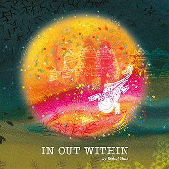
Young India - Then & Now
by Reshal Shah
by Reshal Shah
People often talk in generalities about the youth, having positive hopes in some sense as well as a few complaints against them. But what are the young people of India doing in reality? Why are they doing what they are doing, and what keeps them at it? These questions made me think that it would be interesting to talk to the young faces of my time and learn about their journeys. Looking at what others did in the past, in their youth, would allow me to reflect and understand in some way how we are all connected and how we have conversations, between "then" and "now," with a thread that binds us all together. The title of the project, "Young India: Then and Now," has somehow emerged from Gandhi’s "Young India." This Young India was a journal that had thoughts and opinions that inspired many people. It was focused on addressing various problems of those times, during the pre-independence era, and contained highly motivating views and messages from people who believed in their mission and worked actively towards it. Thus, my journey with this project began with what was happening "then" amongst the Indian youth. The questions about the youth "now" that were yet to be answered had their roots in the past, and thus, the journey of this project in itself became "Young India: Then and Now." Through this project, I wish to bring out the essence of these experiences through storytelling. The goal is to bring in my own image and text in an interesting way to give out the message in a richer form while maintaining the traditional strengths.
Details >>
2D Space Understanding for Blind - By applying 3D concepts
by Shweta Kable
by Shweta Kable
The world around visually impaired person is
drastically different from the experience of a person
with normal vision. Very few skilled and explored
people can achieved the environment around them
to some extent. Every time when we go to any new
place we create mental map of that place with the
help of various visual clues and if someone asked
you about that place then you prefer to give him/
her illustrated hand drawn map. Blind people lack
this visual information and they face great difficulties
in generating efficient mental maps of spaces and
therefore find difficult to navigating efficiently in
these spaces.
Here we describe how blind people perform with
haptic devices and understand the task given to them
with minimum support. The project went through
multiple experiments with blinds and we found out
interacting with them is the best possible way to
understand them better.
Details >>
Intranet Portal Design for CMS UX Portfolio
by Shweta Kable
by Shweta Kable
The key challenge for today’s marketers is to provide the right message at the right time through the right channel. Maintaining brand consistency, coordinating with multiple internal and external service providers, developing actionable insights that reflect a complete and accurate understanding of the customers, and speed-to-market are clear challenges. My project was to create a digital identity for Tata Consultancy Services’ (TCS’) Connected Marketing Solutions (CMS) group to showcase their portfolio. By attempting this intranet portal, we are trying to bridge the gap between customers and CMS Group, which will provide design solutions and strategy. Here, we are achieving it by following current design trends to make it a user-centred design. The project's aim was to showcase their portfolio in a creative way, which would feature their strengths, capabilities, team, and work. We achieved it by following current design trends and making a user-centred design. Our approach was to solve the problem through interactive infographics. I was working with a team of two visual designers and one usability analyst for a period of 47 days. The initial task was to create visuals based on the existing wireframes provided by TCS’ CMS group, which were simple and didn’t have anything that showed the creative process, services, or portfolio of the company. After we had a review of the provided wireframe, we suggested some changes and applied them. We then created two different visuals for that wireframe. The team had a discussion and debate on the wireframe and visual design, through which we came to the conclusion that we should change the overall approach of the portal. Because it was difficult to comprehend complex data or analyse a large amount of information using words or texts, the new approach was to solve the problem using interactive infographics. Infographics make it easy to understand and navigate the complex world of facts, figures, and directions to finish a task, solve a problem, or meet a need. The objective was to create a design that had different layers of information, and each layer could have multiple hierarchies. This was a completely new concept. We started working on this new concept with a comparative analysis of various company portfolio websites, many interactive websites, and infographic websites. We received various inputs and inspirations, as well as insight into the latest design trends and their various effects, and how we could use them smartly in our portal to communicate better with customers, through comparative analysis. The problem definition was to create a wireframe that had a proper content flow, was interactive, guided the user to navigate through the entire portal easily, and also created and developed two different visual design concepts. After creating two different visual designs for the basic four pages, the team had a discussion, and with the concoction of the two visual designs, we created one single final design that served all the purposes. Later, the design was sent to the user interface developers for further processing. Working in a company like TCS, which has an excellent group of people who all have deep knowledge in digital media, was a great experience, also equally challenging and exciting to work with a completely new medium and learn from the basics. As a visual designer from IDC at IIT Bombay, their expectations from us were really high. They immensely appreciated our work, our work process, and our design style. Not only are most of the things new to us, but there were also many new things that they got to know from us. All in all, it was a good exchange of knowledge and experience.
Details >>
Creating Sensory Experience For Visually Impaired Children
by Shweta Kable
by Shweta Kable
This project aims to create a sensory experience for children who are visually impaired. Over time, children with visual impairments slowly become more acute in their other sensesver time, children with visual impairments slowly become more acute in their other senses. The lack of one sense increases the importance of the remaining ones. They become more sensitive to touch, smell, sound, etc. They use their fingers to understand a text written in Braille, remember people or places through fragrances, and understand the space around them through sound. The world around visually impaired children is drastically different from the experience of a person with normal vision. When a person with vision experiences the world, it is primarily through "what they see," but for the visually impaired, "what they touch, smell, and hear is what they experience." This project is concerned with visually impaired children of the pre-Braille class (5 to 10 years old) who stay in residential blind schools. There are a considerable number of students who remain in the same class for years due to hampered growth. Also, children are in a completely different environment when they go home during the weekends. This problem is widely known, yet very little attention is paid to it. My project aims to engage students in physical and mental activity when they are at home. At the same time, this activity will help them to improve their sensory coordination because knowledge of Braille demands sensitive hands, fingers, and coordination between sounds (ear) and touch (hands). The research led to prototypes aimed at engaging visually impaired children in active play. The goal of the designs is to create an aid that empowers children to build cognitive, social, and physical skills. The project will identify these abilities, teach them how to use them effectively, and assist them in learning about Braille. The idea is to make them physically and mentally strong, which will help them with pre-Braille development and at the same time make their sensory experience richer.
Details >>
Pune Bus Transit Route Map
by Shweta Kable
by Shweta Kable
Pune was the cycle city of India, but now it is the motor cycle city of India. Pune has the highest percentage of two-wheelers in the state. Other than autos, bus transit is one of the major public transports Puneites use. Pune’s bus routes and services are very chaotic. There is literally no connection between buses and schedules. One of the common scenarios you will notice at any Pune city bus stand is that people are running here and there and asking everyone which bus goes where. or a particular bus number or route? Any new traveller who wants to travel from destination A to destination B needs to find the correct bus that goes to his destination. Also, there are various buses that go to the same destination but take a different route. The project aims to design a bus transit map that will explain routes and focus on 20 major stations in Pune city. To avoid confusion, this map will show you the shortest as well as all possible bus routes. This will provide the best possible service to the greatest number of people within the governing economic constraints. The route structure will be clear, requiring the user to spend the least amount of time understanding it. Because bus transit is such an important part of public transportation, bus lines should complement rather than compete with other modes of transportation, allowing each mode to be used to its full potential. People should interact with the route map in terms of comprehension and use, which will make their life easy in terms of bus travel.
Details >>
Responsive Design Strategies
by Srinivas Godala
by Srinivas Godala
The main objective of the project was to
analyze and understand the Responsive
design strategies in web design. This project
focuses on the need for responsive web
design for a wide variety of users looking
at the mobile usage in the current day
scenario. With increasing trends in the use
of smart phones and tablets of different
screen size, it became difficult and complex
to maintain the website that fits best on
different screen sizes. Responsive Web
Design (RWD) is found to be an effective
way of solving the issue of site management
for different end users.
As the name suggests, RWD is a conceptual
design of website with the properties
of liquid, which occupies the shape of a
container without losing its properties.
RWD conceptualizes on three main
fundamental blocks of website construction.
Which are Media queries, Fluid grids and
Flexible images.
Details >>
Strategic Pilot on Adaptation to Climate Change (SPACC)
by Srinivas Godala
by Srinivas Godala
I worked at Bharathi Rural Development Society (BIRDS) for a summer internship Allagadda, BIRDS is an NGO working in and around four states: Andhra Pradesh, Karnataka, Tamilnadu, and Kerala. BIRDS vision is "a world where all its inhabitants live in complete harmony with each other to maintain and benefit from balanced eco-systems." BIRDS mission is to create a platform for people from all walks of life so that they are able to take necessary action for ensuring ecological stability, safeguarding human rights, eradicating poverty, ensuring a minimum standard of living, and bringing in social justice (on account of differences based on gender, disability, social and economic marginalization, and displacement). BIRDS will work only for the furtherance of its vision, mission, and objectives. BIRDS recognise that they are only a part of a bigger movement to ensure environmental stability and in the fight against poverty. Therefore, it tries to establish linkages at the organisation and community levels with different strategic developmental players (governmental and non-governmental).
Details >>
Developing the learning method for Hearing Impaired Children in Andhra Pradesh
by Srinivas Godala
by Srinivas Godala
This project is aimed at improving the
learning and communication of hearing
impaired children aged 4-7 years. Hearing
impairment is a major setback as the child
loses the chance to learn language and
speech at this precious age. Added to this,
the parents do not know how to teach new
things to the child for basic communication.
These children require a special learning
method after proper treatment through
hearing aid with Cochlear implants.
Specially trained teachers of Auditory
Verbal Therapy (AVT) are very instrumental
in improving their auditory, speech and
language skills as regular teachers don’t
spend enough time teaching these children
or parents remove the cochlear implants.
I have designed an interactive learning
method designed for solving auditory &
language problems which can used at home
with help of parents as well.
Details >>
Kakatiya Dyansty Art and Architecture
by Srinivas Godala
by Srinivas Godala
This project aims at paying a visual tribute
to the art, culture and architecture of the
Kakatiya Dynasty in Andhra Pradesh - such
as the Warangal Fort, the Thousand Pillar
Temple and the Ramappa Temple.
The finely sculpted dancers, beautiful
flowers, aesthetically carved Prakaras or
Gopuras says a lot about our ancient art
and culture. This project takes the shape
of a pictorial book that communicates the
essence of Kakatiya art and architecture.
Through this project I have tried to
improve my understanding of photography,
communication design and visual design.
Details >>
Branding of Flower selling company
by Tarun Kumar
by Tarun Kumar
Branding and identity are very powerful tools of communication that make a first impression, whether in business or in personal life. It represents the company's profile and existence. It helps people to recall some brands with just a little glimpse. I have never done branding before in my design education or career. I am always fascinated by simple, minimalistic symbolic identities that attract millions of people at a single glance. So I decided to explore the most basic and serious subjects of design. I start working on a hypothetical brand, which lets me think about all the processes of establishing a brand and identity. I start working on the most important element of identity, which is the logo, to make other collaterals on the basis of that. I came up with many ideas and processes between the idea and the final output. This time I worked only on the basics of branding, which can later be added to other things required for promotion and establishment. I decided to do the branding of a flower delivery and purchase company that would be international. I explored some initial options, which I later elaborated on in my own style of illustration, as I am also interested in illustration.
Details >>
Exploration in Image Making
by Tarun Kumar
by Tarun Kumar
Images are an important source of our lives. From
morning till night we see thousands of images
on our smart phone; on television; on computer
screen; magazines ; news paper and road side
hoardings. Images keep coming at us many
mediums and have become an very important
source of our knowledge, entertainment and
information. As a designer I creating images in
many forms like illustration, photography, logosymbols and posters etc.
This project has been an attempt to understand
the process of image making, more critically.
My previous approaches in image creation
have been intuitive. While such an an approach
continues to be important. In this project I have
tried to understand the sources and the content
and the formal aspects of visual language more
carefully.
As I explored different ideas many images comes
to my mind before. A concrete image appears as
a final thing.
One important myth that I questioned during
this project was my belief that image should
always be pretty. There are many things around
us that are not always pretty.
I understood that sometimes images that depict
our environment as its can be like mirror that
reflect our world accurately. So in my project “Exploration In Image Making”
I will create images of things that are often
unnoticed by people.
Details >>
History of Design Timeline
by Vishnupriya Kaulgud
by Vishnupriya Kaulgud
A timeline is a display of events in an order that exhibits
prominent trends and helps understand the reason for such
occurrences. There have been several timelines available
for art movements and design. However, most of these are
meant to document the history that art and design charted
in the West. There wasn’t a cohesive timeline to display the
evolution of design in India.
The aim of the project was to create a design
timeline emphasizing on the evolution of design in India.
However, it still tries to fulfill the key moments from the
History of Design in the West in order to serve as a holistic
reference for any design student in India. It focuses on
typography and graphic design while covering the scientific,
socio-economic, political, and art influences.
Details >>
UX Portfolio Intranet Portal: Visual Design
by Vishnupriya Kaulgud
by Vishnupriya Kaulgud
I took this project as a challenge to myself. I had never worked
in a Corporate IT Company. So, to learn their work culture,
methodology in how they apply things and come to
a conclusion were all into my learnings.
My project was for total 45 days in which we had created
digital identity for TATA Consultancy Services’ (TCS’) Connected
Marketing Solutions (CMS) group. They will be showing their
portfolio work through this website. Here, we have achieved
this by following current design trends to make it user
centred design.
I found out, working in specific time constrains, with limited
sources, how to come out with a completely new solution.
By designing this website we were trying to bridge a gap
between customers and CMS group which would provide
design solutions and strategy.
Visual designs for old wire-frame was dome initially. Then new
concept with new wire-frame was designed. Visual design for
new concept was done and after that one final concept was
completed with combination of two designs.
Details >>
Designing a Touch Based Application Game to Recognise Gujarati Script for Children
by Vishnupriya Kaulgud
by Vishnupriya Kaulgud
India is a country rich with 22 official spoken languages, 13 official and 10 major scripts. In a multilingual environment like India, people travel from one state to another in a couple of hours. When one travels to a different state, there is a new language spoken and a new script used for reading and writing. But one is unable to identify these scripts. Apart from the languages and scripts taught in school, there is no exposure to a new language or script. Many times, people speak the language, but the associated script is not recognised. It would be beneficial if one could recognise at least one new script apart from what is taught academically (in schools and colleges). Previous researchers have shown that the best age for learning new things is early childhood. A new script will be taught based on the Devanagari script as the users' native script. This project aims to provide a solution for easy learning through a touch-based game for the recognition of Gujarati script. Users will be between the ages of 7-9 years old and will be familiar with the Devanagari script. My current goal is to concentrate on the recognition of vowels, consonants, and numbers in the Gujarati script rather than conjuncts or script writing.
Details >>
Game Design to form Conjuncts & Word Construction in Devanagari Script (Hindi) for Children
by Vishnupriya Kaulgud
by Vishnupriya Kaulgud
India is a country rich with 22 official spoken languages, 13 official and 10 major scripts. In a multilingual environment like India, people travel from one state to another in a couple of hours. When one travels to a different state, there is a new language spoken and a new script used for reading and writing. But one is unable to identify these scripts. Apart from the languages and scripts taught in school, there is no exposure to a new language or script. Many times, people speak the language, but the associated script is not recognised. It would be beneficial if one could recognise at least one new script apart from what is taught academically (in schools and colleges). Previous researchers have shown that the best age for learning new things is early childhood. A new script will be taught based on the Devanagari script as the users' native script. This project aims to provide a solution for easy learning through a touch-based game for the recognition of Gujarati script. Users will be between the ages of 7-9 years old and will be familiar with the Devanagari script. My current goal is to concentrate on the recognition of vowels, consonants, and numbers in the Gujarati script rather than conjuncts or script writing.
Details >>
Murtikar: Idol-makers of Pen
by Ameya Narvankar
by Ameya Narvankar
The elephant-headed god, Lord Ganesha,
is one of the most beloved and revered
amongst the Indian deities. Every year,
we celebrate the ten-day-long Ganesh
Chaturthi festival in his honour. In the
western states of India, particularly
Maharashtra, families welcome the god
by installing Ganesh murtis (idols) in their
homes and setting up pandals in public
places. Traditionally made with clay, and
now PoP (Plaster of Paris), they come in a
variety of shapes, sizes and designs. But
little do we know about the 'murtikars',
the people responsible for crafting these
beautiful idols.
My curiosity to learn more took me
to the small town of Pen in Maharashtra,
home to the traditional Ganesha idol
making industry. All year around, the
murtikars here work in their karkhanas and
mass produce the idols that are then sold
in metro cities.
During my visit to Pen, I was exposed
to the various processes of idol making
and got a peek into the life of the murtikar
for whom the traditional art form has
evolved into a year round occupation.
Details >>
Visual Merchandising for benares
by Ameya Narvankar
by Ameya Narvankar
A celebration of all things beautiful, Good
Earth is India’s leading lifestyle and luxury
decor brand. As a part of my internship
programme, I had the delightful opportunity
to work with them on conceptualising and
visualising merchandising ideas for their
upcoming collection (2015-2016).
The following report describes my journey as
I undertook unique projects that challenged
& heightened my design sensibilities; and
contributed to my understanding of the
impact of visual communication on society.
I have presented my design outcomes in form
of tasks, each of which describe the objectives
of the project, my role and involvement in
the development, the challenges I faced along
the way, and how I overcame them to come up
with suitable solutions.
These tasks ranged from visual merchandising
to designing wall collages, all revolving
around the theme of Benares & its cultural
confluence for the 2015-2016 collection.
Details >>
The visibility & representation of LGBT (Lesbian, Gay, Bisexual & Transgender) in Indian society
by Ameya Narvankar
by Ameya Narvankar
The Indian LGBT (Lesbian, Gay, Bisexual & Transgender) community
have for long struggled for their legal rights and acceptance, in a society
deeply entrenched in homophobia. With the reinstatement of sec 377 of
the Indian Penal Code that criminalises homosexual behaviour, it has led
to further discrimination of the community.
It is evident, that we, as a society are conditioned since childhood to
conform to certain gender roles and sexual identity. As we grow up, this
need to 'otherise' ideas we don't understand takes over and homophobia
raises its ugly head. It is the need of the hour to break this cycle and
educate our future generations on this much existent reality of our times.
The resources available to achieve this are minimal and for children,
quite rare. The mainstream has shied away from accurate representation
and often the depictions have been cruel and downright homophobic.
The project is an effort to add towards the positive representation of the
LGBT community through the medium of storytelling.
Ritu & Chandni's story (& struggle) in the form of an Illustrated
Storybook for Children - Ritu weds Chandi is the outcome of this
effort. Little Ayesha observes, questions and tries to make sense of the
resistance and stigma faced by her cousin's same-sex wedding, in this tale
on how love overcomes all odds.
The following report describes my journey as I broaden my
understanding of the LGBT community and subject; and arrive at a
design solution that allows me to contribute with the best of my abilities
as a visual communicator in a meaningful way to the same.
Details >>
The story of MEHFUZ
by Ameya Narvankar
by Ameya Narvankar
History is a vast subject and is often dreaded by both students and adults
alike. The aim of this project is to generate a healthy curiosity towards
Indian History and make learning a richer and memorable experience.
The project began as an exercise in creating visual aids to facilitate
understanding for middle schoolchildren. However, after assessing the
subject I realised that my own understanding of history was inadequate
and thus began the process of re-learning. In addition to exploring
the various reading materials and media resources available on Mughal
History, I also undertook various activities which made my own learning
experience enjoyable and fun.
'The Mughal History Project' - story kit is the outcome of this effort.
The resulting story kit is a bundle of my own experiences that aims to
make history less intimidating for casual readers through the medium of
storytelling and activity.
It explores the A to Z of Mughal Social Life, right from the Atelier
to the Zenana; sharing nuggets of information on the larger-than-life
personalities of the Emperor and his wives, their grand and opulent
lifestyles, the court politics and not to forget the indelible mark they
left on Indian art & architecture, which is reflected in the Miniature
Painting style approach of the design.
The following report describes my approach towards re-learning and
understanding of Mughal History; and arriving at a design solution that
captures my own experiences and present it with the best of my abilities
as a visual communicator in a meaningful way to the same.
Details >>
Visual Ethnography: Gadia Lohar
by Boski Jain
by Boski Jain
Gadia Lohars (also known as Gaduliya Lohars) are
a nomadic community of Rajasthan, India. They
are lohar (ironsmith) by profession who move from
place to place on bullock carts. These carts in Hindi
are called gadi, hence the name ‘Gadia Lohar’.
As they have been on a constant move since many
years, they are found in other parts of the country
too. They generally camp in the outskirts of city for
few weeks or months, temporarily establishing work
place and selling their in the markets of nearby city.
Their current economic status is not good and they
are in constant struggle for political rights since
they have been on a constant move from place to
place since many years.
This report is about one such group settled in the
outskirts of Bhopal, Madhya Pradesh. It is the
account of an attempt that has been made to study
the lifestyle of this ethnic group.
Details >>
Gamification of Education
by Boski Jain
by Boski Jain
A project by IDC, IITB, and RSK (Rajya Shiksha Kendra) for government schools in Madhya Pradesh involves the creation of supplementary material that is game-based and interactive in order to enhance the quality of learning in primary schools across the state. (In classes 1–5, particularly in subjects like mathematics and languages English and Hindi), The workshop was conducted at IDC, IIT Bombay, and included students from the National Institute of Design, the National Institute of Fashion Technology, the Design Department at IIT Guwahati, and IDC, IIT Bombay.
Details >>
Chadar Badar- A puppetry craft of Santals
by Boski Jain
by Boski Jain
The project is about understanding what
is happening to some traditions practiced
in rural areas of India in this an age where
‘development’ often assumes an aggressive
approach. This will be done through the
context of Chadar Badar- a puppetry craft of
the Santals. The project began with wanting
to understand reasons for its decline, its
relevance in the current times and the desire
to preserve or recover this practice.
Questions that arose after understanding
a field trip led to a closer scrutiny of
assumptions underlaying the urge to
‘preserve’ this tradition.
The project seeks to express dilemmas faced
both personally and collectively as our
societies attempt development. This will be
done in the form of a picture book.
Details >>
Improving academic experience through better communication in the teacher-student community at IDC
by Boski Jain
by Boski Jain
Within the framework of the current education system, there is little conversation between teachers and students outside of the curriculum. Teachers and students do not take time or effort to discuss the importance of what is being taught or the methodology being used to do so. The project aims to understand the reasons for this. Talking more often and more freely about course content and projects can lead to better performance and fewer complaints on both sides. But it is apparent that this does not happen. To bridge this gap, solutions will be looked at that will help students speak freely about (a) each other’s work and (b) the course being taught, as well as help teachers analyse if what they want to convey is being understood by students or not. The project shall not suggest a new academic system but rather find opportunities within the current system that will cater to the stated problem.
Details >>
Visual Grammar of Street Signage
by Kanika Kaul
by Kanika Kaul
This report documents hand painted street signage in some parts of New Delhi
and analyses the visual design decisions made by the artists.
As graphic design students, an understanding of visual communication
principles is critical for enhanced design choices. Observing the same choices
as made by untrained artists and the impact of their decisions give us a more
appreciative view of their craft.
Some examples of interesting signage and beautiful technique are presented in
this report, as well as insights from an interview with a practicing, established
signboard painter in Chawri Bazaar, an area of Old Delhi.
This project was undertaken at the Industrial Design Centre, IIT Bombay in
December 2015 and was guided by Prof. G V Sreekumar.
Details >>
BIRA91: BUILDING A BRAND
by Kanika Kaul
by Kanika Kaul
Bira91 is a recently launched indigenous craft beer, currently retailing
in Delhi & Bengaluru. The parent company, Cerana Beverages,
approached DKMD in March 2015 with the brief of designing Bira’s
identity, right from its logo and surrounding brand language but
also its vision and strategic plans for the future to expand Bira’s loyal
fanbase and build a brand banking on goodwill and cheer.
The project covers contributions to Bira’s web & print presence as well
as concepts for image-building events that will strengthen Bira’s recall.
Details >>
Teaching Devanagari Calligraphy To Children
by Kanika Kaul
by Kanika Kaul
This project documents a series of workshops conducted to teach children
between the ages of 10 & 12 Devanagari calligraphy with the intent to sensitize
them to the art of calligraphy and writing beautiful letterforms as well as
generate awareness about calligraphy not just as a hobby or craft activity but
also a creative process of expression.
I created a 3 workshop structure wherein I designed activities & tasks that
would aid their understanding of Devanagari and help them learn calligraphy
using a structured, step-by-step process. The activities begin with an
introduction to basic strokes and then move on to more complex and technical
aspects of calligraphy.
the children responded well to more traditional and basic tools and tasks
rather than abstracted versions of the same activities.
Details >>
Design a self-sustaining, design-centric magazine, published by IDC
by Kanika Kaul
by Kanika Kaul
Magazines are a powerful tool to promote an ideology or way of thinking. However, in the current scenario, magazines are finding it difficult to sustain themselves without the support of advertisements as readership is dwindling due to the slow rise of the digital reading audience. I propose to create a design magazine, published by IDC and targeted at young, aspiring design students, that talks about not just design studios and important people in design in the country but also about larger aspects of design and displays a nuanced view of design as a field or study. A magazine is a perfect vehicle to propagate the design message, in that it not only provides information but is itself a canvas. Since there is no commercial motive behind this magazine, it will be able to disseminate a more holistic design ethos and thinking, which can be part of an evolving design pedagogy. I also aim to create a structure within which the magazine is able to sustain itself without having to restrict any aspect of its being in order to retain readership.
Details >>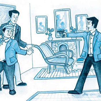
Word-Image Relationship
by Karan Vohra
by Karan Vohra
Images and text create a dynamic relation
which when unravelled creates several
questions. One might say that images
signify by virtue of resemblance or
imitation, words by contrast are arbitrary
signs, part of a language that signify by
virtue of custom or convention. Simply
saying that images are resemblance
may not be sufficient for sometimes
they resemble other images, illusions,
imaginations and creations. Be as that may,
an image also signifies something because
of a social agreement or convention, an
intersection with language, not just by
virtue of resemblance. The relationship
becomes more intertwined and playful
when storytelling becomes a factor.
The project is a way to gather a better
understanding of this relationship through
the lens of stories, especially those in the
curriculum of CBSE. A personal motivation
comes from the standpoint of being an
illustrator and storyteller myself. When
does an image supplement, contradict
or simply gets along with text. Are their
ways to objectively look at images and
their relation with words. Moreover the involvement of children allows for a fresher
perspective, garnering ways of seeing an
image when there exists familiarity with
the text. A simple match between text
and image may never be enough, far
from ideal, they may complement each
other, help push the message through
contradiction or encourage discovery. A
viewer’s relation with the two and the way
in which she participated (or doesn’t) affects
the relationship as well. These questions are
complex. Storytelling through the interplay
or word-image may demand fulfilment of
some factors as well. Discovering the same
is attempted.
Details >>
Design Education Project, Khun Agastya Foundation
by Karan Vohra
by Karan Vohra
Agastya International Foundation is a Bangalore based non-profit educational trust that seeks to transform and stimulate the thinking of economically disadvantaged children. Agastya does this by bringing innovative science education to the doorsteps of government schools in various states in India. Ms. Latkar, Ms. Shah, and I went to the Agastya Foundation in Kuppam in order to understand the way this incredible foundation works as well as to conduct some workshops. Agastya brings students from schools in the vicinity and exposes them to technology, art, and multiple perspectives. I got the opportunity to carry out a shoe art workshop with nine girls from an all-girl residential school in Kuppam. Children were asked to make things that they loved, which in some ways defined them. Students used some incredible colour combinations and learned to use textures and patterns to aid their design. It was a fun-filled activity that gave me insights into organising workshops better.
Details >>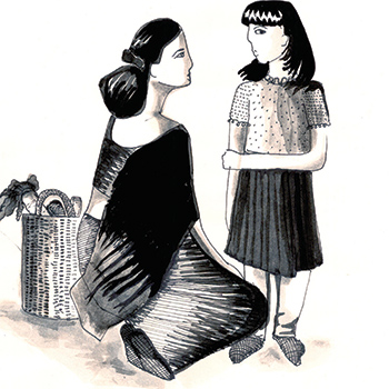
Queer Voices
by Karan Vohra
by Karan Vohra
The word ‘Queer’ is an umbrella term for sexual and
gendered minorities. This community has borne the
brunt of intolerance and rejection from the Indian
society for a long time.
The project attempts to understand the nature of these
oppressions that they face, bringing out their voices to
lead to a better understanding of them. To translate the
‘them’ into ‘us’.
It does so by bringing in the perspectives, life
experiences and opinions of not only the queer
community but also of everyone on this sliding scale of
sexuality including heterosexuals.
Stories of these people existed before the retrogressive
act of 377 came into being, criminalizing homosexual
behavior in India. How has it affected these people?
What are the prejudices that they face (if any) and is
their a way to bridge this gap of our ignorance? These
are some of the questions the project attempts to
answer.
The project ‘Queer Voices’ drives its force from people
and their stories, complex multi-layered identities and
their tryst with sexuality.
Details >>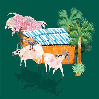
Dahanu Tales: Facilitating english language learning
by Karan Vohra
by Karan Vohra
The project aims at facilitating English language
learning in resource constrained environments.
It aims at making the language more familiar in
a context where it is largely alien and enables an
engagement with it outside the ‘English classroom’.
One of the key ideas is to improve engagement
through content that reflects and is sensitive to the
socio-cultural and geographical landscape of the said
environment. This is done through games and stories
that reinforce vocabulary and alphabet recognition.
Details >>
Graphic novel on start up at Powai
by Nilmani Kumar
by Nilmani Kumar
Powai is a suburban neighbourhood located in northeast Mumbai. Now a days known as ‘Powai valley’ because of startup which is making this particular area as a Mumbai’s most upmarket commercial and residential hub. This project is based on the journey of startup guys in the form of graphic novel. This graphic novel will try to express the thought of shaping the idea into reality as well as the emotional journey to becoming an entrepreneur.
Details >>
Identity design for Infoedge India Ltd
by Nilmani Kumar
by Nilmani Kumar
The design brief was to redesign the logo for Info Edge India Limited. Infoedge is an online company, so they were keen to add some tech meaning to it. During the process, the brief changed from time to time. After the first presentation at Info Edge brief, identity can be derived from key words. After the second presentation, the brief was to come up with the initials of infoedge (I&E). The brief was to connect the pillars of the company with some tech meaning to it. Some memorable symbols It's easy to forget.
Details >>
Story Book on Hearing Impaired
by Nilmani Kumar
by Nilmani Kumar
Deafness at birth or in early childhood has disastrous effects on the child’s overall development. In a country with millions of people, that amounts to a huge number. Language and communication unites as well as divides the diverse groups of people here. One such group is the hearing impaired(mute and deaf). This project traces an attempt to encourage and motivate hearing impaired people to chase their dreams, provide a glimpse of the world from the view point of hearing impaired people, provide examples of success stories of people who fought their disabilities and achieved their goals and encourage the society to accept and acknowledge people with disability.
Details >>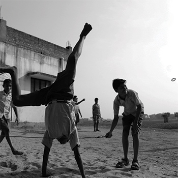
Siksha kya hoti hai
by Nilmani Kumar
by Nilmani Kumar
History implies that the smallest of thought has led to the greatest transformation. But that noble act of change that generates from the simple thought of doing good must start from within ourselves first. And then to the society we live and grow, and ultimately to the whole world. Journey of this project starts from solving the educational problems being faced by the young minds in a place called Jharia, of the Jharkhand state. It focuses on the understanding of problem within the rural society of the state, and therefore it’s necessary to have an understanding of the subject that would lead us to a good solution. Education is a very broad term and hence this journey will give me an understanding towards the real meaning of education. Which will allow me to be able to define the framework for the good education.
Details >>
Visual Communication Special Project
by Ravi Purty
by Ravi Purty
My journey began with lot of excitement in my heart, a chance to meet the people who are famous for their politeness and humbleness. I had lived the state of Uttar Pradesh for more than 18 years, and visited Lucknow on several occasions. This state is divided in 75 district, but there is nothing like Lucknow it has its own culture to appreciate people and it can be seen through generations. Lucknow is the second happiest city of India after Chandigarh according to a survey done LG electronics and IMRB International. Here life runs at its own pace. We may hear a lot of stories of Nawabs of Lucknow, but this city has remained beautiful because of its people. Pahle aap, pahle aap story may be famous because of Nawabs but one can still feel the same politeness from
Lucknow residents. People will have a lot of
time to talk to you, if they are not in real
hurry. There is so much to talk about this city
whether it art, drama, poetry, music, dance,
food, clothing and the people.
Chikan-Kari although introduced by Mughals
but Nawabs made it the legacy, and it still
continues. Some say it traveled from Persia
to India along with Nur Jahan, the begum of
Badshah Jahangir. Some references say it had
been here since 300 B.C. by Megasthenes,
who mentioned the work of white embroidery
on whote muslin. Whatever it was but it is
here today, an embroidery which remained
exclusive for this particular city has become
the identity of the Lucknow
Details >>
Gamification of Education
by Ravi Purty
by Ravi Purty
This project gamification of education was organized by RSK (Rajya Shiksha Kendra), Govt of Madhya Pradesh and conducted by IDC, IIT Bombay. This project focuses on providing supplementary material for government schools of Madhya Pradesh. Prime objective of this project was to explore off-line as well as on-line/ digital medium and design/gamify the course content which is being taught in the schools. Studies suggest that reading, writing or arithmetic has not improved or gone down, at the same time rate of enrollment in private schools gone up as compared to government school in recent years. RSK realized the need of better study material which can improve the learning process and make it more engaging than mere textbooks. Idea of this project is project to make learning more engaging and light hearted so that they can meet other challenges which these schools are facing over several years. It needs to be addressed that there are abundant material already available in this domain, but not reaching to the children of these school.
Details >>
Education for children of construction workers migrating to Mumbai
by Ravi Purty
by Ravi Purty
Every person in this world aspires to live a better life than he/she is current state. It had been a human tendency to look around for a better opportunity for their living and strive for it. Industrialization has opened the doors for people who lived at villages and can get a chance to move to urban settings. Industrialization had brought urbanization, as a number of people traveled from a different place and they needed a place to stay. Urban places got the chance to develop and various facilities like school, healthcare, administration, transportation were more accessible. Education (school education) as a tool helped many of the people to meet their dreams. They had been migrating since ages and everyone has evolved through it. On one side, there were people from privileged society who had
financial support to back them up, while on the other side there were people from underprivileged society. Talking of the privileged people, are the people those who get secondary level education or graduate level education which helps them to work in urban areas as Engineers, Doctors,Lawyers, Banks, Corporates, whereas there are people who don’t get proper education and forced to work as taxi-driver, domestic help,
housekeeping, construction workers etc. Civil societies have tried to help the second type of migrants in several ways. Providing education to the children of these people, so that they can get better opportunity to find a job and living This project is an attempt to understand how this civil society had tried to help the children of these migrants. Were these efforts helpful to, if yes then how and if not how it could be made better?Aman Day Care Centre was one of such opportunity to understand this scenario, and how it is different from the other institution for children of the people who didn’t migrate to the urban settings.
Details >>
Information design on India's participation in Olympics
by Ravi Purty
by Ravi Purty
If you play, you will get spoiled, to become a king you
must study hard. Well, these were the lines which I used to
hear in my childhood. As like many of the children, I never
questioned why I should only focus on studies and not to
play. An aspiration which they were trying to build in me
was to become and engineer or an IAS officer since my
childhood. I always wanted to join the Air Force and yes,
my parents accepted this fact because I was not deviating
myself from studies.Performance in the academics was the only parameter at which we used to get evaluated, and many a times we were
compared with others as how well they are performing. If a
child is not getting good marks, he/she is sent for tuitions
and may be asked to an extra hour of study to improve. To
earn a good livelihood and lifestyle, it is assumed a person
must be good at studies else he/she may not have a great
career ahead. At the end it is all about money to be earned. If we discuss about today’s scenario, there is a lot of opportunity apart from traditional profession. A person can be good at various other skills apart from academics where he/she can build his/her career. The reason I am discussing about all this is because I used to love sports. At one point of time I had an opportunity to give it a try but did not know how to convince my parents. When you are good at something, and it gets appreciated, it motivates you to do more and better in that field. It is the story of thousands of people in the country. People are good at sports, but many a times they do not get support.One of the most important factors is the lack of awareness towards new and upcoming opportunities not only in the field of sports, but many other fields too. For the last 12-15 years, it has been noticed that Indian athletes have been performing in various events like Archery, Shooting, Wrestling, Boxing etc. and winning medals. It is important to appreciate and acknowledge their and efforts, and first
and foremost important things is to know about them.
Details >>
Visual Ethnography of Beaten Brass Ghaagar
by Rucha Vakhariya
by Rucha Vakhariya
Beaten brass vessels especially Ghaagars and Handas are a very famous part of Barshi, a town in Maharashtra which also is my hometown. These vessels have been a part of childhood and growing up years. We use these to store water till date. This project gave me an opportunity to look into the making of these Ghaagars. I was lucky enough to be hosted by a wonderful family by the name of Gore who have been providing these vessels to my family shop for more than five decades now. I learnt about the entire process of making the Ghaagar. And also about a life very different than mine.Visual ethnography was a completely new field for me. With the excitement of a new subject and an age old tradition to explore I embarked on this journey of understanding the ‘Thokyachi Ghaagar’.
Details >>
Coding and Font development of Ek Gujarati
by Rucha Vakhariya
by Rucha Vakhariya
The project undertaken at Ek Type was an attempt to realise the nuances of type design in regional scripts. The project I worked on was to code and develop the Ek Gujarati font. Ek Gujarati is a humanist monolinear typeface that is part of the Ek multiscript family. I worked on the regular and extrabold weights of Ek Gujarati. Gujarati script is quite similar to Devanagari script, minus the shirorekha. It has a distant feature that differentiates it from other Indian scripts, and that is the 'vanak'. With its differences came different challenges in coding. During the course of my internship, I learned how to use the software and programmes needed to code and develop an open-type font. The tools used during this project were FontLab Studio 5.1, Adobe Font Development Kit (afdko), and MakeOTF. MakeOTF requires one to have certain text files apart from a ttf font to develop an open-type font. There are certain specific commands that make these codes work. These included substitution rules, glyph positioning rules, defining glyphs, kerning, contextual substitution, et al. We followed a specific way of naming the glyphs, which helped us maintain consistency in coding. This will also make life easier for anyone who works on this font later. After a lot of trial and error, some serious and some silly, the font was successfully generated. The final part of this was to test the font to see if it worked. And it did.
Details >>
Designing the Mumbai Rail Map for Blind
by Rucha Vakhariya
by Rucha Vakhariya
India, unlike other countries hasn’t addressed the issues of accessibility for people with disabilities quite well. Navigational systems that are built for people with vision usually work for people with hearing impairment and other disabilities. India has the largest blind population in the world. And these blind people face multiple issues in navigation. They depend highly on others for basic tasks like travelling to work everyday. Commuting to a new place is filled with a number of difficulties even for a person with vision. In a city like Mumbai where there are multiple modes of transport and the population so large, anxiety only builds up for a person trying to travel. For a person without vision this only multiplies. Mumbai’s rail network is extremely complex and one of the busiest in the world. There is no system in place that helps the blind understand this network and thus commute independently. And since the railways are one of the most prefered and important modes of transport in Mumbai, it becomes very important to understand it. This project is an attempt to aid the blind people in understanding this network better by using a map and making them independent while travelling on the trains.
Details >>
To initiate a dialogue on the role and status of women in the Jain Community
by Rucha Vakhariya
by Rucha Vakhariya
Jains are statistically a very progressive community. They are highly educated, they have made their mark in almost every walk of life. They live comfortable lives and a have a high standard of living. Even the women in the community have a very high literacy rate. But despite all the prosperity, Jainism cannot boast of treating its women right. Jainism is a patriarchal religion like most other religions in the country, And through the years, women in Jainism have had a secondary status. Examples of this can be seen in the stories, scriptures and general hierarchy in the society. This has percolated in the society that we live in today. Not just the lay women, but also the nuns are given a secondary status in the community. Despite being educated, most women do not stand up against the prejudices and the injustice that happens in everyday life. This project is an attempt at questioning these everyday practices and starting a dialogue in the community
Details >>
Unknown Bharat: Exploring the world of alternate healthcare in India
by Nitin Shekhar
by Nitin Shekhar
“For many millions of people, often living in rural areas of developing countries, herbal medicines, traditional treatments and traditional practitioners are the main – sometimes the only – source of healthcare. This is care that is close to homes, accessible and affordable.” Margaret Chan Director General World Health Organisation Chronic diseases and poverty work in a vicious cycle where they feed off each other. In such a situation providing quality medical care is more than a basic right. The physical well being of low income group and providing basic healthcare facilities becomes an important tool in fighting poverty in our country. One of biggest issues in developing nations like India is how they deal with Non Communicable Diseases. Diseases such as heart disease, stroke, cancer and chronic lung disease, kill more than 36 million people million people each year and account for 80% deaths in low- and mid-income countries. This is is furthered by the escalating cost of allopathic drugs which poses a huge challenge for our country. A large population of India still doesn’t have access to proper healthcare facilities. Traditional or local medical practices try to fill these gaps in our society. One can find them in tents or temporary setups across a lot of Indian cities. They have no professional degrees to follow their names. They boast of no palatial or air conditioned buildings as their clinics. Nor do they have any modern laboratories or sophisticated equipment to aid and assist them in the work of diagnosing their patients. All these constraints notwithstanding, these wayside doctors claim to cure almost all maladies of the human body. These medicine men work outside the purview of organizations controlling the medical system in India. They are considered outlaws in a rationalistic society which demands proof for everything. It’s a complex issue which sometimes runs head on with superstition. Through my brief study of roadside dawakhanas I tried to develop my understanding of the place of traditional methods in the current society.. For a majority of the population this is the care that is accessible and affordable..
Details >>
The 5 Week Brand Strategist
by Nitin Shekhar
by Nitin Shekhar
Landor Associates is one of the world’s leading strategic brand consulting and design firms. Founded by Walter Landor in 1941, Landor pioneered many of the research, design, and consulting methods that are now standard in the branding industry. Partnering with clients, Landor drives business transformation and performance by creating brands that are more innovative, progressive, and dynamic than their competitors. Landor’s holistic approach to branding is a balance of rigorous, business-driven thinking and exceptional creativity. Its work spans the full breadth of branding services, including brand research and valuation, brand positioning and architecture, naming and writing, corporate identity and consumer packaging design, branded experience, brand equity management, brand engagement, and digital branding.Five years in India and Landor Mumbai is now a multidisciplinary, full-service consultancy
providing branding, design, and digital services. Some of our clients include Cafe Coffee Day, Delhi International Airport, ICICI Bank, Mahindra, Taj, Tata Global Beverages, The Park Hotels, Titan, and Usha Martin. The Landor 369 Studio specializes in fashion, food, and wine clients such as Anita Dongre, Busaba, and Charosa Wineries. Branding is a larger strategy of how the perception of consumers is changed and evolved over a long period of time. The design process while being important and being the face of the brand evolves out of the larger umbrella of brand strategy and brand positioning. These tried and tested strategies and methodologies have a fantastic potential to be used in taking design strategies and positioning to craftsmen and businesses who cannot generally afford design agencies.
Details >>
Revival of Devanagari font from Hindi film title
by Nitin Shekhar
by Nitin Shekhar
Films have been using typefaces the same way they have been using music, sound, colours, editing, and lighting to complement and construct the narrative as a whole. They evoke a certain feeling, they subtly suggest what is about to unfold and at times they put you in a mood to laugh, cry or be gripped with fear of something. Typefaces in films along with the other elements are invested with the responsibility of expressing and taking the narrative forward and hence the fonts used in films are an excellent place to delve in to while looking for expressive typefaces. Lettering used in films was specific to the films they were meant for and that way it was unique. Our goal in this project was to put to use the uniqueness and use this inspiration as a base for the project. We have focused primarily on the pre-digital era movie titles which were crafted by hand. Pre-digital era movie titles carry the aesthetics of a bygone era and represent the then prevalent culture. The lettering used in movies were never intended to be carried on to any large scale reproduction and printing. Painters/designers of movie titles could dip into their long years of training in traditional hand lettering and the craft has evolved and refined seamlessly through the ages. That in itself makes film titles an invaluable source for type design. It is difficult to reproduce the same style consistently if we are forced to recreating fonts manually. Our attempt was to transition the hand lettering in the titles by extracting their values and re interpreting them to make a font that contextualizes it for the current times.
Details >>
Film on the Role of Rationality & Beliefs
by Nitin Shekhar
by Nitin Shekhar
India today is plagued by superstitious and irrational religious practices. Only three states in India have laws specifically targeting these practices. Over the past four decades there are many rationalists organisations in India which have successfully targeted internationally popular “god men” who boast a following of millions, exposing their activities as nothing but “well-packaged gimmickry”. In a bid to debunk belief in miracles, palmistry and astrology in the countryside, where the majority of people are illiterate and believe in the supernatural, there are several organisations which hold regular workshops and street plays. These organisations have been trying to pass laws which prohibit godmen from perpetuating these superstitions which hasn’t found a lot of takers. Yet we see religiosity declining in some factions of the society which makes us ask the question about the importance of beliefs and religiosity in today’s day and age. As much as they are considered foolish, superstitions do affect the society a lot. A large section of our society believes in superstition and blindly follow religious practices and therefore fall prey to conmen and godmen and it hinders social progress. Superstitions should not be confused with tradition and culture. Through this project we aim to look at how various groups in the society look at religions and what their belief systems are. Fiction and films influence public opinion, not by making political statements or attacking certain sections, but by the stories they tell and the way they tell them. I would like to stay away from the documentary format and focus towards a fictional film that addresses or asks these questions instead of a film that takes a stand disseminates information. The larger question of what beliefs are and why they are followed needs to be answered. Through this project I want to address the issues behind religion, belief, religiosity, tradition, culture and rationalism through a film
Details >>
Visual Grammar of Hand-painted Signs in Tamil Nadu
by Shreshta Jaisingh
by Shreshta Jaisingh
Amongst the various directional and shop signage, political graphics can be seen all over Tamil Nadu. Every election seems to paint the towns and cities afresh. Today however, there is a growing number of flex banners and printed paraphernalia. Rapidly advancing digitalization of visual space in India is replacing individual creative efforts. On the surface, due to the lack of a clear visual language, the sheer multitude of these signs create visual chaos more than they do order. Tamil characters are larger, rounder and wider than Latin letters, fitting the two together often compromises on legibility. However, on a functional level, do these signs still work? What do they add to the visual of their surroundings? Painting these signs is usually someone’s livelihood. Usually these hand skills are passed on from one generation to the other, along with their fresh and unique appeal and quirks. They are easily identifiable and are an important detail in the visual “brand” of any city—instantly recognizable anywhere. In the course of this project, I was fortunate enough to come across a sign painter and observe his skill. I was also able to identify certain styles or unique characteristics of the signages in and around my hometown, which I easily overlooked before, due to the chaos and visual clutter. This project proved to be a chance to document the sensitivity and fineness of indigenous typography. The locally originating character of marketplaces, hospitals, bus stands, etc.; from where these signs were collected brings forth the native nature of these hand-painted typographical expressions.
Details >>
Branding Transit Hotel at Mial Packaging Vanish Stain Remover
by Shreshta Jaisingh
by Shreshta Jaisingh
Tata Elxsi commenced its business on May 5th, 1989, headquartered in Bangalore, India, with a global network of offices in Dubai, France, Germany, Japan, Malaysia, Singapore, South Africa, UAE, UK, and USA, to develop and promote applications of electronics, embedded systems, and software. The service they provided in the areas of Service Design, Design Research, UI/UX, Product, Visual, and Automotive Design was exceptional. The Graphics team started as an auxiliary to the Product Design department, mostly to create standard packaging labels. Over 3,000 employees are working in the Design Factory. "(Brands are) a fascist state where we all salute the logo and have little opportunity for criticism because our newspapers, television stations, internet servers, streets, and retail spaces are all controlled by multinational corporate interests." Brands began not as a means for consumer exploitation but for consumer protection. In pre-industrial days, a brand provided a guarantee of reliability and quality. Its owner had a powerful incentive to ensure good products in order to persuade people to come back for more. Distance created a need for brands. In poor countries, the arrival of foreign brands points to an increase in competition.
Details >>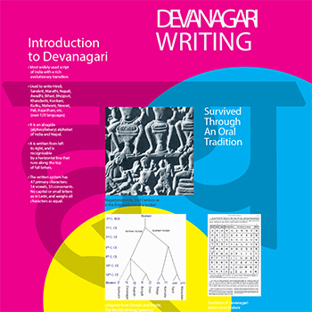
The History of Devanagari Typography
by Shreshta Jaisingh
by Shreshta Jaisingh
The first stage of this project involved collection of data from various academic sources—papers, journals, blogs; my study relies on Bapurao Naik’s “Typography of Devanagari”—the book is comprehensive until a certain point in Devanagari’s time-line. After that, the guidance and works of Professor G V Sreekumar and Dr. Girish Dalvi, combined with references to reports by previous students at IDC that attempted to study various aspects of type-design brought to light newer perspectives and data. This data has been analyzed and sifted through, in order to create a perspective that is accurate and free from bias. Content was created with focus on the message, regardless of medium. A time-line was created for the script right from its evolution from Brahmi until the creation of modern day type foundries such as Ek Type and Indian Type Foundry. The History of Devanagari has been traced through inscriptions, first attempts at hot metal printing in India and overseas during the colonial era, until current day where it is designed on a computer. Filling the gaps in the information to create a concise output has been the greatest challenge of this project. In order to preserve the nuances of the script and not lose it to the constraints of technology, value has to be added to it by those who design. There is a dire need for designers in the field of script typeface design in this age of digitization and responsive web design. My project aims to inspire and provide a comprehensive reference point for such designers. The report concludes with a set of typographic panels, that can be displayed at academic institutes or design gatherings attended by students and professionals alike
Details >>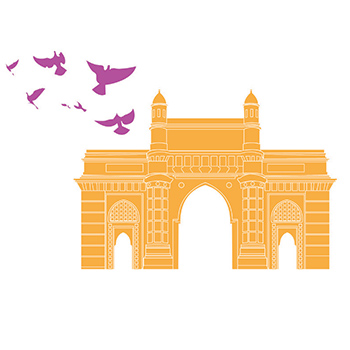
Design to Encourage Walking and Cycling
by Shreshta Jaisingh
by Shreshta Jaisingh
Cycling and walking are two of the most
prime methods of transport. Such modes
of ‘Active Transport’ give us the most control
over our movement. These are two activities
that one can never forget, as it is so ingrained
in our muscle memory. Why then, in a society
that is increasingly health conscious, where
medicine has made leaps and bounds to
extend longevity, where fitness is not just a
trend but a way of life, do we still not adopt
these methods of basic human movement into
our daily lives?
The pollution from our vehicles causes our
temperatures to rise, motorized transport
strains all our resources and creates a looming
mess that we can’t seem to clean up. We
are a society bombarded with choices and
advertorial messages all day, everyday; we have
a world of knowledge at our fingertips, yet
there is a requirement for an external stimuli
that can make us reconsider our choices that
we make in our daily lives.
This project falls into a realm of work that
provides this stimuli. An initial survey involved
asking people their preferences and why they simply do not make a conscientious effort
to contribute to the well-being of the planet
though the means involves merely taking
care of their own bodies. Understanding the
problem, though it might seem like reinventing
the wheel, is part of the process in order to
understand and gain insights about this innate
laziness that we as a generation seem to have
so easily adapted to.
Work done that is similar to this endeavor
in other such situations around the world
was studied as part of secondary research,
wherever similar efforts to promote walking
or cycling were taken.
Much work has been done in glamorizing
cycling as a sport and not enough promoting
it as a means of transport. The most active
cities in the world all have one obvious
common quality of possessing the basic
infrastructure needed to pursue such means
of transport. Since that aspect is not under
my control in the realm of a design project,
I decided to dedicate my project to those
who are already inclined to physical activity. My outcome is a piece of communication
that recognizes the limitations of influencing
opinion and serves as an aide to people who
want to pursure exploring the city in an
unusual manner. It is for those who want
to see it through a more personal perspective
and need an incentive to plan out their own
adventures. This project is created for the love
of being outdoors, be it in an urban landscape
or to be a little closer to the strains of nature
around us. It is an aide towards making
a more conscientious and healthy choice.
Details >>
Visual ethnography
by Shayam V.S.
by Shayam V.S.
While doing my undergraduate studies in Fashion, I was fascinated to learn about fashion subcultures ( e.g.: Goth, punk) and how they evolve. I began to wonder if India had any such street style subcultures and what are the factors which influence those. In India, there is an urban crowd with social media accounts, who is aware of global trends who makes very similar styling choices , there is another crowd influenced by bollywood and there is another set of people who are least aware of fashion or trends. This group of people, most of whom are rural sometimes come up with the most unique ways of dressing and have a very personal style. I have always been fascinated with the way women from North-east parts of India dress. Northeastersn traditional attires are quite elegant and unique. The women seems to have an effortless sense of style. So as a part of DRS, I would like to understand the factors which influence the way the women of Manipur chose clothing. Further, I would like to study how they balance traditional influences, global and local influences to alter the way they dress
Details >>
Summer Internship Project
by Shayam V.S.
by Shayam V.S.
This written submission of my summer internship includes an account of the different types of work I have done during the time I interned at Tantadan Design, Thane. I interned for a period of four weeks from the 1st of June, 2015 till the 30th. As a fresher to the graphic design industry, my primary aim was to understand the workflow, design process followed and to gain a first hand experience of the dynamics of working in a creative studio environment. I also wanted to strengthen my technical skills and gain an understanding of my strengths and weaknesses.
Details >>
From farm to plate
by Shayam V.S.
by Shayam V.S.
This project aims to understand food in the context of a country with a huge population & economic disparity and to learn about food and safe food in terms of what is being done & what could be done, what attitudes prevail. The world is anticipating a food security challenge due to the rise in global population and hence there are debates on whether industrial food system can meet the challenges while being ethically right and environmentally sustainable. Rethinking of how we approach everyday food behaviours that are more environmentally aware, socially inclusive, and healthier appears to be a particularly timely concern. The project aims to study ideas, behaviours, knowledge, practices and attitudes towards food within through a process of extended conversations with diverse people and to communicate them through an illustrated book.
Details >>
Design for History Learning: Engaging & Contexualised History Education
by Shayam V.S.
by Shayam V.S.
The National Curriculum Framework 2005 envisions an education, where children are given a space to reflect, ask questions, wonder, and probe sources of knowledge outside the textbook. A lot of people in India have been working towards making this dream a reality. But even now history still remains a student’s nightmare in schools. The vastness of the subject adds to the drab of trying to learn it. But most of the time, it is also hard to relate to the lives of some King or Queen, living somewhere with life and culture too different from what a child knows. As of now, the school syllabus is largely centralised and hence cannot include local perceptions to a large extend. By enabling communities to include their local history and culture to be a part of education, we empower them and help us connect better to the nation. In this project I have attempted to aid this process of transforming history learning into a more palpable experience by creating resources to document and exhibit a student’s enquiry into his or her own history and share it with the world. This project’s initial goal was to create a set of learning and teaching material, specific to a locality to help students’ of that locality make sense of their identity in relation to individual and to the world. The locality I have focussed on is Kozhikode which used to be a part of Malabar. So I have learned about the history of Kerala, Malabar to build a knowledge base. My outcome is a crowdsourced web platform which can nudge the schools in Calicut to participate in contributing to the history of Kozhikode.
Details >>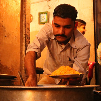
Daslarkhwan
by Suruchi Sati
by Suruchi Sati
Lucknow, the capital city of Uttar Pradesh, is one of the most vibrant cities in India, and is among the top ten fastest growing non-major-metropolitan cities of India. Today’s Lucknow has a varied character, that boasts extravagant, pedantic recent architectural additions that lack ethos, a mixed cultural scenario, thriving commercial opportunities and a highly sought after active political arena. However, less than a hundred years back, it was primarily known as the leisure city, the cultural capital of the Awadh that thrived under the reign of the Nawabs, who left a cultural legacy of appreciation for food, music, dance and beauty. as well as a series of delicate, beautiful spaces and experiences that are faintly reminiscent of the rich Nawabi culture. Despite a rich former identity it held strongly in it’s historical background, the city has evolved through rapid globalisation and fast paced ways of new era. However, some of it’s past has managed to find a place in the lives of the contemporary population. Local food habits and demands in particular, seem to have been very accepting of the new additions while also being inclusive of the older ways, which is quite delightful an experience for the foodies who often wander into the city to try out the local delicacies. Had it not been for the immaculately ancient ways of the local natives, their longing for the past, and the brilliant old token heritage buildings, museums and music and dance schools, the cultural of the Nawab’s would have been almost mythical by now. Having had my own personal encounters with the Awadhi food culture, I took on this project out of sheer fascination, to understand the nuances of a culture which is till date celebrated for it’s delicate character. Visual ethnography, the chosen method of research proved to be a suitable tool during field work. The aim was to understand and effectively capture changes that were brought about in Awadhi culture and food over the years and what promise it holds for the future.
Details >>
Gamification of Education
by Suruchi Sati
by Suruchi Sati
Indian education system has been lacking many appropriate and necessary resources and therefore, has failed to be effective, for a very long time. It has often been criticized for being too rigid and based on rote learning rather than problem solving. There is also an acute shortage of qualified Indians in Indian education system. Apart from the obvious issues, there are also many deeply embedded problems that need to be studied and worked upon, in order to improve the quality of education. ‘KHEL’ is an ambitious project aimed at improving the quality of education in the schools of Madhya Pradesh, and hence make a contribution to the betterment of the Indian education scenario, by generating supplementary material based on game-plays and activities. The opportunity to be a part of this project offered to encompassed many of aspects of quality education and learning based on thorough research and interactions, and resultantly provide us, participants, with an opportunity to contribute to the possibility of a better future for the underprivileged kids in Madhya Pradesh
Details >>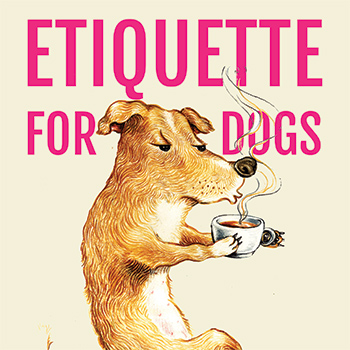
A Divided World
by Suruchi Sati
by Suruchi Sati
In Mumbai, there are around two million stray. IIT Bombay, due to its proximity to Sanjay Gandhi National Park and Powai Lake, itself houses many different kinds and species of stray and wild animals, which includes, stray dogs, cats, monkeys, snakes, leopards, etc. One of the major issues, as reported by the residents, is the presence of stray dogs and cats. For many years, the human residents of IITB have had a variety of responses on the situation. The community here is mostly divided on the issue, and, hence there is a dire need for a formal / informal, functional body or committee, with a vision based on compassions without bias, that could cater to the needs of the residents of the campus, both humans and animals. Through this project, I hope to understand the practical and ideological reasons responsible for the stray dog-human conflict at IITB and propose solutions that keep the relevant welfare of both people and stray dogs residing in the campus
Details >>
Understanding the Elderly
by Suruchi Sati
by Suruchi Sati
Through this project, I have made an effort to understand the realm of old age and how it speaks to the younger generation. The project eventually culminates making a film which speaks of the struggles faced by the abandoned elderly and the caretakers in old age homes. The film aims at encouraging the younger generation to open their hearts to the struggles of the elderly, and take notice of the innocence that comes with old age, a quality which could eventually be a source of joy to many such people young people, who themselves are struggling through today’s fast paced ways of life with a hardened heart. At the core of this project, I have tried to re access the evolution of my relationship with my grandparents, take a closer look at similar experiences of my peers and the elderly themselves, and articulate the learnings either through personal or a third person’s point of view that could speak to one’s sensibilities
Details >>
The Ceramic City Khurja
by Tapan Kumar
by Tapan Kumar
The pottery industry of Khurja makes a variety of ceramic goods such as flower vases, object d’art, crockery, industrial ceramics like chemical porcelain, ball mill linings and balls, electrical and electronic ceramics like low tension (L.I.) and high tension (H.T.) insulators, spark plugs, sanitary ware, stoneware jars, etc. Crockery and insulators account for the major share of what is produced in Khurja. Ceramic insulators and laboratory equipments are made directly by the big factories on special orders. And their production is totally dedicated to outside vendors and industries. But rest of the items can be found very easily in the local markets and Highway side emporiums. Fancy emporium is a famous emporium at Munda Kheda Chowk. There were several varieties of crockeries, vases, Chandeliers, ash trays etc
Details >>
Designing mobile application for the flying grocers
by Tapan Kumar
by Tapan Kumar
The first project handed over to me was Logo Design for a New Delhi based Start up by the name of The Flying Grocers. The Flying Grocers is a new online and offline grocery store which is entering into the business of online Grocery Store. It will have both online and offline grocery stores. One can order either online or can physically go to the nearby store to purchase grocery. Client gave a very clear brief that there company will claim to deliver fastest and at reasonable rates. Colours that will be used in should be cool colours and should go with the functionality of the company. The most important brief was that the company is going to start its new E-commerce business, the logo should look good and eye catchy on the screen. I started primary sketches on paper and after multiple iteration I finally reached the logo that client actually approved
Details >>
Participatory Design with Bhil Artists
by Tapan Kumar
by Tapan Kumar
Bhils being the third largest tribe of South Asia, have a population of over 25 million in India. Their art and culture has a big part in Indian tradition and folk art. Bhils have a lot of untapped and untold interesting stories and narratives that should be explored and put forward in front of large audiences. People nowadays are more inclined towards western culture, films, art and theatre etc. Although its a personal choice, we should also be sensitive towards our own art and cultural heritage. This project is to bring awareness among today’s fast moving tech savvy generation and give a totally new perspective towards Bhil art. Through the support of Tata Centre for Technology and Design, Prof. Nina Sabnani, IDC IIT Bombay took this great initiative and started the project ‘Telling it Together’. This project is concerned with the themes of craft development, education and technology. It brings together designers and craft communities to create media artifacts that enhance the reach through digital media and offer new opportunities for craft development and craft awareness. The objective is to engage and collaborate with the Bhil community of Madhya Pradesh that has its own unique form of painting and narratives that can be transformed into different artifacts, animated films and illustrated books
Details >>
Participatory Design with Bhil Artists (Game Development Phase)
by Tapan Kumar
by Tapan Kumar
This project will be the next stage of my Academic Project 2 Participatory Design with Bhil Artists. In the previous phase (Project 2) the main focus was understanding the Bhils, their cultural values and their narrative paintings. The main goal of the project was to create a visibility for their art through game design. Thus the main focus was on understanding the community and then taking some aspects of their culture to conceptualize the game Bhagoria. The final output at this stage was the game play, graphic representations etc. Now, moving on to the next level of this project which is Project 3. I am taking the same game project Bhagoria to its implementation stage. In this stage, the focus would be on rectifying the feedbacks from previous stage, designing the game props, animations, sound effects, main and mid cutaway story animations, finalizing the game mechanics, coding of the game and finally packaging the whole game design into a working game application. And if possible I would like to test the game as well. This phase of the project would help me to understand and learn the game development process, which includes animation, sound effects and game mechanics: basically from the idea and concept stage to the final execution of the deliverable. The most important learning would be to understand how any digital design is likely to change and grow in its journey from concept to its final execution stage
Details >>
Folk Culture Of Maharashtra~ East Indians Of Vasai
by Kulkarni Aditi Subram
by Kulkarni Aditi Subram
This project, titled "Visual Dictionary: Folk Culture of Maharashtra", looks at the East Indian community of North Konkan in general and the Samvedi Christians of Vasai Taluka, Thane District in particular. What makes this community remarkable is that it did not evolve thus, naturally, but out of mass religious conversions. Several kingdoms ruled over the Vasai region, each one adding their own flavour to what already existed . Creating a cultural mosaic; a sort of mash-up of languages, music, food, rituals, and costume. Thus, a hybrid folklore has evolved. Today, the youth of Vasai are moving away from traditional jobs and lifestyles. Their urban white-collared jobs have not only brought them prosperity but also the notion that "traditional" is passe while "western" speaks of fine taste. Thus, the rich culture of Vasai stands at a crossroads. Having said that, self-reflexivity compels me to look at myself as I judge Vasaikars for letting their culture evaporate. Don’t most traditional cultures melt into cosmopolitia and die a natural death? So, on what basis should I insist that they preserve their traditions when I myself think in English rather than my mother tongue? This report is an account of journeys made to Vasai villages. It attempts to understand "folklore" and its context by looking at East Indian literature, music, and customs. The Visual Dictionary was done much later, almost as an afterthought. more out of curiosity about the place than as a pre-requisite for this special project.
Details >>
Summer Internship at Upasana
by Kulkarni Aditi Subram
by Kulkarni Aditi Subram
Auroville (City of Dawn) is an ‘experimental’ township in Viluppuram district in the state of Tamil Nadu, India near Pondicherry in South India. Auroville is meant to be a universal town where men and women of all countries are able to live in peace and all nationalities. The purpose of Auroville is to realize human unity. Upasana Digital Studio was founded by Uma Prajapati, Upasana was born in 1997, originally with one table under a tree, as a garment design and manufacturing unit. Today it is a place where business, creativity, fashion, Indian Culture, design, social responsibility and spiritual progress all come together for a creative synthesis. Recognising the extensive litter plastic bags throughout India and the damage it was doing to our environment, the team at Upasana Design Studio set about creating a reusable cloth bag that could be conveniently packed and carried, eliminating the need to use plastic. This project aims to tackle large issues with small steps and move towards greater environmental and social awareness.
Details >>
Getting people to interact
by Kulkarni Aditi Subram
by Kulkarni Aditi Subram
Modern design education in India began with the setting up of National Institute of Design (NID) in 1961 and Industrial Design Centre (IDC) in 1969. Much has happened since then. From the days of ‘License-Raj’ India has taken a path to liberalisation and opened its markets to the world. In the wake of all this and the shift from a social[1]ist outlook to a more capitalistic inclination, the role played by design schools needs to be reviewed and re-examined. This chapter is related to my readings and reflections on subject of design and design schools. I also look at Auroville (though not a design school) as it has an atmosphere conducive to growth and nourishment for creative spirits. Two other notions that offer interesting standpoints that can enrich educational approaches at IDC are liberal arts and self-reflexivity
Details >>
Viju Master (a film on Jaihind Brass Band)
by Kulkarni Aditi Subram
by Kulkarni Aditi Subram
Hopes to open up the world of a brass band owner to everyone and draw one into the culture, traditions, beliefs and aspirations of the Samvedi community to which the musicians belong. This film is about individuals who are musicians by passion and bankers, engineers, teachers etc by profession. This film is really about balancing passion & profession, making life meaningful, giving back to community and about individuals, pushing towards progress and taking everyone along. Jaihind Brass Band plays at weddings, communions etc in Vasai area. My personal journey of getting to know them unfolds through this film.
Details >>
Print Making
by Anindita Mandal
by Anindita Mandal
This project is directed to explore the possibilities and future of printmaking and setting up a fully functional printmaking setup in IDC, IIT Bombay in order to enable the enthusiasts to express themselves through the feeling of multitude, the core essence of printmaking. Going by the varieties of the printmaking techniques, the knowledgeble ones know that the technical possibilities are unbounded which includes, but not limited to etchings and woodcuts, vinyl graphics, linocuts, lithographs and complicated, conceptually driven projects intended to raise social consciousness. Philosophical questions remain. As new mediums proliferate and lines between genres dissolve, you may wonder if there is any value in maintaining printmaking as a separate artistic category. To answer this question, it is tried in this project to explore the realm of printmaking, as a separate genre of art and art history, as well as the medium through which the artist can probably vent out her/his long due frustration of unfruitful labor, as printmaking comes with the feeling of giving birth, a feeling of long overdue success, of engraving some permanent mark in the roof of the bulldozer of myriad expressions and tools of creativity.
Details >>
Summer Internship at Digital Picasso
by Anindita Mandal
by Anindita Mandal
Digital Picasso has been founded and is headed by Shahid Badshah, a JJ School Graduate with over 9 years’ of design excellence. This is an advertising and brand design agency. They think, They design. They fuse the science of strategy and the art of pixels. They create & offer creative communication solutions. Applying micro-thinking to macro levels. Just by thoughtful design. A small agency with big ideas. They are digitally related to Picasso. They are Digital Picasso. My main task was to re-design logo, back drop,posters, brochure. display design, packaging and survey for Sparkles diamond jewellery and design a brochure for Uniglo diamonds(Belgium). I worked on following topics: • Re-branding for sparkles diamond jewellery • Brochure design for Uniglo diamonds. This was a new apporch for me and was exciting as well as challenging, which allowed me to look at design from industry and user point of view.
Details >>
Design for people with Speech and Hearing Disabilities, for Mirakle Courier
by Anindita Mandal
by Anindita Mandal
The aim of this project is to understand the working system of Mirakle Courier and their employees as all the employe’s are speech and hearing disables. The project also aims at understanding the working of courier system and make changes in the existing system to make the work more efficient and fast. The target audience being the employees of mirakle courier, the project aimed at designing a working system for them which will include stationary design, design and redesign of various forms, computer base application etc. Which will make the working system of Mirakle Courier fast and efficient.
Details >>
Images Beyond Sight
by Anindita Mandal
by Anindita Mandal
The project is an attempt to understand the possibilities of visual structure and composition of images photographed by the visually impaired. It also tries to understand the uncharacteristic shooting angles in addition to the objects and the subjects they choose to shoot- to open a window to their rich, fantastic visual world. The documentary film explores the various tactile, audio clues, visual memories of sight, the warmth of light and cognitive skills are used by the visually impaired to create “mental image” before they take judgment to take a picture. They use the camera as an extension of “self” to explore the visual world, gain deeper insight while recording their imagination and their point-of-view. Photography by the visually impaired reveals that a photograph can be made successfully in the mind as much as by the eyes, free from the techniques and rules followed by sighted photographers. It illuminates a new line of thought distinct from the way we approach photography and demands active mental participation of the sighted viewers to understand the experience of expressing a world that is not seen or limitedly seen.
Details >>
Chor bazaar - we recycle the past
by Kimya Gandhi
by Kimya Gandhi
The methodology of visual research has been challenging for the simple reason that it is difficult to be invisible in an environment and be observant at the same time. Since the most important aspect of visual ethnography is observation, an open mind and eyes are the most important tools while doing research. The stages of research of research have been: General observation and getting to know the place: this included just walking around the bazaar without any particular intention. This establishes a sense of the place and people around. The next stages involved close observation of people, products and shops. This included using media like sketches, notes and photographs to document the bazaar again with no particular focus. This helped lay a ground for study and reflection of the subject area. Once there was an established sense of the place the next stage has been to focus more into a particular area or person, learn and record more insights. The study thus starts from an overview of the bazaar. It then slowly enters a macro level where each aspect of study is carefully understood.
Details >>
Devanagari Font Design for OCR at Centre for Development and Advance Computing, (CDAC) Pune
by Kimya Gandhi
by Kimya Gandhi
The project is an attempt of acquainting me to the field of type design and scripts in India. The format of the document is more like my learning diary where I have tried to put together the various facets of type design the way I have learnt them. ‘The process has been equally important to the end product’. The chapters progress in the same order as I have approached my project. The first two chapters speak briefly about the nature of work in CDAC in the field of font design and an account of the project initiated there. In the next two chapters I have tried to summarize very briefly the digitization in letter design pertaining to Indian scripts and standards and the study of devanagari script which is a prerequisite to developing further understanding. The further chapters extensively elaborate my project work and stages involved. It reflects my approach and methodology and the actual learning of the project and process of font design. Thus the document lays down the process of my summer internship, moreover the many various things I got to learn and see during the course of this project.
Details >>
Design of a multi-purpose Devanagari typeface
by Kimya Gandhi
by Kimya Gandhi
The increasing advent of globalization and technological advancements are taken to tell that we are living in an age of increasing sameness. The cultural diversity, once rich and abundant is being replaced by a global culture. This has had an effect on the visual culture of India. Regional dialects, languages and scripts have not escaped the consequences of ‘modernization’. The well painted billboards and shop signs have been replaced by massive in your face advertisements. The streets are full of panwalas and departmental stores wear the same huge red beverage advertisements on their heads. The devanagari script saw its peak in the times of letterpress, when elegant complex letterforms were cast and used widely in print and publication. The nature of Indian scripts being different than Roman or Latin, their digitization initially proved to be a tedious task that did not deliver the script in its totality. Recent developments in type digitization however have reached a stage where the script can be produced in its original richness of form and elements. There has been increasing demand for the digitization of Indian scripts to reach larger number of audiences via several media. In the print media, newspapers in Hindi boast more circulation than their english counterparts, proving that there is certainly demand. The digitization of Indian scripts however have brought in their wake alteration in form to suit the requirements of the technology available. Though reach of the scripts has widened, they propagated the spread of a deteriorated form. This forms the inspiration for undertaking the task to analyze the current type design scenario & thereafter design a new approach to designing typefaces to propagate the richness of a correct and complete script.
Details >>
Design of a Multipurpose Devanagari Typeface
by Kimya Gandhi
by Kimya Gandhi
The devanagari script saw its peak in the times of letterpress, when elegant complex letterforms were cast and used widely in print and publication. The nature of Indian scripts being different than Roman or Latin, their digitization initially proved to be a tedious task that did not deliver the script in its totality. Recent developments in type digitization, open type font formats, web embedding has ensured the script to be produced in its original richness of form and elements. There has been increasing demand for the digitization of Indian scripts to reach larger number of audiences via several media.
Details >>
Study of Marathi Literature for Children
by Maitreyee Sanjay Nilawar
by Maitreyee Sanjay Nilawar
This is a study of Marathi literature for children written in Devnagri script. I did a study of the technicalities of Marathi books from the point of view of illustrations, printing quality, layouts, and content. I have interviewed several authors, illustrators, publishers, school teachers, shopkeepers, and kids. I have done a comparative study of the present material available in the market and the older literature. The past and current trends in reading have been analyzed. The methods which can be employed to increase interest in reading Marathi books have been included in this project.
Details >>
Summer Internship at Synapse
by Maitreyee Sanjay Nilawar
by Maitreyee Sanjay Nilawar
Synapse is an information agency that partners with clients to solve their business problems through information based initiatives. t the process of interacting with clients and delivery of work because unless we stand for something, how we will work. There are almost 40 people work there in different project group. The family members of Synapse are Visual juju, txtcontxt, dotahead, Zaki etc.. So there are like 8 sections. Which works unitedly and happily under one roof. In main Synapse office according to clients the project sections are divided, like Zaki works on creating paintings as they supply paintings as per the order. I was appointed in Project 3 where mainly they were working on HP printers, Microsoft, and Share Khan. For HP printers, the task was to create sale in electronic shop where other gadgets are available. We had to create idea for need of printers so that its selling rate increases and the market for printers rises. In the other projects of Microsoft and Share Khan I had to create comic illustration for their home purposes which were used within the office.
Details >>
Visual Guide for FORT area Mumbai
by Maitreyee Sanjay Nilawar
by Maitreyee Sanjay Nilawar
Fort is the business district of Mumbai. Once considered the heart of the city, this area is known for its side walks those are constantly filled with vendors selling books, music cassettes, CD, clothes, imported items etc. This area is also gifted with other gems include Bombay University, The High Court, the BMC Building and stately Horniman Circle. This area is jam-packed with visitors and commuters who came to experience this established commercial center of Mumbai. In addition of my personal experience of finding way to my desired destination had a dependency on street vendors and local people. I also found many other people like face similar problems and it was much greater for people from foreign land due to language barrier. I decided to work in this particular area in order to help the visitors to reach their desired destinations and also arouse my interest as a Visual Designer to take up this problem of helping tourists to explore this area by providing them with a visual Map.
Details >>
Reflections of Nature in Imagery
by Maitreyee Sanjay Nilawar
by Maitreyee Sanjay Nilawar
The project is an attempt to understand my approach to painting. It began with a study of my earlier works that included textile motifs using forms from nature. During the project I explored using acrylic colours and creating images that were not entirely pre-meditated. As a painter to expresses his/her thoughts through paintings. As being a student on visual arts I was able to express myself through my paintings but it was very tough job writing about it. There may be many flaws in my writings. I am used to creating images from early times and I am confident of expressing it well but my writing, which I started few months back is not that good. So I have written this report in an question answer format, the question which I had asked during the process, so I feel that this process will be easy to understand for the reader to grasp.
Details >>
Visual Ethnography of a Mumbai Local Train
by Radhika Gujar
by Radhika Gujar
This is a document of what I have seen, experienced and heard when I traveled on the No. 9 compartment of the Mumbai Local trains. There are many things about the Locals that surprise me every time I travel in one. There are so many interesting people that you meet in the compartment. They are friends who meet only in the locals, who share their lives for the time they travel together and then go their own way. There are many incidents that made me want to do visual ethnography such as experiencing a “bhajan” group (groups which sing religious songs) in a men’s compartment, hearing of groups of men who meet on the same local everyday so as to play cards, Women who have formed groups in the train and have kitty parties which are named after the time or number of the local trains etc. I wanted to see this different world and experience every bit of it. When I started going by train I realised that it was too vast a subject to cover so I started concentrating on the women’s compartment only and that’s when I realised that its a small world in itself and had many kinds of incidents that I could write on.
Details >>
Redesign of Magazine, Brochure and Design of Newsletter for Maharogi Seva Samiti
by Radhika Gujar
by Radhika Gujar
In the year 1949, the great humanitarian Baba Amte being moved to the core by the physical trauma and social stigma of leprosy afflicted people, set up the Maharogi Sewa Samiti on a piece of 50 acres of uninhabited, barren and rocky land in Warora, Chandrapur District, Maharashtra. The initially the activities were limited to the medical treatment, training and rehabilitation of the leprosy stricken. However, due to the unique nature of services rendered, over the years, it grew to such heights as to embrace within its ambit a wide spectrum of downtrodden and marginalized people as the physically challenged, the deaf-mute, the blind, orphans, tribal people etc. Muralidhar Devidas Amte was born at Hinganghat in Central India, on the 26th of December 1914. As the eldest son of a wealthy Brahmin landowner, Muralidhar was protected from any material deprivation. His enormous energy was happily absorbed in an idyllic childhood with long hours of play, pranks and wrestling with other boys.
Details >>
Exploration in Tangible Storytelling
by Radhika Gujar
by Radhika Gujar
Storytelling or the verbal narration is an art that makes stories more immediate. Storytelling is an oral tradition. It is known to use several media such as painted scrolls etc. to enhance the telling. However the control still stays with the teller. I wanted to add one more dimension to the already existing art of storytelling i.e. to make it more tangible in the physical sense of the word and a personal experience. I also wanted to let the child learn storytelling and use the same tangible characters to create multiple narratives. Stories and Storytelling have always fascinated me. As a child I always loved to listen to various stories told by my grandmother and my mother. Also I used to love making up stories with the innumerable toys that I had. Remembering my days of wild imagination I wanted to create a similar platform for children that could allow their thoughts and imagination to be free.
Details >>
Exploring innovative approaches and techniques in Macro Photography
by Radhika Gujar
by Radhika Gujar
“Exploring innovative approaches and techniques in Macro Photography” is a project in which I will be exploring and learning the different facets of macro photography. I will be exploring techniques used to do macro photography and present the images in a novel way. In doing so I will increase my knowledge and enhance my skills of macro photography. At a later stage I will be combining Macro photography techniques with time lapse photography to give the project a whole new dimension.
Details >>
Zardozi Stitches of Lucknow
by Sakshi Gambhir
by Sakshi Gambhir
Lucknow has been famous for its various handicrafts for as long as anyone can remember. Zardozi is one of the most exquisite ones. It is extensively practised in Old Lucknow where a lot of craftsmen live and work. I visited one of the add as where it is done and in no time made a bond with them. This project is an attempt to understand the nuances of the craft and its people, get a glimpse of their life and know them better. Each day marks a different experience, a stronger bond and a deeper layer of insight. In the course of this visual ethnographic study, I begin to enjoy the rhythm of everyday activities and evolve in a way that is intangible.
Details >>
Studio Pottery
by Sakshi Gambhir
by Sakshi Gambhir
“Pottery is not just an art form, it is a therapy.” An AIFACS awardee, Meena Vohra believes “Its never too late to learn.” She had her first brush with clay at the age of 50. She has had a journey through its realms and has carved a niche for herself. She had been a school teacher for 13 years but was always interested in art. Pottery is made by forming a clay body into objects of a required shape and heating them to high temperatures in a kiln to induce reactions that lead to permanent changes, including increasing their strength, hardening and setting their shape.
Details >>
Conversations with Clay
by Sakshi Gambhir
by Sakshi Gambhir
I love clay. In it I feel seeds of growth that I can nurture with my hands. Pots are like babies and pottery a bliss. Every pot is a projection of myself but it has a language that is beyond the grammar of written words. It is like a conversation that happens between clay and fingers, the former almost commanding the latter how to move in a certain rhythm and create the form. It is challenging yet simple, it is primordial yet playful, it is formless but creates the form and it is full of surprises. Goals for the current project: * To demonstrate the ability to create a set of identical pots to the extent to which the effortless ease of production pottery has been internalized. * To evolve my own aesthetics of form and glazing. * To develop a clarity with regards to repositioning of a craft. * To explore pot-making. * To follow the bliss.
Details >>
Exploring Alternatives in Education
by Sakshi Gambhir
by Sakshi Gambhir
People across the globe are bothered about the future of the planet, a future that none of us have any answers to. With a hope that the generations to come will save the world, both outside them and within, alternate and non-traditional models of education have to be explored. A holistic education of the child is necessary to find an answer to that question. That is what sketches the outline of my project this semester. Goals for the current project: * To attempt an understanding of how children behave in a given environment. * To observe their responses to materials and learning through art. * To document the Free Progress education model followed in Deepanam School, Auroville, in the form of a book. * To explore book-design.
Details >>
Understanding the philosophy of Contemporary Indian Rock Bands through their Visual Representation
by Saurabh Tewari
by Saurabh Tewari
Indian music and visual communication has developed through ages. It always incorporated western and technological influences to create new forms. Similarly, with the rise of information technology and knowledge sharing at the speed of lightening, the new forms are emerging. The idea is to look into the mentioned fields in the present scenario, cumulatively and then simultaneously. The contemporary music scene in India is an ocean itself. The rock music has also found its way and scope within a larger domain of “music from India”. The musicians are attempting to communicate not just musically but also visually. So, the research attempts to understand the philosophy of contemporary Indian Rock Bands through their Visual Identity and Representations.
Details >>
Industry Internship Report
by Saurabh Tewari
by Saurabh Tewari
The UNESCO New Delhi Office’ Social and Human Sciences Sector has commissioned an Indian adaptation of the generic Guide, Historic Districts for All – a Social and Human approach for Urban Actors The generic guide is the result of the work carried out at UNESCO between 1997 and 2007 and has been produced as a teaching tool to address the pressing need of local decision makers in large and medium sized cities, and to strengthen the capacities of city professionals, architects and urban planners across the world. Considering the specifity of the Indian Urban context, UNESCO has decided to develop a Guide for Urban Actors in India that reflects the country’s complex urban scenarios, the structure of local governance, the decision making chain and the urban reform currently underway through the Jawaharlal Nehru National Urban Renewal Mission ( JNNURM). An official interview was taken on 7th May 2009 by Ms. Marina Faetanini, Programme Specialist , Social and Human Sciences Sector. A Current Project, Historic District for All – India, was explained by her. After learning the internship duration is just a month, she insisted that I should stay at the organization as much as possible. A City Walk invitation by a private NGO, Salaam Baalak, to slums and grey areas near the New Delhi Railway Station was an eye opener. The Constraints in which people live and their will not just to survive but also to excel was inspiring. This City Walk had a different flavour to offer from the Traditional Heritage City Walks in different cities around the World.
Details >>
A travelling exhibition on Laurie Baker, the architect, his works and philosophy
by Saurabh Tewari
by Saurabh Tewari
Today, when the western images dominate design and architecture students’ minds, they become disassociated with indigenous practices. With a jargonized consciousness around, the inspirations need to come from the self. Especially, when there is a wave of sustainability in design environment, and complex facial approaches towards it, there is a need to come up with relevant and simple methods. Architect Laurie Baker’s work lies in the relevant domain of indigenous geniuses. His wide variety of works handled with not so common ‘common sense’ is boon for this century. Being an architecture and design student, I always heard and acknowledged Laurie Baker’s work, but never realised the strength of his way of building, which lie in the power of simplicity. So, I see this project as an opportunity to present, to our generation, a relevant philosophy towards design and life.
Details >>
Design for Elderly: Mitrika, a hindi magazine
by Saurabh Tewari
by Saurabh Tewari
Being old is a tough truth of life. It is inevitable. One cannot avoid it, but one can definitely live it! The silvering of life can make people lose their contact with their internal and external world, as there is a gradual deterioration in the mind-body coordination. The physiological strength declines with time, which most of the times effects the overall psychology and vice-versa. Whereas, if one attempts to keep the mind engaged in creative pursuits, the deteriorating nature can be neutralized. A good mind, therefore can help in maintaining a good physique. Eventually, the state of wellbeing is the most important factor towards, living it! When in my first year of studies, the project “Design for Elderly” was introduced, I had hazy ideas about the approaches towards the subject. I was not clear how will I really contribute. With time as I discovered the general process of user specific design, I realised one can really attempt towards designing for this newly emerging segment. Initially, I was trying to relate only with physiological problems. Later, I realized my scope of work is more toward the psychological aspect. The boundaries are thin, and one needs to walk over them cautiously. One really needs to understand, what this user group really would like to have. Not a radical change, which makes the benefits them to a level of isolation, and not the same pulp which makes them struggle for finding the context and association. Just a balance, a design, which makes them feel special.
Details >>
Summer Internship project at Lotus Concepts
by Sheetal Vishwas Barge
by Sheetal Vishwas Barge
In the Summer Internship project in Lotus, I got opportunity to work on ACEAGRO project under Omkar Mulgund. It is an India based Agricultural company which is famous for its export quality organic products. There were different projects executed by me as a part of this training which ranged from CIP (Corporate identity programme) for Natural Sweetener which is Aceagro’s total organic substitution for sugar, Cat[1]egorization of Information and designing for web designing and Informative show reel of company for Aceagro. While working in summer internship project I learnt other related areas of design such as handling corporate clients and their comments, and giving my best in deadlines.
Details >>
Exploration in story telling using Mythology to address contemporary issues
by Sheetal Vishwas Barge
by Sheetal Vishwas Barge
The earth has its own system of balancing its environment. The cycle of balance is going on from so many years. Now this cyclic process of balancing is facing numerous problems. These problems are slowly affecting the whole planet and ultimately, us. There are many organizations working on environmental issues to spread this awareness. This message needs to reach to every level, so the needed change in human behavior and habits can be motivated. In India where not everyone is literate and not everyone has access to technology, this message need to find its way to all. I am trying to convey this concern for environment in a manner, which is highly accessible though simplified. For this purpose, I am working on a theme, which is close to a large part of Indian society, who can easily relate to the way it is made. I am using a traditional way of entertainment, education and communication to convey my thoughts about environment, which is mythology.
Details >>
Documentary film on Cartoonist and illustrator S. D. PHADNIS
by Sheetal Vishwas Barge
by Sheetal Vishwas Barge
Mr. S. D. Phadnis is a renowned cartoonist and an illustrator, working for almost six decades. He has carved a niche for himself in the field of humorous illustrations. The simplicity in his work brings out the humor in the day-to-day life. His outstanding illustrations in the Maths textbooks (1st/2nd std) for school children, introduced me to the splendid art of illustrations at a very early age. His illustrations made learning Maths more fun and easy. Thanks to my documentary film project, for my Masters, I got an opportunity to meet him personally and understand his perspective towards work.
Details >>
Bicycle Friendly Area Design Workshop
by Shiba Sheikh
by Shiba Sheikh
Auroville is meant to be a universal town where men and women of all countries are able to live in peace and progressive harmony, above all creeds, all politics and all nationalities. The purpose of Auroville is to realize human unity. It was founded in 1968 by Mirra Richard (since her definitive settling in India called “(The) Mother”) and designed by archi[1]tect Roger Anger. Auroville was founded as a project of Sri Aurobindo Society on Wednesday 28 February,1968 by The Mother. She was an equal spiritual col[1]laborator of Sri Aurobindo, who believed that “man is a transitional being”. The Mother expected that this experimental “universal township” would contribute significantly in the “progress of humanity towards its splendid future by bringing together people of goodwill and aspira[1]tion for a better world.” The Mother also believed that such a universal township will contribute decisively to the Indian renaissance. The aim of Bicycle Friendly Area design workshop was to research, conceptual[1]ize and prototype a few components of environment (pathways, shelters, lighting, signage and accessories) using local and natural materials to create new forms with minimal eco footprint.
Details >>
Chai Conversations
by Shiba Sheikh
by Shiba Sheikh
Chai is merely the generic word for tea in Hindi and many other languages around the world, but for many English speakers outside those regions, particularly in the Western hemisphere, “chai” automatically implies “masala chai”. The traditional chai-brewing process actively boils the tea leaves over sustained heat. Chai prepared in this manner has a caffeine level higher than most teas, as the prolonged boiling produces a more robust beverage than quiescently steeping the tea leaves in hot (but not boiling) water. Chai has no rules. You can make it the way you like. Drink it the way you like. Hey, even drink it whenever you like. It’s got no stiff upper lip rituals and spares you the embarrassment of not knowing the difference between a mocha and a macchiato. It’s no wonder then that this quaint, traditional Indian concoction has evolved from a common man’s beverage to a whole new way of life for today’s young and old. The flavour of chai may change from one region to another, but the ease at which it brings people together never will.
Details >>
Diseases, Prevention & Control Reference book on Malaria for children
by Shiba Sheikh
by Shiba Sheikh
A book on Malaria for children from 7 years and above. It is placed in the young reference book category as it provides factual content in an engaging, creative & coherent form. The stem of the book is a story based on the disease which takes forth the content explaining the all key components involved in understanding & learning about a disease, control & prevention. The story is only to help children make associations , relate with characters & follow a time line, while the essential facts and information to give deeper in-depth understanding of the science behind it.
Details >>
Internship in Photography with Ravi Dhingra, New Delhi
by Jampala N Somya
by Jampala N Somya
This was an opportunity to experience documentary photography. I wanted to attempt at the procedure of ideation, creation, execution and production during my internship. Hence, I intended to learn the process of design with photography as the medium while I interacted, observed and received feedback from different people and photographer Ravi Dhingra. Knowing my interest, he encouraged me to take up a project on my own giving me complete freedom. As I learnt and understood the various techniques from him, I also developed my own rules towards photography and completion of a project. Ravi Dhingra is an established freelance photographer based in New Delhi with an experience of more than 10 years in Lifestyle Photography which includes Food, Interiors, Product and People. Besides working for leading Advertising Agencies in India, he is also associated with Fine Dining Restaurants for Food and Interiors photography. He has been teaching at NIFT, Delhi since many years. I started understanding basic features of using a digital SLR moving on to learnt some helpful thoughts I should consider while pursuing photography. The learning was based on discussions regarding elements in a photograph, foreground & background and sun, lighting & shadows. Considering my interest in travel photography, I was encouraged to go to the streets of Chandni Chowk. The various activities in Chandni Chowk made me absorb myself in the environment and take up a subject for a project in the area.
Details >>
Playful learning for children in Indian context
by Jampala N Somya
by Jampala N Somya
Science is all around us. Everyone enjoys the pleasure of learning about universe and tries to understand it. But, children have an inborn curiosity and yearning to make sense of things, people and the world around them. Play is a voluntary intrinsically motivated activity being associated with pleasure and enjoyment and It presents the best answer towards learning in for children. The project is an attempt to facilitate playful learning for children of 11-14years of age which can be adapted to different learning environments of Indian context. It has been built on a conceptual framework of children, play and learning. It has explored how an activity can be planned and designed for the learning of a child without a textbook and without one to all teaching method. Emphasis is to enable experimentation and creation by children themselves rather than just communication and passiveness towards knowledge. It aims at a solution in the form of an activity kit to enhance sensitivity in realm of light (with reflections and shadows) as well as physical, social, emotional and intellectual development of a child.
Details >>
Learning Science through play
by Jampala N Somya
by Jampala N Somya
Learning is associated with education which stresses on learning through classrooms, teachers, text books and exams. But, we tend to ignore the fact that we all including children learn through what we experience. This project aims at selfdirected, purposeful and meaningful experiences against passive, forceful and fearful education. Experiences mean things done with body, muscles, hands, tools as well as the mind; the things which involve actions which are physical and involve senses. Talking, reading, listening, writing, questioning, observing, thinking, making, breaking and even dreaming are part of the experiences. ‘Play’ is the most active component of things when we engage, enjoy, have fun, question, analyze, argue, prove and do things. Science is to know how things work. Children are naturally curious to know how things work around them. Sun is the most essential component of our existence being responsible for most of the phenomena in our environment. It is important to know Science behind Sun. The project is an attempt towards learning to understand ‘Sun’ through a book where activities are planned and illustrated to encourage children to learn Science with readily available materials in a playful way.
Details >>
Visual Ethnography at Jejuri
by Vallabh Prasad Munshi
by Vallabh Prasad Munshi
In India, the religion is an inherited pattern, and it becomes a part of a man’s space, time and soul. Religion has the most fascinating things to offer, to name a few are food, festivals, clothes, language and even scripts. Pilgrimage destinations have the most intriguing faces, faith is the driving force and people seem to have a strong belief that supernatural powers actually control their destinies. An observation is that the people who have a rationale in their daily lives become either eccentric or naive while on a pilgrimage. Suddenly, god becomes the objective and priests become the bosses, nothing else matters. Man is ready to stretch himself to limits for a simple darshan or a ceremony in the temple.
Details >>
Summer Internship at Mtv
by Vallabh Prasad Munshi
by Vallabh Prasad Munshi
It is an Ident for Mtv. In this proect I could work on a script of my own and get a budget sanctioned for the film. I proposed a stop-motion animation for the same Mtv requires idents for itself which are aired, they act as fillers and also promote the channel. With the monsoon knocking at the doors i thought of doing a film which gives a feel of monsoon. It did not have a story as such but just a crazy sequence of some sort. The initial script was a morph of visuals seen in the monsoon season, i intended to depict the relief brought to man by monsoon. The idea was rejected because they had already done a lot of morph animations in the past and so had other music channels. I explored the possibility of a man who was being prepared for the monsoon by a pair of scissors. This script was finalized and a ten second Ident for Mtv was proposed.
Details >>
Forum for Sustainable Ideas from India
by Vallabh Prasad Munshi
by Vallabh Prasad Munshi
“Development that meets the needs of the present without compromising the ability of future generations to meet their own needs”.[1] Sustainable development is defined as a pattern of social and structured economic transformations which optimizes the economic and societal benefits available in the present, without jeopardizing the likely potential for similar benefits in the future. A primary goal of sustainable development is to achieve a reasonable and equitably distributed level of economic well-being that can be perpetuated continually for many human generations. Sustainable development implies using renewable natural resources in a manner which does not eliminate or degrade them, or otherwise diminish their usefulness for future generations. It further implies using non-renewable or exhaustible mineral resources in a manner which does not unnecessarily preclude easy access to them by future generations. Sustainable development also requires depleting non-renewable energy resources at a slow enough rate so as to ensure the high probability of an orderly society transition to renewable energy sources.[2] Sustainability has become such a wide-ranging term that it can be applied to almost every facet of life on Earth, from a local to a global scale and over various time periods. This is not about obvious things like recycled paper or electric cars. We must expand our horizons and start looking at everything around us.
Details >>
Signage & Wayfinding design for Maharashtra State Road Transport Corporation
by Vallabh Prasad Munshi
by Vallabh Prasad Munshi
In an ideal world, there is very little that needs to be told about where to go, because on arriv[1]ing at an unfamiliar destination, the next direction would be self-evident. Within the best architecture, finding ones way around should hopefully require minimal effort and, at least, minimal signage.1 This implies that design, which has a holistic approach and which is centred around the users takes care of most of the problems, including wayfinding. In a situation like Maharashtra State Road Transport Corporation (msrtc) popularly known asst, it is apparent that planners, architects and designers are not being consulted. The admin[1]istration seems to be ignorant to the fact that designed interventions prove to be efficient and economical in the long run. Msrtc is trying to update itself in a lot of areas by incorporating electronic tickets, computer[1]ised reservations, air-conditioned buses etc. It keeps on adding more and more buses to its fleet and it reaches out to citizens living in the remotest areas of Maharashtra. But, the problem in the current system is that it lacks functional foresight. The system starts loosing its integrity whenever there are additions and alterations. These changes should be anticipated in advance because they are natural, especially in an increasing population like ours which has increasing demands every day. To cater to these demands there are make-do arrangements and casual signages which are inefficient, as a consequence, chaos prevails at all times. Due to inadequate planning and casual methods, there are loopholes in the communica[1]tion system, due to which information is not understood and then there are further problems. Things become even more confusing during rush hours. Buses arrive and depart continuously and anxious people are seen pacing around all the time. The staff is overburdened due to the immense number of passengers who keep on inquiring at the counter. The regular passengers become immune to the system because of the routine, but they still deserve better service. Among all, the people who suffer the most are the novice, elderly, non-marathi speaking citi[1]zens, handicapped, illiterate, women etc children.
Details >>
Reclaiming moving images in a digital age
by Adersh Sreedharan
Details >>
by Adersh Sreedharan
The inevitable switch from analogue to digital, regardless of the industry: In journalism, it’s the evolution from print to online; in photography and cinema, it’s the switch from film to digital. Even though there are people who still prefer to use film cameras and listen to vinyl music, their attachment to the old systems and the feeling they get from them can’t be compared with the new technologies. Their perspective on cinematography is very different from that of people in the digital age. For them, cinematography is also a craft, and the act of stitching a film takes them closer to the medium.
Cinema is a language, and within it are the specific vocabularies and sublanguages of the lens, composition, visual design, lighting, image control, continuity, movement, point-of-view, etc. Learning this language is a never-ending and fascinating lifelong study.
A cinematographer deals with some duties that are entirely technical. But the technique used in the older analogue cameras is a little different when the digital systems come into play. For the people who gradually switched to digital, they would have gotten updated with the growing technology. But people who haven’t been updated with technological advancements would face a problem understanding the change all of a sudden. But after all this time, why will they switch to digital?
Digital photography records light impulses as electronic charges stored on a memory disc. The image is a matrix of rows and columns, and where they intersect are small squares called picture elements, or pixels, which carry information about brightness and colour.
The image can be altered in innumerable ways. The interaction between digital imagery and photography is made possible by the fact that analogue photographs can be scanned and converted to digital format. The smooth curves and tonal graduations of the analogue image are converted into discrete steps of grids. More directly, digital cameras can now be used to capture images electronically on a desk, bypassing the photochemical process. Once an image is in digital form, its components can be rearranged, extended, deleted, and modified before it is printed. These processes are now made easier by software designed for them. When we add to the ease and power of altering an image, the possibility of simulating photographically realistic components on a computer becomes possible. It appears as though the photographer has gained complete control over the final image and acquired the freedom of the painter to depict whatever he or she can imagine.

Visual Representation of Dandi March
by Adersh Sreedharan
Details >>
by Adersh Sreedharan
As part of my internship programme, I had the wonderful opportunity to work with Prof. Mazhar Kamran, a well-known cinematographer in India.
I was working on the initial storyboarding for the movie Dandi March.
My first time working for a movie challenged my perspective about films and the work's progress. It also strengthened my visualisation capability and overall understanding of framing in movies, the role of the cinematographer, director, or photographer, and the perks of storyboarding before making a film.
This report describes the process I went through to do my task, from the script to the final renders (50+ frames) for the film on ‘recreating Dandi March."

Understanding the lives of Elderly
by Adersh Sreedharan
Details >>
by Adersh Sreedharan
They have been a part of the world for a long time; they are the living treasure we find today, full of life experiences and ideologies.
Above all, their unique stories and moments that still remain in their long-term memory are the ones we shall seek. Old age is our destiny. We are all looking forward to that stage, and every decision we make today, our lifestyle, our social life, and every single thing around us matters. That is going to define our old age.
This project is undertaken to understand the lives of elderly people and to celebrate them by featuring glimpses of their lives and the richness among them. This report describes the process I went through to understand elderly life and finally create images of old age.
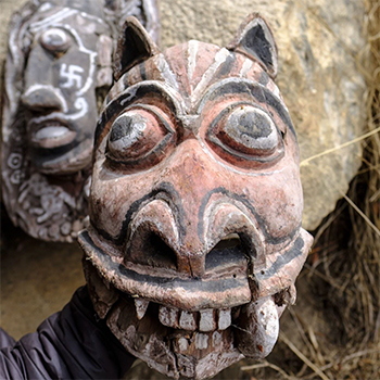
Visual Expression of Cultural Experiences through Film
by Adersh Sreedharan
Details >>
by Adersh Sreedharan
India, one of the most populated countries in the world, has an endless diversity, starting from geographical features to languages, religions, art and crafts, customs and traditions, flora and fauna, demographic structure, and so on. Indian culture, which is a fusion of several cultures from all the Indian subcontinents, has been influenced and shaped by a history that is several thousand years old. The diversity of India is unique, giving us reasons to think of India as a ‘mini world’. In order to understand a culture, one has to experience it. This project was undertaken to experience a particular culture, understand it, and then express it visually.
Dronagiri village in Chamoli district of Uttarakhand was chosen as a place with untouched culture to experience and understand a lifestyle that is not known to the outside world. In this village situated at 11,800 ft. altitude, a mountain worshipped by locals is believed to be the one that Hanuman disfigured during his search for the life-saving herb Sanjivani.
This report describes the experience of getting exposed to a new cultural environment, the culture shock one may face because of the unfamiliar way of life, and how we adapt to it. And the process through which the culture is experienced is translated into a visual form.

Understanding Art Installations at Kochi Muziris Biennale 2016
by Ansari Salik
Details >>
by Ansari Salik
The Kochi-Muziris Biennale is an international exhibition of contemporary art held in Kochi, Kerala. It was the first biennale of its kind to be held in India. The Kochi-Muziris Biennale is an initiative of the Kochi-Biennale Foundation with support from the Government of Kerala. The exhibition is set in spaces across Kochi, Muziris, and surrounding islands, with shows being held in existing galleries, halls,and site-specific installations in public spaces, heritage buildings, and disused structures. It is an event that happens every two years. It is most commonly used within the art world to describe large-scale international contemporary art exhibitions. As such, the term was popularised by the Venice Biennale, which was first held in 1895.
In May 2010, Mumbai-based contemporary artists of Kerala origin, Bose Krishnamachari and Riyaz Komu, were approached by the then culture minister of Kerala, M.A. Baby, to start an international art project in the state. Acknowledging the lack of an international platform for contemporary art in India, Bose and Riyas proposed the idea of a biennale (a large-scale international exhibition) in Kochi on the lines of the Venice Biennale.

Makaan: A documentary film based on construction worker
by Ansari Salik
Details >>
by Ansari Salik
‘Makaan’ is about telling the story of the construction worker community through one’s family struggle. Their ups and downs as they navigate their daily lives are puddled with economic and social hurdles. The narrative of the film juxtaposes similar situations. It expresses differences in the way of responding through the perspectives of children and the elderly, where the children transform the hard reality. In their games, leaves are turned into money, and a ten rupee note becomes a butterfly. The film also tries to capture the essence of "workers" and their struggle in today’s modern time.

Can gameplay aid structural understanding of language?
by Ansari Salik
Details >>
by Ansari Salik
The project aims to facilitate English language learning in resource-constrained environments. It aims at making the language more familiar where it is largely alien and enabling engagement with it outside the ‘English classroom’.
One of the key ideas chosen in this project is to improve engagement through games that reflect and are sensitive to the socio-cultural and geographical landscape of the said environment. Expanding the current ongoing project LETS (Learn English Through Stories) through a different approach and making grammar learning intuitive and fun is the main focus of this project.
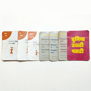
Can gameplay aid structural understanding of language?
by Ansari Salik
Details >>
by Ansari Salik
A traditional classroom environment doesn’t provide much scope for teachers to try different ways of teaching. The population of students and the lack of availability of designed materials that would work for both teachers and students are two of the major constraints. When it comes to learning a second language (SL), the situation is even worse. The project "Can game-play aid structural understanding of language?" aims at facilitating ways of learning and teaching structural English (grammar) in a traditional classroom environment, where English is a second language.
The topic chosen in the grammar teaching is tenses, and the idea is to design a pedagogy that works for both teachers and students. The developed method (pedagogy) begins with a card game that facilitates pattern learning within tenses.
This is followed by a classroom activity designed to reinforce the acquired pattern. The third and final part of the design is a planned lesson (instructional design) to communicate the meaning of the overall concept.
A series of experiments were conducted with a group of 18 students in grades 6 and 7, and the designed materials were tested, improved, and then evaluated on the basis of the qualitative results of those experiments. The report further contains a detailed view of the testing with materials and their iterations. The results show an increase in the level of engagement of the students with the topic. It also indicates a jump in the quality of their ability to look for and find patterns in the materials given to them.
This project expands the boundaries of the ongoing LETS (Learn English Through Stories) project under the Tata Centre for Technology and Design, using games and planned lessons to teach structural English, thereby making grammar learning intuitive and fun.
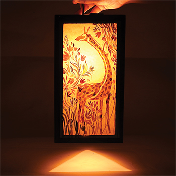
Exploration of paintings on lamps with experimenting through the treatment of light ‘Transforming Lamps’
by Ashika Singh
by Ashika Singh
Transforming Lamps is a special project by Ashika Singh that explores the expressive potential of painted lamp surfaces and the interplay of paint, form, and light. Through hands-on experiments with surface treatment, translucency, and illumination, the project explores how painted motifs and material choices alter a lamp’s behavior and the atmosphere it creates—turning functional objects into narrative lightscapes. By mixing hands-on experiments with careful observation and thought, the work places decorative painting in a design approach that focuses on touch, light, and the creative potential of ordinary items.
Details >>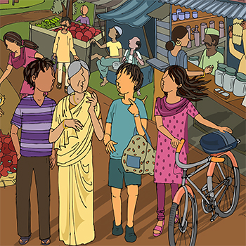
Internship under Clix at TISS
by Ashika Singh
Details >>
by Ashika Singh
My internship project was with CLIx at TISS, under the production team. I initially worked there as an illustrator for the digital math game, but very soon i was shifted to work on the English curriculum. The following report will be my illustration work for the audio-based English story. The attempt was to come up with a new style of illustration that would go with the story and be easy for the rural children to relate to.
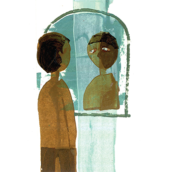
A journey through the mind of a Transgender
by Ashika Singh
Details >>
by Ashika Singh
For years, transgender individuals have struggled for acceptance, protection, and visibility, even among other minorities. With the list of states legalising gay marriage growing and broad acceptance in pop culture, the gay and lesbian population has gained increased visibility and protection in recent years. However, transgender individuals have not been afforded the same rights. The project is an effort to encourage society to emphasise and acknowledge transgender people. Through the medium of poetry. Poems based on the different emotions of a transgender person are the outcome of this effort.
The following report describes my journey as I broaden my understanding of the transgender community and subject and arrive at a design solution that allows me to contribute to the same with the best of my abilities as a visual communicator in a meaningful way. I have tried to understand the existing attitudes and emotions of transgender people and society and to weave together a series of poems as a reflection. The research represented here cannot be considered complete, for I know I have only scratched the surface, but it is a start in trying to understand where the problem lies and the steps needed to be undertaken to rehabilitate this minority community, which is very much a part of Indian past, present, and future.

Children of broken homes
by Ashika Singh
Details >>
by Ashika Singh
Nowadays, the rate of broken families is alarmingly increasing. Largely, it is seen today that families are broken up by breakups and divorces. Although the effect falls on both spouses, even the child goes through all the hardships and troubles that remain unseen by all. Its effects are huge on the children, which leads them to depression, insecurity, and many other mental problems.
My project on ‘Children of Broken Homes" will deal with the psychology of a child, including how and what the child goes through mentally when the family is broken. How the separation of parents and regular fights at home affect his behaviour, actions, lifestyle, choices, and decision-making abilities throughout his life. An attempt will be made here to address the issue from the child’s point of view.

Sindhoora A Wooden Craft
by Ashish Kumar
Details >>
by Ashish Kumar
Varanasi, the city of Lord Shiva and the holy Ganga, is known around the world for its rich culture. People have been following their traditions and passing them on from generation to generation. There are colonies of craftsmen in Banaras for crafts like Gulabi Meenakari, Panja Dari, Chunar Red Clay Pottery, Hand Block Printing, Wooden Craft, and many more.
Khojwan is one of them, a suburban neighbourhood located in the south of Varanasi district (Uttar Pradesh). Khojwan is the place for the making of wooden crafts, including Sindoora.
I had seen Sindoora for the first time in the hands of a newly married lady at Ganga Ghat in Banaras. She was worshipping her Sindoora and praying to Ganga Maa for her ‘Suhaag’ (husband). And that’s how I got interested in learning about these beautiful wooden vessels. This project gave me the opportunity to look into the details and the value of these wooden vessels. And how this craft plays an important role in people’s life.

Making light weight of SAMAR: A Rounded Devanagari Font
by Ashish Kumar
Details >>
by Ashish Kumar
‘Ek’ is synonymous with ‘one’ in several Indian languages, and Ek Type is a collaborative platform in India under ‘one’ roof to develop fonts. As a part of my internship programme, I had a great opportunity to work with them on their ongoing project, ‘Samar Devanagari Rounded.
This report describes my experience and work process, as well as my understanding of the details and methodology involved in developing a font. I have presented my work in the form of the design process, which includes pre-study, designing, analysing, testing, and refining. It shows my role and involvement in the development, as well as how I came up with a suitable design solution.
Designing a Monolinear Devanagari Font
by Ashish Kumar
Details >>
by Ashish Kumar
Type design and development is a process that involves the minute refinement of every detail. From scratch to end design, it needs a good understanding of form, space, balance, and a tremendous amount of patience, along with technical knowledge.
This report describes my experiences, work process, understanding of the details, and methodology for developing a font. I have presented my work in the form of a design process, which includes pre-study, designing, analysing, testing, and refining. It shows my role and involvement in the development, as well as how I came up with a suitable design solution.
Design of a Monolinear Devanagari Font in multiple weights
by Ashish Kumar
Details >>
by Ashish Kumar
Type design and development is a process that involves the minute refinement of every detail. From scratch to end design, it needs a good understanding of form, space, balance, and a tremendous amount of patience, along with technical knowledge.
This project is the continuation of my previous project (designing a monolinear Devanagari font). In which I have designed the basic Unicode character set in regular weight. The aim of the project was to design a matching Devanagari font for Univers for bilingual communication at IDC, School of Design, IIT Bombay.
This report describes my experiences, work process, understanding of the details, and methodology for developing a font. I have presented my work in the form of the design process, which includes pre-study, designing, analysing, testing, and refining. It shows my role and involvement in the development, as well as how I came up with a suitable design solution.
Advancement and Prototyping of a Driver Interaction System for Simulated Test Drives
by Aswin Yogesh R
Details >>
by Aswin Yogesh R
A monotonous environment while driving on long highways can lead to a dangerous state of drowsiness in the driver. The previous advanced design project (ADP) of Amini et al. developed the concept of a driving assistant system that uses gamification features to break the monotony of the driving task. This work picks up this concept and develops a software prototype of an interface to perform Wizard of Oz-experiments in the driving simulator of the institute for ergonomics (IAD) at the Technical University Darmstadt. The development processes are due to the guidelines of the human-centred design process. The context of use for the prototype must be seen from the perspective of the driver as well as from the perspective of the experimenter. The driver is in a monotonous driving environment and can get input via head-up display (HUD), liquid crystal display (LCD), or audio output. The experimenter can monitor data about the current driving behaviour given by the simulator software. In addition, the experimenter uses the prototype on a laptop. The requirements for the development are derived from ISO 9241-110. The developed prototype is an interface between driver and assistant, as well as an interface between experimenter and assistant system. A user of the prototype can control the three output channels with the software prototype. The user sees the content of the HUD and LCD and has a control panel with buttons that enable him to handle his task. In contrast to this, the driver can only see the parts of the interface shown via the HUD and the LCD. The screen content of the wizard interface is shared with the software screenleap and teamviewer on a smartphone in front of the windscreen, which represents the HUD, and on a tablet, which represents the LCD on the middle console of the car. Therefore, it is possible to show the corresponding parts of the interface to the driver.
It is possible for the driver to interact with the assistant system by voice. A start procedure, a quiz, and three driving games that motivate the driver to show better driving behaviour are the main features of the prototype. The games challenge the driver to hold the current speed, the current distance to the vehicle in front, or the exact position in the middle of the driving lane for 60 seconds. The task of the experimenter is to rate the behaviour of the driver during the games and transfer this input to the assistant system. Buttons to rate the behaviour and create a score are included in the interface of the experimenter. Depending on the score, the driver receives feedback about his current performance from the HUD and afterwards about his performance over the complete duration of the game. Furthermore, the experimenter can handle scenarios that pause the game, e.g., lane changes or dangerous situations like emergency stops. Next to the driving games, a quiz is implemented in the prototype. The quiz and the starting procedure are created as an oral dialogue between the driver and the assistant system. To trigger the corresponding audio output, the experimenter has different buttons that suit the current situation. The usability of the prototype for the experimenter is evaluated in this paper. Afterwards, small changes will be considered to improve usability. The prototype developed allows for the performance of Wizard of Oz experiments in the context of the IAD driving simulator. Only these experiments can show if the concept of an assistant system that uses the described gamification features is suitable for a driving scenario with other road users and if such an assistant system can reduce the monotony of the driver.
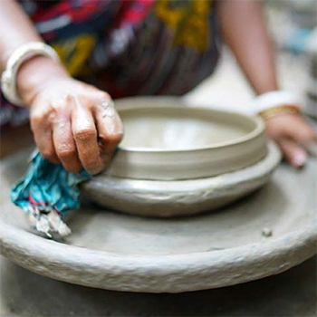
Summer 2016 Explorations
by Aswin Yogesh R
by Aswin Yogesh R
What can a cashless society do for microcredit? High operation costs are cited as a reason for the high interest rates on microloans. This leads to the microloans being among the most expensive loans in the world, while the repayment rates are unbelievably high, above 96%. This is a loan officer at work in a Grameen local unit.
Details >>
The Politics of Sustainable Development
by Aswin Yogesh R
Details >>
by Aswin Yogesh R
What has changed in the way we live, and how are the big powers, both within the state and external, influencing our lives?
The film will explore how we have broken away from the traditions of sustainable living and how the development the state undertakes in the name of sustainability, if not helping, is sometimes doing more damage to man, the environment, and our future.
Thinking through Meritocracy: Caste in Indian Institute of Technology Bombay
by Aswin Yogesh R
Details >>
by Aswin Yogesh R
Meritocracy is a social system in which people hold positions exclusively based on their abilities. But India, as a democracy, undertakes several measures to reduce the inequality caused by historical prejudices by showing positive discrimination like caste-based reservations.
The Indian Institutes of Technology were established after Independence to create trained technical personnel of international standards for the nation. In order to establish "merit" as the only criterion for admission into these institutes, they were originally exempt from the policy of reservations. Extant structural inequalities ensured that only the "already privileged" could find their way into these spaces of "merit". As a result, these institutions have until recently been almost exclusively populated by the upper castes, who, through the instruments of merit, were able to transform their caste capital into modern, "caste-less" capital.
All this changed with the introduction of a 22.5% reservation for Scheduled Castes and Scheduled Tribes in 1973 and 27% for Other Backward Castes in 2006. This has transformed the IITs into heterogeneous, complex, and often volatile, politically charged spaces.
The encounter of the ideologies of meritocracy and caste in the spaces of IIT Bombay throws up interesting, difficult questions. This film is an attempt to identify, articulate, and interrogate the complexity caste brings to the IIT Bombay campus by exploring the stories of people who are part of it.

Studying Light & Shadow through lamp design process
by Kalagouda Patil
by Kalagouda Patil
The project explores the understanding of the behaviour of light and shadow using a tea-light candle as a light source and paper as a subject through the lamp design process.
Details >>
Design of Namma MetroMap
by Kalagouda Patil
by Kalagouda Patil
Namma Metro started its work in 2007 and was open to public on 20th Oct 2011.
Details >>
Passenger Information Display System for Mumbai local for a futuristic scenario
by Kalagouda Patil
Details >>
by Kalagouda Patil
When I was travelling for the first time in Mumbai, I noticed something unexpected. The orientation of platforms to get off trains is different at different stations. For one station, the crowd faced left, and for the next, it faced right. Being a novice, this annoyed me as there were no means by which I could know my station and the direction of the platform other than asking.
This experience led to the inception of the thought behind this project: "How would real-time information be designed for futuristic Mumbai local trains, served inside the high-tech compartments for the future passengers". The real-time information is usually conveyed by the Passenger Information Display System (PIDS). The project doesn’t aim to solve any current problems but will take inspiration from the same problems and visualise the future of info design for PIDS, specially catered to Indian situations (multilingual; language barrier; chaos and crowd inside trains; lack of information system). The first part of the project introduces the Passenger Information Display System (PIDS), its role in public transport, and my area of focus in this design project.
The second part looks at the main conditions that shape this project, such as the current scenario of Mumbai's local compartments, the needs of the user from a novice perspective, and the necessary information. The final part discusses the design and decisions (both visual and motion design) made to accomplish the project.
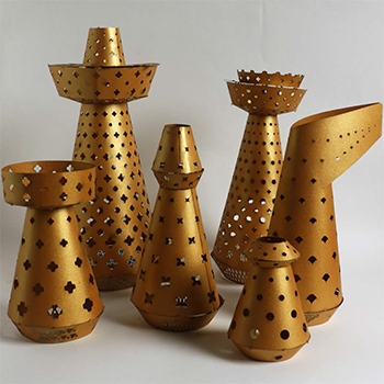
Exploring Shadows: An interaction between Light and Paper
by Kalagouda Patil
by Kalagouda Patil
This project explores the possibilities of interaction between a light source and a subject, which projects the impression of a subject on a screen called The Shadow. Considering light source and subject as major variable factors, their behaviour of interaction is altered by changing properties, and hence the resulting phenomena are observed. Domestic lights are used as the medium for the light source, and paper is used as the material for the subject. Lamp is chosen as a medium to explore these variables, as it is a perfect model that leads this exploration towards a tangible product.
Details >>
Unconditioned Learning
by Kawalpreet Singh Saroy
by Kawalpreet Singh Saroy
They say if it’s the fork you remember after a dinner, then the food wasn't good enough! Well, I will be lying if I say that the food for thought discussed at the "Thanima’17" seminar was all I remember... The scenic view of the Konkan Railway from the window seat, crossing the green ghats amidst the backdrop of an orange sunset, the sadhya meal on banana leaf, strolling at the Kozikode beach nibbling banana chips, sipping filter coffee by the back waters...were reason enough for me to pack my bag and head to the very God’s own country.
Details >>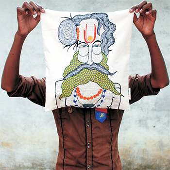
Ahambhumika: Gond art embroidery
by Kawalpreet Singh Saroy
Details >>
by Kawalpreet Singh Saroy
‘Aham Bhumika’ is an NGO, a group of like-minded people based in Bhopal, a city in the state of Madhya Pradesh in India. The diverse group consists of artists, housewives, engineers, tourist guides, teachers, and government employees. As a humble start-up, they are striving for the betterment of the underprivileged in rural areas of India.
To help the underprivileged children, destitute, and orphans by involving generous people from the cities by collecting material discarded by them (clothes, bicycles, books, toys, newspapers, etc.) for the underprivileged people One can just walk in and join as a volunteer at Aham Bhumika and make their contribution to the betterment of society. The main project undertaken is the embroidery project in Borda, 4 km from Bhopal. It is to empower the women folk of the region by generating lively hood through embroidery. These panels are then converted into tote bags, cushion covers, and pouches. A fair share of the profit goes to the artists.
They have established collection centres in Bhopal where you can contribute clothes, bicycles, toys, books, and grain. One can also help us by sponsoring various events organised by us and paying for transportation, printing of literature, etc. They also accept monetary contributions through a check or demand draught favouring ‘Aham Bhumika Swayam Sevi Sanstha," payable at Bhopal.
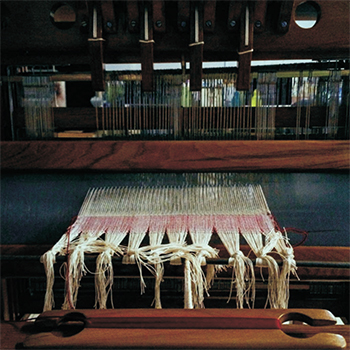
Woven Narratives: Celebrating the handmade
by Kawalpreet Singh Saroy
Details >>
by Kawalpreet Singh Saroy
The project is about celebrating the handmade, not giving away the pleasure of creating a cloth to a machine, knowing where the cotton of a thread comes from, where the thread for khadi comes from, where the cloth for my kurta comes from, etc. The project is about the women of the Ahir tribes in Kutch, who spend their day embroidering vivid patterns that remind one of the works of Paul Klee. Women with no formal training who have created a world around their remote thatched households. The project is about the young weavers at the Handloom School, Maheshwar, who didn’t opt out of their family occupation of weaving but instead will continue the tradition while remodelling with the current fashion trends.
The project is about Shrinu, my guide, and a new recruit at the weaver service centre on Charni Road. With an experience of more than 15 years in jacquard loom, he humbly teaches me the intricacies of working on table loom while himself earning for his children to study well and get ‘good-paying’ jobs. The project is also an attempt to understand Gandhi and his urge for everyone to spin! The man who patronised the richness of Indian textiles and himself wore just a lion cloth At last, it's about celebrating the handmade, not giving the pleasure of creating a cloth to a machine. To know where the cotton of a thread comes from, the thread for khadi comes from, the cloth for my kurta comes from...

Woven Narratives: From table loom to foot-treadle loom
by Kawalpreet Singh Saroy
Details >>
by Kawalpreet Singh Saroy
A significant part of the project would be an attempt to learn the work ethics of a weaver, who sits quietly on a loom, weaving a seven-yard fabric. To weave as a daily routine. While aiming to hone my skills with each 'satak-su' sound...
With some experience working on the table loom from my previous project, I will learn to weave on a full-frame loom. It's an extension of Project 2 in the sense that one keeps the 'embedded narrative' intact but also attempts to reflect on the meaning of creativity in our times.
One part of the project is a collaborative association with ten B.Tech. IITB students and Mr. Shrinu (a weaver at Weaver Service Centre, Mumbai) over a period of three months. It would be a collective engagement with weaving, thereby creating handloom products such as scarves, mats, and tote bags. To reflect on the sartorial choices that fill our wardrobe, with high-end brands like Fabindia at one extreme and Khadigram apparel at the other end.
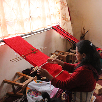
Daily Pattern
by Kimberly C. Manners
Details >>
by Kimberly C. Manners
In the month of December 2016, I paid a regular visit to Mawryngkang, a weaving village in Meghalaya where the oor and y-shuttle looms are predominantly used, and to Roilang Livelihood Academy Unit of Bethany Society, Shillong, to learn about the backstrap loom, or loin loom, which is predominantly used all over North East India. Due to its affordability and portability, I’ve brought it back with me to IDC to start a routine of daily practise on it.
The purpose of my research is to dive into the lives of local weavers in Meghalaya to get a sense of the daily practise of weaving as a craft.
Graphic Design for The Minimalist
by Kimberly C. Manners
by Kimberly C. Manners
Graphic Design for The Minimalist by Kimberly C. Manners explores minimalism as both a visual and conceptual strategy in contemporary graphic design. Guided by the principle of “less is more,” the project examines how elements such as typography, colour, imagery, layout, and whitespace can be distilled to their essence without compromising clarity or communication. Drawing from the historical roots of minimalism in art and design, Manners situates her work within today’s visually saturated world to advocate for restraint, focus, and intentionality. Through iterative exploration, she reveals how the thoughtful reduction of form enhances both functionality and emotional resonance, allowing meaning to emerge through simplicity. The thesis ultimately positions minimalism not as mere simplification but as a disciplined design approach—one that transforms limitation into clarity, elegance, and enduring impact in visual communication.
Details >>
‘MEM MEM’ a graphic narrative on MATRILINY IN TRANSITION
by Kimberly C. Manners
Details >>
by Kimberly C. Manners
The purpose of my project is to study the Meghalaya Matrilineal Society in depth, i.e., the system practised in the state by 80% of the population (tribals) that gives its women lineage importance and inheritance rights and has had a great impact as a boon on the situation of women in the state as compared to the women in the rest of the country but also a grievance to men. The study as well as my personal experiences will be directed towards the compilation of a graphic novel that will subtly focus on talking about the features of society and address the debate of whether it should undergo a transition or not.
Storytelling and writing have been two of my strengths, and my inclination towards visuals and graphics inspired me to do a graphic novel. Although information about the matrilineal culture is accessible, a compelling narrative and visuals would be more engaging to the reader and leave a lasting impression. The novel will be targeted at readers ages 12 and above in Meghalaya but will also be relatable to others.

A Study of Contemporary Culture: Fulfillment in the 21st Century
by Kimberly C. Manners
Details >>
by Kimberly C. Manners
What drives us to get out of bed every morning? While some of us contemplate what our purpose in life is, others wake up just to put food in their mouths. Every day is a struggle for survival. This project is an attempt to understand the idea of fulfilment and answer the question, "How does living in the 21st century change our understanding of attaining real, lasting, and genuine fulfilment?"
The medium of communication is film. Film is a powerful medium that holds information as well as emotions. The film is a self-documentation of my surroundings and thoughts. It will serve as a reflection of the 21st century’s young adults.
Study of narrative murals and art installation
by Kshetrimayum Dideshwor Singh
Details >>
by Kshetrimayum Dideshwor Singh
Art is a diverse range of human activities that involve creating visual, auditory, or performing artworks that express the author’s imaginative or technical skill and are intended to be appreciated for their beauty or emotional power. There are lots of mediums to express one’s artistry. Murals are a form of art that has been in common use since the late 19th century. Understanding narrative mural art is essential for an artist and visual designer.
For my design research seminar, I had chosen to study the narrative mural and art installation. I had the opportunity to work on and study the murals made for the ongoing Dandi project in Hyderabad. I thought it would be a great experience for me to go back to the place where the murals are being made. For the art installation, I went to Kochi for the Kochi-Muziris Biennale 2016. It is an international exhibition of contemporary art held in Kochi, Kerala. Through this study, an in-depth sense of traditional and contemporary art could be developed.
Understanding art direction and mural making for dandi project
by Kshetrimayum Dideshwor Singh
by Kshetrimayum Dideshwor Singh
Intern in two different subjects: art direction and mural making. This project is focused on understanding a little bit about the role of art direction in films. Work as an art director for a short film of a FTII student’s project in Pune. Secondly, my contribution to making murals for the ongoing Dandi project in Hyderabad.
Details >>
Self-Determination and The Nation-State, Understanding Conflict through Sculpture
by Kshetrimayum Dideshwor Singh
Details >>
by Kshetrimayum Dideshwor Singh
The topic deals with the apparatus of the nation-state and self-determination as contexts for art-making. Understanding the conflict between nation-states and self-determination was the origin of this project. My reaction or responses to this conflict were expressed through a series of sculptures, which may give an artistic solution to the viewer of my sculpture.
Our country is known for its unity in diversity. The high mountain ranges, countless rivers and streams, dark forests, vast seas, large river-irrigated lands, and sandy deserts—all these have adorned India with exceptional diversity. Among the people, there are numerous races, castes, creeds, religions, and languages. As we said, India is a sovereign country with 29 states, and people living in India are the children of one mother, whom we call Mother India, but there is a lot of conflict and diplomatic interference between states and nations. Some states demand self-determination, and the nation-state is trying to control them. So when someone is trying to control someone’s freedom, conflict arises. I was particularly focused on studying the burning issue of Manipur.
Manipur is a state in India that is located in the north-eastern part of the country. which is also my birthplace, where I grew up and played around. I have been involved with such conflict zones since childhood, and the conflict still continues in Manipur. So, in this project, I am trying to understand how conflicts arise and study other conflicts in the 21st century. I tried to understand why people want to have self-determination, why people want to be against someone's freedom, and how we may control it and give a peace massage to all the people in an artistic way.

Enhancing Visual Culture in open Space: Public sculpture for IIT Bombay
by Kshetrimayum Dideshwor Singh
by Kshetrimayum Dideshwor Singh
My own understanding of the history of art and how I perceive what constitutes visual culture Rethink art and its role in our time. To understand how artists contribute to the visual culture of a public space and public art around the globe Possibility of enhancing visual culture in the form of public art inside IIT Bombay. Finally, a public sculpture of IIT Bombay.
Details >>
Evaluation on Maternal Health solutions in Rajsamond, Rajasthan
by Manish Kumar
Details >>
by Manish Kumar
In India, thousands of women die of pregnancy-related complications, anaemia, and malnutrition. These are easily preventable deaths, requiring only good nutrition and education in basic health care. In large parts of rural and urban India, the public health system lacks basic infrastructure like labour rooms and blood banks, as well as staff and proper equipment for childbirth. Here, an attempt has been made to educate women about pregnancy and maternal health, especially in rural areas, by providing them with pregnancy-related information. The output of the project is a pregnancy calendar from which pregnant women could learn what important steps should be taken during their entire pregnancy period. because the calendar is the common medium of information in rural areas. A calendar is a form that generates clues as to how one should read information. This information is provided in the pregnancy calendar in the form of images, informative poems, and instructions. It is also providing a system for midwives to visit pregnant women at least once a month.
This project is an attempt to find an alternative solution to my previous project, which involved designing, testing, and documenting it.

Maternal Health in Rural Areas
by Manish Kumar
Details >>
by Manish Kumar
This project is aimed at getting a personal understanding of maternal health in rural areas of Rajsamond District. For this, I have done an internship at an NGO called Jatan Sansthan, based in the Rajsamond district of Rajasthan. In this internship period, I talked with the actual audience in rural areas and tried to understand the actual problems. During field work, we have done assessments of the quality of maternal and newborn health services and had discussions with females.
My next step will be to focus on the customs of a particular community regarding maternal problems, which will include an audiovisual document on this particular topic.

Understanding of Maternal Health in Rajsamond, Rajasthan and Wighawali, Maharashtra
by Manish Kumar
by Manish Kumar
In India, thousands of women die of pregnancy-related complications, anaemia, and malnutrition. These are easily preventable deaths, requiring only good nutrition and education in basic health care. In large parts of rural and urban India, the public health system lacks basic infrastructure like labour rooms and blood banks, as well as staff and proper equipment for childbirth. Here, an attempt has been made to educate women about pregnancy and maternal health, especially in rural areas, by providing them with pregnancy-related information. The output of the project is a booklet from which pregnant women could learn what important steps should be taken during their entire pregnancy period. This information is provided in the booklet in the form of images, short poems, and instructions.
Details >>
A boy who lived his dream
by Manish Kumar
Details >>
by Manish Kumar
The people of our society don’t want to accept reality. People have something in their minds, and they think this is right because they have spent most of their lives in that thought. So they refuse to accept the other ways of life, and they become blind to them. This is because, with less education, their minds are not flexible enough to think beyond their own limits.
They are only seeing what they want to see. They are unable to see the other ways, and even if they come across them, they are not ready to accept them. They accept it only as far as they acknowledge it. I wanted to communicate this issue through a film based on the life of a little boy who lived out his dream of living in a city.

Visual Ethnography of Invitation and Wedding Card
by Palash Tukaram Bawankar
Details >>
by Palash Tukaram Bawankar
The encouragement to select this topic for visual ethnography came from the relevance and importance of the topic in communication design. It was also one of my childhood interests to cut the stamp foiled Ganeshji or any deity or beautiful decoration in golden shining on it on these cards of invitation. It had always been the topic of my curiosity to see how these beautiful pictures are engraved on such small cards and how papers are cut into such small pieces of drawing.
Luckily, visual ethnography gave me the chance to study this craft closely and entirely. I could study the interesting process of manufacturing invitations and wedding cards and its impact on the people in this profession. Some people were stuck with traditional printing technology, which has become outdated due to the influence of the digital world. Some of them could adapt themselves according to the situation and manage to adjust to the technological changes that come from time to time. Due to which they are dwelling for the time being.
Visual ethnography was a completely new field for me. With the excitement of a new subject and an old craft tradition to explore, which is driven by my own interest, I embarked on this journey of understanding the craft of invitations and wedding cards.

Creating Awareness on Child Sexual Abuse
by Palash Tukaram Bawankar
Details >>
by Palash Tukaram Bawankar
India has the dubious distinction of having the world’s largest number of sexually abused children, with a child below 16 years raped every 155th minute, a child below 10 every 13th hour, and one in every 10 children sexually abused at any point in time.
Generations of Indian children have watched their parents remain silent on sexual issues. We learn this silence, which is further complicated by a tradition that demands that every child respect and obey all elders. And so children obey and remain silent, no matter what the elders do.
This project aims to break the communication barrier about the issue between parents and children and encourages children to break the silence about a ‘touching problem’ and openly communicate on the subject with a trusted adult.
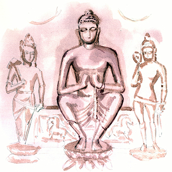
Illustrating Iconography of Buddhism
by Palash Tukaram Bawankar
Details >>
by Palash Tukaram Bawankar
Buddhism has had a very large impact on the art history of India. It is the fourth-largest religion followed in the world. Buddhism has three vehicles to enlightenment: the Theravada, Mahayana, and Vajrayana. Vajrayana includes an embodiment of Sunya called Adi Buddha, or Vajradhara. Dhyani Buddhas emanated from Adi Buddha, and Dhyani Bodhisattvas with Saktis emanated from Dhyani Buddhas, which were responsible for creation. Due to major incarnations in Vajrayana, Buddhism has a wider scope for iconography, which can be classified into idols, mandalas, and mudras (hand postures).
In this project, I will be concentrating on mudras. Mudras are non-verbal modes of communication and self-expression consisting of hand gestures and finger poses. It is an external expression of ‘inner resolve’, suggesting that such non-verbal communications are more powerful than the spoken word. Mudras are gestures that symbolise divine manifestation. They are also used by monks in their spiritual exercises of ritual meditation and concentration, and they are believed to generate forces that invoke the deity. Another interesting meaning is given to the idea of the mudra. It reveals the secret imbibed in the five fingers. In such an interpretation, each of the fingers, starting with the thumb, is identified with one of the five elements, namely the sky, wind, fire, water, and earth. Their contact with each other symbolises the synthesis of these elements, which is significant because every form in this universe is said to be composed of a unique combination of these elements. This contact between the various elements creates conditions favourable for the presence of the deity at rites performed to secure some desired object or benefit. That is, mudras induce the deity to be near the worshipper.
This project focuses on illustrating the deeper meaning imbibed in mudras through a series of posters. It will also include the exploration of the delicate forms of mudras through illustrations. It will not only be relevant for the Buddhist followers but also for the students of design and art who want to study and want to know the meaning behind iconography in Buddhism.

Visual fatigue among computer users
by Rahul Kumar Dhanuk
Details >>
by Rahul Kumar Dhanuk
This report presents a survey of the available literature related to the present scenario of technical devices and methods to quantify visual fatigue and its long-term effects on the eye due to computer-related work, along with psychological and physiological aspects.
The introduction of computers during the 1970s gave rise to a lot of controversial debate. Controversies were wide-ranging, ranging from workplace ergonomics, lighting to health and work stress. The overuse of computers makes adults and children both susceptible to computer-related vision symptoms. Performing both important and enjoyable tasks without breaks until near exhaustion may increase eye focus problems and eye irritations. This calls for computer vision syndrome, which is a widely spreading but largely unknown epidemic among computer users. It is considered the top official health-related problem. In ancient times, human beings used to live in forests, and their primary occupation was hunting. Their visual need was to look at distance, but now the distance-dominated world has suddenly changed to a near-point world, as most jobs are now confined to tables and chairs, working on computers, and small office boundaries.

Summer Internship at Response India Calcutta
by Rahul Kumar Dhanuk
by Rahul Kumar Dhanuk
Their reason for existence is to prove a point that is contrary to popular opinion through fresh, focused, and accountable world-class communication that can be created and conducted from Calcutta. Corporate, product, and brand strategy and tactics, New product and brand concepts, public relations, graphic design, corporate ids, signage, packaging strategy and design, web strategy, design, and development.
Details >>
Visual Communication at IDC, an analysis
by Rahul Kumar Dhanuk
by Rahul Kumar Dhanuk
After joining IDC to study ‘Visual Communication’, the question "What do you actually do?" from fellow students in various disciplines often led to some tentative answers, but it was very evident from people's facial expressions that they didn’t understand. The realisation came that "visual communication’ has to be studied more deeply, hoping that in the future it will also lead to an understanding of the broader subject of design. The current project is an attempt to do a qualitative and quantitative analysis of around 700 VC projects done at IDC from 1984 to 2016. Considering the time available, this study focused more on developing a methodology that could later be expanded for a more comprehensive study.
Details >>
Kaliyuga predictions: Its relevance and visual depiction
by Rahul Kumar Dhanuk
Details >>
by Rahul Kumar Dhanuk
This project is a visualisation attempt of the Kaliyuga predictions, written in Sanskrit in Srimad Bhagavatam, whose English translation and purport have been given by Abhay Charanaravinda Bhaktivedanta Swami Prabhupada. All 17 posters include the original Sanskrit verses, their English translation, a one-word English title, and illustrations that closely depict those predictions' meaning.
Creating posters on Kaliyuga predictions is about making it interesting to attract attention, thus giving the viewers an opportunity to verify its relevance in the present world, which may give them a broader world view to deal with life situations.
Through this project, I learned how pictorial metaphor and analogical juxtaposition can be used to create a visual that conveys meaning and creates an impact in the viewer's mind.
Visual Grammar of Street Signage in Delhi
by Rishabh Pandey
Details >>
by Rishabh Pandey
This report showcases the existing hand-painted street signs in the areas of Delhi and nearby and the finesse in painting letters achieved by sign board painters through years of practise in different scripts and styles.
It also attempts to shed light on how globalisation and brand communication have affected writing styles in present times.
Visual Identity Design: Young Designers Collective
by Rishabh Pandey
Details >>
by Rishabh Pandey
GCC was founded in 1974 by Sudarshan Dheer, the Grand Master of Corporate Communications in India.
The studio specialises in corporate communication projects—identity, literature, packaging, and signage systems—and continues to serve both national and international clientele.
Sudarshan Dheer has designed logos or brand identities for over 100 clients. His work has been featured in more than 50 international publications and won more than 40 awards.
Taking a Line for a Walk Communicating Through Lines
by Rishabh Pandey
Details >>
by Rishabh Pandey
Man has been making images since the prehistoric era, and the images have continued to inspire and influence mankind in many different ways. The images have not only shown modern man the lifestyle of cavemen but also worked as a mirror of society and made man realise the good and bad things in life; in religion, they guided man to focus on higher powers; they've inspired man to create what previously seemed impossible; and they've also opened up a way into our world where communication without the use of words becomes possible.
Today, when we look around, we find out that our streets, television, and Internet are filled with images of animals, most of them cats and dogs; people killing each other over some issues; places being destroyed; daily soaps spreading negativity and untrust within families and society; advertisements for self-promotion or to increase consumption of goods; and images spreading cultural values or religion, etc.
Now, with the advancements in technology in cameras, making images has become easier and more accessible than it was five or six years ago. Today, everyone wants to click pictures all the time while on the go.

Design of Signage System for IDC
by Rishabh Pandey
by Rishabh Pandey
This project aims to create a system-level design to develop a way-finding and signage system for IDC. The new signage system establishes clarity for visitors to the IDC through floor-based colour-coded signage in a bilingual typographical approach. Personal spaces, workshops, studio spaces, and general utilities are clearly presented in the new design. Viewing angle, legibility of letter forms, and visibility were some of the factors considered while designing the new signage system at IDC.
Details >>
Packaging Design and Visual Impairment
by Sachit Shyam
Details >>
by Sachit Shyam
From the point of view of packaging design, there is very little we know from literature about how blind people relate to the packaging of everyday consumer products in India (Mumbai). As part of a design research project at IDC, we attempt to get answers and insights into how visually impaired people access various products (especially FMCG) on a daily basis. Are there any standards set up by the government or the food industry to aid people? If not, how are people currently accessing products? These are some of the key questions to which we tried to look for answers.
There are also issues like how visually impaired people currently identify, locate, and find information about the products and the shopping stores. In most cases, people are accompanied by a family member or a friend, but if a person lives alone and is independent for most of the daily chores, what are the problems faced by them (if any) and what are the workaround solutions they have devised to tackle these daily problems?

Maku: A friendly Devanagari typeface
by Sachit Shyam
Details >>
by Sachit Shyam
Since my childhood, I have always been attracted to letter forms. From scribbling random words on the backside of the math book to designing booklets and reports for the design projects during the graduation period, it has been a tremendous journey. I consider this project my first step in professional type design. To be honest, I always had an inclination towards the Latin script and had never thought of designing for or with an Indic script. This project helped me overcome my fear of Indian scripts.
This project aims at learning the process and enabling designers to take design decisions for type-design projects. It specifically focuses on the handwritten Devanagari typeface and further explores the possibilities that can be achieved through the open type features.

Improving communication between mnd*patients and their caregivers
by Sachit Shyam
Details >>
by Sachit Shyam
MND progressively affects the motor neuron sensors responsible for sending signals from the spinal cord to muscles. In a lot of cases, tasks as simple as talking and swallowing become impossible. At present, as there is no cure for this, the average life expectancy may be shortened. The symptoms may start in the arms, legs, respiratory, and swallowing muscles and then spread to other regions. Difficulty performing fine tasks like buttoning, writing, closing the jar lid, slipping of footwear, nasal speech chocking while eating and drinking, and frequent falls on uneven surfaces are some of the early symptoms. The medical treatment for MND and ALS is only palliative and symptomatic.
In July–August 2014, the ALS Ice Bucket Challenge, an activity involving dumping a bucket of ice and water on someone’s head to promote awareness of the disease (ALS, also known as motor neurone disease and in the US as Lou Gehrig’s Disease), and encourage donations to research, went viral. The challenge encourages nominated participants to be filmed having a bucket of ice water poured on their heads and then nominating others to do the same. A common stipulation is that nominated participants have 24 hours to comply or forfeit by way of a charitable donation.
Designing a Gurmukhi Typeface
by Sachit Shyam
Details >>
by Sachit Shyam
There was a time before the machines in Punjab when each book cover, advertisement, poster, etc. had a character of its own. Each magazine headline and title was different, as the creator did each piece by hand and added to the pool of diversity. At present, it is hard to differentiate between a book on economics and a poetry book.
The desire and need to design a Gurmukhi typeface came from the lack of good Gurmukhi typefaces available today. My aim was to fill in the gap by adding to the Gurmukhi-type palette available. In the project, I explore the roots, golden era, and transition of the Gurmukhi script and design a semi-casual typeface that fits contemporary taste. This project has two essential domains, i.e., the ‘essence’ of the typeface and the quality and ‘fineness’ of the type design, which I juggled constantly, switching between the two as the project progressed.
Ethnography on Banaras Ghats (fucused on Mallaha’s life)
by Vicky Chindaliya
Details >>
by Vicky Chindaliya
Uttar Pradesh has a very vast culture. From Lucknow to Vrindavan, from Agra to Varanasi, every city in Uttar Pradesh has a rich culture. But out of all of these, my point of interest was always Varanasi. Varanasi is the India of your imagination. In one of the most colourful and fascinating places on earth, surprises abound around every corner.
There are lots of documentaries on almost every subject on the ghats. I also went there to document the lives of "Mallahs" on the Ghats. Everything there has its own limelight at Bananas Ghats, including Arti, Pandas, Naga Baba, Sanyasi, cremation, marriage, birth, death, and "Te Mallahs".
This report is an attempt to study the socio-economic condition of the boatman community in Banaras from a visual ethnographic perspective. The city of Banaras has now developed into a major pilgrimage centre for Hindus and a key destination for foreign tourists searching for the true soul of Indian culture. However, the Banaras Ghats are incomplete without the boatman. Boats create a very artistic visual culture on the Banaras Ghats. Boatman plays an important role in introducing the city to its visitors. Although traditionally the boatman community belonged to the "Mallah" caste group, this feature is now diminishing as different caste groups enter this profession day by day. In this perspective, this paper ethnographically describes the social structure, material culture, and other aspects of the boatman community. The major source of data for this report has come from the fieldwork at Banaras Ghats.
This report contains various sections, and each section focuses on different issues. The study concludes that despite their significant role in continuing the charm of the Banaras Ghats, they depend mainly on boats for their livelihood. As the numbers of boatmen increase, competition is rising, which is not healthy for their livelihood. Also, this occupation is seasonal. These conditions are creating financial crises in the lives of boatmen. This community is in a poor state and needs special care from the government.

Summer Internship at Grofers
by Vicky Chindaliya
by Vicky Chindaliya
Grofers is an on-demand delivery service that connects consumers with local stores. Founded on December 27, 2013 by Albinder Dhindsa and Saurabh Kumar, Grofers has raised $166.5 million to date after three rounds of funding by Softbank, Sequoia Capital, and Tiger Global.
Details >>
NAVIGATIONAL SYSTEM FOR VISUALLY IMPAIRED PEOPLE
by Vicky Chindaliya
by Vicky Chindaliya
Signs are important in daily life. It gives us directions, signals, warnings, and introduces places and buildings. Without the signboards, it will be difficult to navigate the city. Maybe one can manage with the architectural mapping, but people with visual impairments can’t see architecture or buildings to navigate. For them, it is necessary to get signals to navigate in any form of communication that they can access through other senses except vision. In the absence of signage, people with visual impairments rely on other people. And because of this, many cases of rape occurred among the visually impaired. If they could know where they are going and where they are standing, that could help them. This project was done to address this problem. One mobile app and a tactile tile were designed to provide signage information. To map all signage, beacon technology is considered with the incorporation of Google's developed tactile pavements to indicate the location of signage.
Details >>
Motion Signage Design For Amusement Park To Enhance User Experience
by Vicky Chindaliya
Details >>
by Vicky Chindaliya
The project was started to add motion to signage to enhance the user experience of amusement parks. We have been seeing static signage for ages. It started in the early Stone Age, or perhaps even earlier. From then to now, signage has been static, but now we have the technology, and signage can be explained with motion, changing the experience as well. But it's not the first time someone has introduced motion signage. Designers already do work in this field. With my research regarding the project, the findings gave new insights into this field, and it was decided that only giving motion to signage would not do any good. Emotions are more important to enhance experiences. So the brief has changed from motion signage to emotion-motion signage. Emotions play a big role in changing moods or experiences; people connect with each other through emotions. It is easier to relate to things with emotions than just random motion signage.
Till now, designers were applying only the laws of gravity and speed to design motion signage, but this kind of signage seems ineffective without emotions. So in this project, it was decided to give character or nature to signage according to its content to better connect with the user.
This project needed a hero, like every story, so the first idea was to create a mascot. But later on, I chose "Arrow" to be my project's hero. I came to this decision after a week’s exploration for a mascot. I tried lots of characters, but those were inappropriate. I needed a mascot, and that doesn’t mean it could be anything. It has to be from the content; a strong and meaningful relationship is necessary because I want to deliver emotions through the mascot, and if the user can’t relate the hero to the story, he is not going to connect with the agenda.
Now there is some 8/10 signage designed. I included very basic tasks to explore, and as the topic is so vast, I had to give more time to the research part than the exception part. The floors can be built at any time if you lay a strong foundation for the building.
Visual Ethnography of Sonepur Cattle Fair
by Vidya Bhushan
Details >>
by Vidya Bhushan
The project idea came to me from a childhood memory that I had about Asia’s largest animal fair, Sonepur Mela, or Harihar-Kchetra Mela. I still remember that when I was a kid, my father used to take me to this mela along with my siblings. It used to be one of the most fascinating and anticipated times of the whole year. Crowds and lots and lots of toys, giant rotating swings, magic shows, the well of death, and the most attracting, the animal and bird market. I used to insist that my father buy a rabbit from there. Although he never bought it. Apart from all these attractions, there were so many other things that I still remember as beautiful experiences.
Having this opportunity to study visual ethnography, I thought it would be a great experience for me to again go back to the place where my beautiful memories lie, i.e., the Sonepur cattle fair. Through this study, an in-depth sense of cultural and social behaviour could be developed.
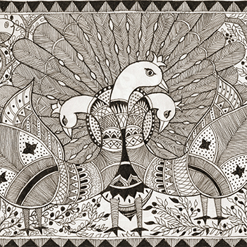
Learning Mithila Painting
by Vidya Bhushan
by Vidya Bhushan
A 25-year-old NGO run by Shasthi Nath Jha at Ranti in Madhubani, working for women's empowerment through the famous regional folk art. Providing utilitarian value to the art and generating livelihoods for local people Painting done on clothes, pots, toys, and puppets
Details >>
Visualizing Contemporary Bihar through Madhubani Painting
by Vidya Bhushan
Details >>
by Vidya Bhushan
Bihar has a very glorious past. Its past has had a great influence on Indian history. But over the decades, this glory of Bihar has been lost. Be it for reasons like politics, geography, development, or anything else, contemporary Bihar seems to no longer reflect its past. On the other hand, it is considered one of the most backward states in the country nowadays.
This project aims to understand the contemporary aspects and realities of social life in Bihar and depict them through Madhubani painting.

Bringing Life to Madhubani Painting
by Vidya Bhushan
by Vidya Bhushan
The project is an exploration of the possibilities of animation using the Madhubani painting style. The moments in animation are achieved using digital puppets. The narrative content is inspired by incidents from the Ramayana, like Taadka’s Vadh and Sita’s Swayamwar. Thus, the project shares the same spirit as Madhubani painting by adopting the commonly painted Ramayana’s theme.
Details >>
Intellectual Observers
by Abhey Singh
Details >>
by Abhey Singh
The world is changing, and with it are its needs and the ways to fulfil them. Jugaad, the concept of using traditional knowledge and combining it with good instincts and common sense, is fast catching on. There are numerous products like Mitticool, a $30 fridge, that are being designed daily by common people. These products are not only easy to produce but also cost-effective at the same time. This phenomenon has brought the process of design closer to the common man.
While a large number of these products have been uncovered in industrial design, very little is done to observe and execute this type of approach in Communication design. Through this project, we want to shed light on one such example of design by common people in the field of Communication design: the system of painting road signs on the highway by mechanics to guide people whose vehicles break down or get punctured. While visual appearance seems to be the most important ingredient of a communication design deliverable when it is taught at design schools, through such examples, we realise that aesthetics can be subjective in relation to the creator and viewer.

Internship at Pankaj Anand Photography
by Abhey Singh
by Abhey Singh
This project was done as part of my internship. I see an internship as an opportunity to work on real-time projects and as exposure to the industry. I want to work as a photographer, so I decided to work with a professional to gain hands-on experience. I am interested in travel, documentary and street photography, and photojournalism. I started with a retouching assignment, which was followed by assisting at a wedding and an exhibition. The training was not continuous, and in the breaks between the assignments, I did two projects: shooting roadshows at Banaras and book design in collaboration with Pankaj, mixed with my own interests. In total, I ended up doing five projects.
Details >>
Visual Narrative of the Coaching Capital of India - Kota
by Abhey Singh
Details >>
by Abhey Singh
Every year, more than a lakh students appear for entrance exams for engineering and medical institutions. The education system, which should nurture the aptitude of students for diverse fields, is a complete failure. This gap between the deliverables of the educational system and the demands of entrance exams, combined with the middle-class definition of success, which is becoming a doctor or an engineer, has fueled the development of entrance exam factories at Kota.
Kota, a name now synonymous with coaching institutes, was once known for reasons not even minutely related to coaching. It has now risen to become the coaching capital of India, with more than 200,000 students residing in this small city. Undergoing the emotional transitions of teenage life, these students work hard day and night to achieve a humble dream: a dream to enter a prestigious engineering or medical institute, a dream to become a doctor or an engineer, a dream to leave behind a financially constrained life, a dream that is the product of simple Indian mentality. Amidst such emotional and lifestyle challenges, a few of them succeed in getting into the premiere institutes. In fact, one-fourth of people who make it into IITs are products of one or more Kota coaching institutes. But this training to become the poster boy or girl does not completely shut out their dreams. These dreams, which may or may not be aligned with their duty to clear the entrance, are expressed in the form of scribbles here and there.
Through this project, I aim to explore the lives of students in Kota. I do not intend to show the "successful" or "unsuccessful" stories. I aspire to show the transformations a student undergoes while being factory trained to explore their dreams through the metaphor ‘The Last Page of a Notebook’. I do not wish to take the position of a judge and justify or criticise the coaching business. Rather, I wish to create sensitivity towards these emotional changes in an unbiased manner.

Parenting and its effect on children
by Abhey Singh
by Abhey Singh
A person is made of the impressions he accumulates during his life. Parents play a major role in creating these impressions. What if some of these impressions are not positive? These impressions can then turn into scars that haunt a person throughout his life. Once a child is scarred, he lives forever with the unanswerable questions of ‘Why me?’ or ‘What had I done to deserve this?’ Through this project, I aim to raise awareness and create sensitivity about the effects of bad parenting on a child.
Details >>
Relevance of pottery in today’s time
by Anupriya Kashyap
Details >>
by Anupriya Kashyap
Pottery in India and the Indian subcontinent dates back thousands of years. Pottery in the early settlements of the Indus Valley civilization was more of a utility than an art; in fact, it was a perfect combination of utility and art. Today in India, Pottery mainly thrives as an art form, and Traditional potters struggle to survive. So what is the reason, how does pottery today relate to each of us, and how will To help pottery survive in the coming times, the following is the topic that we have discussed and pondered upon.
Summer Internship at Bounce Communication Design
by Anupriya Kashyap
Details >>
by Anupriya Kashyap
With the increasing rush in metro life, we leave our beloved people and things almost daily. To keep them secure and be satisfied with their well-being. There is an increase in the need for home and business security cameras. The USP of the camera that the company is going to launch is that it is one of the most high-tech cameras with motion detectors, sensors, and an alarm system that is connected to a well-formed network. It also connects and shows the photos on our Android and iOS devices, has connectivity through WiFi, and is accessible through the Internet on the go.

Dog Vaccination and Healthcare
by Anupriya Kashyap
Details >>
by Anupriya Kashyap
Dog owners always wonder if vaccinations are truly necessary. Vaccines protect pets against contagious and potentially fatal diseases. But many cases of overvaccination and vaccination side effects have created fear among pet owners, and they prefer skipping it or Sometimes pet owners aren’t at all aware of the vaccination schedule and the core and non-core vaccines.
The purpose of this project is to provide dog owners with an Android mobile application that will help them plan a proper vaccination schedule for their pet. It will give them information about the various vaccines that can help them judge the crucial vaccines for your dog without putting your dog through any unnecessary discomfort. The project will also address basic healthcare issues and help the user locate the nearest vet, breeder, or NGO around a location.
Anticipating Unseen Delhi
by Anupriya Kashyap
Details >>
by Anupriya Kashyap
Delhi has a long history that has witnessed several dynasties come and go. Great kings longing to leave an impression on the city have given us a veritable treasure trove of monuments. Lal Qila and Qutub Minar are famous across the world. Delhi has a rich and old heritage to show and attract tourists from all over the world and across India too. Because I belong to Delhi and have lived there for almost 22 years, I have experienced and seen Delhi in a very different way than others. I have been to places that are famous as well as places that are not so popular but are part of our rich culture and heritage.
These are the places that somehow get hidden in the spark and reputation of famous monuments, markets, etc. As I have come out of Delhi and made friends from other states of India and abroad, I am still experiencing Delhi in a very different way when I start comparing it with the other states and wonder how different the two states of India can be. Talking to people from other states also gives a different perspective on Delhi, people have their own unique perception of places and people.
So I took on this project where I wanted to give a little glimpse of the experience they might have in terms of the crowd, culture, attire of people, and food through a docudrama. I wanted my first experience handling this medium to demonstrate the good and bad things about Delhi truthfully. a sort of docudrama, which is my own first-hand experience.

Word Image Relationship
by Ayesha Rana
by Ayesha Rana
The report establishes a relationship between images and text. It reflects the interaction of images and texts in multiple ways. The focus here is comics and shows how certain elements combine to make a perfect comic and how images make better visualizations than words.
Details >>
Summer Internship at Beard Design Studio
by Ayesha Rana
by Ayesha Rana
The branding was to be done for a client
that wanted to sell big and premium
peanuts from the city of Rajkot. They
wanted a brand that could get a recall value
of those close to Lays and Kurkure and
wanted to promote peanut as a healthy
snack rather than something which was
thought as a miniscule snack. The target
audience aged early 20s to so on.
The name of the brand could be anything
meaningful to something that just sounded
interesting.
The following branding process includes
deciding a name for the peanut brand with
all the secondary research to create a final
packaging for it.
Details >>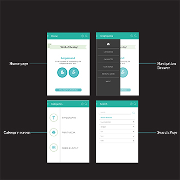
Graphipedia
A Dictionary of Graphic Design
by Ayesha Rana
A Dictionary of Graphic Design
by Ayesha Rana
The world is experiencing a mass evolution in science, technology, design and culture today. They are prime examples of cumulative cultural evolution, with each generation preserving and building upon the achievements of prior generations. The benefit of an evolutionary approach to these changes is- population thinking,
where broad trends and patterns are explained in terms of concepts. Design and technology constitute separate yet interacting evolutionary processes.Today there is a varied culture in design. With multiplying technology, new words are given birth to. They are registered and passed on to designers as a gradual process. But it is a lengthy affair and is impossible to know all the words in the field of Graphic Design. We fail to be acquainted to the simplest of words in the design world. Sometimes it is ignorance but a lot of times it is not being familiarised with the word itself. Hence we need to be informed. A personal experience during the Summer Internship led me to the thought of making a Dictionary of Graphic Design.
Details >>
Masini A Devanagari Display Typeface
by Ayesha Rana
by Ayesha Rana
Whenever I looked at big billboards, hoardings and any similar print or display media trying to leave an impression or making a statement, I often failed to see any beauty in the treatment of the Devanagari typeface in an otherwise painstakingly done visual artwork. The typeface most of them used were bolder
versions of existing fonts. I wanted to provide a beautifully done display typeface that would have the finesse to express the brand and leave an impression on the viewer. My journey with Masini started from my observations and culminated with the design of a Devanagari fat face which explores the play of negative and positive spaces to defne characters that are sublime yet striking at frst glance but
doesn’t compromise it’s legibility. The basic letter forms of the Devanagari script were studied thoroughly followed by hand lettered explorations using various tools and finally it was digitized.The name of the typeface is a tribute to my grandmother who was an inspiration to me.
Details >>
Imagery from Nature on Ceramics
by Gauri Karunakara Panicker
Details >>
by Gauri Karunakara Panicker
"Imagery from Nature on Ceramics," as the title indicates, involved a study of nature and natural forms and creating designs that are characterised by natural forms. A close observation of flowers, leaves, insects, animals, and natural elements and periods like night, water, daylight, air, and fire led to explorations with clay.
The underlying impetus for the project is somewhat similar to that of the Art Nouveau Movement, which arose as a response to the Industrial Revolution and often emphasised utility over aesthetics. The ease of access to diverse cultures in the 21st century makes it different from the period that gave birth to our times, which appears to be the unprecedented exploitation of nature and natural resources. How we relate to nature can shape our lives and those of the planet.
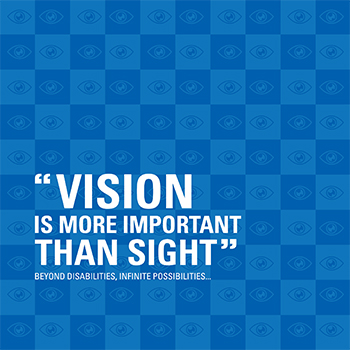
Summer Internship at EKansh Trust
by Gauri Karunakara Panicker
Details >>
by Gauri Karunakara Panicker
A good design helps deliver any message in a more appealing and effective manner. It can promote your brand, regardless of your business. I wanted to work on the visual design language and learn how it can affect the way we look at a particular company, organisation, or service.
This was the first time that I worked with an NGO. It was an experience where I had to make decisions while working and convince them why they needed the change. I made a visual language for EKansh that could bring more clarity and attention to the work they were doing and their communication media.

A report on understanding direction in movies
by Girish Kumar A M
by Girish Kumar A M
To understand the role of a director in a movie, I chose to study 12 Angry Men, an Oscar-nominated film made by acclaimed director
Sidney Lumet. Lumet’s book "Making Movies" was taken as a reference to understand the various techniques used by filmmakers to bring
a movie to life. In this book, Mr. Lumet dissects his own process of making motion pictures in 13 chapters.
Details >>
Summer Internship under Ronny Sequeira
by Girish Kumar A M
Details >>
by Girish Kumar A M
The objective of the summer internship was to understand light. Understanding light is the basis of all photography, for the word photography itself means drawing with light. I wanted to seek out and learn from someone who uses light extensively in all his work.
Light becomes even more critical in Fashion and Advertising photography, as the photographers in this realm are constantly trying to experiment and reinvent themselves. I tried to put myself in the photographer’s shoes and try to understand how he uses different sources of light, to what effect he uses them, and the adjustments he makes to get it absolutely correct.
I also gained insights into people management. The tact with which the photographer balances his client’s needs and his own creative urges It is also interesting to see the manner in which he negotiated with celebrities and their quirks. By the end of my 4-week internship, I had walked away with much more than just an understanding of light.
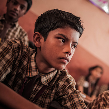
A Fictional Tale about loss of Innocence
by Girish Kumar A M
by Girish Kumar A M
Whenever a child commits a crime, the media blames violent movies, video games, and rock music. Why are there never questions raised about the kids’ childhood? The nature vs. nurture argument is used without a complete understanding of either. The worst part is that, in many ways, the kid perpetrating a crime is as much a victim of the same. His innocence is lost forever, and from that day onwards he will have to live with it, which will in many ways define the man he will grow up to be.
Details >>
Adaptaion of an Indian Author’s work
by Girish Kumar A M
Details >>
by Girish Kumar A M
Film has displaced the novel as the twentieth century’s most popular narrative form. Yet increasingly, there is a convergence of these two art forms in the sense that major motion picture studios are adapting bestsellers and writers are writing in ways that offer easy adaptation for filmmakers. Furthermore, the novelists are also getting involved in the pre-production of the movie by developing the screenplay of their novels.
This project is an attempt to understand key narrative functions and how the medium of film can be utilised to enunciate the emotion represented through words in the Novel into Visuals that speak to the audience.

Visual Ethnography: Sualkuchi
by Kavita Brahma
Details >>
by Kavita Brahma
When we talk about Indian Independence, The Khadi revolution marks a pioneering event in terms of freedom, empowerment, and equality. The Khadi revolution embraced the concept of discarding machine-made textiles and creating them at home.
This movement uplifted the concept of hand-woven or self-created textiles among many communities in India. This further led to the development of textiles inspired by the cultural and social environments to which communities belong and provided them with identity in terms of craftsmanship and creativity. One such community is the Sualkuchi community, which used the fibre to become their identity. Therefore, with commercialization and globalisation, they have ushered their identity to such heights that it has given Sualkuchi (Assam) the national identity of being called "the Manchester of the East".
This visual ethnographic study is an attempt to understand the socio-economic influence and struggle of the Sualkuchi community to keep pace with current trends and their traditional essence. This study talks about the complications of surviving and competing in the modern machinery world.
Summer Internship at Homegrown
by Kavita Brahma
Details >>
by Kavita Brahma
The report showcases the time spent and work done with a Start-up Online Publication Company called Homegrown: Young India’s Handbook to their Roots and Beyond, based in Bandra, Mumbai. The period of one month was marked as the internship project, which was meant to be the first gateway to experience in the industry. The time period for the internship was from May 6 to July 6, which is four weeks as per the internship guidelines set by the Institute.
The projects involved creating visuals (graphics and illustrations) from the reference content that was provided. All the projects were aimed at giving the content a new dimension, or rather, breaking the convention of the content. The language of the graphics and illustrations was very eccentric.

Multisensory Experiential Learning for Rural Kids
by Kavita Brahma
Details >>
by Kavita Brahma
Mathematics is a subject that is very closely related to, or rather, derived from, real life. Everybody practises math in each and every step, with or without realising it. For example, A vegetable vendor who might not have had any formal education uses it to sell the goods. In such cases, math is a functional concept that is being developed through repeated practise.
The formal education system also understands its importance and provides it in a very textual form in a book to young minds. The textual form might sometimes fail to help a child visualise how the same given problem relates to the environment. Since the text and the language also define understanding the concept to the core, this can be an issue in a multilingual classroom where the language used in the book is difficult to encode.
Therefore, the project aims to break the barriers of the book language and provide them with a supportive medium in real-life scenarios. The approach involves using elements from the child’s environment and creating them into deliverables such that they are interesting, surprising, and practical at the same time.
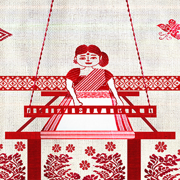
Handloom Textiles of Assam
by Kavita Brahma
Details >>
by Kavita Brahma
The aim of the project is to explore Assam’s handloom textile motifs as a visual medium for coded messages. The idea is to understand the motifs as a form of communication by the weavers towards the person they are weaving them for. The attempt was to understand the deeper meaning of the distinguishing elements and use the symbolism to depict a story using an amalgamation of the existing traditional technique of weaving with digital art media.
The concept of reviving a traditional medium with the new-age technology of digital media was thoroughly explored. This attempt could provide the different artists, designers, and weavers with a perspective on seeing their practise at a more scalable and experimental level. The project saw growth from an attempt to first understand the motifs to search for a story and then the struggle to understand and learn the traditional technique of weaving to modifying it using digital software to developing a product in terms of a book and further enhancing it to create a 2D animation.
The future of this project could be a series of stories that could be gathered from different parts of the State and compiled through the common loop of the weaver as the main connecting point to each story. For example, The weaver could weave a different motif or a group of motifs and tell a different story every time.
Traditional Artefacts
by Pooja Masurkar
Details >>
by Pooja Masurkar
Chhatrapati Shivaji Vastu Sangrahalaya and Dr. Bhau Daji Lad Museum have various artefacts on social interaction. The following report exemplifies various types of artefacts used in India. The artefacts documented in this report are: i) jewellery boxes; ii) Vases, Jars, and Flasks iii) Coins; iv) Trays; v) Miscellaneous Artefacts

Summer Internship at Tata Cosultancy Services(TCS) Innovation Labs - Mumbai
by Pooja Masurkar
Details >>
by Pooja Masurkar
This project would help put technology within reach of rural people and boost their economies. It would further help in bridging the rural-urban divide by enabling self-sustainable rural development by catering to their communication needs. This report is a documentation of the research and study on the existing mobile digital application, Gappagoshti, for rural areas. Problems and solutions for the same have been reported after studying the given screenshots and mock file of the mobile application. Another aspect covered in this report is the study and research on mobile phone utility in an urban household scenario. The problems regarding the same have been reported after surveys and experiments. After analysing the collected data and studying the urban phone usage scenario, solutions and scope for improvement have been suggested. The interface design, information structure, and visual design for mobile banking have also been designed as part of the project.
Transportation in IIT
by Pooja Masurkar
Details >>
by Pooja Masurkar
Narrowing down the scale and focusing on one of the solutions to the problems surrounding the transportation issues on campus, this project is an attempt to redesign the existing digital interface, i.e., a website that works on various devices such as smartphones, tablets, and desktop computers and enables a person to search for the most convenient route to her or his desired destination.
The core aim of the project is to empower the end user to save time travelling from one place to another within the campus so that she or he can be more efficient in her or his work. The redesigned interface would enrich the user’s experience using digital media while navigating through the campus in the real world by pinpointing accurate directions and precise timings at which the user will reach the destination.

Learning an Indian language as a foreigner visiting India for a short duration
by Pooja Masurkar
Details >>
by Pooja Masurkar
This project aims to build a product that enables foreign tourists visiting India to learn an Indian language spoken in India, i.e., Hindi. The target audience of this product is tourists visiting India for a short period of time, falling in the range of one week to one month. Hence, the user research, study of competitive products in the market, and design of the product were done keeping in mind the needs of this target audience. The design goal is to enable overseas visitors in India for a short duration to converse in Hindi for at least one minute. The process of designing included user research, field visits, study of competitive products in the market, ideating several concepts, understanding the context, imagining scenarios, planning the conversation, system design thinking, interface design, execution of the final product, and evaluating the same with users.
The features of the final product include audio output, translation, vocabulary building, basic grammar, and access to a wide range of phrases and sentences that can be used in common situations that users might encounter during their stay in India. These features integrate the functionality and form of the product. The design focus of this project is the efficient functioning of the product, wherein the purpose of the product and content are supreme. The ideation of the final design concept considers factors such as the time constraints of the visitors, their journey route, and access to the learning application during the same. It complies with responsive design principles and can be accessed on all devices, such as a desktop computer, tablet, or smartphone.

Dadar Flower Market: A Visual Ethnography Project
by Shubhangi Salinkar
Details >>
by Shubhangi Salinkar
I visited Dadar Flower Market almost daily. Initially, I was a passive observer and hesitated to intervene in the flurry of activities that were taking place. But I started striking up conversations with the flower sellers bit by bit, and in their free time, they started having conversations with me. I observed it at various times in the day, noticing closely how the activities took place, like garland making, selling, wholesale supplying, clearing, stocking up, etc. I also observed the connections between the various flowers being sold and the market itself: they are intrinsically associated with the time of year, festivals, day of the week, type of buyer, etc. I also observed what was sold in addition to the flowers: leaves, garland-making supplies, and various types of leaves.

Summer Internship at Avalokitesvara Trust
by Shubhangi Salinkar
Details >>
by Shubhangi Salinkar
Ladakh is one of the most geographically isolated regions in India. Education in Ladakh is a relatively recent phenomenon. Across an area of about 60,000 square kilometres, that is, Ladakh, about 981 schools of different sizes and categories struggle to exist. Schools in Ladakh belong to three major categories: Private Schools, government schools, and monastery Schools.
The common thread that runs through the different categories of schools across Ladakh is a lack of exposure to the outside world for students and teachers alike. Today, various NGOs are working with Ladakhi schools, providing valuable material resources and sending volunteers to teach the children.
The basic aim of the film is to reach out to the educated people of the country and get them to volunteer in the schools of Ladakh. By documenting the types of schools, the problems they face, and the environments they have, the film is an effort to educate people across the country to spend their time and whatever knowledge they have, with the schoolchildren of Ladakh.
Reconnecting Urban Children with their Natural Environment
by Shubhangi Salinkar
Details >>
by Shubhangi Salinkar
Nature is fast losing its place in the lives of urban children. The urban child's exposure to nature is largely virtual, through television, the internet, movies, and books. Spending time in nature has been documented to improve a child's life and learning in many ways. Out of the few situations in which urban children do spend time in nature, nature trails were found to be fairly prevalent.
This project aims to create a set of resources to give children a less structured, more enjoyable, yet informative nature experience without a field expert's presence. A self-guided nature trail is conceptualised. Anyone with these resources may initiate their own nature trail. The area selected for the sample nature trail and resources is the IIT-Bombay Lakeside.
This set of resources forms a kit for children, termed as The Little Explorer Bag. It consists of the following items, specifically designed for use by children: A Field Guide for specie identification, an Activity Book, which contains a set of thoughtfully designed, trail-specific activities and information nuggets, a Trail Map of the IIT-B Lakeside Area, and other resources to enable the group to plan and create their own nature trail. It is recommended for an adult to accompany the group of children on the Nature Trail. The use of the kit will enable the children to have an informative as well as an enjoyable nature immersion experience and might act as a trigger to generate sensitivity towards nature in children.
Tool for Foreign Nationals to Learn Sentence Building in Hindi
by Shubhangi Salinkar
Details >>
by Shubhangi Salinkar
Over the past few years, more and more people of foreign nationalities have moved to India for purposes other than tourism. In order to feel integrated with the local culture, they often find it necessary to learn the local language. Hindi is widely spoken as either the first or second language across North, Central, and some parts of Western India.
English-speaking foreign nationals face many difficulties in trying to learn Hindi. One of the major difficulties is that the grammatical structure of Hindi is very different from that of English, making it difficult for them to pick up the language without learning the Grammar. Grammar is essential when it comes to sentence-building. It defines the rules by which words come together in a sentence. The identified problem was that the users found it difficult to build sentences with the vocabulary that they had learned or might learn along the way. The objective of the tool was to come up with a sentence-building tool that would help learners internalise grammar rules. Along with building sentences, learning another important skill required by the users—speaking—was also part of the tool.

To make a guideline to revive a letterpress Devanagari Typeface
by Snehal Patil
Details >>
by Snehal Patil
Classic typefaces are the ones that everybody wants to use over and over again. They are beautiful, and even in today’s day and age, they stand for whatever they were designed for decades ago. Because of the limitations of technology, we might not get the chance to use them in our designs today and treat our eyes to their visual richness. Most of the time, these classic typefaces are found in letterpress punches, photo compositions, or detailed drawings on paper. To use them, we need to revive them from these various mediums in the current digital medium. This serves as an attempt to understand the design thinking behind the creation of classic typefaces.

Summer Internship at Beard Design
by Snehal Patil
Details >>
by Snehal Patil
The Iconomic Meltdown is an event organised by Team Beard Design. It is for enthusiastic Designers who are keen on Designing icons. Icons, especially with Indian aesthetics This Event aims at creating a pool of icons that are free to download and use. This event provides designers with a platform to Design icons in an Indian Scenario. It also provides a collection of new-age, funky Indian Icons.
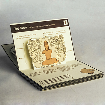
Design for a unique experience at Elephanta Caves
by Snehal Patil
Details >>
by Snehal Patil
Historical places in India are visited by all age groups and have become popular tourist spots. It is a gateway for us to connect to the past and learn from our glorious heritage. Most of these sites have tourist guides or information booklets for assistance. Tourists hardly resort to these resources, which are available. The reason is that there is no check on the credibility of the guides, and the information displayed on the pamphlets is not interesting enough for the tourist.
Elephanta Caves is one such beautiful heritage site that needs an information revamp. The aim of this project is to develop an experience for tourists that will be memorable and informative.

Designing of a geometric devanagari typeface in multiple weights
by Snehal Patil
Details >>
by Snehal Patil
The needs of graphic design change over a period of time. Typefaces are designers tools to create strong visuals for flawless communication. There is a growing need for fonts in multiple weights that cater to the requirements of different platforms. Typefaces are generally classified according to their wide usage in text and display. One of the objectives of this project is to bridge the gap between text and display typefaces. So that the requirement can be met with only one font family.
A brief study of devanagari letter structure helped in form exploration. Various calligraphic tools gave direction for creating potential designs. A set of styles for the letterforms was selected to set a guideline for the characteristics that would suit the needs of the project. One such exploration was of geometric rounded letterforms. It proved to be a distinct and interesting approach that could possibly meet the purpose of the project.
A working typeface in three weights, i.e., light, medium, and bold, was created. This typeface is legible in text at small point sizes and is attractive at display sizes. The name of this geometric devanagari typeface is ‘Acacia’.

Imagery from Nature on Ceramics
by Upasana Gadgil
Details >>
by Upasana Gadgil
Ceramics has always been a subject of interest to me. Coming across a well-equipped ceramic studio in the Industrial Design Centre during my master's programme raised my excitement to play with clay and make things, which otherwise I would only sketch in my notebook. Imagery from nature on ceramics is a theme taken for a design research seminar project with the intention of understanding how the things we use today are inspired by nature. The beauty of any aesthetically appealing object made by man is indirectly a creation of God since this whole universe is his creation.
Studio work has been a major part of this project, where I experienced the pleasure of making my own clay objects that can actually be used. Made tiny mugs, tiles, jewellery, and other articles. While exploring the methods and techniques to make quality clay articles, I also thought of how making such usable clay articles would benefit small potters in the villages located around Mumbai city and help them earn a better livelihood. This report outlines the detailed design process being followed while creating the clay articles.
Summer Internshipt at Intuit
by Upasana Gadgil
Details >>
by Upasana Gadgil
I chose to work for a product company because I thought it would be a completely new experience for me in terms of understanding the product, its users, and their needs, the design process being followed by the company, dealing with strict deadlines, and working in a team.
I wanted to work on a project that would go live. And this was the main reason I chose "Insights Homepage" as my project, which has a huge scope to work upon. There was a wide scope to improve the user experience, for which I could use my course learning, skills, and knowledge.
This report outlines the design process that I have followed for all three projects. From finding a problem to coming up with an appropriate solution, the details of all the stages are put down clearly so that the reader gets a complete understanding of the end-to-end design process.
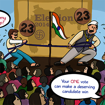
An Introduction to the Indian Parliament for the First Time Voters
by Upasana Gadgil
Details >>
by Upasana Gadgil
The Parliament of India is the supreme legislative body of India. The Indian parliament comprises the president and the two houses, the Rajya Sabha (Council of States) and the Lok Sabha (House of the People), which form an important part of our Government System in India. The government of India is the backbone of the country. Every procedural aspect of an Indian citizen’s life is linked directly or indirectly to the Government system. I chose to work on a political science subject for my project because I thought this would be a great opportunity to motivate myself to learn and understand the subject.
I wanted to work on a project that would help people in real life, and the topic that I have chosen, "Parliament of India," gave me a huge scope to work upon. There is a wide scope to improve the transfer of required and important knowledge to the target audience, for which I can use my course learnings, skills, and knowledge.
This report outlines the design process that I have followed throughout the project. The details of deciding a topic, defining the target audience, finding out the problems, and coming up with a set of possible solutions for the same are laid out clearly so that the reader gets a complete understanding of the end-to-end design process.
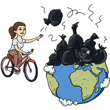
KAUN KAREGA SWACHHA BHARAT? - Can IITB be a Zero Waste campus?
by Upasana Gadgil
by Upasana Gadgil
The project gets its impetus from the 'Swachha Bharat Abhiyan' launched by the Prime Minister of India. Since the task of keeping metropolises, cities, towns, and villages clean is a challenging one, the project attempts to understand some of the different dimensions of such a mission. It then examines two contexts: one that has to do with aspects of cleanliness in the immediate environment, i.e., the campus of IIT Bombay. The second one is the village of Vavoshi in the Raigad district of Maharashtra. The communication design sought to be developed through the project focuses on wet waste management on the campus of IIT Bombay.
Details >>
Heuristics for Evaluation of Educational Application- (Let’s Find Letters) for Children with Dyslexia
by Harshita Bandodkar
by Harshita Bandodkar
According to the Dyslexia Association of India, “Dyslexia is a neurological condition that is characterised by difficulties that mainly affect the ability of a child to read, write and spell”. Even though there are multiple detection centres and correction facilities available, most cases go unnoticed, as they are expensive and unaffordable for people from lower economic classes, which leads to most children dropping out of schools in pursuit of manual labour after being deemed as ‘not so bright’. ‘Let’s find letters’ is an application under development designed by Poonam S. Wagle, a communication design student, and Sasupilli Madhuri, a computer science student currently pursuing a PhD on developing educational aids for children with dyslexia. The application's ongoing development necessitated a heuristic evaluation. This paper presents a heuristic for evaluation of educational games for children with dyslexia in India in terms of usability, game experience and pedagogy. This has been achieved by a comprehensive study of existing heuristic evaluations for computer games, mobile games and educational games. This paper also explores some myths and assumptions researchers may have about dyslexia, as the pedagogy of this category of games depends on it.
Details >>
Greysprings Software Solutions Private Ltd.
by Harshita Bandodkar
by Harshita Bandodkar
Greysprings Software Solutions Private Ltd. was founded by a team of alumni from IITs and NITs. They develop educational computer games for children that cater to kids of the age group 2-10. They believe that a right blend of technology and creativity can create such products which can not only make learning fun for kids but also open new dimensions to kids’ perception towards education. Their mission is to revolutionise education with the help of technology, making it simple, experiential and available for the masses.
Details >>
Map and information booklet for Kanheri caves
by Harshita Bandodkar
by Harshita Bandodkar
Kanheri Caves in Mumbai are a group of 129 rock-cut caves of Buddhist origin. These caves have around 100 inscriptions and served as an important Buddhist settlement. Due to their large number, visitors do not always visit all of the caves and also don’t have enough information about their origins and significance. Most of the information given by guides is usually misguiding and incomplete. The caves also depict mythological stories which are hard to be deciphered by uninformed visitors.
Details >>
Understanding the self using embroidery
by Harshita Bandodkar
by Harshita Bandodkar
Often one finds oneself adrift with thoughts, doubts and uncertainties, indecisive of how to proceed and filled with questions about how one got there. I found myself in a similar flux a couple of years ago, disconnected with myself, unsure of what I wanted, looking for an escape and procrastinating work. As I started trying to understand why I felt so, reading and looking up more information, I found that I was escaping from myself, avoiding spending time with myself and introspection. This project is an exploration into the self, spending time with my thoughts, pondering on the topics I have hitherto been dodging via the medium of embroidery. I hope that the project would provide some insight and encourage another who might find themselves in a similar plight to take a journey of their own.
Details >>
Using analogies to increase the comprehension of AV medium for instructions in mountaineering for the indigenous people of the Northern Himalaya
by Hassan Kumar Gundu
by Hassan Kumar Gundu
The northern Himalayan belt is a hub for adventure activities such as trekking and mountaineering in the country. This enables the indigenous people residing in these areas to pursue a career as a guide in these activities. But they are often restricted because of their limited knowledge involving the technicalities of these sports, even though they have acquired a certification in the same from one of the mountaineering institutes in the country. A similar experience was encountered when the author was pursuing a course in mountaineering from one of the institutes where it was observed that these indigenous locals are unable to grasp certain concepts of mountaineering, mainly due to their low proficiency in English and flawed educational background. This acted as a hurdle in their learning during the course. Which, if left unaddressed, can lead to accidents causing injuries and even loss of life in the future when these people take on the responsibility as guides themselves. In an effort to tackle the same, in this paper we talk about our efforts to explain one such concept of friction involved in making a clove hitch (a type of knot) in mountaineering using an instructional video created by us. Further, we discuss the issues encountered during the same and how we dealt with it by using analogies derived from the everyday context of these indigenous people.
Details >>
Schlumberger- User Interface Designer at Schlumberger- Pune India Technology Centre
by Hassan Kumar Gundu
by Hassan Kumar Gundu
The search for an internship was a tedious task. The options were to intern with a designer, artist, design firm or an organisation. Also having enrolled with the placement cell at IIT-B, I was able to land an internship as a user interface designer (UI designer) with the oilfield giant Schlumberger. Schlumberger is the world’s leading provider of technology for reservoir characterisation, drilling, production, and processing to the oil and gas industry. The objective of this internship is to gain knowledge through real-life experience in various areas of user interface design while keeping the end user in view. To understand the overall functioning of a corporate enterprise along with the roles and responsibilities of a UI designer in this setup. To work and deliver creatives as per the briefs and deadlines.
Details >>
Training and Teaching Aids In Mountaineering- Instructional Videos on Rope Work
by Hassan Kumar Gundu
by Hassan Kumar Gundu
Mountaineering is an extremely dangerous sport. It found its roots in India in the 1960s, and from there on, it kept growing constantly. Initially, the institutes which provided education to the people enrolling in these courses were meant to cater to the military forces of the country. But, ever since northern Himalaya became a centre of attraction for adventure sports in the country, the institutes opened up for civilians too who want to venture into this field. The people who are the most dependent on them are the locals, as it gives them an assurance of better livelihoods after the course by becoming trek leaders, climbing guides, etc. But, there is a huge mismatch in the comprehension of the locals attending these courses and the way in which the instructions are given. This often leads to half-knowledge and learning difficulties for these people. Because the methodology carried out here is mainly in line with the military personnel who have a basic form of education, whose comprehension is way higher when compared to the locals.
Details >>
Internet Sex Addiction- Addiction To Internet Pornography
by Hassan Kumar Gundu
by Hassan Kumar Gundu
Whether we acknowledge it or not, sex is an integral part of human life. The irony is that, even though we are the second largest population on the planet, sex is still a taboo subject for us. Existing sex education is not sufficient for understanding sexuality, and it happens that many learn about sex from pornography. Such distorted understanding doesn’t result in a balanced outlook of human sexuality. There are many discussions and debates about the impact of pornography on the increasing rate of violence against women. Besides, consumption of pornography can turn into an addiction which affects the personal growth of a young individual. This project looks into this aspect of addiction and how it can work against the individual and his well-being.
Details >>
Sound Symbolic words in Indian comic books- A study on textual representation of sounds in comic books
by Ishu Kardam
by Ishu Kardam
Sound symbolic words (SSW) are the visual representation of the sounds in comic books. It helps the reader to imagine the ambience of a particular panel in the comic and hence plays an important role in enhancing the mood of the panel. Consider examples such as CRASH, DHADAM, BOOOMM, and so on. An SSW is designed by two elements: (a) the form, i.e., the visual representation of the SSW, and (b) the word itself that represents the sound. This paper focuses on the following topics: 1) The determination of a suitable SSW for some common sounds through a survey. 2) An individual study of SSWs in the comedy genre of Indian comic books. For the first topic, forms were created for the survey and were distributed online and offline to take inputs from participants. The forms were then analysed based on the data received. For the second topic, a bunch of Indian comic books (mostly Raj comics) of the comedy genre were studied, and observations were recorded.
Details >>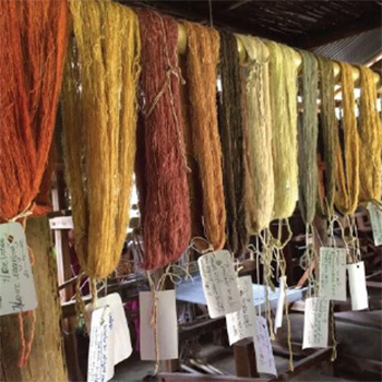
Summer Internship Project- Echostream Pvt.ltd
by Ishu Kardam
by Ishu Kardam
ECHOSTREAM is an evolving community of designers, dreamers, and doers with professional expertise in industrial and communication design. It started as a collective which aimed to provide design services to the government of Sikkim and communities with the prime focus on larger development agendas in capacity and assets in Echo stream to take on the challenges of a start-up in designs.
Details >>
Development of Educational Aid for Game Design
by Ishu Kardam
by Ishu Kardam
Gamification has been practicing in various forms across disciplines like education, learning, conveying messages, business, and marketing. Currently, education and learning are some of the most dominant and widespread forms of gamification. Here we explore the scope of gamification in the game design course itself and how physically gamified coursework could be better than digital learning. The aim of the project is to replicate game design coursework into a physical medium such that the essence and the message remain intact, but the form changes in order to add the interactivity. The idea is to combine coursework with the engagement of a board game, which gives the essence of a book but also the experience of a board game to compete with the digital platform of learning, including the accessories and elements of coursework.
Details >>
Communication in Healthcare Demystifying Sleep Paralysis
by Ishu Kardam
by Ishu Kardam
In recent times, the Internet has emerged as a platform for sharing experiences and expressions across the world. People use the Internet to seek help and to help others. Even in the medical and healthcare industry. However, with this ease come the consequences, and the authenticity of information on internet is questioned. The same comes with the role of art and self-expression to others. Rare topics like hallucination, sleep paralysis, and lucid dreaming came into being and reached the general public with the help of the internet and art projects. On one hand, it helps people to an extent; on the other, it turns to alter perspectives. The sensory experiences from hallucinations are more likely to distress people, and they start holding supernatural beliefs, which also gives rise to religious preachers to misguide people. In this project, all the aspects were investigated, how incomplete or wrong information can cause fatal circumstances. This project, based on studies of psychological health by specialists and personal and shared experiences of hallucinations by people, is an attempt to create a graphic journal on sleep paralysis. This journal is intended to create awareness and influence people who are suffering from sleep paralysis and hallucinations. The journal aims to make an impact on those people who refuse to express their experiences and suffering from any fear to some extent.
Details >>
Sound Symbolic words in Indian comic books- A study on textual representation of sounds in comic books
by Mayur Chaure
by Mayur Chaure
Sound symbolics (SSW) are the visual representation of the sounds in comic books. It helps the reader to imagine the ambience of a particular panel in the comic and hence plays an important role in enhancing the mood of the panel. For example, CRASH, DHADAM, BOOOMM, etc. An SSW is designed by two elements, (a) the form, i.e., the visual representation of the SSW, and (b) the word itself that represents the sound. This paper focuses on the following topics: 1) The determination of a suitable SSW for some common sounds through a survey. 2) An individual study of SSWs in the comedy genre of Indian comic books. For the first topic, forms were created for the survey and were distributed online and offline to take inputs of participants. The forms were then analysed based on the data received. For the second topic, a bunch of Indian comic books (mostly Raj comics) of comedy genre were studied and observations were recorded.
Details >>
Work under cinematographer Santosh Thundiyil and director Suresh Eriyat on commercial project
by Mayur Chaure
by Mayur Chaure
I wanted to work with a cinematographer, and I got the opportunity to work with a gifted cinematographer from the Indian film industry, Mr Santosh Thundiyil. After getting a post-graduation diploma from FTII Pune in cinematography, he started his career as a cinematographer with the Bollywood film “Kuch Kuchota Hai (1998), and then he gave so many hits like Krish, Rustom, Kaal, etc., in Bollywood, and also he did many regional films, advertisements and documentaries. He got the Filmfare Award and the Asianet Award for Best Cinematography. The director of this project was Suresh Eriyat; he is a well-known Indian animator, director and producer. He did his postgraduation at NID Ahmedabad in animation. He started his own studio, Studio Eeksaurus; under this studio, he did lots of TV commercials and short films. Mr Suresh Eriyat got two national awards, one for “Fisherwoman and Tuk Tuk” (2016) and “Tokari (2018). Along with this, he got too many national and international awards for his work. He is known for his experimental style and techniques. I am feeling very glad that I worked with these two maestros. It was a great experience with them to understand how the film industry works.
Details >>
Satyacha Rang
by Mayur Chaure
by Mayur Chaure
In this digital era, gadgets have become a part of human life. Social media helps connect different corners of the world with a snap of a finger. Social media is misused as much as it is used judiciously. Posting and forwarding hoax messages, rumours, fake news and fake information is one such misuse, which quite often results in violence, riots and loss of human lives. Sentiments take over conscience and harmful decisions are made without verification and further investigation. My story is inspired from one such incident that happened in India, where people lost their lives because of the hoax message. It can be a dilemma whether social media is useful or not, but it can be said that it is up to an individual to decide how they could deal with these kinds of situations. The film being expressive, full of emotions and information, is a good way to communicate and express my thoughts.
Details >>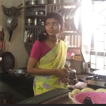
Aai ani mi- Fictional Short Film
by Mayur Chaure
by Mayur Chaure
It is essential in our lives to grow up with both parents, with their love and their support (financial, mental and emotional), which helps us to grow and stand on our feet. But when one of them does not exist in a child’s life, what then? Then it becomes difficult and more challenging for both the single parent and the child. This happens very often; we see families like this in our neighbourhood, among our relatives, friends and in our society, but it is very difficult to know all their problems. This film is an attempt to shed light on the problems related to single parenting faced by both parent and child.
Details >>
Reinventing Identity of a Cinematographer
by Mrinal Biswas
by Mrinal Biswas
In the history of any art form, cinema made the biggest impact, covering the most widespread audiences with the least amount of time. In 1896, the dawn of filmmaking, Georges Méliès invented the “cut”, and the magic began! Instead of just some moving images, cinema got its own language. And now, after 100 years, when we have 360-degree filmmaking techniques, we are still not clear what to do with it. The basics of filmmaking technique are again now on challenge. Right now we have to rewrite the whole language, from the point of light to composition, editing and even storytelling. So-called specific rules are not usable right now. Possibilities are infinite; only we have to find out the most efficient way. In merely a hundred years it has changed so drastically that to make a comment on any form and substance of film is exceedingly difficult. Though the change is substantial, as Soren Kierkegaard said, we can only understand something by looking backward, though we lived forwards. So if we want to understand the future, we have to look back and try to find out the pattern of the whole process.
Details >>
Summer intenship on digital film editing
by Mrinal Biswas
by Mrinal Biswas
The main aim of this internship was to learn about digital film editing as well as get an exposure to the film industry and get an overview idea of how all the departments with different skills work together. During my studio visit I got an opportunity to know about the approach towards the whole filmmaking process, which was an eye-opening experience.
Details >>
Indian Society- Past, Present and Future
by Mrinal Biswas
by Mrinal Biswas
We adopted our constitution to make our country a sovereign, socialist, secular, democratic republic. These were the initial steps taken by our political leaders. In the last two decades of the 20th century we decided to move away from the ‘licence-raj’ and opened our market to the forces of globalisation. But where do we stand in the second decade of the 21st century? Did we solve our initial problem in a significant way? This project attempts to understand Indian society since independence.
Details >>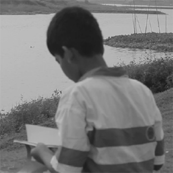
An experimental film on Alienation
by Mrinal Biswas
by Mrinal Biswas
The term “alienation” means a feeling of exclusion, coming apart of essence and existence. As human beings, we are always trying to achieve a better quality of life. However, in modern society, we do not seem to exercise a will or consciousness or design. We just do as we are told. We act in a mechanical way. Although human beings are essentially productive, this system moulded us in such a way that we feel most human when we are away from work. We feel human by means of consumption, which is a parody in itself, making us as similar to other beings possessing the same qualities. Due to this, the most important quality, the ‘creative’ part of us is being ignored. Any form of human creativity can lead to an eventual improvement of a skill/art, but in the assembly line-structured systems, that’s not possible. In such a system, we may achieve increased production; however, if we value human life solely based on economic profits, we significantly limit our potential. In this project, I attempt to address some basic problems of alienation which are well known around us. Though those problems are not clearly identified as major life-threatening issues of our society, the number of people who are suffering from this state is not negligible.. As an outcome of this project, I have chosen to use a short movie as a medium to communicate my thoughts.
Details >>
A study on WhatsApp Usage variation across age groups
by Nandini Bhosale
by Nandini Bhosale
In the age of smartphones and internet connectivity reaching every person, digital communications have become an integral part of almost everyone’s lives. WhatsApp is one such internet-based messaging and communication platform available as a free application and widely used in India. In this report, a study of Whatsapp usage variation across age groups has been presented. Quantitative interviews were conducted across participants of different age groups ranging from 12 to 72 years to investigate the frequency of usage of messaging and also the various document-sharing features and chat features provided by WhatsApp. Data is represented graphically, compared and analysed. This led to a brief overall understanding of how people from different age groups appropriate the use of the various features provided in WhatsApp Messenger.
Details >>
Internet Design Zone
by Nandini Bhosale
by Nandini Bhosale
The app icons and their screenshots displayed in the already overcrowded online application stores are extremely crucial. In split seconds they create impactful impressions and can directly affect the purchase rate of the app. Under the digital marketing space, the main area of work for me was designing icons and screenshots appearing in the App Store and Play Store for those apps created by the company. This included studying the various existing game icons and screenshots in these online stores and generating the essential ideas for the same for the given games. Also, some areas of Content Development for ASO (App Store Optimisation) and creative writing were covered.
Details >>
STARING- Understanding the Misunderstandings
by Nandini Bhosale
by Nandini Bhosale
With a slight flavour of the #metoo movement running in the backdrop, ‘Staring’ is chosen as the representative topic of concern in this project. The intention to do this project is bilateral. For one side, it is to enhance sensitivity amongst us so that we are more aware of how our actions in public might be negatively affecting someone around us without us even realising and hence, act consciously. For the other side, it is to amplify the level of consideration amongst us so that before we immediately jump to conclusions, judge and take action against something that disturbs us, we give it a thought from the other person’s perspective too. This short narrative, in the final form of a photogenic novel, hopes to shed some light on the above grey issues and foster understanding of the misunderstandings that could happen anytime.
Details >>
Social Acceptance of Homosexuality in India
by Nandini Bhosale
by Nandini Bhosale
I was inspired to take up this topic after I had a deep discussion with two of my close batchmates, Meera (who is a lesbian) and another guy friend (who is gay and doesn’t want to be named). Even post-decriminalisation of homosexuality, her parents were not ready to accept her and her girlfriend’s relationship, and on top of it, they were forcing her to marry a guy as a solution to avoid the social pressure. It was drastically affecting her personal as well as academic life here, and it left me disturbed with a question: Which is a bigger weapon? The law? or the social prejudice that still exists in varied extents throughout the country. Decriminalising Section 377 is surely a progressive step that has brought about a huge positive wave of change in our country. But still, there exist many who are yet to be a part of the change and are still holding on to their preconceived myths about homosexuality instead of actually knowing more about it. Many blogs written post-decriminalisation state that it’s still a ‘battle half won’ until the social prejudices vanish. The struggle to win the other half still continues, and I genuinely wish to contribute to it through my work. We usually like to follow the natural rhythm that has been already set by the society for us. Going against it or choosing to differ takes courage, especially if one has already spent most of their life abiding by all the set rules, which is the case with most Indian parents.
Details >>
Critical analysis of the Indian currency design from the perspective of visually impaired
by Prem Sonar
by Prem Sonar
Observation and research of visually impaired people dealing with the exchange of banknotes with a mixture of old and new designs. It also includes their habits and behaviour as well as tricks and tweaks for identification of denomination. The paper portrays the current situation of visually challenged people while exchanging currency and analyses the new design of the currency (Visual + Product) and its usability and utility, considering the amount and type of population we have.
Details >>
Graphics Beyond
by Prem Sonar
by Prem Sonar
The main aim of this internship was to learn and explore details of wayfinding and signage and its installations. Graphics Beyond, III being specialised in Public Information System Design and Installations, it helped me to study in this particular area. Then I got a chance to visit the workshop where all designs get produced as per the required scale. There I got to study materials used for installations. I also worked on the typography area, where I worked on personalised stamps and identity, and then I worked on the packaging. The place was full of a lot of books; I got a chance to read most of them. Overall, it was nice learning. I got introduced to many real-time problems which usually occur in workshops as well as while installing them, which the designer should attend while designing.
Details >>
Re-Designing Brand Identity Of Raja Dinkar Kelkar Museum
by Prem Sonar
by Prem Sonar
Museums always have been unbiased teachers, as they are open to everyone regardless of class, race, gender, caste or religion. I believe that they are a portal to the past and a bridge to the future. We always have been talking about aesthetics, forms, metaphors and concepts of ‘Western culture’ while referring to design. I recently visited the Raja Dinkar Kelkar Museum in Pune and was fascinated to see the variety of artefacts one single museum could have. I would urge every designer to visit this museum at least once. It triggered to me that the museum needs some boosting, as most of the audience are unaware of its amazing collection. The collection consists of musical instruments, Mughal lamps, paintings, carved palace doors, a pottery collection, and vessels made up of terracotta, copper, iron, and even brass. Each and every object displayed reflects the mastery of the craftsmen who designed them. The project will be a rebranding design exercise which will give the museum a new face. The exercise will include creating infographics that will turn the museum into an informative exhibition rather than just a display of historical artefacts. The project also looks forward to creating way-finding solutions for the existing museum building to increase ease of navigation. This project will be an attempt to bring forward the Kelkar museum with a new face. The project will also focus on informing people about the richness and beauty of Indian craft.
Details >>
Communication in Civic Sense
by Prem Sonar
by Prem Sonar
This started as a project about love and patriotism about our country. But in the initial stage of presentation and studies, I understood that love and patriotism are very personal, and everyone has their own political preferences. Children and youngsters have their own definition of love and patriotism for the country based on their surroundings. The idea was then narrowed down to why is my country not clean, not disciplined, and not punctual, and why is there a ‘Chalta hai’ (it’s okay) attitude, which I think is the base of many problems we face in our daily routine? How do we introduce these problems to children of developings? That was the challenge I accepted and started working on. While talking to the children, I came to know that they do observe things happening around them but do not understand why people behave like that! After talking to the adults, they were unconcerned about this issue, saying that in India that’s how it will be. As a witness to these weird behaviours I face every day, I decided to study and portray different angles of Indian socio-culture and civic sense in front of children so that they will grow up to be responsible citizens in the coming years.
Details >>
Heuristics for Evaluation of Educational Application- (Let’s Find Letters) for Children with Dyslexia
by Priyanka Purty
by Priyanka Purty
According to the Dyslexia Association of India, “Dyslexia is a neurological condition that is characterised by difficulties that mainly affect the ability of a child to read, write and spell” . Even though there are multiple detection centres and correction facilities available, most cases go unnoticed, as they are expensive and unaffordable for people from lower economic classes, which leads to most children dropping out of schools in pursuit of manual labour after being deemed as ‘not so bright’. ‘Let’s find letters’ is an application under development designed by Poonam S. Wagle, a communication design student, and Sasupilli Madhuri, a computer science student currently pursuing a PhD on developing educational aids for children with dyslexia. Since the application is under progress, a heuristic evaluation of the same was needed. This paper presents a heuristic for evaluation of educational games for children with dyslexia in India in terms of usability, game experience and pedagogy. This has been achieved by a comprehensive study of existing heuristic evaluations for computer games, mobile games and educational games. This paper also explores some myths and assumptions researchers may have about dyslexia, as the pedagogy of this category of games depends on it.
Details >>
Summer Internship at Adivaani
by Priyanka Purty
by Priyanka Purty
Adivaani, based in Kolkata, is an archiving and publishing organisation dedicated to creating a database of Adivasi writing for and by Adivasis. Established in late 2012, Adivaani has published 19 books spanning various genres, including fiction, non-fiction, folk stories, historical accounts, and poetry. The organisation was founded by Ruby Hembrom, who also serves as its director. Hembrom is the author of two Santhal creation books titled We Come from the Geese and Earth Rests on a Tortoise.
Details >>
VISUAL NARRATIVE of Kolarian Customary Folklore
by Priyanka Purty
by Priyanka Purty
The project attempts to reinterpret and create original content based on the Kolarian customary folklore for the Ho-speaking population of India. The project also aims to generate a contemporary folklore which is intertwined with the old and the new. Furthermore, it explores how landscape and soundscape can be employed to set up an ambience to effectively express a visual and aural narrative.
Details >>
Children’s Pop-up Book based on Kurukh’s Spring festivals
by Priyanka Purty
by Priyanka Purty
The project attempts to create a contextual and relatable visual narrative of Kurukh’s spring festivals as a learning tool for the underprivileged children from resource-constrained rural and tribal areas with low literacy levels. The project also aims to promote local folklore and narrative in order to inspire, encourage and help its readers to familiarise themselves with English as a foreign language through local narratives. Furthermore, the project explores pop-up design as a medium to enhance visual folklore in order to create an immersive and tangible experience for the reader.
Details >>
Diffusion of Service Innovation in India
by Rajesh P
by Rajesh P
As new companies which leverage smartphones to provide innovative services are becoming more and more common, there is a need to understand what leads to the adoption of these services. Diffusion of Innovation (DOI) Theory proposed by Everett M Rogers provides a framework to understand various factors involved in the diffusion of innovations. In this study, we analyse the diffusion of new service innovations by looking at two services, PayTM and Swiggy. The study focused on postgraduate students of IIT Bombay who would fit into the user category of innovators and early adopters, as defined by DOI theory. We conducted interviews with the students to understand their experience with PayTM and Swiggy and identified important factors that led to the adoption of these service innovations. This data was mapped to the variables that affect the rate of adoption of innovations, as defined by DOI theory. The study finds that some variables have more importance in the diffusion of the two service innovations considered among students of IIT Bombay. The study suggests that the DOI framework still holds as a good framework to understand the diffusion of innovations, but it has to be modified to incorporate factors as demanded by the context.
Details >>
Internship Report on Game Show Pre Production Activities in Zee TV
by Rajesh P
by Rajesh P
This internship project is on the pre-production of a game show which was a Sunday prime-time airing project taken by Zee Network. This is taken to compete with the parallel game shows that were running between 1-2 pm on Vijay TV, which is the main competitor of ZEE TV. Following the Success of the “Athirshta Lakshmi” program the same production house was hired to make this game show. The initial budget of the game show was 35 lakhs. Media Mogul was the production house hired to make the game show. And I got the chance to work on pre-production activities of the game show, which was going around June and July 2018.
Details >>
Life of a Junior Artist - Fictional Short film
by Rajesh P
by Rajesh P
Perceiving whether a life experience is positive or not is purely subjective. Sometimes we fail to understand this. This short film tries to showcase the emotional fulfilment of people who are otherwise considered as a failure in public eyes. We publicise so-called success stories, which are just a minor percentage. In this film I am telling the story of a junior artist in the film industry who is considered a failure and his unique perception of it.
Details >>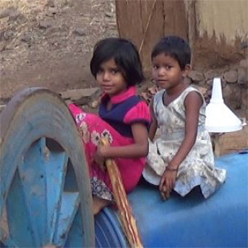
Malnutrition in Palghar- Documentary Short film
by Rajesh P
by Rajesh P
In the evolutionary process, humans are said to be at the peak of intelligence and are exploring different aspects of life based on their own talents. We are in the digital age when something can be communicated to the whole world in a click of a button of a smartphone. As we enjoy this power, it's an ugly truth that a percentage have not yet started their lives. An animal’s life goal is reached when it gets its food, but not in the case of humans. We are here to live rather than to survive, yet some of our own species share the condition of an animal, even worse. There’s just a hundred-kilometre distance between the country’s richest person’s home, Antilla, and a thatched hut in Palghar where children die because of not getting food. Many unknown faces work with the government or individually to bring fresh life out of the death cycle, and my work here is to document the effort, such as a network of people who work on malnutrition, particularly in Palghar.
Details >>
Temporary Printed Visuals in the IITB Campus
by Sanket Kapoor Gonte
by Sanket Kapoor Gonte
The printed visuals, like posters, banners, and billboards, are a frequently used medium for communicating messages and advertisements. The visuals are printed on various materials like PVC-coated polyester sheets called flex, cloths, acrylics, cardboards, metal sheets, papers, etc. Even in this era of social media and the internet, the printed visuals are considered to be a powerful medium to reach the maximum number of people. IIT Bombay, one of the prestigious technical institutes in India, holds various festivals, talks, conferences and many events for its students and people outside the campus; this results in poor management of printed visuals on the campus. The aim is to study the use of temporary printed visuals and understand its effect on the environment of the campus and the consequent problems and come up with plausible guidelines and solutions.
Details >>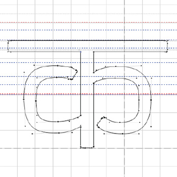
Designing A Variable Devanagari Typeface
by Sanket Kapoor Gonte
by Sanket Kapoor Gonte
This project is to create a multipurpose, monolinear, variable Devanagari typeface. The aim is to provide users a better alternative to existing Devanagari fonts and flexibility to use it as per their particular requirements, which non-variable typefaces may not be able to do. The idea of developing a variable font for an Indic script occurred to Mr Manoj Gopinath, a prominent type and visual designer himself and my guide for the project. Variable fonts are a relatively new and unexplored arena in typeface design for Indic scripts. I am very grateful to him for his faith in me and allowing me to take this project forward. The brief was to create a variable typeface which should be multipurpose (usable in different contexts), monolinear (to maintain the readability at different sizes), aesthetically pleasant and appealing to all ages. To give it a modern feel, it should be neither too roundish nor too squarish, as all Indic scripts have a characteristic roundishness. I was able to understand the intricacies of typeface design and the sheer hard work that goes into it during the internship. I was able to complete the basic designs of 26 characters (12 consonants, 14 vowels and the corresponding maatras), which are subject to further modifications.
Details >>
Designing A Devanagari Font
by Sanket Kapoor Gonte
by Sanket Kapoor Gonte
The aim of this project is to design a multipurpose monolinear Devanagari font, which can be scaled to be used as a variable font in OpenType format. After initial form iterations in the weight and width axes with emphasis on readability, it was decided to create a form which is not too roundish or too squarish but to go with a form which is in between the two styles. The final font follows a unique visual form which is unique and finds a peculiar blend of round and square visual primitives. The final output is currently in single weight, which can be used for text as well as display purposes. The final form provides a good outline structure for further development as an OpenType variable font in multiple weights and widths.
Details >>
Helping People Understand Anxiety and Take Relevant Measures
by Sanket Kapoor Gonte
by Sanket Kapoor Gonte
All people experience anxiety at one time or another, to varying degrees throughout their lives. Anxiety is a feeling of uneasiness and worry, usually generalised and unfocused, as a reaction to a situation. However, the perception of threat in the concerned situation is very subjective. Anxiety affects quite a few people in a way that it hinders their daily life. Due to lack of awareness, lack of communication, negligence and stigma surrounding the issue, it remains untreated and could lead to unhealthy repercussions. As someone who struggles with depression and anxiety, I felt a strong desire to help other people who might be going through it themselves or know someone who does. It proved to be a great learning experience as I navigated through it myself, got to know different perspectives and helped myself understand these issues better. The project, in a sense, has been a very personal journey of hope, self-awareness, and finding the confidence and comfort in being my truest self as I worked on myself and, thereby, on the project.
Details >>
Temporary Printed Visuals in the IITB Campus
by Shivani Nayak
by Shivani Nayak
The printed visuals, like posters, banners, and billboards, are a frequently used medium for communicating messages and advertisements. The visuals are printed on various materials like PVC-coated polyester sheets called flex, cloths, acrylics, card boards, metal sheets, papers, etc. Even in this era of social media and the internet, the printed visuals are considered to be a powerful medium to reach the maximum number of people. IIT Bombay, one of the prestigious technical institutes in India, holds various festivals, talks, conferences and many events for its students and people outside the campus; this results in poor management of printed visuals on the campus. The aim is to study the use of temporary printed visuals and understand its effect on the environment of the campus and the consequent problems and come up with plausible guidelines and solutions.
Details >>
LogIQids- Every time a little smarter
by Shivani Nayak
by Shivani Nayak
LogIQids, started by IIT-IIM graduates, is anive web-based learning tool to develop logical reasoning in kids at a young age. LogIQids aims at boosting brain development in kids and enhancing various critical skill sets like problem-solving, creativity and lateral thinking.
Details >>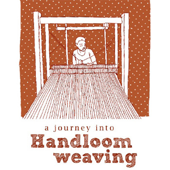
Understanding the future of hand looms in India
by Shivani Nayak
by Shivani Nayak
The project is about the future of handlooms in India. The handloom industry has faced critical times due to the invasion of mechanised looms and decline in demand, but to convert this sunset industry to a sunrise industry, few of the young enthusiasts have put in their efforts to revive the craft and preserve the knowledge. The aim of the project is to communicate their ideas, work and journey in a book and appreciate them.
Details >>
From Cotton to Cloth- Understanding self-reliance by working with hands
by Shivani Nayak
by Shivani Nayak
“If the craze for machinery increases, a day will come when we will curse ourselves for not being able to use the machine gifted to us.” - M. K. Gandhi. Like any of his other predictions, this prediction scares me and has made me realise that other than using our fingers for scrolling on our mobile phones and ordering food and clothes, we are on the edge of losing the basic knowledge of cultivating and cooking our own food and spinning, dyeing and weaving our own clothes. We have relied on technology that has negatively affected our confidence, self-awareness and happiness in reality. My project is to understand self-reliance by making cloth from cotton. This will help me understand Khadi, which has been mislooked just as a cloth, and understand its importance in my development of being more aware. My second objective is to weave an indigo-coloured convocation scarf for myself and my friends and learn the process and challenges faced during the process. Through this project I want to develop a perspective towards the need for handlooms as a means to sustainability by living and experiencing the lifestyle which is sustainable, interacting with people with a similar ideology and putting the energy into the formation of the future of Dandi studio at IDC School of Design.
Details >>
Understanding Mockumentary as a medium for storytelling
by Siddharth Aredath
by Siddharth Aredath
This work talks about the relevance of mockumentary as a medium to communicate. We try to look into the general perception that many students fail to introspect and find their own calling while skimming through rigorous academic guidelines within the design field. We believe mockumentary is an ideal format to address this story by standing objectively on the sideline while trying to portray serious issues in the plot through the ‘mockumentary treatment’. Initially, we studied classic mockumentaries to identify treatments and approaches towards the plot and scene. We have used the format of interactive storytelling with a choice-based narrative. Followed by a short study into interactive films and the possibility of integrating mockumentary through this interactive medium. Which brings about the question of the approach: emergent narratives or the traditional storytelling ways? In the later part of our work, we elaborate on the process followed while outlining the plot and pre-production planning while working with the Text RPG approach to identify possible problem areas while conveying our story to the audience. Finally, we talk about challenges while working with interactive mockumentary as a medium and its ability to persuade compared to the traditional narrative median path we choose to stick to.
Details >>
Summer Internship at Cinematics India Pvt. Ltd.
by Siddharth Aredath
by Siddharth Aredath
The purpose of summer internships is to provide an opportunity for students to get experience working in design firms, practising professionals in various fields of design, artists and consultants and other kinds of organisations and social enterprises. It is to be no less than four weeks.
Details >>
Faces in Phases | Discerning Design in Portrait Photography
by Siddharth Aredath
by Siddharth Aredath
The project deals with the study of portraiture, from portrait paintings to post-digital-age portrait photography, its evolution and role, with particular emphasis on mapping changes in stylistic approach in photography against art movements of the time, marking out advances in technology and other unique events. It addresses issues of content, paying attention to history, theory, and formal analysis along the way. Contemporary portrait styles have become more relaxed and less formal in the past decade. What is gained is a level of spontaneity that people seem to like. What is lost is the idyllic, structured way of rendering the human form. There are numerous reasons for the move to a more casual framework. The influence of fashion photography, with its heavily diffused lighting and untraditional posing, is one big reason. A change to modern DSLRs and equipment like the electronic flash gives photographers a level of flexibility that lends itself to shooting lots of images and many variations, including more spontaneous poses, not just in traditional studio settings. Digital technology offers the portrait photographer flexibility and speed and, perhaps most importantly, the ultimate in creative control. Additionally, the daunting task of traditional retouching has all but been eliminated by Adobe Photoshop and Adobe Lightroom and its many tools and techniques. The special effects tricks that were once the province of the accomplished dark- room technician are now routinely created quickly and expertly by the photographer using software. This project attempts to combine some of the time-tested disciplines with more contemporary methods in such a way that they will be useful to the modern-day photographer. It is not the intent of this project to impart a series of rules that must be followed without exception. Instead, this report aims to give photographers an understanding of the traditional rules and how they may be broken so they may incorporate what they will into their individual repertoire of techniques.
Details >>
The Story of River Nila, its People and its Environmental Destruction
by Siddharth Aredath
by Siddharth Aredath
In this project, which has been my most extensive yet, I travelled along the river Bharthapuzha that runs through the length of Kerala, documenting the environmental condition of the river and the lives and occupations of people who live by it. In this process, I interacted and engaged with many people who have been closely related to the river, through personal histories, and some of them, through conservation efforts. In this process, I learnt of how environmental conservation is inextricably linked to social justice. And in a deeply hierarchical society like Kerala, conservation and caste cannot be addressed separately. These are complex questions, which I perceive and have attempted to understand. However, how does one address the difficult relationships between society, economy and environment in our conservation efforts? I have tried to use the medium of film as a tool for research. Through this medium I have tried to understand how the changes in society, culture and economy of the riverside population may have contributed to the degradation of the river.
Details >>
Indian Institute of Technology Bombay (IITB) campus map redesign: Visual and information design decisions and their impact on perception and wayfinding in a portable campus map
by Unmesh Nayak
by Unmesh Nayak
Maps are wonderful examples of information design. Information design is the organising of information such that the hidden content is brought out in the right context and underlying patterns and relationships, if any, are made visible. The redesigned portable map of the IITB campus is a reference map. The purpose of this map is to help visitors find their way around 550 acres of sprawling IITB campus. In India, people are more comfortable asking for directions than reading maps. In this context we looked at the existing IIT Bombay campus map to find out the difficulties people faced while using it.
Details >>
The Bombay Grind Studio
by Unmesh Nayak
by Unmesh Nayak
The Bombay Grind Studio is a summer internship project focused on communication design by Unmesh Nayak (Batch 2017-2019, IDC IIT Bombay). This project delves into the visual and informational language of a studio identity—likely exploring how design, branding, and storytelling combine to express ethos and values.
Details >>
Re-designing the system of symbols for railways in India
by Unmesh Nayak
by Unmesh Nayak
The most primary means of commuting within a country and in its cities is its public transportation systems. These systems get flooded every everyday with commuters and tourists that wish to use these systems to their full extent but are commonly confronted with problems in wayfinding and even language. Here in Mumbai, the public transportation system is the lifeline of commuters. The system is a complex web of services, woven with railways, metro, mono and bus transport. The most common problem that comes across while commuting through these systems is the wayfinding. There are systems in place for wayfinding, but they stand inadequate when confronted with the density of population and its diversity. Symbols and signs are now being used widely due to their ever-increasing need in wayfinding at public spaces, where masses of people interact and language becomes a barrier in communication. But it was observed that symbols that are responsible for guiding an individual to his/her destination are modified to meet the aesthetics of each individual system and then executed using hand-painted symbols, stencils and even stickers, depending on the overall budget. These symbols vary with every mode of transport, from bus to rail to metro, eventually creating a chaotic wayfinding experience. Here, the need to create a standard for the execution of symbols arises to ease the wayfinding experience of tourists and commuters and facilitate the ease of execution of more wayfinding systems in the near future, as more transportation systems might get included in the same web.
Details >>
Understanding the reasons why victims of sexual harassment don’t come forward sooner
by Unmesh Nayak
by Unmesh Nayak
After being amplified by the media, the #Metoo movement generated fear between the sexes; men started to be scared around women. Companies started devising policies that created a rift between men and women rather than bridging it. This was just the opposite of what the movement was set out to do. The question asked by me over this problem was, “Why don't they speak up right away?” Lead me to understand that the insensitive point of view I was harnessing was in itself one of the reasons they don’t come out and speak openly. The question formed the basis of the project and helped me gain an overview of the patriarchal world we live in. Where we expect solutions to all the problems to be clear as black and white. We often have strong points of view over situations which we see or hear from a distance, but the ones who face them know and understand the complete heat of it. The project was able to surface multiple reasons and their layers that make decision-making hard in situations like these. The victim is confronted by multiple psychological and physical challenges that include fright/freeze, shame, denial, fear of consequence, low self-esteem, isolation, and hopelessness, eventually breaking the willpower of the victim to speak up. By the time they realise the fact that action should have been taken, it becomes too late. The focus of the project is to communicate through a fictional story about sexual violence and explain reasons why victims of such incidents don’t speak up. How perpetrators get away with the crime and how important a role society plays in situations like these. The challenge of the project is to visually justify the message through the medium of an illustrated graphic novel.
Details >>1999-2008
(92 items)
A collection of traditional artifacts and symbols from Kerala
by Anand. A
by Anand. A
In Kerala, the boundaries between rural and urban life are often blurred when it comes to visible cultural patterns and lifestyles. The rich, the poor, the villager, or the urbane—everybody seems to agree with and adapt to a range of traditional beliefs and practices. This link between the past and the present often creates a clash between the mythical and the rational. Many manifestations of such a distinct culture can be seen in the objects of day-to-day life, festival iconography, and architecture. This research and documentation project is a photographic compilation of some of those objects and icons, looking at them from inside their own cultural fabric.
Details >>
Design of a Display Typeface in Malayalam
by Anand. A
Details >>
by Anand. A
Typeface design in Indian language scripts still suffers from the absence of typefaces, which are tailor-cut for specific needs. There is a complete lack of awareness of the needs of well-designed typefaces that meet both the requirements of digital technology and the functional requirements of typefaces.
Kerala State, which boasts a rich literary tradition and the most popular publications in the country, also suffers from mediocre design standards when it comes to typefaces. With a day-by-day growing publication industry and information portals from the state, the demand for typefaces that meet functional and technical aspects of typography is more than ever.
This project studies the existing typefaces in Malayalam, the script from Kerala, in the contexts of usage, visual quality, and technology in the publication industry. These studies identified the need for a display/byline typeface for standard publication needs. Thus, a typeface family named IDC Vani, consisting of five typefaces in true type and postscript formats, has been designed. A demonstration of various applications of the typeface and a stylebook featuring the guidelines for usage of the IDC Vani family also formed part of the final output.
Digital puppetry- a story telling approach
by Anand. A
by Anand. A
Multimedia-enhanced children's games and storybooks are available in plenty these days. Most of them, in the process of achieving a great deal of interactive entertainment and powerful imagery, fail to understand a child's way of thinking and their creative strength in story telling. In addition, children of today are being exposed to and attracted to violent arcade games and entertainment concepts that fall short of any good virtues. This project is the result of a study of South India's traditional puppetry, its story-telling methodology, and its subsequent application in developing a multimedia story-telling/creating application that is interactive, giving the child options to create his own characters and stories. Further, it also allows for forming an active team and enacting a play with the characters and stories they make. Thus, integrating a great source of learning from traditional visual forms and developing a highly participatory and hence dynamic play environment, 'Puppettooner'—the multimedia application provides 'edutainment' rather than just entertainment.
Details >>
Sharing Mental Imagery in Collaborative Design
by Anupama Kamath
by Anupama Kamath
Nigel J. T. Thomas describes mental imagery informally as 'seeing in the minds eye', ' visualization and is a quasi-perceptual experience; it significantly resembles perceptual experience but occurs in the absence of the appropriate perceptual stimuli. The focus of the research started with the goal of understanding mental imagery in the field of design. This experiment is a continuation of the studies of mental imagery in the architectural design process. The earlier experiments attempted to study the nature of mental imagery in the mind of the architect during the design process and the subsequent sharing of the same with a co-architect. In this experiment, the focus would be on the issues that arise in a team while sharing mental imagery.
Details >>
Production Processes in Character Animation
by Anupama Kamath
by Anupama Kamath
JadooWorks is a Bangalore-based animation company. With a strength of about 150 people, the company does commercials for Indian television, but the focus has been on production work for the US and French markets. The production unit has two studio divisions for 2-D and 3-D animations, respectively. It also has a gaming unit. During the period of training, the production processes in animation were studied. Hands-on experience with some production techniques was attempted. Some of the training assignments developed by the company were attempted for a better and quicker understanding of concepts.
Details >>
Discovering the city within - Old Pune
- An information booklet
by Anupama Kamath
by Anupama Kamath
Every city has an identity. This identity is built over a period of time. It is built on the city’s culture, architecture, environment, arts, crafts, and lifestyle of the people. Heritage places are important reminders of where we have come from, and each generation has a responsibility to future generations to protect those places. Built heritage convinces us that the past really happened and gives communities links with attitudes and values that have shaped their environment.
Details >>
An information booklet on
Heritage walks in Pune
by Anupama Kamath
Details >>
by Anupama Kamath
Many times, we take for granted what we see around us and fail to appreciate its value until it is too late. With specific reference to our past and the reminders of it, i.e., our heritage, it has been seen that negligence and insensitivity have led to the erosion of many of its valuable components. A simple form of awareness for this purpose is explored in this project. Introducing heritage components in their built form to a person by taking him for a walk.
The project needed an understanding of the components involved before presenting them to the target audience. The city of Pune presented some problems in terms of its heritage buildings being scattered and not confined to one area. The issues involved identifying the building amidst its new surroundings and retaining the interest of the target audience during the walk. Information had to be presented in such a manner so as to locate the building easily, making the experience of the walk an engaging one. The project provided an opportunity to interact with the INTACH Pune chapter and understand how they had dealt with the same problem.

ADITYA
the Sun in the Indian Thought
- an Exhibition
by Anupama Kamath
Details >>
by Anupama Kamath
In India, since ancient times, there have always been explanations about the sun's activities in the fields of astronomy, philosophy, religion, cultural traditions, and rituals. A brief study of these subjects proves the depth to which people have given meaning to these phenomena occurring in their everyday lives.
Aditya, the Sun in Indian thought, is a documentation of the influences of the Sun in the daily lives of the people in India and how they have perceived, understood, and explained these influences. This fascinating subject of documenting the sun has not been attempted before on these lines and will prove to be an awakening to the role played by this Supreme Force, which has been forgotten in many aspects.
An exhibition has been visualised to present this documentation to the general public. The presentation method attempts at the ‘experience’ approach in a manner that would involve the participation of the visitors. While this would by no means make understanding concepts simpler, it would also help me explore better ways of presenting information to a larger target audience.
Livelihoods in Dharavi
by Dipti M Panesar
Details >>
by Dipti M Panesar
The Urban Opportunity Project, a research initiative of the Institute of Design at IIT Chicago, has provided the scope for adopting a collaborative approach of working between ID Chicago, IIT Bombay, and non-governmental organisations like the Society for Human and Environmental Development (S.H.E.D.) in Mumbai. This collaborative approach has enabled the acquisition of true and valuable insights on the livelihoods in city slums. Dharavi was taken as a specimen for the study.
The Society for Human and Environmental Development (SHED) was formed in October 1982 with the prime objective of improving the outlook and living conditions of those living in slums and rural areas, especially tribal areas. At present, the society is working in the major slums of Mumbai—Dharavi, Jogeshwari (East), Sagbaug, and Kalina—and also in a village and 21 tribal hamlets of Saphale Block and Palghar Taluka in Thane district.

Making Toys For Children Using Corrugated Toys
by Dipti M Panesar
by Dipti M Panesar
This project explores the relationship between children and play through toy design that supports cognitive, motor, and creative development. By studying child psychology, play patterns, and age-appropriate activities, created several innovative toy concepts, including building blocks, puzzles, and interactive kits. The final concept, Story Town, allows children aged 6–12 to construct modular 2D-to-3D pop-up towns with accessories like houses, trees, and vehicles. The design encourages both solitary and group play, fostering storytelling, town planning, environmental awareness, and civic sense through hands-on, imaginative interaction.
Details >>
A Documentary On My Grandmother
by Dipti M Panesar
by Dipti M Panesar
Dreams inspire people to live and then strive towards fulfilling them. Biji is almost at the sunset of her life. As a child, then a woman, a wife, and a mother, she has had her own dreams and expectations.
Details >>
Biji My Grandmother
by Dipti M Panesar
by Dipti M Panesar
Dreams inspire people to live and then strive towards fulfilling them. Biji is almost at the sunset of her life. As a child, then a woman, a wife, and a mother, she has had her own dreams and expectations.
Details >>
History of Special Effects in Mythological Genre of Indian Cinema
by Gautam Vijay Karnik
by Gautam Vijay Karnik
The aim of the project was to collect information about the history of special effects in the context of Indian cinema. A need to document the history of special effects is observed. The Indian filmmaker has been content with experimenting with topics and ideas, but the efforts by these pioneers, the techniques used, and the social implications of the choice of subject have not been steadily recorded in a single place. The project was to have an output that would give an overview of the factors contributing to the advent of special effects in Indian cinema. Due to time constraints, the research has been limited to the mythological film genre, which was the first genre to grace the Indian film scene and relied heavily on special effects for storytelling. Similar research could be carried out for the entire genre that followed.
Details >>
Identity Design for IITB Sports
by Gautam Vijay Karnik
by Gautam Vijay Karnik
The mission of IITB Sports will be to bring students together in activities that promote healthy lifestyles, enhance a sense of community and belonging, encourage the pursuit of excellence in a spirit of productive cooperation, foster responsible behaviour, and foster growth in leadership and teamwork skills. Fulfilment of this mission will ensure the all-round development of the students - the leaders of tomorrow.
Details >>
Packaging Design for Children’s Products
by Gautam Vijay Karnik
by Gautam Vijay Karnik
The project was to design the packaging for a set of educational kits designed by Navnirmiti, an organisation dedicated to the universalization of learning science and math. The educational kit contains six games that differ in their identity as a family and lack branding. They were also lacking in their attempt to reach the home sector and were limiting themselves to the dissemination of these kits in the school areas where students could access them for a limited period of the school day. The project aimed to build an identity for the kit through packaging design, communicate the potential of the games, and thereby increase their reach in the home sector.
Details >>
Book series on Marathi Poerty
Exploration in Design and Typography
by Hemant Kadegaonkar
by Hemant Kadegaonkar
The project aims at designing a visual system for a set of books on a subject, with each book exploring a different aspect of the subject. This is a set of books on Marathi poetry, compiling the works of six poets with different styles of writing poetry. The set was created with the objective of system design in mind, with an exploration of design and typography. The set overall expresses the marathiness and poetic quality of the content. Variations in the system in terms of grid, typography, and overall look allow individual books to express their own content while still being part of the set.
Details >>
Cataloguing and Collecting the Works of Ram Mohan
by Mohini Kotasthane
by Mohini Kotasthane
Ram Mohan the legend of Indian Animation has walked for fifty years in the animation industry. Being the doyen of the industry, he has witnessed the history of animation in India. He has a wide spectrum of work in the areas of 2D classical animation, 3D and CGI, cinema, and live action. He is also credited with creating a whole generation of modern animators in India. But to date, there has not been any kind of documentation or collection of his works. So the project aims to find out more about the animator, his back story, and career, collect his works, and make a chronology of them. This project will help future design students who want to study Ram Mohan as an animator, his method of working, style, and vision.
Details >>
Motion is the Message
by Mohini Kotasthane
by Mohini Kotasthane
The world of motion graphics has always moved me but remained unknown; hence, I wanted to explore it. Motion graphics is time-dependent; hence, its beauty lies in the pace, force, and energy at which different things occur. Every element has its own growth cycle (in its seed), which is evident over the course of time. I wanted to explore this concept in design.
Details >>
UNFOLDING
by Mohini Kotasthane
by Mohini Kotasthane
The order of growth unfolds in nature. Unfolding is a process that occurs in the growth programme of every living organism. Life unfolds every moment and in every aspect from the beginning to the end. Unfolding bears all the changes with the increasing complexity of growth. Hence, a tender young leaf of a plant looks very different from that of a mature leaf. This metaphor of unfolding happens in our lives as well; life unfolds with different seasons. Seasons unfold with days unfolding. Every day unfolds differently with changing times, events, moods, and people. A person unfolds with different happenings and stories around him. Thus lies the beauty of unfolding.
Details >>
A History of State Funded Animations in India
by Pudi Ravi Krishna
Details >>
by Pudi Ravi Krishna
It is ultimately the past that creates the present. This project is aimed at understanding the story of Indian animation. Initially, animation in India was the result of experiments by Indian film makers who were inspired by Disney. After independence, it was mainly the government that started to encourage animation through the Films Division. A significant part of this report is dedicated to the detailed study of animation films made by the state-funded Films Division. Especially the period between 1956 and 1969 is of significant importance since some of India's best-known animators worked in the Films division during this time. The earliest attempts at animation were the outcome of experimentation by the founders of Indian cinema, Dadasaheb Phalke, who used time-lapse photography due to a shortage of films. Subsequently, other animation films inspired by Disney's animation films were being made at periodic intervals until the end of British rule in 1947.
The Films Division was established in 1948 for the production of documentaries and news reels. An animation film called The War That Never Ends was made in 1949 by British animator Myna Johnson, with J. S. Bhownagary serving as the script writer. The Cartoon Film Unit (CFU) was set up at the Films Division in 1955 and, for the first time, received an animation camera under the Indo-American Technical Aid programme, accompanied by the services of Mr. Clair Weeks, a former animator at Disney Studios.

Design of webpage template for Engineering Colleges
by Pudi Ravi Krishna
by Pudi Ravi Krishna
A template is a blank page layout where the kind of information and the placement of information are pre-defined but sufficiently flexible for the end user to modify it according to his needs. A webpage template helps webmasters create and maintain professional-looking websites. The primary task of the webmaster when using a template is to upload information. This project aims at designing a template specifically for engineering colleges, taking into consideration the problems faced by them and their design needs. The deliverables of the project can be used by webmasters at Indian engineering colleges to create and maintain a professional website. Also, the template shall provide screens through which college users, like faculty and students, can manage their content on the site without the help of a webmaster.
Details >>
Interactive storytelling Theme: Water
by Pudi Ravi Krishna
Details >>
by Pudi Ravi Krishna
Interactive storytelling, a story in which the audience has influence over the narrative, has existed in non-digital variations for thousands of years. In India, respected storytellers in the 'Harikatha' styles have studied the scriptures, literature, languages, classical music, and elements of drama. These storytellers adapt their stories according to the audience, either by their response or by popping questions to keep the audience involved. Theatre, film, and TV can be viewed as steps in the evolution of dramatic language. Interactive drama should be seen as the next evolutionary step. Interactivity helps to create a sense of action and movement, but it should be fundamental to the story, not something trivial and unrelated; otherwise, the spell of immersion is broken.
The most innovative interactive stories don't try too hard to be innovative. There's simplicity in the presentation, a subtlety in the navigation; it flows smoothly from beginning to end, engaging the user occasionally, not constantly. That's good storytelling. Whenever possible, a story needs to be presented as a vital part of a cultural whole. Folk tales form the unwritten literature (stories, proverbs, riddles, and songs) of a culture. This project was aimed at exploring the possibility of telling such stories in an interactively rich format.
Patterns in interaction - A review of current works
by J Rambrijesh
by J Rambrijesh
This study attempts to understand the patterns approach for interaction design, tracing its roots to architecture, and looks at how it has been adopted by computer programmers while highlighting the recent interests shown by people from the HCI domain. The paper also tries to establish the merits and limitations of the pattern approach and speculates on the use of patterns to aid the 'expert evaluation' in usability testing. It suggests the use of patterns as a delivery mechanism in place of specifications and the use of interaction design patterns to enrich the project life cycle. With the study of examples from IDC projects and the web, an attempt has been made to suggest how the ‘Patterns approach’ can be used to understand the fields of user interface design and IxD and its design implications.
Details >>
Website design For Department of tourism India
by J Rambrijesh
by J Rambrijesh
India is a land of fascinating experiences and exhilarating destinations. A vast country with a history that goes back 5000 years. Its vast geographical diversity, heritage and culture, fairs and festivals, yogic education, varieties of cuisine, and monumental attractions are unparallel to any other country in the world. India has an unlimited variety of innumerable tourist destinations to showcase. But it's not one of the top tourist destinations. Off late, the tourist inflow is registering sturdy growth. To reach out to a larger audience group, a new aggressive integrated (web, print, and TV commercial) campaign 'incredible India' has been launched. As a result, the official tourism website is getting enormous hits but fails to satisfy the users because it fails to provide the required services and information.
Details >>
Alternate to file management system for windows
by J Rambrijesh
by J Rambrijesh
This project envisions an improved file management interface that overcomes the limitations of traditional systems by offering better control, increased screen real estate, and richer functionality. It aims to maintain consistent conceptual models while supporting natural, intuitive interaction. One key feature is the ability to fetch required files without needing to know their names, thereby easing retrieval. The design also explores alternate visualizations and leverages system intelligence to assist users.
Details >>
Viewport -Alternate file manager for windows
by J Rambrijesh
Details >>
by J Rambrijesh
In today's context, with large hard discs and network connectivity, we store an enormous number of files on local discs; as a result, maintenance and retrieval become tough. Aggravating the problem, most people have tendencies towards haphazard file management. It becomes practically impossible to locate files when file names or folder locations are forgotten. A variety of user research was done to unearth individuals' habits and tendencies pertaining to file management. A parallel study of current technological trends and research in visualisations was undertaken.
The main file management problems were attributed to the lack of differentiation between folders, not being able to guess the contents of the folder from outside, the necessity to remember accurate folder locations and file names, and the lack of supportive tools. Based on the findings, a conceptual system called ‘viewport’ was developed. It is a recognition-based file system that uses a zoomable interface paradigm for navigation. The system supports a new visualisation system that allows for quick, efficient ways to find a required file and accommodates informal ways of managing files.
Study of temple flags of north Malabar
by Rashmin Raj A
Details >>
by Rashmin Raj A
Kerala is world-famous for its natural beauty and its vibrant art forms. Kerala was also world-famous many centuries ago for its spices. A time in which pepper was known as the black gold and was worth a king's ransom. The most important of Kerala's ports were in Malabar. Malabar consists of six districts, namely Kozhikode, Tellicherry, Cannanore, Kasaragode, Palghat, and Malappuram, which make up north Kerala. This was where the first European traveller, namely Vasocodi Gama, landed, a few kilometres from Kozhikode, at a place called Kappad.
Malabar is also called the land of the living gods. This is because of the vibrant art form called Theyyam. The coastline is dotted with temples and Kavus, each of which has a festival associated with it. The festivals are social events whereby all the people in proximity to the temple join together and celebrate the festival. When the festive dates are decided, flags are hoisted to inform people about the event. It’s a really colourful spectacle to see the green landscape dotted with vibrant flags, visible from ar away. This study was aimed at understanding the usage, varieties, standards, if any, and meaning of the traditional flags in north Malabar.

Re-design of the interface for email messaging,
retrieval and storage from a 'Social Computing'
point of view
by Rashmin Raj A
by Rashmin Raj A
The computer has come a long way from its humble beginnings and is now a part of our everyday lives. The coming of the internet was another major factor that made the computer one of the most important tools in the 21st century. The most widespread application on the internet is person-to-person communication. Electronic mail has revolutionised the way humans communicate and thus brought about a new era of faster and more efficient communication. The number of emails sent per year has grown by leaps and bounds with time, as has the underlying technology. The email interface has not been able to keep pace with the advancement of technology. Electronic mail started as text-only communication, but the scenario has changed with the advent of newer technologies and faster communication speeds. Even with the advancement in GUI and faster processing power, the basic structure of any email interface still remains the same.
Details >>
Design of devices and interfaces for casual
group interaction
by Rashmin Raj A
by Rashmin Raj A
Communication is one of the most fundamental needs. The new century has brought about a revolution in the way we communicate. The coming of wireless devices and the wired world has changed our lives and made devices ubiquitous, but at the same time, it has brought forth new problems and issues. One of the most important developments in the area of interpersonal communication is the telephone. The telephone, which was a public device, developed into a very personal device with the advent of cell phones. The path of this development wasn’t smooth; the video phone was predicted to become the next-generation communication device, but somehow it failed miserably in its task. The development of new technology and services needs to learn from the mistakes made in the past.
Details >>
Study of Information Graphics in Television in India
by Shalaka Dighe
Details >>
by Shalaka Dighe
Information graphics are visual representations of any information, statistical data, or reconstruction of an event. The graphical display of information is among the most obvious and important forms of visual communication. The organisation of realistic data into a field that is recognisable at a glance yet can be studied and probed over a period of time can prove to be a useful tool that offers tremendous value to both the audience and the designer. Graphics can describe information in a better way through visual mapping. Visual aids can compress huge amounts of information into smaller, more comprehensible capsules.
We are aware of the presence and importance of graphic representations throughout the history of man. Diagrams, maps, charts, and many other kinds of symbols take part in our daily lives. All visual media have explored various aspects and advantages of infographics, and television media is no exception. The dynamism of TV media offers more scope to the designer and broadens the horizons of possibilities. Graphical representations benefit from the fourth dimension of 'time', and can help create better.
Rediffusion DYR brand communications
by Shalaka Dighe
by Shalaka Dighe
In 1995, Dentsu of Japan and the US-based Young & Rubicam decided to pick up a stake in this Indian agency, and in 1998, Rediffusion-DY&R formally assumed a new name, "Rediffusion-Dentsu Young & Rubicam brand communications." Rediffusion is ranked #5 among Indian advertising agencies.
Details >>
Interaction Design for Home Computing
by Shalaka Dighe
Details >>
by Shalaka Dighe
Technology affects life; it is meant to do that. But it seems absolutely illogical and unfair that it should compulsively change the way people live. It is evident that the personal computer is completely impertinent to the home environment, its needs, and its physical location and does not blend with the family lifestyle. A study of these, as well as of those devices that work well in households, suggests some strategic changes to the approach of bringing a computer into the home setting. A brief overview of Indian household needs and home environment suggests the need for reminders, family communication aids, and assistance in household tasks.
'Yojak' is an attempt to bridge the gap between PC and Indian home needs. It is a home computer with the basic form of a digital calendar. In India, family schedules revolve around the calendar, family accounts are maintained on a calendar, and most home information comes from the calendar. In effect, this is mainly what the personal computer aims to do today in a home setting, yet quite ineffectively. 'Yojak', with the metaphor of a calendar, radically changes the scene, and the computer achieves a physical, psychological, and emotional 'space' in the household.
Lifestyle and Cultural Practices of the East Indian Community In Mumbai
by Sherline M. Pimenta
by Sherline M. Pimenta
Wherever there is a settlement (society), it is bound to be affected by change on the micro or macro level sooner or later. This is caused by a number of factors and has some impact on that society. Through this project, I have tried to analyse the effect of social change on the East Indian community, keeping one aspect as my main issue of study, i.e., ‘wedding ceremonies’ The research method I have used for this study is the ethnographic methodology, wherein I went around talking to people and used an open-ended questionnaire. Only after fully understanding the practices and observing them have I drawn my inferences about identifying the cause of change. The East Indian community offers itself as an ideal subject matter for this kind of study, as the changes are recent and ongoing at different levels.
Details >>
Digital Miniature Paintings
by Sherline M. Pimenta
by Sherline M. Pimenta
Miniature paintings are viewed through a magnifying glass, where one sees the finer details of the painting. Taking a cue from this, the idea of 'digital miniature paintings' got evolved. These paintings are created by digital illustrations that are to be viewed on the computer screen. One can explore the painting by clicking on certain areas, which zoom out to reveal a new painting.
Details >>
The World of Kannada letterforms for Children
by Sindhu K.N
by Sindhu K.N
Alphabet learning is the means to an end that few teachers or parents question. Several techniques and methods to learn the language and script have been extensively developed. The material developed is dull and eliminates "experience." Children have to learn to read and write the language, but the process is narrow and monotonous, and the love for learning is never induced. Looking, observing, and carefully observing never seem to be an important part of learning or an aspect of developing the learning material. We know that if a learning material can overcome the problem of attention span and engage a child, then most of the problems of learning can be tackled. I am interested in exploring how a material can encompass the enjoyment and discoveries that looking and experiencing can bring.
Details >>
Livelihoods In Dharavi
by Utpala Wandhare
by Utpala Wandhare
The Urban Opportunity Project, a research initiative of the Institute of Design at IIT Chicago, has provided the scope for adopting a collaborative approach of working between ID Chicago, IIT Bombay, and non-governmental organisations like the Society for Human and Environmental Development (S.H.E.D.) in Mumbai. This collaborative approach has enabled the acquisition of true and valuable insights on the livelihoods in city slums. Dharavi was taken as a specimen for the study.
Details >>
Nagpur Doordarshan kendra
by Utpala Wandhare
by Utpala Wandhare
Doordarshan Kendra, Nagpur, came on the telecast Map of India on August 15, 1982. Initially, area-specific programme kendras now have the identity of local kendras in Maharashtra. It is the third-largest telecast centre after Mumbai and Pune in the Vidarbha region of Maharashtra. The daily telecast time is from 6-7p.m. from Monday to Friday, mainly in Marathi language. It covers an area of 120km. in diameter in and around Nagpur.
Details >>
Teaching aid for Teachers
by Utpala Wandhare
by Utpala Wandhare
Technology is not an educational panacea, but it is an important facilitator of education. This is a strong rationale and the dominant argument for expanding the use of technology in schools. A clear understanding of the role of technology in change and the implications of technology-mediated changes for education is the key to the success of any innovation in education. We need to take a look at the traditional goals of education and formulate new definitions of learning consistent with the revolution in cognitive sciences. It is time we viewed the learning process as selective filtering of experience, coordination of information, and construction of knowledge. To be able to do that is the biggest challenge of information and communication technologies in education. If we are convinced of this, then we shall be able to fashion a climate of values that encourages the ordering and re-ordering of thoughts needed to comprehend technology and strive for education to emerge from its disciplinary narrowness.
Details >>
Documentation of Augmented reality applications
by Viswanatha kumar
by Viswanatha kumar
Physical Reality has been a subject of contemplation from time immemorial, right from the times when our ancestors pondered about the mystery behind stars to the unfolding facts about black holes today. Man has classified the physical as real and non-physical things like dreams and hyper dimensions as virtual. Virtual is something which doesn’t exist. The digital technology has given rise to a new order of reality – the virtual real, which addresses all the sensory perceptions of humans and make the brain believe that something non-existent as real through the projection of a virtual world onto him.
Details >>
G R O W
Green Red Orange White
by Viswanatha kumar
by Viswanatha kumar
The theme behind the film revolved initially around weapons of mass destruction and technology getting into the wrong hands. The bomb blast that took place at Zaveri Bazaar and the gateway of India on August 25, 2003, made me focus the film on the blast and portray the mindless destruction of human lives and properties. I started collecting footage related to Black Monday (blast on August 25). With some 6 hours of raw footage consisting of the footage on the day of the bomb blast, interviews with the eyewitnesses, victims, and their relatives, various forms of reactions that happened after the blast, and the few secular activities in the city, I was faced with the major task of editing them and making a short film out of them. I also saw the potential of making a full-length documentary with the collected footage on the construction of communalism in India, which would require more time and research. After repeated watching of the footage and reading about communal terrorism, I decided to focus the film on themes like religious misconceptions and extremism and the co-existence of love and hate in a cosmopolitan setting.
Details >>
Design of a digital sketch book
by Viswanatha kumar
by Viswanatha kumar
The core idea of the project is to design a digital sketch book that can facilitate the user's ability to capture his thoughts and expressions effectively and enable him to share them with different people in a local group, like in places where collaborative learning and sharing take place, or with a global community through the internet. A device that can help the user with brainstorming and idea generation, which can help him visualise his ideas better. The device is envisioned as a digital sketch book that has the flexibility to be updated while retaining the quality of a sketch book that the user keeps with him for a long time.
Details >>
Conversation with an Artist
by Aditi Babel
by Aditi Babel
“Conversation with an ”artist’”—the project was essentially focused on understanding the approach of an artist so as to understand the uniqueness in his thinking process and his creations. This project gave an opportunity to study what we understand by the term culture and acknowledge its importance as an inspiration for any creation. My keen interest was to find out how culture is understood by different people and what makes it easier for them to express their creation in terms of culture as an inspiration and sometimes as a tool and also sometimes just unknowingly creating something that defines culture itself.
Details >>
Abhinaya- System of Dramaturgy
by Aditi Babel
by Aditi Babel
Theatre - Abhinaya, the ancient Indian system of dramaturgy. This performing art of theatre, as the dictionary defines, ”the activity or a profession of acting, producing, directing, or writing plays,” is an art form that has a beautiful pattern of planned design of actions. It's a form of extensive teamworkin which the efforts of each and every member of the production matter a lot for the success of the play, the irony of the situation being that every action of every person who is part of the production is mainly governed by the director of the play. The entire system depends on the directors play of actions. This art form includes the most important and basic elements of design, i.e., lines, planes, textures, colours, space, shapes, and forms.
Details >>
Theatre xpression illusion
by Aditi Babel
by Aditi Babel
Theatre - Abhinaya, the ancient Indian system of dramaturgy. As the dictionary defines the activity or a profession of acting, producing, directing, or writing plays,” it has a pattern of planned design of actions. Theatre is a medium that encloses within itself all forms of performing arts; it can evolve itself with forms like drama, action, speech, dance, poetry, etc., and also encourages experiments and exploration in one and all. It is one of the most effective forms of communication, as in a very interesting manner it holds the attention of its viewers and communicates the message across.
Details >>
Game Design on Indian Temples
by Aditi Babel
by Aditi Babel
The project focuses on designing a game based on the elements of Indian temples. The motivation to take up this project was to study an aspect of Indian tradition and culture, a very significant part of which are the Indian temples. This project gave me a chance to understand important and different elements related to Indian culture. The initial objective was to create interest in the subject that encourages self-involvement and motivation to learn more on the subject. The structural and strategical approach of game designing was ideal to create awareness on the subject with a lot of interest, i.e., the rituals, beliefs, myths, and significances attached to them, which are being forgotten with time. Games have been an intimate part of Indian tradition and culture. Some of the most famous and interesting games were developed and played here and became a part of the tradition, e.g., Pachisi.
Details >>
An Enquiry into the Absurd- The Fictions of Jorge Luis Borges
by Anand Prahlad
by Anand Prahlad
This project delves into the surreal and labyrinthine worlds crafted by Jorge Luis Borges, interrogating notions of reality, fiction, and absurdity through visual and narrative explorations. Employing techniques of communication design, it interprets Borges’s themes—infinite libraries, mirrors, paradoxes, and alternate worlds—in a graphic and conceptual medium, offering viewers a contemplative journey that blurs the line between the real and the imagined. The work is reflective of Borges’s playful tension between order and chaos, inviting audiences to question the nature of meaning, identity, and perception.
Details >>
Icons : The Lotus
by Anand Prahlad
by Anand Prahlad
My internship at RGD lasted a month, starting early May 2006. During this period I had the opportunity to work on three live projects. I also researched and studied the origin and development of the lotus as an international icon. The Lotus—Of the many icons that represent Eastern civilisation, the lotus is probably amongst the most famous ones. This study traced the origin of the lotus as a symbol of divinity and spirituality all around the world. The information was gathered from books and other online resources, which was assimilated with illustrations drawn by me in a single book.
Details >>
An animation on- The city of Mumbai
by Anand Prahlad
by Anand Prahlad
The objective of this project was to go through the process of creating an animation using a blend of 3D animation and 2D techniques. The film, approximately 5 minutes and 18 seconds long, was created using a blend of conventional 3D modelling and animation and pixilation (stop-motion animation using human actors). The theme for the animation is the city of Mumbai. The story more specifically looks at how the rain affects people in the city. The premise for the story is set in a six-floor, seemingly improbable building, where the inhabitant of each floor deals with the excessive rain.
Details >>
An animated study of a psyche
by Anand Prahlad
by Anand Prahlad
The objective of this project was to create a film with characters whose foundations lie in some of Jung’s theories. Since my project from the previous semester looked at a broader scenario of the rains in the city and how the inhabitants of a hypothetical building deal with the deluge, this semester’s project deals with a more personal and quiet self-space. The story outlines the confusion and turmoil people go through during the transitional periods of their lives. The film is rendered using a toon shader. The end effect is that of a hand-drawn and inked illustration.
Details >>
Journey of an Artist- A book about my father Maruti Patil
by Barkha Patil
by Barkha Patil
This project is a deeply personal design narrative and publication endeavor by Barkha Patil, which artistically chronicles the life, ethos, and creative legacy of her father, Maruti Patil. Framed as a book, it weaves together visual storytelling, archival memories, and design sensibility to reflect both familial bonds and artistic identity. Using the medium of communication design, the work becomes a tribute and an inquiry—not just into a life lived, but into how memory, biography, and aesthetic expression combine to shape one’s legacy.
Details >>
Warli Painting- Investigation into Non Textual Interface
by Dipu George
by Dipu George
There are several clans of Adivasis (original inhabitants) occupying part of the region north of Mumbai, the most numerous being the Warlis, who call themselves kings of the jungle. The Warli Tribe, which resides in the Thane district of Maharashtra, is spread out mainly in the villages of Dahanu, Talasari, Mokhada, Vada, and Palghara. For our study we chose the village of Dahanu. The origin of the Warlis is yet unknown, and no records of their art form are found, but many scholars and folklorists believe that it can be traced to as early as the tenth century A.D., when such men learnt to build walls of the house. The economy of the Warlis is basically agrarian. The Warlis have survived for millennia in harmony with their environment and without oppressing others. Their culture incorporates the spiritual and material, living and non-living, into one integral whole.
Details >>
Summer Training at Forest Design
by Dipu George
by Dipu George
The client is a major stock photo agency. The project involved redesigning the interface icons in their image management software. The objective was to streamline the workflow to increase the efficiency. This software has basic image editing tools and is primarily used for categorising and keywording images. My role in this project was to redesign the current set of icons and render them with a new visual look as well as create new icons with consistency and bring out a new contemporary style to the set.
Details >>
Interactive Campus Information System for IIT Bombay
by Dipu George
by Dipu George
This project is an attempt to address (learn the process involved in) the designer’s challenge to make information accessible and available to users within the campus. This project attempts to create an interactive information system that would make it easy to access the information the user needs from the complex set of information in IIT Bombay. The interactive system seeks to reduce the cognitive load on the user and minimise the learning time otherwise normally spent to access such a system. The system is proposed to be accessed by users within the campus. Interactive systems tend to aid the user in navigating and zooming into specific areas. The report structure comprises the requirement study, where the user needs were identified, followed by the data collection and the conclusion of the analysis. The interface design and navigation aim to provide the user with an effective interface so he/she could access information more easily. The proposed system is a simulated model and demonstrates its effectiveness. The working model can be fulfilled after all data has been fed into the system.
Details >>
Information Maps of Kerala
by Dipu George
by Dipu George
The scope of the project is to present a tapestry of Kerala’s history from the earliest times to AD 1850, covering aspects like history, culture, and geography in an interactive visual timeline. The interactivity of digital media makes it possible to represent such interesting information compared to that of print media. This project seeks to design an interactive information map (a visual timeline) that would highlight interesting snippets of information from Kerala’s history. The interactive visual map seeks to present to the user an interesting experience of the diverse aspects of Kerala in the historical perspective.
Details >>
Faces as a narrative
by Fatema Kainan Barot
by Fatema Kainan Barot
Being born and brought up in different places, in different contexts, interactions with other people and experiences of different circumstances consciously or subconsciously have made people what they are or what they have chosen to be. There are various factors that keep influencing people’s identities and personalities. Respective identities are reflected through various manifestations like their posture, body language, clothing, mannerisms, behaviour, gestures or their expressions or faces. There are stories about themselves that they reveal. Images of themselves that they create or those that are created on their own. However, they are revealed within the scope of the readability of the observer. The observer too has developed this sensitivity based on his own contexts, experiences and associations he has established through his own understanding of events, circumstances and other people. It is the perception of these identities or stories through faces that is intended to be studied through this project. The route to it is also through my perception of identities and how I read people through their faces.
Details >>
Animation on Media Revolution
by Fatema Kainan Barot
by Fatema Kainan Barot
Communication media enables the sharing of information in the form of data, images, ideas, etc. We rely heavily on media for having access to any information, as it is not in anyone’s capacity to have authority or knowledge of all the information that is available through various sources. Hence, being the source of our awareness of many things, it plays an important role in moulding our mindsets and opinions of many things. Dominant forms of media dictate aesthetic preferences and forms of social, political and economic structuring in society, as they have a collective influence on a mass audience. It plays a major role in the establishment of perceptions in the minds and imaginations of entire societies as it advocates the development of constructive or destructive ideas towards various issues at different levels in a social system, like family, violence, relationships, authorities, identities, etc.
Details >>
Conversations through Calligraphy
by Fatema Kainan Barot
by Fatema Kainan Barot
“Conversations through Calligraphy” is a communication design project that investigates the expressive potentials of calligraphic forms as a medium for dialogue and meaning. Led by Fatema Kainan Barot (2005–07 batch at IDC), the work explores how visual letterforms and compositions can become carriers of metaphor, emotion, and conceptual exchange beyond their linguistic content. Under the guidance of Prof. G. V. Sreekumar, the project experiments with integrating calligraphy into conversational contexts, blurring the boundary between language and visual art to invite viewers into a reflective, mediated interaction.
Details >>
The Face as a Narrative
by Geetanjali Srivastava
by Geetanjali Srivastava
For every object that we see around us or voice we hear on the telephone/radio, we as simple people desire to form a face or give it a facial identity. We look for faces in everything, which always consist of two symmetrical horizontally positioned dots for the eyes and a horizontal line just a little below to form the mouth. All other details are negligible; it is not vital that other details like the forehead/eyebrows/nose/philtrum and chin be present. The face is an important feature for the identification of others and conveys significant social information. The basic face would be shaped of eyes that can see us and a mouth that may speak to us. As children, we may construct faces out of plug points and headlights on cars/scooters, draw smileys on dusty car windows and make faces at the mirror. The face is the only immediate and widely recognisable feature which distinguishes one individual from another. Ironically, because of the importance of its role in social interaction, the newer communication systems like SMS and online chat completely eliminate the instance of ‘seeing’ the person you are communicating with. There are solutions, of course, to this situation; one of them is where you can post a picture of yourself, or if you do not like your face too much or simply want to ‘lie’ about your appearance, wear a mask!
Details >>
Falling Leave- An Interactive Learning Kit
by Geetanjali Srivastava
by Geetanjali Srivastava
Learning in schools is practised in a way where students are ‘told’ information about various topics through textbooks which they are expected to memorise and finally repeat during assessments. The chapters in textbooks are arranged in increasing order of complexity, at the end of which there are questions which the student is expected to answer by searching through the content in as many attempts as necessary. Students begin to understand that grading is on the basis of accuracy of recalling the information, and hence, learning to copy-paste answers is the type of learning that students pick up as a habit. Merely remembering words like ‘sunrise’, ‘rain’, and ‘sea’ does not mean that the student has understood the meaning of the word. He needs to experience the sunrise, see the darkness recede and the light take over, walk on the beaches to experience the water and sand, and get wet in the rain to enjoy and understand the proper meaning of the observable fact.
Details >>
Newspaper Redesign- The Free Press Journal
by Geetanjali Srivastava
by Geetanjali Srivastava
“Newspaper Redesign—The Free Press Journal” is a communication design project that reimagines the visual and editorial layout of a daily newspaper to improve readability, coherence, and aesthetic appeal. Undertaken by Geetanjali Srivastava as a P3 project at IDC IIT Bombay under Prof. G. V. Sreekumar, the work involves rethinking typographic hierarchy, information architecture, and visual flow to bring freshness while retaining journalistic integrity. The redesign strives to balance the demands of content richness, clarity, and user engagement in the evolving media landscape.
Details >>
Study of tools and innovative Techniques of calligraphy
by Harshvardhan Kadam
by Harshvardhan Kadam
Calligraphy since ages has been evolving from its original form. So have its functions. But the basic requirements of calligraphy have always remained there and are mutually dependent. Calligraphy is incomplete without these essentials, i.e., the tool, the medium and the surface. Calligraphy since ancient times has remained as a medium of visual communication, communicates a message(s) for the sake of wisdom, and has not widened much. But there have been a lot of experiments, reformations, and cross-cultural adaptations over the scripts of calligraphy, like writing the Devanagari script with a Japanese round brush, modifying steel tools to be ergonomic for Devanagari, installing a reservoir for ink in the tool itself, etc., which have contributed to shaping a new dimension of calligraphy. The process of evolution of letter forms has deep spiritual roots. Akshar is an experience of a very highly profound meditation process. Calligraphy can be called a process in which your mind and body are involved towards attaining a simple goal, of akshar. Akshar means the one that will remain forever.
Details >>
Indrasmriti- Remembering Indra
by Harshvardhan Kadam
by Harshvardhan Kadam
Indra Smruti is a small attempt towards remembering the most respected god from the Rigveda, who is no longer worshipped as a god, nor does there exist a temple of him. The title speaks all about the project – remembering Indra once again in today's era. The idea originated as an opportunity for visualising the dynasty of Indra. But as time travelled, more and more mysteries about the Vedic and the Hindu Sanskriti were revealed. The thought of Indra was no longer an idea. It took a shape of its own. It started evolving and revealing itself. Of course, the method which I followed made it possible. This evolving and revealing process is never ending. As we can see numerous icons of Vishnu, Shiva, Ganesha, and Ram, and just by looking at them, we can state the icon. We tend to understand the character and recognise them. But Indra's character/icon is not so visible through Hindu iconography. This project is about exploring Indra the way I have perceived and absorbed her. I did not want my expressions to be very stereotyped comic style. The initial explorations were very much like the conventional comics style, but later on I tried exploring in my personal style, though the style was not an issue. The later explorations were more expressive. I tried to draw a line between comics' style and the miniature paintings.
Details >>
Knowing- Pune A Documentary Film
by Harshvardhan Kadam
by Harshvardhan Kadam
A strong attachment with the city is one reason that I thought of documenting the stories and events that have transformed the city. It is a common feeling that usually a class of people have for their city they have grown up in. Being a Puneite, I had not known a lot of interesting things about Pune, like how the city got its name. There were similar scenarios around me, due to which I thought of understanding the evolution of the place. The story which I want to tell could be about some simple events, treaties, wars, floods, rivers, mansions, roads, kings, ministers, architecture, etc. My idea was to talk about the unknown facts, myths and stories of the city, but after questioning the idea of unknowingly, one gets an answer that whatever one hears or reads, the next moment it becomes known. So the goal became making a video on relatively unknown facts of Pune.
Details >>
Story-telling in Graphic Novels- A Study of Autobiographical Graphic Novels
by Hemant Kumar
by Hemant Kumar
‘Graphic novel’ is a term generally applied to refer to comic books which are aimed at a mature audience and are centred around mature and complex themes. Graphic novels are supposed to have better artwork and printing and binding. They can be published as original single-volume novels or compilations of previously published multiple-volume serialised stories. A collection of short stories (in comics) is also referred to as a graphic novel. Although a widely used term now, ‘graphic novel’ is more of a publisher’s and marketing term. As comics are generally associated with juvenile themes and adolescent readers, the term graphic novel indicates a departure from monthly disposable magazines to a permanent bookshelf collection. However, many of the foremost authors, like Alan Moore, say that they are fine with the term ‘comics’ and do not intend to be called graphic novelists. Acclaimed comics theorist Scott McCloud also remarks that a square binding and slick printing do not guarantee a creditable work of literature and that comics as an art form and a communication medium do not need the term graphic novel to prove their worth.
Details >>
Grandmother India
by Hemant Kumar
by Hemant Kumar
Grandmother India is a Mumbai-based firm providing visual communication services to a variety of clientele spanning from music labels, fashion brands, hospitality agencies and IT giants to independent artists, photographers and filmmakers. Set up in 1999 by Kurnal Rawat and Tejas Mangeshkar, the firm believes in local designs with global aesthetics and is known for creating a unique visual milieu. During my time at Grandmother India, I got involved with various design activities differing in nature, intention, medium and complexity. Taking up tasks and responsibilities offered a great deal of learning.
Details >>
Comics On Violence
by Hemant Kumar
by Hemant Kumar
This project is aimed towards addressing the issue of violence that is changing many lives voluntarily or involuntarily. It is an attempt to understand the concerns and effects of violence and communicate the same through a medium often criticised for glorifying it: comics (defined by Scott McCloud as juxtaposed pictorial and other images in deliberate sequence, intended to convey information and/or to produce an aesthetic response in the viewer”). Despite the great potential that the medium of comics offers in communicating ideas and storytelling, its application has been quite limited in popular culture. Comics have been criticised for promoting and selling violent content to kids. Still, there is a lot more to comics than popular culture. The project seeks to provide a view of the notions of violence and its existence in a society through exploring the medium of comics. Through the project I aim to build an outlook of things as they are and as they should be in a world so restless and impatient to resort to violence for all that is unfair and unjust.
Details >>
Stories of Failure
by Hemant Kumar
by Hemant Kumar
This project is aimed towards addressing the issue of violence that is changing many lives voluntarily or involuntarily. It is an attempt to understand the concerns and effects of violence and communicate the same through a medium often criticised for glorifying it: comics (defined by Scott McCloud as juxtaposed pictorial and other images in deliberate sequence, intended to convey information and/or to produce an aesthetic response in the viewer”). Despite the great potential that the medium of comics offers in communicating ideas and storytelling, its application has been quite limited in popular culture. Comics have been criticised for promoting and selling violent content to kids. Still, there is a lot more to comics than popular culture. The project seeks to provide a view of the notions of violence and its existence in a society through exploring the medium of comics. Through the project I aim to build an outlook of things as they are and as they should be in a world so restless and impatient to resort to violence for all that is unfair and unjust.
Details >>
Documentation of Animation Techniques
by Nair Vineeth Anand
by Nair Vineeth Anand
The project Documentation of Animation Techniques is a special communication design endeavour that meticulously explores, records, and analyzes various methods and practices in animation. Under the supervision of Prof. Shilpa Ranade, the work seeks to demystify and make explicit the often tacit skills behind motion, timing, and visual storytelling. Through this documentation, the project not only preserves techniques but also acts as a pedagogical bridge, helping designers, animators, and students navigate the principles and craft of animation in a structured, accessible way.
Details >>
White Light Moving Picture Company P.Ltd.
by Nair Vineeth Anand
by Nair Vineeth Anand
White Light Moving Picture Company Private Limited was incorporated on 4th May, 1987, as a private limited company. The registered office and its head office are in Kolkata, West Bengal. Its business operations are carried out from its Mumbai branch office situated in Famous Studios in Mahalaxmi. The company’s Chairperson and Managing Director, Ms Namita Roy Ghose, and its Director, Mr Subir Chatterjee, are both based in Mumbai. They are also the co-directors of all commercials produced by White Light. The Finance Director, Mr Ujjal Ghosh, is based in the Head Office at Kolkata. The company engages around fifteen more personnel to undertake the key activities relating to film production, administration and business development.
Details >>
Design of a software tool for animators
by Nair Vineeth Anand
by Nair Vineeth Anand
Experimental animation is like a bottomless chasm. The possibilities are endless. The key being, anything & everything can be animated. Under the guidance of Prof. Ravi Poovaiah, the basic idea of providing a platform for exploring possibilities took shape. A variety of styles & diverse use of the medium have always been the key focus in experimental animation. Reaping the power of technology and combining it with an in-depth thought process laid the base. Artificial intelligence to help the software think & comprehend was another focus point. The challenge was being able to provide a variety of styles and to embed a sense of creative freedom for aspirants wanting to get a glimpse into the world of experimental animation. Planes or surfaces to play with were looked at so as to generate interest amongst the users. To be able to control plane parameters and thereby moderate the behaviours of the plane added to the vision. This software concept provides for smart functioning. The motive being to showcase the possibilities in plane-moderated experiments and provide for it. The interface aids in creating various animations using water, sand, a light grid or paper as the surface.
Details >>
Load Shedding- An Animated Short
by Nair Vineeth Anand
by Nair Vineeth Anand
The newspapers lately are abuzz with the growing power cuts in the suburbs. My project deals with the same, but in a subtle and light manner. With a bit of humour, and through a simple story, I have attempted to spread the awareness to curb load shedding. The story has a central character, the “load shedding baby”, who in his simple, sweet way manages to slay the “load shedding monster”, which has been haunting the city of Kalyan for a long time. The focus has also been laid on the fact that frequent power cuts have seeped into the lives of the people, and they have taken it as a part of their lives. Protests are staged, and the electricity board is bad-mouthed. But these are not that which will help us get rid of this syndrome. It is only when we start thinking and start saving electricity in our homes that we can make a difference. I have tried to bring out this message through my animated short.
Details >>
Understanding sexual morality- An animation short
by Poonam Madhav Athalye
by Poonam Madhav Athalye
I wrote a script as it came to me. Once I was thinking of a dear friend of mine. We were best of friends when we were kids, but as time passed by, we went different ways. I was not in touch with her for a long time. Later when I heard of her, she was known to people as an easy woman. Someone known for swindling men around. I was very disturbed and felt really bad. I tried to justify her side unknowingly to our common friends, but I could not. I was angry with her, but I never showed it. I wanted to scold her, but I thought I could not. It took us five years to develop affection for each other again. And it took me even longer to realise that she did not do anything ‘wrong’. Neither was she right. There is nothing that is right or wrong sometimes. I think no one is in a place to judge if somebody has been ‘morally’ right or wrong. Because if one tries to see from the involved person’s point of view, it is circumstances and time which together can lead you on a path, which can neither be right nor wrong. It can only be different from your path. There are several kinds of sins which are morally put forth, but I decided to contemplate on the sin of lust. These are matters which involve intimacy. I certainly don’t advocate betrayal or cheating, but I feel the sexual parameters change depending on the person. I feel there should not be ground rules for morality which are applicable to everyone.
Details >>
Recreating the experience of a dream ‘Cotton dreams’ an animation
by Poonam Madhav Athalye
by Poonam Madhav Athalye
During a typical life span, a human spends a total of about six years dreaming, which is about 2 hours each night. It is unknown where in the brain dreams originate, if there is such a single location, or why dreams occur at all. “I had a horrible nightmare that there were sick kittens all around me, hungry and sick. One of them, a small black kitten, jumped up on my lap, and to my horror, split in half, and the top half jumped off my lap, leaving the bottom half. I screamed and woke up.” Dreams are expressed in the form of sensory metaphors. Some say that dreams are metaphorical translations of waking expectations. From the point of view of the dreaming state of mind, dreams are real events in real environments. Based on this notion, one can re-enter the landscape of a dream and flash back to the images, whether it is a memory from waking life or from dreaming. One enters a hypnagogic state; then, through the process of questioning, images are explored through the perspective of feelings and sensations manifested in the body, enabling new awareness to develop.
Details >>
Storytelling in the Graphic Novel- Analysis into the process of developing the novel
by Prarthana Hariharan
by Prarthana Hariharan
The intention of this project is to gain a clearer understanding of the process involved in the generation of a graphic novel, the seamless integration of the text with the imagery. It delves into the manner of representation of serious and politically tense topics through this medium. The nature of political and historical novels is studied through selected pieces of work. The process involved in the translation of a film into a graphic novel also falls within the spectrum of my study.
Details >>
J. Walter Thompsons
by Prarthana Hariharan
by Prarthana Hariharan
J. Walter Thompson is a worldwide organisation. It is one of the oldest advertising agencies in the world. They over the years have built an enormous network of companies across all continents. Now they are a company with a network of over 200 regions. The infrastructure of this company has been built over years of dedication and solidarity. Recently the company went through a major change. The change in the colours of JWT and the compression of the name of the agency from J. Walter Thompson to JWT has been one of the colossal tasks that have been taken up. For a 75-year-old company to undergo such a huge change was considered to be a big move. They have one of the largest ranges of clientele. Their client list ranges through numerous products in the market. They have some of the most prestigious sets of clients.
Details >>
Visual Representations of the work of Omar Khayyam
by Prarthana Hariharan
by Prarthana Hariharan
Imagery and representations of the poems that run alongside Khayyam’s words. Explorations in terms of mode of visual imagery, content, medium, calligraphy and typography. Calligraphy and typography that is driven by the content of his poetry. This will act as a visual compilation of Khayyam’s poetry.
Details >>
Photo Exploration- Faith and Penance of the Tamil folk- A book on the belief and worship patterns
by Prarthana Hariharan
by Prarthana Hariharan
This project documents the faith, rituals, and penance practices of the Thevar and Nadar communities of Tamil Nadu, primarily from the southern districts of Ramanathapuram, Virudhunagar, and Madurai—collectively known as the Thevar belt. Through visits to various Mariamman temples in Chennai and the grand Thiruvizha at Samayapuram in Trichy, the study captures the deep-rooted traditions, devotion, and spiritual intensity of the participants. The photographs reflect the atmosphere of worship and offer a glimpse into the enduring power of faith that continues to shape Tamil cultural and religious life.
Details >>
Warli Painting- Investigation into Non Textual Interface
by Prashant Bhandare
by Prashant Bhandare
Interfaces that deal with aspects other than text can be termed as non-textual interfaces. Audio, video, spoken language, performing arts, visuals, etc. are some examples of non-textual interfaces. Some of the examples identified from the non-computing environment were Warli paintings (narratives), Kathakali (gestures and audio), Dabba walas code signs (signs and symbols) and temple motifs (symbols). Because of time constraints the scope of the project was restricted to analysing only one from the above-mentioned.
Details >>
Summer Training at ~ FL!P Design, Bangalore
by Prashant Bhandare
by Prashant Bhandare
As part of the M.Des. (visual communication) course, students have to undergo a month’s industry training at the end of the second semester. This one month has a lot stored in it, as there is interaction with the company and people working there, getting involved in projects, helping out, sitting in brainstorming sessions and loads of fun.
Details >>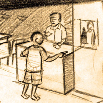
Hapus ka simple joy- A Story on Child Labour
by Prashant Bhandare
by Prashant Bhandare
In our everyday life we came across many social problems around us. “Child labour” is one of the problems in the list. The worst thing about this problem is that the victims are the tiny juvenile humans. They are children, as delicate as flowers, but are scrambled underfoot by conditions. Conditions could be anything, but the fact is that they have lost their childhood. This is the time when a child needs a lot of love, protection, education, good food, etc., so that they will develop in all aspects. From this project I have tried to portray a simple aspiration of a particular child labourer (Bhoora) who works in hazardous conditions. And how he struggles to fulfil a small desire.
Details >>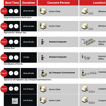
Information graphic for public place- Regional Transport Office, Thane
by Prashant Bhandare
by Prashant Bhandare
The need of the society in the government sector is to understand complex processes and eliminate the third-party involvement to reduce the corruption and also reduce the time and stress involved in completing the task. This is taken as the aim of this project to analyse the possibilities of exploration. In India many government sectors have various kinds of complex processes which need to be followed to complete the task for the people. In this project I decided to explore the possibility in R.T.O. (Regional Transport Office), where a huge number of people’s interactions happen every day. From the 18-year-old student to the 40-year-old private vehicle owner, they need to face many complex processes. Processes are not easy to understand when they are on paper. The understanding of processes very effectively and easily is taken for the exploration.
Details >>
Contemporary Indian Short Stories
by Russell Gonsalves
by Russell Gonsalves
Stories are told, heard, seen, and read, but most of all… felt. A good story has the uncanny ability to enrapture from the oldest to the young. Combining subject, experience and message, each writer has taken an everyday theme and built around it a brief yet captivating drama – an essentially human requirement. But beyond the story itself, a short story can serve as a valuable and intimate account of a chosen subject, a place, an incident, or a person. Without the employment of pigment or bristle, a short story can at once paint a beautiful picture, unbound by time. And like painters, every author seeks to capture a different subject. From the value of the love of a family to the use of a dining table, the stories are based on themes as eclectic as the people in this nation. However, if there is one thread holding them together, it is the feeling of every author's own personal experience that comes through in a rather compelling manner. In 'The Fig Tree Stands Witness', the author tells of a tragically materialistic world through the hardships faced by his uncle when all his family cares about is his property and not his well-being. These messages, though known to us, come across more profoundly in these stories in ways we can more easily connect to. As compared to its older counterparts, the delivery of a message in the contemporary short story is more graphic. Although there is usually no 'moral' that sums up the story in a single line, the story itself comes across as very real and tends to put the reader smack dab in the middle of events taking place. The message is thus experienced rather than read.
Details >>
Poems of Gitanjali Through Theatre
by Russell Gonsalves
by Russell Gonsalves
Gitanjali's poems are not very long, averaging about 25 lines. The lines themselves bear just a few words. And though the language used is very good for someone of her age, the poems do not bear the rhyme or lyrical quality of most renowned poets. The emotional expression, however, is just as strong, if not stronger than the best of them. Gitanjali's 110 poems, written during the period of her illness, feature the people, things and emotions that affected her life the most. Her family, her friends, her pets, nature, sadness, joy, death and, above all, God, among others. Most of her poems are tributes and messages to each of these characters. Through the poems one also gets a picture of Gitanjali's mental state between the time she was diagnosed with cancer and her death. Some of the poems carry the natural and obvious plea for help and respite from a person who is fully aware of her impending end. She begs of God to give her a new lease on life. But most of her poems, however, carry an unimaginable fortitude. The courage she has displayed, knowing that her life is drawing to a close, is something we can all learn from. She accepted death and often had conversations with death, requesting it to come unnoticed so that the people around her would not be hurt too much. She seemed to worry more about her loved ones than herself. Self-pity is one element that has not really featured in any of Gitanjali's poems. She seemed to have made the most of whatever little time she was handed on earth.
Details >>
Perspectives on problems- A short film
by Russell Gonsalves
by Russell Gonsalves
My aim is to capture and portray people's perception of problems in one frame. Juxtaposing contrasting as well as similar events, issues and reactions. We often times live our lives in isolation and shut out the rest of the world in our time of grieving. But time does not stop. I will attempt to present... the ways in which we view and prioritise events in our lives, the ways we react to them, and the ways we handle them (or at least attempt to). No problem is so grave as to make the world stop on its axis. Nor is any problem so small as to be considered inconsequential.
Details >>
Investigation into Rangoli Patterns
by Sachin Jadhav
by Sachin Jadhav
“Splashing of an array of colours, internalising the colours of bands, and creation of beautiful formations toward all that is holy and pure – that is Rangoli.” Revelation of beauty, attainment of auspiciousness These are the twin motives of Rangoli. The place where it is drawn automatically reverberates with a climate surcharged with auspiciousness & goodness. Hence the importance of Rangoli in festivals & the like. A rangoli drawn in a courtyard of the house reflects the beauty, love & affection innate in any dwelling house. The 'Rangoli' becomes the epitome of group culturedness, & therefore the description of the Rangoli as a culture-rich manifestation of art becomes truly befitting. It is widely believed that the Rangoli drawn on the threshold and courtyard wards off the entry of vile powers & stops the auspicious powers from leaving the house.
Details >>
Summer Training at GOD
by Sachin Jadhav
by Sachin Jadhav
GOD (Gang of Designer) is an advertising agency which designs the concept according to the clients requirements with a creative mind. Gang Of Designers! That's what the two-year-old Mumbai-based ad agency, Palasa, is now calling itself, which is more into print media. GOD plans to delink its direct marketing and media divisions, both of which were operating as units within the agency till now, and run them as separate entities, servicing work for both GOD and other agencies. The agency has clients, including Gili, Mercury, IT Brand Circle, Sprint CDs, Voltas Corporate (on a project basis) and STAR One, for which it handles 'The Great Indian Laughter Challenge'. It claims to have expanded its business to include a production house, a suiting brand and a publishing house.
Details >>
Interpretation of Jataka Tale- Matakabhatta
by Sachin Jadhav
by Sachin Jadhav
The “Jatakas” are an early collection of Buddhist writing. The word “Jataka” means “birth”, so the “Jataka tales” means birth stories of Buddha. The Jataka stories are built as frame tales, which makes them one of the oldest and most important examples of frame tales in world literature. In each Jataka tale, Buddha is shown in his present life, usually speaking with his monks about problems and disputes at the monastery. Then Buddha tells a story about the past life, which is at times humorous and at times very serious. When Buddha finishes telling the story, he returns to the present and provides the interpretation of the story, explaining the incarnations and the moral of the story. The Jataka tales are, as everyone must admit, nobly conceived and lofty in meaning, and...many a helpful sermon might be preached from them as text, so the Matakabhatta Jataka stories talk about the fact that no good ever comes from taking a life while showing the various aspects of life.
Details >>
Game on Geography
by Sachin Jadhav
by Sachin Jadhav
The present educational system gives maximum importance to the bookish way of learning. The interaction between the bookish knowledge, the reality in the environment and the self forms the basis for a creative experience. The ability of the child to question, to find form and order, to rethink and restructure and find new relationships with knowledge at hand needs to be encouraged. Optimal reading occurs when it is fun and the individual is challenged to the limits of their abilities. This state occurs when the challenge is matched to the child's knowledge and skills.
Details >>
A fiction film on The Construction of Identity
by Vaibhav Singh
by Vaibhav Singh
The idea of a written document accompanying a work of cinema tends to be merely descriptive and explanatory, and more often than not, a repetition of the ideas already conveyed through other means. As I fail to understand the objective of such a repetition, this piece of writing concerns itself with my ideas about the cinema and on the subject of my project, that is, identity and the realisation of the self – and not a description of how I went about doing what I did. As Tarkovsky, in Sculpting in Time, writes, “Search as a process (and there is no other way of looking at it) has the same bearing on the complete work as wandering through the forest with a basket in search of mushrooms has to the basket of mushrooms when you have found them. Only the latter – the full basket – is a work of art: the contents are real and unconditional, whereas wandering through the forest remains a personal affair of someone who enjoys walking and fresh air.” Also, in this case, explanation amounts to nothing. If, for instance, the objective of the work is to create signs and metaphors, then they must be complete in themselves and independent of accompanying footnotes; otherwise, one has to be content with creating cryptograms.
Details >>
Representations of Time Short Film/s
by Vaibhav Singh
by Vaibhav Singh
The fiction of time is closely related to the time of fiction. Narratives that fictionalise time are representations of the fiction of temporality itself. Perhaps as an extension of this, narratives and temporality are interchangeable and exist as self-reflexive concepts, one defining the other, which in turn defines it back. In the absence of the fictionalising faculty, which is difficult to imagine, imagining the concept of time would be doubly difficult, if not impossible altogether. It is with this contention that an inquiry into the ideas of representations of time assumes the form of that particularly forceful conventionality of beginning, middle and end. It can be said that all narratives in this mode clearly present a representation of time. What differentiates that representation from the one I propose is the idea of multiplicity and indeterminacy of these concepts. That is to say that instead of a beginning, there are possibilities of several – if not innumerable – beginnings, and instead of the finality of an end, endings as potentialities. It remains to be examined what exactly the outcome of such a substitution achieves in terms of representation, but to begin with the beginnings, it is undoubtedly a more diffuse and flexible pool of possibilities (and one that perhaps lends itself to a wider margin of error on that account).
Details >>1989-1998
(59 items)

Vastusastra- The Path of Reason
by Anoop R
Details >>
by Anoop R
Vastuvidya is derived from "Vas," meaning "to dwell" or "to occupy." The vastus refers to all mortal and immortal dwellings. The science of designing and building vastu, or vastusatra, originated in the Vedic period. Kerala in the olden days had adopted the concepts of architectural engineering from Vastuvidya or Vastusatra, which is also known as Sthapatyaveda or Vastusilpa.
Vastusastra, as a science, takes a systematic approach to the planning, design, and construction of Vastu from concept to completion, based on certain thumb rules. But most of the concepts are shrouded in mystery. Most of the time, the theories of this traditional science are explained in a spiritual or philosophical manner. But a scientific approach to this subject may be useful for familiarising the common people with this traditional science.
We can discover some scientific facts hidden in the texts of Vastu, written purely in a spiritual or philosophical language. The Acharyas or Sthapathis who wrote those texts might have also thought scientifically, but the style they used for representation was purely mythical. So in order to translate them into the present world, a new channel of thought has to be opened without disturbing the sacredness of the past. This is a relatively difficult task and, most of the time, impossible as well. But it may be that only with this translation process, the essence of the traditional system be made popular and practised in the present world.
This project aims to connect some of the traditional building concepts used by the sthapathis with modern reasoning. The traditional residential and secular architecture of Kerala is taken as a backdrop to the study. So this project includes some case studies of traditional Kerala dwellings used for constructing buildings and some modern scientific principles that can be related to Vastu principles.

The Living Colours- Animation with Paint Packages
by Kaladhar Bapu
Details >>
by Kaladhar Bapu
In enormous variety of software packages for designers and other creative professionals is available today. These range from small paint packages like Paint Brush that come with any standard Windows installation to more independent commercial packages like Corel Draw: From advanced painting software like Adobe Photoshop to cutting-edge 3D rendering and animation software like Alias Max and others, The aim of this project is to fully explore and apply design principles to any one of the mentioned softwares, my choice being paint packages such as Photoshop, Fractal Design Painter, and Power Goo. The packages mentioned herein can be broadly classified into two groups, namely, paint packages and animation packages.
The versatility of animation software is well known, and so the possibility of using features of paint packages for creating animations, etc., is being studied in my special project. Hence, I have chosen to work with Photoshop and Fractal Design Painter with all the plug-ins that are compatible with these packages.
Structuring Information for Multimedia
by Kamlesh Saxena
Details >>
by Kamlesh Saxena
Exploring various levels and the surface of information in multimedia, linking information through pathways, and organising it within a basic structure allows it to be put to better use and build a convenient, simple, and easy-to-interact multimedia environment.
Integrating various media together seamlessly facilitates effective use of text, graphics, animation, video, and audio through input and output devices, making for a better multimedia.
Until now, the information contained in any medium had a linear structure, i.e., it was not governed at the user’s end but structured by the designer. What makes multimedia so different is that the entire information can be designed as per the user’s need, i.e., on his request for a story, a message, or an idea. The information is no longer linear as the user has freedom of navigation, he can choose his own path. At the same time, the medium has excellent linking potential.

Documentation and Analysis of Fashion Accessories
by Khyati Nagar
Details >>
by Khyati Nagar
Accessories are of course only a part of body decoration, and it is only through mental separation that we can separate body modifications and supplements from the body itself and from each other and extract what we call adornment. Most of the data I could collect concentrated mainly on jewelry, and through these I shall cover the first category, though body painting, tattooing, scarification, and the filling or extraction of teeth are equally important. Most involve more permanent and dramatic transformations (some examples of this are included here) than does the wearing of jewellery. Movements and gestures are also relevant. Indeed, these may be so characteristic that they may be reproduced so as to suggest the presence of adornment even when, in fact, it has not been worn. Igbo women in Nigeria, for instance, typically wear heavy brass anklets of plate-like proportions, which cause them to have a rolling gait as they walk. This style of movement is often imitated by those who are not adorned in this way to suggest that they too are accustomed to decorating in such a prestigious manner.
Jewellery is also set apart from other means of transforming physical appearance in that it appears familiar; we think we know what it is and what it does. However, although the physical alteration of the body may be regarded as an act of beautification by those who practise it, it is often characterised by others as barbaric and brutish.

Toys Made in Clay Using Scientific Principles
by Kshitija Patole
Details >>
by Kshitija Patole
Every society and its people have simple, practical, and useful knowledge, which is often expressed most creatively and effectively by the people of that society through their tales and toys. Thus, each region has a different and unique character that is reflected through these sources. These craftsmen have unique ideas for playthings that become popular in their areas. Many a times the basic principle behind the toy in many regions might be the same, but they reflect the look of the society from which it belongs to.
Today in the markets, you do get to see low-cost toys that are everyday playthings for millions of Indian children, past and present. But as compared to the past, toys made of clay are rarely seen. Most are factory-made toys using materials like plastic, metal, wood, etc.
To get back into the past, it is interesting to find that the folk toys of India, particularly those found at the excavated sites of ancient centres of culture, show very striking similarities to those discovered in Crete and ancient Egypt. As far as India is concerned, the most ancient toys of which we have any record belong to the period of the Indus Valley Civilization, dating from 2500 to 1700 BC, and bear a surprising affinity to the hand-made folk toys of a much later date. At the ancient sites of Mohenjodaro and Harappa have been found terracotta toys representing human figures, farm carts, cows, sheep, pigs, oxen, birds and animals, rattles, whistles, balls and kitchen utensils all pointing to a settled rural existence. It is worth noting that some of these toys, like bulls with nodding heads, were apparently worked by string, indicating that the toy makers of even such remote times had a mechanical bend of time.
Later Sanskrit literature literally abounds in references to toys and children’s games, and we are forced to the conclusion that the children of ancient India must have had a variety of toys to play with, toys which were not merely for amusement but instructive as well, and often decorated, though simply, indicating that the aesthetic aspect was not neglected by the toy makers of old.

Enhancing the other side of pottery
by Manish Sampat
Details >>
by Manish Sampat
Pottery is any kind of dish, pot, vase, or other object that is formed of clay and baked until it is hard. The finest chinaware and the roughest clay pots are both forms of pottery. The science of making pottery is called ceramics. Pottery has been called the oldest of all the art forms. Men were making pottery for thousands of years before the introduction of metal. Man learned and developed hundreds of different ways of making pottery and decorating it so that it could be beautiful as well as practical.
Tradition and Modernity- A Culture at Crossroads
by Manoj Sharma
Details >>
by Manoj Sharma
The idea of doing a project on Gujjars came to me not very recently. It was some six years ago when I first had a little closer look at the tribe, though at the time I should confess that I didn’t have any soft corners for the tribe. The tribe appeared to be violent and withdrawn. This relates to my past experience, when I wanted to take some pictures of the tribesmen and they stopped me from doing so. They also asked me to tear off the sketches I had done, reasoning that it was against their religion to do so. But this time the story was quite different. Probably the first time I went to a Gujjar Dera was like tourist, someone looking at somebody’s life-style from a distance, which of course never works. In the beginning of the project, I didn’t know how or where to begin. I started by looking for ways in which I could go and stay with Gujjars. Of course, anybody who heard of my plans laughed at me, since it was not considered easy to stay in a deep forest with people totally unknown, especially during the winter. The place where the Gujjars were to be found was in the deep forests of the Shivalik hills on the Dehradun-Sahranpur border. The village nearest was Mohund, and the city nearest was Dehradun, some 30 kilometres away. from the beginning of the forest. I did have no doubt problems, but believe me it is just a question of accepting the hugeness of something, which nature is, and getting in harmony with it. The nature was in its most untouched form, when the jungle has its own rules.
Kerala Murals: From Ritual to Regimen
by N Manoj
Details >>
by N Manoj
In 1971, archaeologists discovered the cave paintings of Bhimbadka, situated 45 km from Bhopal, the capital of Madhya Pradesh, and over 200 rock formations in the area and its surroundings. Figures of men on the hunt, animals, and Tantric symbols formed the premise for these paintings.
According to noted archaeologist Dr. Vishnu Wakenkar, the oldest of these paintings could be as old as 20,000 years, while the most recent ones would be around 500 years old. Similar to other such paintings found elsewhere in the world (Altamira in Spain and Lascaux in France), here too in Bhimbadka, the paintings, rather than merely imitating real life as it existed, sought to explore the truths behind those happenings. However, cave paintings can only be regarded as forerunners of the art of mural painting. True murals are those that conform to the following standard of preparation:
-on a constructed wall, a rough plastered surface is made. This is smoothed over by a second finished surface. Paintings done on this surface are actually murals.
The tradition of embellishing temples and places with mural paintings in the classical style dates back to at least 2,200 years in India. From the wall paintings at Ajanta, which have stood the test of time, we can comprehend the standards that once existed in the ancient towns of Pataliputra, Ujjaini, Vaishali, Varanasi, and Rajgruh. It was between 1 BC and BC that the paintings at cave nos. 9&10 in Ajanta were done. The only Buddhist themes of the paintings that are still intact are those dealing with the worship of Bodhi Vriksha and the Jataka Tales.

Exploring the Content page of the Web
by Prasad Bartakke
Details >>
by Prasad Bartakke
Welcome to the World Wide Web. It has "X" information, and its content has to be designed to address the users' needs. But how is this really done? And what does it really contain? a search to find the answers under a special theme. The next few pages not only discuss what is content but also why it is important, which aspects have been focused on, along with some design principles and many dos and don'ts, aided by a few alternatives, and then conclude. They are all aspects of one topic—the content. The general option is that web sites are boring, badly designed, and low in editorial content. But then why does this really happen? or so we should believe. Instead, one should consider the widespread gloom of homepages a real challenge. Simply inserting dates and putting information into the website is not enough. The World Wide Web has a logic all its own. The primary goal is to inform the masses. This information can be in many forms: news, magazines, advertisements, training, and just about anything you want to know about everything digital.
A Vernacular/Historic Pocket in a Metropolis- ‘The Jew Town of Kochi’
by Rajesh N S
Details >>
by Rajesh N S
The aim of this project is to observe the coexistence of ethnicity and modernization, to identify a Historical vernacular pocket in metroplolis, learn about its religious and cultural rootings and also to observe the changes due to the onslaught of modernization and how traditional culture has endured or adapted itself to form a new self into the present times. The study extends into that of images, architecture, remains, and monuments, as well as its people, their needs, fears, and desires. This also leads to a chance to compare the city with the vernacular pocket or it is the study of co-existance of tradition and modernization. The role of a designer in this project is that of an observer who pans his eyes through the past, present, and future of that community.
Kochi, as it is known to the western world, is "the queen of the Arabian Sea." Her contact with the western world, which dates back to history, explains her evolution as a major metropolis and the trade capital of Kerala. She is different from the other parts of the state as a lot of radical changes have taken place in her history. The vernacular pocket identified for this is the Jew Town of the Mattancherry township, a major part of the metropolis of Kochi. Mattancherry is a small town in Kochi which is not much affected by the fast growing pace of the city and has a mix cultured community comprising of Kerala hindus, the biggest part, Muslims, Christians and a minor North Indian community of Parsees and Gujarathis mostly. The jew town part of Mattancherry was once in her full glory dating back to centuries and now on its journey, becoming a monument of that glorious past, with a few jews freezing inside it, still the conservative nature and strong social bonds of this community is another reason for working on this particular area.
The study extends to the documentation of people, places, objects, phenomena, activities, and rituals, looking at and observing things from a designer's point of view, for whom an awareness of and information on the society in which he lives is very important.
Investigating Virtual Reality
by Ram Ganesh
Details >>
by Ram Ganesh
"And, as imagination bodies forth The forms of things unknown, the poet’s pen Turns them to the shapes and gives to airy nothing "A local habitation and name"—William Shakespeare.
Shakespeare wasn’t describing virtual reality, but his words capture its essence. Virtual reality, or VR, allows human imagination to create shapes and sounds out of invisible electrons racing through circuits. Like the poets to whom Shakesphere alludes, science fiction writers have long imagined the virtual worlds that we can now explore due to the development of this sophisticated technology. Virtual reality is a new poet’s pen, a computer tool that turns imagination and thought into simulations, virtual worlds, and habitats of airy nothing that appear real to our senses. These worlds are places where we can both work and play.
Immersion and interactivity are the two criteria on which VR simulations are based. Immersion refers to the ability of participants to believe they are "present" in the virtual world and can navigate through and function within the simulation as if it were physical reality. Interactivity pertains to the participant’s ability to manipulate objects encountered within a simulation, depending on the hardware and software. You may be most familiar with the recreational examples of VR. However, VR technology is being applied in professional fields as well. This project describes examples of such applications in the fields of medicine, architecture, engineering, the military, science, and financial analysis. What does the future of VR technology hold?
In addition to the research that is being done here, I have given a concept of how VR can be put to practical use in taking advantage of the communication network and the collaborative nature of the work cops undertake.

Symbolism in Popular Hindu Religious Imagery
by Rina Parak
Details >>
by Rina Parak
India has housed a widespread variety of religious systems wherein thrive a number of casts, either interconnected or independent of each others existence. Hindu is a term which was coined not for a religion but the people dwelling beyond river Sindhu by the Afghans, the Persians, etc. later with the influences of foreign tribes Hindu became a term describing a religion so as to differentiate them from the Muslims, the British, and other foreigners.
In every religion, the roots of worship spring from the very cradle stage of civilization. At this stage the people start worshipping what they fear-mainly elements of nature or what is awe inspiring, or what they would consider as a helping elements of nature or what is awe inspiring, or what they would consider as a helping element for e.g. rain for the crop. In every civilization-be it the Indus Valley or the Greek, the Mycenean, Egyptian, or any other the cause of worship of God remained the same. Initially these forces were worshipped as they were i.e. in their original form, but with a feeling of the existence of a supreme being in them that became pre dominant and the prime element of worship, which later gained an anthropomorphic form with various attributes concurred upon them, to the extent that now a days the Gods (beings that were worshipped) have become so popular that the element from which they emerged have almost long been forgotten e.g. Siva is meant to denote time and fertility, but rarely does any layman know about the associations of the various elements surrounding the deity.

Application of Indianness on Roman Letterforms
by shailesh-shilwant
by shailesh-shilwant
The idea started taking shape after I observed and realised the lack of an Indian look in roman typefaces. There are thousands of typefaces and fonts that are designed for roman letters. Many of them are decorated based on one particular idea, and that idea reflects the image of the typeface. But no one has tried to give an Indian image to the roman typeface. There are very few decorative fonts available that give the impression of Indianess, but this is not done on purpose. As English has become a universal language, a lot of Indian literature, Indian thoughts, and traditional concepts are written in English using Roman script to convey and communicate with other people about India, its tradition, and its culture. A lot of printed materials, like newspapers, magazines, books, and advertising material like posters and hoardings, are also printed in English. which has a lot of Indian content but is losing its Indian identity due to the roman script. So printed material with strong Indian content that talks about Indian people, culture, and traditions should reflect Indianness while reading or viewing it, creating a very strong image of that particular product.
Details >>
Ceramic Murals: Documentation and Exploration
by Shilpi Agarwal
Details >>
by Shilpi Agarwal
A mural is something that is embedded in a building's wall. The difference between a painting and a mural is that the painting can be removed, while the mural is done on the wall itself. Walls fracture and define space in terms of human needs. They establish the boundaries that contain or exclude activities and involvement, thereby becoming part of the environmental condition. As a result, it is the mural that has the power to make this wall an area of special enrichment.
A mural is not merely a painting looked at through a magnifying glass. The principles used in its design, its concerns, and its considerations are all quite different from ordinary painting. Painting is an independent art form in and of itself. It is independent of its environment and rests on its own merits. A mural, on the other hand, does not have a separate existence. It is an integral part of the building in which it is placed. A painting is viewed from a fixed point, whereas a mural artist does not have this advantage. It is unreasonable for him to expect that his viewer will get a clear view all the time. As a result, it increases his responsibility in selecting the theme, size, color, and technique.
Bi-Lingual Imagery
by Siva Prakash
Details >>
by Siva Prakash
In our society, bi-lingual communication is an effortless activity where the mixing of words in daily communication is routinely observed. In interregional marriages, the partners and particularly their children are seen to effortlessly switch between two languages while communicating. Being bilingual is common practise in today's popular media, such as television soap operas that compare events and sports commentaries.Bilingualism is one of the most effective ways of communicating and connecting in a multilingual society like India.How bi-lingualism grew up in Indian society Being bi-lingual at home and at work gave a sense of preserving roots as first-generation immigrants living in a world of different languages
. Crossing regions looking for opportunities and settling down, cosmopolitan cities. School education, national language, and English. Three language formula
The European Union is proposing a two-language education policy in Europe, i.e., a student will learn one extra European language apart from the mother tongue. It is a primary step towards developing an European community, which will make marketing communications easier and give a picture of a united Europe. Bilingualism is a necessity for globalization. The concept of a second language is not novel in India. Sometime back, a three-language policy was tried, which had a very disastrous effect on students. The study of languages should be according to choice, for example, first language or second language.
Meaning In Architectural and Environmental Elements
by Ajay D kulkarni
Details >>
by Ajay D kulkarni
There exists a complex built environment around us that has evolved out of the various needs. We constantly participate in their environment, with other living and nonliving things. In the process of this interaction, we respond to them in a respectful manner. Depending upon the needs, we come in contact with the built environment, which is mainly composed of buildings (here, plantation as a deliberate action can also be a built environment). Obviously, we express them verbally as well (depending upon their uses). as a temple," 'a house," 'a shop," etc. These verbal expressions are merely based on our past experiences, and thus, these interpretations are nothing but identification of the building types that stand for that specific use.
Visual attributes basically help in the identification. We have strong notions of this environment around us. Such an identification is an inevitable process. Basically, we have the visual image in our mind rather than the verbal interpretations. The human mind is aided by the existence of structure in the world. The fact that it is almost always possible to guess the category name even when a very small position of the object (or organism) is seen suggests that for most objects. Perpetual and functional features occur in some unique bundles. In other words, objects within a category appear to substantially share features that show a clear correlation.
New examples appear to have been positioned with respect to the center, based on the degree of similarity in their features.
People appear to have perceptions about the office buildings or its 'officeness." It is important that the building or product form shows its belongingness to the category in order that it would be potentially recognized as its legitimate member, and not by default but through conscious and systematic efforts, it becomes necessary to have belongingness, which evokes respective emotions of the building environment. This enhances the quality of the environment. In the process of design, we not only give strategies for the mere reproduction of existing products or buildings, but always new interpretations, which are quite often based on typicality.
Bilingual Typography - Its Problems and Approaches
by Dipti Vaidya
Details >>
by Dipti Vaidya
TYPOGRAPHY
Typography can be described as designing for the efficient communication of words that A wishes to transmit to B. This would entail the production of new typefaces and the use of existing typefaces in an ordered arrangement whereby efficient communication may take place. In order to understand language, the typeographer needs linguistic skills regarding its structure and the various uses of language that determine meaning, as used by A and B.
BILINGUISM
Bilinguism means words that underscore the linguistic contact between two languages. Bilingualism mixes two cultures together and binds them in stronger ties for a better understanding. The same thought or idea is shared by two different audiences side by side simultaneously, which gives a feeling of oneness. Bilingualism is the means of a healthy exchange. It can prove to be an important tool to unite a country and countries for a better world.
Bilingualism affects not only the smallest units of language sounds, but also the characters of the type used to print letters.
The two languages of a bilingual text can remain in perpetual confusion and conflict. The risk of typographical conflict will be all the greater if the languages share the same writing system. Each identical sound signals, accented letter, word picture, and letter group has a different role in each language. The same letter shapes appear differently in different languages,
Thus, in designing a bilingual page, the problem of language must be a prime consideration. Looking at bilinguism from a cost point of view, the consumption of a bilinguistic page is lower because of the smaller amount of paper required and the lower circulation of the copies.

Computer As A Self-Instructing Tool
by J Vijayakumar
Details >>
by J Vijayakumar
Computers are going to play a very important role in the field of education. It is sure to create a revolution in all facets of education. This project tries to add a new dimension to computer-aided instruction (CAI) by emphasizing motivational methods since the computer is viewed as a self-instructing tool. Various new possibilities for CAI and different questioning methods have also been discussed.
In this report, the initial state of CAI is briefly mentioned. The second chapter talks about other possibilities for computers in education. The third chapter deals in detail with the various strategies for motivation in the processes of comprehension and evaluation. The last chapter is a model package worked out using the new strategies.
(The scope of this observation is restricted to the CA at the school level in India.) The central school of IIT is one of the nodal centers for computer education introduced by the government. It is supposed to have the best computer facilities and instructional packages. The packages that were under use or available there were studied. The general format of the packages is similar. It opens with pages of running text, followed by questions to answer. Colors are used to highlight the important words in the text. A few packages had figures accompanying the text. Animation has also been tried out in the evaluation part.

Concept of Primitives in Major Indian Scripts (North and South)
by Manisha P Lele
Details >>
by Manisha P Lele
The study of primitives in Indian scripts is not the study of the historical evolution of the letter forms nor of their primitive symbology but the study of the elements constituting the physical shape of the letter form, i.e., the curves, lines, and circle segments, and the manner in which they join so beautifully.
This project is a step towards generating 'a' system of the different Indian scripts rather than setting them as individual scripts. In the process of also tracing out similarities in a single script, the research will also broaden my understanding of the scripts under study with respect to their form and their joinery norms. forms with lines and curves. The sophistication of today's software allows the ability to change the size, angle, and placement of the skeleton's lines and curves, simplifying the evolution of the skeleton's lines and curves.
Models of Information Retrieval Using HyperCard
by Deepak G Patil
Details >>
by Deepak G Patil
If a person goes to any large architectural complex in Bombay, he feels lost and directionless. He could not locate his destination with ease. Why ? What helped a person to locate the destination, person, or place for which he was looking? How was the information conveyed to a person in such a huge building? The signboards and information boards that give information and direction are the source that guides a person to reach his destination.
The project is done as stacks on the hypercard, which shows various models in which the information can be retrieved. The information can be static (as in the book) or dynamic (on video), user-dependent or interactive (in games), This report itself is a stack on HyperCard, which also has access to these models.
Information and Direction Graphics in Large Architectural Complexes : Documentation and Study of Present Situation in Bombay
by Poornima Khadakkar
Details >>
by Poornima Khadakkar
If a person goes to any large architectural complex in Bombay, he feels lost and directionless. He could not locate his destination with ease. Why ? What helped a person to locate the destination, person, or place for which he was looking? How was the information conveyed to a person in such a huge building? The signboards and information boards that give information and direction are the source that guides a person to reach his destination.

Ergonomic Studies of Telugu Script
by S. N. Vikas
Details >>
by S. N. Vikas
Quite often we hear people complaining about reading, such as "they can't read properly or they are tired of reading," etc., as the phenomenon appears to have been occurring quite often. It is possible that the problem may be with the reading material itself, in the form of composition, kind of printing, the fonts used, etc. Hence, it becomes necessary for us to analyze the problems and suggest an appropriate remedy. In this project, studies are done in Telugu. A systematic ergonomic study with respect to the identified problems is intended. Basically, the process of reading depends on the following factors:
VISIBILITY
The quality of a character or symbol that makes it separately visible from its surroundings
LEGIBILITY
The attribute of alphanumeric characters that makes it possible for each one to be identifiable from others (this depends on such features as stroke width, forms of the characters, contrast, and illumination).
READABILITY
This quality makes possible the recognition of the information content of material when represented by alphanumerical characters in meaningful groupings, such as words, sentences, or continuous text. depends more on the spacing of the characters and groups of characters on their combination into sentences or other forms than on the specific features of the individual characters.
Such studies regarding the English language are available. These studies have been implemented quite often in enhancing the quality of the reading environment. This has given rise to more than 1,000 types of faces according to their specific functions. This is primarily a psychological study in designing a better reading environment.

Space and Time in Theatre
by Shilpa Raje
Details >>
by Shilpa Raje
The theater experience is that of the perpetual present tense: it occurs, it happens. It is transitory in the fact that on stopping it stops being; unlike literature and the visual arts, which are tangible and unchanging, the essence of this is to catch something in a moment in time and freeze it; this is impossible with theater as it is a performing art, an event, and not an object.
With music, nothing persists except as it moves through time. A note cannot be held forever. Music is created by perpetual shifts of notes through repetition, variation, and the accumulation of effects. Similarly, theater occurs over time. A cumulative series of sights, sounds, and impressions creates theater.
Objects like costumes, props, scenery, and script are a part of theatre, but none constitute the art. Its permanent features are not theatrical. The script is an outline for the performance; unacted, the play remains incomplete. The experience will always be different as building occurs every time. Physical production affects the performance. The experience really lies in the performance itself.

Documentation of Slide Talks in Print Media
by Arlene Rajabooshanam
by Arlene Rajabooshanam
Seminar slide talks and presentations are effectively communicated through dramatic narration and dynamic visuals. But when these presentations have to be documented in print for various other purposes, the essence is lost, and the documentation fails to recreate the same ambience as in the original presentation. Though it is almost impossible to recreate the same experience in print, an experiment has been conducted in this project.
Details >>
Ecology- Powai Lake
by Mary Swapna Mankekar
Details >>
by Mary Swapna Mankekar
When environmental awareness first started, it was predicted that the world was headed towards doom. It was predicted that things could and would go drastically wrong if environmental abuse continued. What went wrong? Or rather, what went right?
But the important thing today is that we are 'aware' of where we stand. We are aware of what the future holds for us if we continue at our current rate of environmental abuse.
In India, the trouble lies between our vast population and growing industrialization. The environment and ecology suffer as a result of the two.For centuries, mankind has used the water available to him in rivers, lakes, and streams. It has provided both food and drink, been used for recreation, energy, cooling, waste-disposal, etc., Man-made lakes and reservoirs have been created, rivers dammed, watercourses altered, and canals and aqueducts constructed. Inevitably, the quantities of water available have affected what has been done with it. And, equally inevitably, human activities have had their effects on the waters.
Colour & Composition in Indian Miniature Art
by Pratima Rawat
Details >>
by Pratima Rawat
The treasure of ageless beauty manifested on a few square centimetres, telling of love, the joy of living, the splendour of creation in its cosmic manifestation, and encapsulating thousands of years of thoughts, meditation, and creativity.
Their rich colors—cobalt blues, shell powder whites, vermilion, and tropical greens—were often accented with gold and silver leaf with which they were painted. Sometimes the strokes were so fine that only a squirrel's hair brush was used.
Its admiration was for nature's beauty and the illustration of its deepest desires. Its highest goals were poetry and music.
It had an imprinted love of life and beauty, recognition of humanity's relationship to the universe, love worship, and love of man and woman as a prelude to absolute love in divine plenitude and union as its eternal source. The treasure of ageless beauty manifested on a few square centimetres, telling of love, the joy of living, the splendour of creation in its cosmic manifestation, and encapsulating thousands of years of thoughts, meditation, and creativity.
Their rich colors—cobalt blues, shell powder whites, vermilion, and tropical greens—were often accented with gold and silver leaf with which they were painted. Sometimes with strokes so fine that a single squirrel's hair brush was used.Its admiration was for its natural beauty and the illustration of its most secret dreams. Its highest goals were poetry and music.Its eternal source was an imprinted love of life and beauty, recognition of humanity's relationship to the universe, love worship, and the love of man and woman as a prelude to absolute love in divine plenitude and union.

Order and Chaos in Thinking
by Punyashloke Mishra
Details >>
by Punyashloke Mishra
The ancient Greeks used it to describe the state of the universe before creation. A sort of hazy, disordered gaseous state. Out of this chaos emerged the cosmos (a beautiful word), which implied the lovely ordered world we see around us, existing according to definite laws and rules. It was the entire universe, with its beauty, grandeur, and interconnectedness. The cosmos was orderly and sensible. Chaos was disorder and nonsense.
Chaos was about as bad as a word could go, and hence there was no way but up. Now chaos is the name of the new science that has revolutionised the way we look at nature. Chaos is a science of everyday things—of art and economics, of biological rhythms and traffic jams—giving new insights into the workings of nature. Not bad for a word with such lowly beginnings. On the other hand, Cosmos had nowhere to go but down. It slowly took on restrictive meanings of beauty and, worse, superficial beauty, and now remains with us in the form of the word "cosmetic". So we see that what was nonsense becomes a science, and what was order and grandeur becomes superficial and silly. An apt description of today's absurd situation.

An Investigation Into The Semantics of Communication
by Raja Mohanty
Details >>
by Raja Mohanty
This project was intended to be an investigation into the semantics of visual and verbal communication. It was intended to be a study of various forms of communication, such as prose, poetry, cartooning, and illustrations, to see what gave each one its distinct flavour.
I first heard the term "semantics" about a year and a half ago and have always felt uneasy in its presence. Over the months, I have tended to view it with a certain amount of suspicion. I hold nothing against it. But, when approached directly, "meanings" have a habit of deluding you. If done in the 'true' spirit of a project, this report would have included voluminous chapters on 'data collection,' 'analysis,' and a set of solutions based on the understanding gained from such an analysis.Unfortunately my cowardice fails me. However, I hope that the word "investigation" in the project's title allows me to express why I want to avoid such an analysis.
Because man is inherently lazy, he chooses to live his life through symbols. The 'nice' guy The 'sad' song The 'lived happily ever after' tale He has an extremely efficient memory, which he uses to record past experiences, allowing him to respond most effectively to a new stimulus. He is constantly making observations and, on the basis of these, certain generalisations. Perhaps this stems from the instinct for survival. This wisdom does ensure that you duck in time to avoid the hard dust that the teacher hurls at you, but it also tells you that you ought not write sentences that are too long, for that would be bad English. Everything is fine until this smart assh.... comes along and does exactly the opposite of what he should have done and does it well, and where are you?
If you go by the book, it's unlikely that you will get your fingers burned twice, but it is also unlikely that you will experience the same thrill that you did when, during a freak thunderstorm, you found hailstones lashing your face for the first time.
Documentation of Proportion and Structure In “Nirnaya Sagar” Typefaces
by Rajeev Prakash
Details >>
by Rajeev Prakash
"Universality and permanence are the two aspects of the master piece."
The definition applies fully to the type faces produced by Nirnaya Sagar Press and Javji Dadaji Type Foundry, established in the early 20th century in Bombay under the inspiring guidance of Javji Dadaji. This tradition set up by him has been ably followed by dedicated type designers and punch cutters like Ranoji Aru, who have produced excellent designs with an artistic beauty that is still unmatched today.
Even after the arrival of phototypesetting, computerization, and other modern techniques, it is worth mentioning that the typefaces done by Javji Dadaji are still excellent in both beauty and function. Javji Dadaji learned from his mistakes and errors, and this working experience helped him produce master pieces that cannot be compared or equaled today, even with so much technological advancement in type design.
Thus it is still relevant to study and analyse Nirnaya Sagar types with greater detail so that whatever we do for the present Indian script follows not only scientific rules of letter design in terms of legibility but also maintains traditional harmony.

Documentation of Text and Images From Rare Books
by S K Mohanty
Details >>
by S K Mohanty
Books are the most important medium for communication because they can be preserved for centuries. Thus, one book can be preserved for centuries. serves many thousands of people. But, to a designer, books have much more than just the content; just as we have our own anatomy and personality, books have their own anatomy, identity, and personality. Some old and rare books have an interesting appearance because of their size, shape, layouts, typography, and illustrations. This study has been quite exotic and fascinating. done at the Library of the Asiatic Society of Bombay, which is one of the oldest libraries in our country with a fine collection of many old and rare books.
The Asiatic Society of Bombay was born as the Literary Society of Bombay in 1804, at a meeting in the government house of the day (currently the Haffkine Institute). Its first president was James Macintosh. On November 26, 1830, the society moved into its current location, the Town Hall Rooms, an imposing landmark in Bombay. The first Indian to be admitted was Manekji Cursetji in 1830.
The library has about 7,50,000 books as it has been receiving copies of books printed in Maharashtra since 1867 and is also the depositary of Indian books since 1954 in all 14 Indian languages from publishers all over India. This library has a fine collection of rare, beautiful, and contemporary books, documents, and manuscripts in many foreign and Indian languages.
Over the years, the technology and design approach have changed. Though printing on paper and reproduction quality have improved over the years, the old books inspire a designer to be flexible in his approach because some were quite ornamental and some were fully handwritten, giving a spontaneous layout. Others have elegant and high-quality illustrations with interesting margins and layouts. In some books, the first letter of a chapter is very large and highly ornamental, which is making a comeback, and some have interesting dimensions.

Literacy
by Smita Sawai
Details >>
by Smita Sawai
This project deals with collecting information on literacy (in India and abroad) and documenting the same in the form of a booklet.
I chose this project because I felt that illiteracy was one of the most important problems facing humans today. I felt it would be in the interest of society to convey these facts to the common man. Being a visual communicator, I felt I could utilise my design skills to make the information more accessible and interesting. My aim was to explore illustrations by using various techniques available through a modern tool, the computer. Integrating text with visuals was another idea I wanted to implement, to make the booklet visually interesting.
Model For Audience Feedback For Educational Films
by Madhava Hebbar
Details >>
by Madhava Hebbar
Evaluate, evaluate, evaluate! was that morning alarm... I think I started off... What to evaluate? My dreams.
Morning 9.15, i was at IDC... actually working on my project 3 on type design... and that durable day was my first presentation of this seminar project... yes.. but then... it matters less... as i had proceeded into main designing of the letter form... once something starts it never will have problem... thought over is clear... not to call it crystal clear... yes maybe, spectrum clear ! .Then, on that favourable day, I was to be faced with a presentation of the basic outline and aim as a whole. I knew it. I had prepared a bit; my guide was always there: omnipresent, omnipotent. I had just spoken a day before, Ravi. What do you expect of me, young lady? What am I supposed to do? and I feel he was crystal clear, as whenever he was dealt with, he briefed
Apply the model you have suggested to those films, from IDC, perhaps, or Reddy's film, or your film; do it at TISS; take help; At least by the end, you must have set a base for future application; you may have to see how design as a whole is evaluated and whether the same is true in the context of films. said I went and gave the presentation. There were quite a few people around. I talked a bit.. to tell what I had discussed... pow came few suggestions... one even insisted not to evaluate my film as I may get biassed...
From that day on, I made up my mind to do a little bit of work on it so that I could present on time, but then hurdles took over, which may take pages to complete but may not be worth a penny! So today, the 26th of September 1991, when 80% of the work is complete, though not the way it should have been, as the executor strayed into areas of associated topics, such as problems and wicked problems, feedback, operations research, and so on, it seemed an interesting yet never-ending topic to operate on, untill my guide Siren decided to end the reference and come out with conclusions, which include the following:
the main feature of the project, "The Evaluation Model," so the work of compilation started.
What ever was dealt with in the books has been reduced to a taxonomical structure of charts; they have been structured in parts with minimal explanation; this whole report thus remains as a base for further initiatives.
Though it could be quite taxing to go through the pages filled with taxonomical charts, it could just be helpful as reusable material.
Bibliography takes a frontline position as it could be a glance through material that is not to be missed... and also because this report is almost a reduction of what has been dealt with in those papers or books and is of prime importance to the future user.
Further, before I end, the last line as a forte is in Avant-Garde bold, i.e., evaluation keeps design alive.
Documentation Of Pichhvai Paintings
by Ajay A Thombre
Details >>
by Ajay A Thombre
With its strangely attractive land encompassing extremes of geography and climate, colour has always been an intrinsic facet of Rajasthan. In its art and architecture, in its rites and rituals, and in the clothing of its people, colour symbolically represents the life-spirit in a myriad of forms and shapes.
Rajasthan has played an important role in the history and developments of Indian art from the earliest times. The Rajasthani genius was at work in the Ghaggar basin in the northwest, where the Harappan civilization flourished. It was at work also in the Chambal valley to the east, where numerous caves and rock shelters with prehistoric and early historic paintings have come to light.
The tradition grew vigorously in everyday rituals, in the embellishment of dwellings and household objects, and in the illustration of palm-leaf manuscripts. Illuminated manuscripts and painted manuscript covers dating to the eleventh century are preserved in the Jain repositories at Jaiselmer. Contemporary texts like the Kuvalayamala Kaha, written in A.D. 778 at Jalore, tell us about wall paintings that existed at that time. The palm-leaf manuscripts of Ogha-Nirukta and Dasa-Vaikalika-Tika copied in 1060, followed by Savaga-Padikkamana-Sutta-Chunri painted in 1260 at Aghata, modern Ahar in Udaipur, under the Guhila king Tejsimha, gave place to numerous paper manuscripts prepared in the following centuries. References to wall paintings have also been found in an account of Sultan Jala-ud-din Khalji's Rajasthan conquest between A.D. 1290 and 1296.
This period was followed by one of the most confused political environments, and it is difficult to identify the painting styles that flourished in different parts of the state. Some scholars attribute the paintings of the Chaurapanchasika and the Laura-Chanada manuscripts and the distinct style of these and some related paintings to the Mewar-Malwa region. In view of the fact that paintings—both mural and miniature—are produced at Chavand, Chitor, and some other centres of Mewar, the possibility of the latter, with its rich cultural, literary, musicological, and religious attainments, being a strong centre of art activity cannot be ruled out.
The socio-cultural development of the fifteenth and sixteenth centuries provided an ideal background for the growth of flourishing schools of painting. Painters took delight in drawing colourful paintings of Radha and Krishna from Jayadeva's Rasikapriya. Romance and poetry also dominated the literary and artistic creations, and many sets of Ragamala (visually depicting musical modes) or Nayaka-Nayika Bheda (the moods of the hero and heroine) or Baramasa (paintings depicting the characteristics of the twelve months) were produced.
Oral Vernacular Traditions Koli Community
by Johnson Pathrose
Details >>
by Johnson Pathrose
We speak when we are awake, and we speak in our dreams. We are always speaking, even when we do not utter a single word aloud but merely listen or read, and even when we are not particularly listening or speaking, we are continually speaking in one way or another. We speak because speaking is natural to us.
What is speech ? Speech is the audible expression and communication of human feelings. Thus, feelings are accompanied by thoughts. Hence, it cannot surprise us that as soon as a man looks thoughtfully at himself or his surroundings, he quickly hits upon the language. So, when language is spoken, it is an expression, a human activity.
An abiding activity of humans in all societies is to distinguish themselves from lower animals. All societies have creative myths that tell how the world and the people and animals in it came into being. These myths identify traits unique to humans, distinguishing features that separate humans from animals. Understandably, language is frequently included among these traits.

Guideline for the Design of an International Exhibition
by Marion Hendricks
Details >>
by Marion Hendricks
This project is a two month project and is research oriented. Unlike the previous two projects, which were practical exercises, this project is aimed at making a thorough theoretical study and producing a report at the conclusion of the stipulated time. My aims in taking up this project were my long-standing interest in exhibition design. The idea in mind is to gather together all available information that will be useful to a designer who is putting up an exhibition on an international scale. This information will attempt to cover all aspects that an exhibitor may have to come across in the designing as a successful exhibition. It is intended to serve as a guide for all the necessary activities, right from the selection decision to the dismantling and removal of the exhibits. A special attempt has been made to give a detailed picture of how designers play a vital role in the success of any exhibition, from the conceptualising of the basic layout, the designing of the stands and panels to the minute details like colour and the type of fabric used to cover the floor. The ultimate aim of the project is to compile all this information into a booklet that can be referred to for any relevant information.

Excavation of Historical Sites
by Sudeep Dasgupta
Details >>
by Sudeep Dasgupta
Some years back, when I was in school, I visited an archaeological site at Purana Quila. The excavations were carried out there since 1969, started by the renowned Prof. B. B. Lal of the Archaeological Survey of India, and continued for a few years.
This had revealed a vast treasure of excavated human settlements that dated back hundreds of years before the birth of Christ. The exhibit of the pottery and the other excavated material there fascinated me enormously.
This was the very reason that inspired me to take up a project on this subject. I am extremely thankful to Prof. S. Nadkarni for having realised my keenness in this matter and allowing me to take up this project.
This project is divided mainly into two parts:
I - A basic introduction to excavation and archaeology
- Various factors that lead to an excavation and the method and technology involved in it
- Excavation technology
- Recording of archaeological finds
- Dating methods
- Preparing a report on excavation
II A study on the excavations carried out at Purana Qila.
Traditional Open Spaces (The Koli Community)
by V J Mohan
Details >>
by V J Mohan
In the premier city of India live the Kohlis, a fishing community possessing a distinctive culture of its own.
They were some of the earliest inhabitants of Bombay. The people are lively, full of enthusiasm, and have a zest for life. These honest and God fearing children of the sea constitute an important part of Maharastra's life. Although, due to the constant and intimate contact with urban groups, the Koli culture has undergone change, the process of adopting foreign traditions has been gradual and selective. The core of the tradition and culture has been preserved.
Some of the areas covered by me are etymology, early history, internal structure, marriage, divorce, childbirth, religion, social statistics, and the types of open spaces and the activities that take place within them.

Editing for Educational Films
by Anirudha Joshi
Details >>
by Anirudha Joshi
With the advent of video, the medium of cinema has truly reached the masses. Filmmaking was initially the monopoly of big film companies and skilled professionals. But the prices of equipment have dropped phenomenally, and unlike film, video tapes are reusable. As a result, any small institution, which perhaps earlier couldn't afford even a film projector, can now make video films of its own. As happened with photography, amateurs are making their way into filmmaking as well. The result is a jump in the number of films produced every year. Unfortunately, the lack of professional skills shows easily in some of these films.
Among the amateurs, there are a large number of teachers who have turned filmmakers. They are interested in documenting lectures by experts on the topics of their interest. The phenomenon of using the powerful medium of cinema for education is not very new. What is new is the filmmaker.
Editing is the most unnoticed department in filmmaking, unless it is bad editing. In fact, a well-edited film is one in which the cuts are least visible. So it becomes difficult for an amateur film maker to observe good cuts without assistance.
The aim of this project is to identify certain basic editing techniques that are specifically applicable to educational films and document them on video for easy identification.

Study Of Stereotype In Book Publication Design Spine of Books
by Amrit Kaur
Details >>
by Amrit Kaur
Unlike metaphysics, the science of physiology explores the living processes of an organism. With the help of exploration in this venue, one understands the underlying chemical and physical changes and the structural peculiarities of the whole system. Hence, to have an insight into the working processes of a living organism, knowledge of chemistry, biology, microscopic anatomy, etc., becomes very inter-disciplinary, and the relationship of one discipline to the other becomes very complex. This interdisciplinary junction is located on the plane of ERGONOMICS.
Ergonomics is coined from two Greek words: "ergos" (work) and "nomos" (natural laws). So on the basis of work measurement, studies are done on the energy spent by the organism while in action. The dimensions of the human body and its segment proportions have apparently always been of much interest to physicians, anatomists, and artists, too. Marco Polo described his travels around the earth in the 13th century, evoking particular interest with his descriptions of various body sizes, regions, and physiology relationships. Even the artist Leonardo da Vinci studied human body anatomy and basic structure to get the right sense of human proportions.
Comic Book As A Medium Of Communication
by Dinesh Katre
Details >>
by Dinesh Katre
The purpose behind taking up this subject as a research project was to evaluate this medium in terms of communication, its potential, and its versatility. The advancement of technology has offered us a number of mediums, like video, audio-visual photography, interactive computer programmes, etc., through which one can communicate with the masses. The comic book is as flexible as the other mediums and is largely accepted by people.
Education through entertainment
It is a new thought coming up these days. Lots of educational films are made, and experimentation is being done. Compared with television, a comic book is the cheapest medium that an Indian kid can easily afford. Though some publications have tried to make it more informative, nobody has used it for truly educational purposes. This report attempts to focus on its hidden potential and generalised principles.

Coordinated Collection and Documentation of Environmental Landmarks in the City- Bombay
by Geeta A Joshi
Details >>
by Geeta A Joshi
Bombay- the name conjures up a juxtaposition of contrasting images. It is the city of the affluent and the poor, the skyscrapers and the slums, old style Gothic architecture and new style buildings. It is a city with vast ethnic diversity and a truly cosmopolitan population with different customs and languages. It is a city that accepts and welcomes all but is at the same time indifferent and respects privacy. It is the hub of industrial activity and the commercial capital of the country. It is a city in which the businessman, the artist, the worker, and the intellectual feel at home.
The capital of Maharashtra State, 'Mumbai, as the city councillors would like it to be known to the world today in acknowledgement of its patron goddess 'Mumbadevi' is affluent, modern, densely urbanised, and one of India's fastest-growing cities. Bombay is a gritty, impossible, and unforgetable place. Bombay is a mixture of different communities. It is a one-of-a-kind city with a cosmopolitan personality. It is an image of intense activity. It is a city ever in search of modernity but never forgetting its past. It is a city of towering skyscrapers and overcrowded slums. It is a city of bursting crowds and rustling traffic, yet it is a city of great orderliness. Child beggers, pavement sleepers, sprawling urban slums, noise, tangled traffic, skyscrapers, fashionable apartment blocks The very poor, who have emigrated from villages in the surrounding regions to seek a better fortune, and the very rich, including merchants, industrialists, and film stars It is also, in a very special sense, India's most cosmopolitan city. The Indian subcontinent is home to people as diverse, ethnically and in terms of languages and customs, as all the countries of Europe put together, and no city is more representative of this diversity than Bombay, to which people from almost all parts of the country have gravitated. The charm of Bombay lies in the cheerful warmth with which it accepts and welcomes all. It is a city that respects your privacy and your right to live as you please.

The Methodology of Documentation of Slide Lecture and Audio Visual
by Joglekar Rajendra Shrikrishna
Details >>
by Joglekar Rajendra Shrikrishna
Last year, the methodology of documentation using slides, lectures, and audiovisuals was created and used for the personal presentation of my first project. Previously, I used to show reference drawings and charts with the help of personal speech without audio tape. But it was not known how many people had perceived it either fully or partially. This was due to my weakness for speaking. I therefore tried to show some references or demonstrations, with short text without slides or photographs so that the auditor could approximate my speech using their imagination.
Later on in November, the final presentation of my second project, Yoga, was differently planned. It was a slide lecture, synchronised with audio tape, and flopped on the screen. Listening to the recording of the yoga lecture, along with the slide demonstration, became popular with the audience. In perceiving the image, I showed yoga with its important features, the visuals, and its applications, with a wide range of designs, to the audience, especially to the chairman, professors, and students. That was the first time the methodology was used, due to the hindrance of speech, and then it was thought that this primary methodology could be useful to others, irrespective of faculty, when they deliver their lecture.

Methodology of Planing Grids in context with the Indian standard paper sizes and Typographical style sheet showing use of grids with special reference to magazines in Devanagari (Marathi)
by Neeta Mugwe
Details >>
by Neeta Mugwe
In India, publishing and printing are burgeoning in terms of languages, circulation, complexity, and quality. Print products on paper continue to increase in spite of television, video, and computers. In industries today where technology plays an important role, precision is in the lead. In a publication design, the placement of the various components that constitute the design and giving importance to the right elements are important.
Grid forms the foundation of these varied publication designs, giving them structure and form. Grid can be defined broadly as the systematic division of space to incorporate the various elements of a design layout. If the grid is used with skill and sensitivity, it can lead to the production of handsome and effective pages, and it can give the overall design a sense of cohesion and continuity that has a distinctively unifying effect.
In this project, an attempt has been made to analyse a few Marathi magazines of various natures, dealing with different subjects, to study the kinds of grids used and the stylesheet followed in these regional magazines. An analysis has been made, and some points have been noted as to the methodology followed in planning the grids for these magazines.
The second part of this project deals with designing grids for E4-sized pages. An attempt has been made to convert a few of the existing magazines into this Ed-size grid to see its capabilities. Looking forward to various modes of technology, the grid has been designed with the help of computers (Apple Macintosh and PageMaker). It has been seen that a great deal of paper wastage occurs in obtaining the ad size pages as the Indian paper sizes differ from the international paper sizes. Therefore, with the use of resized paper and the resulting size adjustments, great damage is caused. Therefore, publishers today use the existing A4 size grid for the sizes obtained without paying much heed to the damage done.
Child’s Perception of Space
by R Venkatesh
Details >>
by R Venkatesh
When people are asked what they mean by "space," they usually answer in terms of vastness, space travel, extending out from the earth's surface, wide open vistas, etc. This is a natural response.
There is another prosaic use of the word space. It is used to illustrate such phrases as make space for me', is there any space?', watch this space!', etc. The word is usually associated with some activity or another.
These two notions of space are directly related to each other since people, when asked "What do you think space is?" answer with the more intangible notion of vastness because they are being asked for a description of something in isolation while it has always existed linked with an associated activity such as gardening, sitting around, parking a car, advertising, and so on.
A third way of thinking about space is by way of measurement, which we come to control as we grow up. This is in response to the complexity of relationships that he perceives. He defines spaces. For instance, surfaces are defined as two-dimensional spaces made up of multiple distances, as are volumes.
In the end, the word 'space' has always implied some action that is possible. In the present-day world, the possibilities for actions are so diverse and of such different kinds that we have to realise that no one definition will do for 'space'.

Structural Analysis of Nirnay Sagar Typeface Great Primer No.3
by Ashwini Phadke
Details >>
by Ashwini Phadke
"Various literatures like the Vedas, Shastras, epics, historical accounts, and poetry books can be printed in various ways (frequently) at a fair price."
This oath taken by Jaoji Dadaji Choudhari regarding the Nirnay Sagar Type Foundry seems appropriate.
NIRNAY SAGAR ERA
Jaoji Dadaji Choudhari (1839–1892), aka 1760, was the founder of Nirnay Sagar Type Foundry.
1848: He joined the American Mission Type Foundry at the age of ten, employed in rubbing types. I worked for ten years.
1859: The press was taken over by Exchange Press, now known as The Times of India.
1862: After one and a half years, I joined Indu Prakash Press as a typecaster.
1862: Oriental printing press; assigned work of typefounding
1864: Started his own type foundry.
1866 Indu Prakash type foundry was handed over to Jaoji, as stated in a note published in Indu Prakash (April 11, 1892).
Jaoji started his type foundry only after mastering the art, as he learned from Thomas Graham (as acknowledged by Ranoji Raoji Aru). Jaoji was assisted in typesetting by Ranoji Raoji Aru. Jaojis types were universally acclaimed and were in demand in many foreign countries, where they are still in use. 1868: Undertook printing of the Almanack prepared by Vithal Sakharam Agnihotri. It was a twelve-page typed document.1719: He composed Panchang Saka in the types specially cut by him, which were later printed in 1869. Nirnay Sagar Press was started with only one Super Royal hand press. The first book printed was the Garud Purana (in Sanskrit).
Concrete Poetry in Context to Instant Theory
by Deborani Dattagupta
Details >>
by Deborani Dattagupta
The inspiration and purpose behind pursuing this project topic can be traced back to an article in the 1988 autumn issue of Visible Language. The article, Instant Theory: Making Thinking Popular, by Craig J. Saper, explores the hows and whys of evolving a public theory for the understanding of various media and culture.
A public theory increases access to strategies and information on learning and innovations. This article states that there have been previous attempts by concrete poets to popularise thinking in the form of pattern recognition and puzzle solving. In fact, it is this attempt that guides this essay as it studies the views of other theorists to explore alternative systems for representing our knowledge. These alternative systems help build an entire cultural setting for the spread of ideas. It also includes the possibility of dissolving accumulated theories into thinking images.
Before elaborating on the alternative systems, a brief introduction to concrete poetry is essential to understanding why it is important to study concrete poetry in the context of instant theory.
Aspects of Organization of Text
by Hashim P M
Details >>
by Hashim P M
In our daily lives, we come across more and more visual and verbal information. Ever since writing has been used to store thoughts, the written word has been used to convey information. Text has been playing a major role in communication in all media. Text manifests itself in different forms in books, magazines, newspapers, leaflets, brochures, etc. (print media), computer screens, television, video (electronic media), signage, environmental graphics, and most likely in all future media too. Though it is said that a picture is worth a thousand words, it takes words to bring out this exact message.
With the importance of text known to all, several methods have been devised to present text in its most appropriate form. From the micro level to the macro level, many methodologies are being used to enhance text. At the micro level, the fundamental unit of text, the alphabet, has been made available in different styles (typefaces), and at the macro level, various ways of organising text have been experimented with. Over the years, several norms have been accepted as essential to the organisation of text.
Organisation is described in the dictionary as a systematic arrangement or giving an orderly structure to or forming into an organic whole, etc'. It can be said that organisation leads to structure and order. Since order helps in learning, this in turn aids in easy retrieval of information.
We know how a newspaper looks, or how a magazine, a paperback novel, or a chequebook would look. Many of these norms have been taken for granted, and we only become aware of them when they are drastically altered. The organisation of the text has established these norms.

Vyala
by Manali Pai
Details >>
by Manali Pai
Vy?la is a composite animal, a combination of the facial parts of a number of beasts. They are creatures of fancy regarded as powerful presences of nature, composite marks symbolising existence in varying individual animals and self-preserving the world in the 50 created creature powers of the natural the very of imagination.
As an adjective, vy?la means wicked or vicious, in the sense that they may be seen as forms that ultimately ward off the evil eye from the auspicious buildings. The interest in them is more than their symbolic or functional meaning. They stand out as finely realised forms complete in themselves.
The nature of fantasy in vy?las is that it is playful and inventive, as shown in its appearances and motifs.
Vyála is also the name of the animal shape "made by art."
(Krttima-gr?sa., ref: Samar?ng??as?tradh?ra)
It is known as Virala in Orissa or vy?la , particularly, in South India. The protean animal made by art always has the body of a lion and its more prominent versions, as well as its face. It is a symbolic shape and corresponds, within the manifestations, to the face of the glory, the mask of Asura.
The vy?la could mean a tiger, a leopard, a panther, a demon, a kind of bird or animal that is stronger than the lion of the natural world, or it could mean having more than four legs and of which there is no likeness on earth.
Significance of Regional Identity in a Cosmopolitan Situation study of the Tamil community in Bombay
by Ravi Krishnan L
Details >>
by Ravi Krishnan L
In most of the metropolitan cities and other urban centres in India, the immigrants coming from different cultural regions tend to simulate their regional, cultural, and social environments. Such simulation of their regional culture in an urban situation leads to the characteristic community life of the immigrants of the city. The process of simulating the regional culture in the urban area is facilitated by the residential segregation of the immigrants, who tend to cluster around relatives and other immigrants belonging to their own region, caste, language, religion, and class. The simulation of regional culture in the city is selective in the sense that the immigrants do not bring to the city the entire joint family, but only the nuclear family. Probably because they cannot afford to bring every one. Therefore, they find all the more need for simulating the culture of their place of origin, for they do not want to be left without traditional moorings, lest their families feel lost in the city. Moreover, because of the presence of their wives and children in the city, the immigrants are likely to find a greater need for security, which is provided by the ethnic community, which simulates the culture of their place of origin.
In the process of simulating the culture of their origin, the community will not be able to perfectly replicate it within the urban area. They may have to make some functional adaptations in the city, and therefore, what one might find is a near-approximation of the native culture in the urban situation. 'Assimilation' is the term used to describe this process of adaptation. This results in a kind of "give and take,"' whereby a community dilutes or discards part of its culture by accepting others. The immigrants will not and need not adjust, adapt, acculturate, or assimilate in all spheres of life.
A migrant may feel ill at ease in a new social environment, but may feel adjusted to the professional sphere. There may be adjustments in certain aspects of life and even conflicts in others. Within various spheres of immigrant social life, there is likely to be a conflict of values between the old and the new.
Study of the Source of Features in Kerala Churches
by Satish Babusanan
Details >>
by Satish Babusanan
Christianity in Kerala has supposedly existed since the 1st century A.D. It is said that St.Thomas, Apostle of Christ, came to Kodungalloor, a village port in Kerala, in 52 A.D. He began by converting four high-caste Brahmin families (thus called Nalillakkar), and soon a substantial number of people were converted to Christianity. St.Thomas himself is believed to have soon left for China and, on his way back to Mylapore, near Madras, was killed and buried there. The descendants of the converts from St.Thomas's time call themselves the Thomas Christians.
The Thomas Christians built their places of worship and supposedly settled down as a respected community living in harmony with the Hindus. The Kings of Travancore are said to have given them great honour and freedom. Certain copper plates to this effect are in the possession of the Thomas Christians.
For these reasons, the churches that they built are very much like the Hindu temples of the region. In most cases, at a casual At first glance, the only strict differences one would notice are the use of the cross and, on closer inspection, Christian motifs on the sculpted walls of the interior.
The liturgical rites of the Thomas Christians were always East Syrian. In the 4th century, one Thomas of Cana came to Kodungalloor with about three to four hundred Palestinian families. This resulted in a schism between the Syrians and the native Christians, creating Southerners and Northerners, respectively. The Roman influence began to creep in around the 13th century. Marco Polo was the first Roman to appear in Malabar. But he was in the service of Kublai Khan, who was an anti-Roman Venetian and had no ambitions for religious work.

Documentation of the History of an Indian Newspaper
by Somya Kumar
Details >>
by Somya Kumar
Before India's independence, the Indian press functioned as a crusading agent for the freedom of the country. The newspapers then carried lengthy speeches of political leaders that served the purpose of ammunition. Thus, these demands of the freedom movement led the press to adopt a serious tone in its treatment. The fact that the newspaper had to function as the spearhead of the nationalistic movement left its mark on the profession as a whole.
As long as India was a dependent country, the press had to function as one entity to address arguments. After independence, however, the general consensus gradually lost its intensity, and the emphasis shifted from national to local problems. However, many newspapers till late 1950 still carried the format of lengthy and elaborate argumentation and political speeches of politicians. By 1965, sections of the press in Uttar Pradesh, Bihar, Orissa, Madhya Pradesh, and elsewhere had turned themselves into provincial papers largely concerned with local problems.

Aspects of Graffiti
by Sukanya Sarkar
Details >>
by Sukanya Sarkar
Writing is the visual counterpart of speech. Marks, symbols, pictures, or letters drawn or written upon a surface or substrate become the graphic counterpart of spoken words or unspoken thoughts. The limitations of speech are the fallibility of human memory and an immediacy of expression that cannot transcend time and place. Until the present electronic age, the spoken word vanished without a trace, but the written word remained.
The invention of writing brought the lustre of civilization to people and made it possible to preserve hard-earned knowledge, experiences, and thoughts. The development of writing and visual language had its origins in simple pictures, with a close connection existing between the drawing of the pictures and the marking of writing.
Both are natural ways of communicating ideas, and primitive man used pictures as an elementary way to record and transmit information. Perhaps in the cave paintings, the pigment was smeared onto the walls with a finger, or a brush was fabricated from bristles or reeds. This was not the beginning of art as we know it; it was the drawing of visual communications because the first pictures were made for survival and were created for utilitarian and ritualistic purposes. The presence of what appear to be spear marks on the sides of some of these animal images indicates that they might have been used in magical rites designed to gain power over animals and success in the hunt. Or perhaps they were teaching aids to instruct the young on the process of hunting as a cooperative group effort. Abstract geometric signs, including dots, squares, and other configurations, are intermingled with the animals in many cave paintings. Whether they represent man-made objects or are proto-writing is not known. It will never be known with any certainty because they were made before the beginning of history, the 5,000-year period during which people have recorded in writing a chronicle of their knowledge of facts and events. The animals painted on the cayes are pictographs, elementary pictures, or sketches that represent the things depicted.
Analysis of Visual Images on MTV
by T V Praseed
by T V Praseed
Music Television MTV, the US-invented pop culture tornado, has put a new breed of international rockers into the spotlight and brought new heights in multiculture popularity. The wide network of its abilities has surprised sceptics who fretted that it would inundate Asia with yet another wave of American cultural imperialism. Instead, more than 3 million households in India, in particular, have turned to this music channel.
Details >>
Analysis of Illustrations/Diagrams for School Textbooks
by Julie R Leonard
by Julie R Leonard
Drawing/illustrations help the students to visualise concepts, ideas etc. Which are abstract. It also helps in providing information and explaining experimental set-ups and theories so that the student is able to grasp the matter easily. For example, the distribution of electrons, the microscopic diagram of a cell, skin etc. Diagrams help understanding the principles, experimental procedures. The textbooks illustrations lack certain qualities which create problems for the students at their level to tackle. For example, an object say a clamp is represented in many ways which tend to create confusion in the students mind. Misinterpretation is also possible in such cases. The skill of the students at their respective age groups have to be considered, keeping in mind that the diagrams has to be reproduced by him/her. The students medium of representations is pencil. It becomes really a difficult task for the student to reproduce certain diagrams as they have thick and thin lines, varied perspectives, differences in shading etc.
Details >>
Bombay Cityscapes: A Photo Documentation
by Neelesh Kale
by Neelesh Kale
A city is a screen that reflects with great sensitivity the lives and thoughts of its citizens. The form of a city is created as a reflection of the changing sense of value of the people living in its various sections as time goes on. In this context, the formulation of an urban image is an important element in the creation of the unique aesthetics of a city. The richness and depth of a cityscape are formulated over its long years of history and the protection and efforts of its citizens. And the quality of a given city is accumulated through the sense of values of its people through the ages. The time since independence through the period of economic growth and up to the present has indeed been a time of confused values, and today we continue to live amidst the echos of that confusion. The elements that make up a city include not only such large facilities as public offices, housing, and commercial architecture; there are also a number of urban facilities and tools close to the daily lives of the people that work together to support the urban environment.
Details >>
Use of Hypermedia in Children’s Stories
by S. V. Neelakantan
by S. V. Neelakantan
Anyone who wishes to write for children must be able to daydream and think like a child and must have the ability to roam freely in the world of imagination. Going through Rabindranath Tagore’s poems, one could easily see how he identifies himself with children. For example, take his poem, “Veer Purush”. In this poem, Khokha imagines that he goes to distant places riding on a red horse and escorting his mother, who is travelling in a palanquin. Suddenly, the dacoits surround the palanquin. Khokha unsheathes his sword, fights bravely, and puts the dacoits to rest. He thus bravely saves his mother. Khokha then fantasises that he sits on the lap of his mother and is fondled by her. Only a mind that thinks like a child could have written such a poem. Those who would like to write stories for children should be like a child at heart, or at least have a good knowledge of child psychology. By the time a person grows up to be an adult, he tends to forget what it is like to be a child.
Details >>
Explorations In Bamboo Toys
by Sachin Paliwal
by Sachin Paliwal
Toys, in the Indian context, have been much more than mere playthings. Somehow, these have also had very simplistic relationships with the activities, objects, and living beings that are a very important part of our lives. These have also been excellent examples of reusing waste or recycled materials and have also been relevant to the economy and social status of the people by being cheap (cost-wise) and yet carrying with them the very human qualities and creativity of the toymaker. These probably had a deep understanding of the nature of kids, and thus most of the toys were not “breakproof”. This temporariness and the low cost had always made these toys affordable as well as “disposable” after lives. And bamboo, a versatile material, is highly valued for its use in most of the economical toys.
Details >>
Shop Signs- Documentation and Survey of the Shop Facades
by Somedh Sharma
Details >>
by Somedh Sharma
A shop is fundamentally a simple thing. It has always consisted of a shelter with an entrance front used to advertise and display the business within, a sales room where customers can inspect and buy the goods stored there by the merchant, and a service entrance for incoming and outgoing merchandise. The test of its functional fitness is how well it integrates these three basic requirements.
Here we discuss the various aspects of the shopfront, dealing with the shop signs and the window display of the shop. As a designer, the factors that are taken into consideration while designing a shop facade are briefly covered in this report, which is mainly a photo documentation of shop signs covering shops in various areas of Bombay and Pune.

Jali (Screens) in the Architecture of India
by Varsha Sathye
Details >>
by Varsha Sathye
Jalis, three dimentional lattice screens. These screens make interesting surface patterns. It was Islamic architecture that gave birth to jalis. After the eleventh century, when Muslims came to India, some of the most beautiful monuments were constructed with excellent jail patterns, which decorated the surface beauty of the monuments. For example, the tomb of Salim Chisti in Fatehpur Sikri.
Jalis are part of an architectural decoration. The formulation of patterns in the jalis is mathematically calculated considering the different angles, degrees, and symmetry. The basic geometric forms seen in the construction of a jail pattern are a square, a circle, and a triangle. A subdivision of any of these can give us other geometric patterns like a pentagon, a hexagon, an octagon, and so on, as well as a rhombus, triangles, etc. Animal motif and foliage patterns abound, but numerous are still repetitions of abstract forms—circles, crescents, rectangles, and arrangements of stripes and lines.
1979-1988
(20 items)
Hyphenation in Hindi a preliminary study for computer application
by Khullar S
Details >>
by Khullar S
Printing, the 530-year-old process of reproduction, is a well-established industry today. From the days when a printer did the jobs of a typographer, publisher, machine operator, and proofreader, today the jobs have been categorised and specialised. A specialist handles a specialised job. A proofreader, for example, is a language expert (perhaps a graduate student) who does the correction work. He also takes care of hyphenation.
The proof reader knows the dos and don'ts of hyphenation, and in a printing setup, he is the final authority on it. He is, however, free to use a standard dictionary in case of doubt. Hyphenation is then perhaps a simple problem, and the following is a perfect solution: lets see
Information transfer has become of bloodlike importance in the body of modern business and industry. The new technology has made information transfer a faster and easier process. As a result, information processing has become faster to keep up with the former. Now, a parallel change has occurred in the print industry, certainly as far as the printing of news is concerned. More and more news from faraway places is available, so there is a need to process this news as quickly as possible, print it, and send it to the readers. A small delay and the news will be stale (radio and television are certainly faster, but print media still has a long way to go). Therefore, there is great pressure to reduce the processing time involved in printing.

Constructional Details In Signage
by M S Athavale
Details >>
by M S Athavale
Architects or Graphic designers entering the field of signage design will soon realise that there are many ways to fabricate even the simplest of signs. By becoming thoroughly familiar with the basic materials and techniques, they will be able to select and specify the most appropriate material for a particular sign system. By understanding basic joinery and construction details, they will be able to guide construction workers and design some very effective details to suit their respective conditions.
Understanding basic joinery and basic constructional details will enable architects or graphic designers to specify the right construction technique for an already selected material according to the function of the sign. The right technique, when properly used, can speed up the fabrication process, reduce cost by saving time, and produce a superior end product.
The purpose of this handbook is to present, in a concise format for easy reference, all parameters involved in the construction of a sign. The emphasis is placed on a systematic approach to tackling the task by providing checklists with relevant details and visual aids.
History of Hindi Film posters
by Prashant Agarwal
Details >>
by Prashant Agarwal
Films have entertained Indians for the last eighty years. They have been the easiest and cheapest form of entertainment available for the masses of India. The film medium is an industry by itself. One of the largest industries in India.
A lot has been written about the Indian film industry. Its vastness, the number of films made, and the variety People have written about the producers, the directors, the actors, and the technicians. They have explored the history of films since their inception in the early part of the century. But no one has ever given a thought to the media and the people who helped to advertise and publicise these films. Those people who blew up these film personalities into super heroes Presenting the films in a highly glamourized form.
These people, who never reached the limelight of the film industry and worked lifelong in forgotten concerns, are the ones who, through their art, brought films to the masses.
No one ever tried to find out how these people worked, what they did, or what their contribution to the film industry was. This project is an effort to study a part of the film's advertising. To probe into the history of Hindi film posters and find out the design changes and trends through the years.
Reforms in Tamil Scripts
by S. Rama
Details >>
by S. Rama
The Tamil language is of ancient antiquity, and the chronology of its evolution from the proto-dravidian through the proto-South Dravidian spans several millennia. The Tamil script is relatively more recent.
The script of a language is largely determined by various factors, and its evolution has a bearing on the interaction of such factors. One has to take note of the geographical and topographical features of the regions where the writings are available, the materials used for engraving or writing records, the chronological factors, the political, religious, and social influence of the age, and so on.
The systematic study of the scripts is known to archaeologists as paleography. We have a rich collection of writings on rocks, metals, and palm leaves. A study of the numerous inscriptions in different regions reveals how the scripts in the various regions differ not only due to differences in the tools and surfaces but also due to the whims and tastes of the scribe and sculptor and to political, religious, and social factors of the period.

Content Of Comic Art
by Shaibani Azam
Details >>
by Shaibani Azam
Comic art is a phenomenon of our times, widely read and practised. Considering that it reflects, even sets the trends of the times, it is important to discover, or rather, state, what comics are saying and how they are saying it.
In this project, an attempt was made to identify and define the means by which comic art attracts us. This project was initially titled 'Educational Content of Comic Art'. The term "educational art" was dropped because it was decided that the purpose would be best served by studying the art form as a whole. The term was restrictive in the sense that everything could be regarded as educational or not, depending on whether one means educational as 'schooling' or educational as informative. It was preferred not to define it as either, and therefore exploration could be carried out in directions that may not have evolved if one had stuck to "educational content.
The first chapter deals with comic art in general and lists some of its prominent features. The second chapter attempts a categorical analysis of content with an identification of the visual devices that prompt a category.

Concepts in Indian Aesthetics
by Sridhar M Rangaihn
Details >>
by Sridhar M Rangaihn
The truth, as is often said, is half-concealed and half-revealed, and hence closer acquaintance and association are needed to appreciate it in all its beauty. The artist, in man, feels it, is inspired by it, and feels happy and elevated in conveying to others his experience of the golden touch of art. When this process resolves itself into a well-ordered and accomplished fact, art turns over its conquests to science and sets forth to explore unknown regions in the Land of the Beautiful.
In real life, every experience may not be pleasant or enjoyable. The medium of art makes it so. But art is not art per se. It has a certain communicative value. It cannot remain mystic and obscure. It has to transcend and reach the people, touch them, enrapture them, and educate them. For this, it has to be concrete and tangible.
It has to satisfy a certain standard of communication. Towards this end, critical judgements were formed, and from the theories that germinated, concepts were formed. In Vedic times, and for quite a few centuries later, too, the arts were looked upon from a religious viewpoint. Arts were executed (performed) almost as a ritual. Strict adherence to the theories, principles, and concepts was considered a must. These concepts became the guidelines for judging and evaluating the perfection and beauty of a work of art.
In this report, an attempt has been made to present a few concepts from one or two aestheticians in the different art fields. India has a rich cultural heritage and has produced numerous artists of great merit as well as aestheticians of profound knowledge. It requires an exhaustive study, which is beyond the scope of this report. This report is conceived as a brief glimpse of Indian aesthetics.
Body Language and Body Painting as means of Self Expression In Day to Day Life
by Suhail Abbasi
Details >>
by Suhail Abbasi
We all observe people at all stages of life everywhere: at home, at bus stops, railroad stations, and markets. By watching others almost every time, we learn a lot about them and eventually about ourselves. At times we register a mental note of a certain gesture in our minds; we wonder where the gesture originated, but seldom do we make an attempt to go beyond that. We feel differently in different companionships, and our feelings change accordingly, but we don't know why. For instance, we say, "I feel relaxed in the company of Mr. Malhotra'' or '' I feel uncomfortable in Mrs.Laxmi's house." If only we get a bit curious, we can learn how feelings are aroused and how and why we act the way we do.
Just a few years ago, an exciting science was uncovered and explored. It was called BODY LANGUAGE. Both its written form and scientific study have been labelled as KINESICS. It is based on the behavioural pattern of non-verbal communication. Each person develops a special behavioural pattern. If we study his behaviour clearly, we can understand him better in our next encounter. It is also possible to see beyond the surface of the event when he meets or interacts. By learning body language, a keen observer can use his knowledge to transform a boring conversation into an interesting one. The primary goal is to come to a deeper understanding of human interactions and the remarkable predictability of human behaviour.
Classification of Typography and The Analysis of Typographic Samples in Devanagari
by Virendra S Rathore
Details >>
by Virendra S Rathore
Typography, the printed word, is one of the most important areas of communication and is a fundamentally functional vehicle for transmitting ideas. Typography may be defined as the art of rightly disposing printing material in accordance with a specific purpose, of arranging the letters, distributing the space, and controlling the type so as to achieve maximum reader comprehension of the text content.
Typography was used earlier as just a way of printing a text matter with more emphasis on bringing the content matter across in a more comprehensible way. But in today's world, typography has acquired a much wider visual sense. Typography has become a medium of visual communication. With the Dada movement and, more recently, the onset of concrete poetry, typography has acquired a new dimension in the world of visual images.
Typography at present is not restricted to the printed matter on a page but has extended its definition to projected typography on film, video, and television mediums. Computer-aided typography is yet another field that has assumed prominence in recent times. Laser typography is the vision of the future. Typography as used in different applications has its own styles, limitations, constraints, and analytic values. Each application, so to speak, dictates a different typographic approach. In some applications, the point size or boldness might be more important, whereas in others, the column width, layout, etc. might be more important; in yet another, the grey value of the printed area; and so on. This project is an investigation into different typographic fields with respect to different applications and an analytic review of the parameters of typographic design. Typographic samples have been collected and classified into different fields to facilitate easy understanding. The samples in each field have been analysed with respect to the different parameters involved.
Self Expression Through Time And Space
Illustrated through a movement in Art-Impressionism
by Bhavana Sheth
by Bhavana Sheth
This project explores the idea of self-expression as it evolves through time and space, using the art movement of Impressionism as a central framework. It examines how artists responded to changing social, cultural, and environmental contexts by moving away from rigid realism toward more personal and moment-based interpretations of reality. Through the study of Impressionist works, the project highlights the shift in artistic intent—from depicting exact forms to capturing light, atmosphere, movement, and subjective experience. By situating Impressionism within its historical context, the project demonstrates how art becomes a medium for expressing individual perception while simultaneously reflecting the spirit of its time. The study emphasizes the role of visual language in communicating emotion, temporality, and spatial experience, thereby illustrating how artistic movements serve as markers of changing human sensibilities.
Details >>
Analysis Of Raghu Rai’s Social Photography
by K. Senthilvel
Details >>
by K. Senthilvel
The world of today is a world of images. Humankind continues to reveal the truth in mere images. Photographs teach us a new visual code; they alter and enlarge our motions of what is worth looking at and what we have a right to observe. They are a grammar and, even more importantly, an ethics of seeing. To collect photographs is to collect the world. and television programmes light up the walls and flicker. Movies and go out, but with still photographs, the image is also an object: lightweight, cheap to produce, easy to carry about, accumulate, and store. Photographs really are an experience captured, and the camera is the ideal arm of consciousness in its acquisitive mood.
Photographs furnish evidence. Something we hear about but doubt seems proven when we are shown a photograph of it. In one version of its utility, the camera recorder incriminates. A photograph passes for incontestable proof that a given thing happened. The picture may distort, but there is always a presumption that something exists or did exist that is similar to what is there in the picture. From the object to its image there is ofcourse a reduction *Extracts from "On Photography" by Susan Sontag in proportion, perspective, colour but at no time is this reduction a 'transformation'.Certainly the image is not reality, but at least it is its perfect 'analogon," and it is exactly this analogical perfection that, to common sense, defines the photograph. The act of photography is a gesture of sorts. Most subjects photographed are, just by virtue of being photographed, touched with pathos. To take a photograph is to participate in another person's (or thing's) mortality, vulnerability, and mutability.

Children Response To Colour And Form
by Kiran K Bidwai
Details >>
by Kiran K Bidwai
Art has a potentially vital role in the learning process of children. The process of drawing, painting, or constructing is a complex one in which the child brings together diverse elements of his experience to make a new and meaningful whole. FOR THE CHILD, ART IS A DYNAMIC AND UNIFYING ACTIVITY.
In our present educational system, most emphasis has been put on the learning of factual information. More and more people are recognising that the ability to learn differs from age to age and from individual to individual, and that this ability to learn involves not only intellectual capacity but also social, emotional, perceptual, physical, and psychological factors.
What a person knows or does not know may have no relationship to creative action. One of the basic ingredients of a creative art experience is the relationship between the artist and his environment. Painting, drawing, or constructing is a constant process of assimilation and projection that involves taking in through the senses a vast amount of information, mixing it up with the psychological self, and putting into a new form the elements that seem to suit the aesthetic needs of the artist at the time.
Man learns through his senses. The ability to see, hear, smell, and taste provides the means by which an interaction between man and his environment takes place. The greater the opportunity to develop increased sensitivity and the greater the awareness of all the menses, the greater will be the opportunity for learning.
A Framework For Analysing Films, With Special Reference To Mirch Masala
by Partha Sarkar
Details >>
by Partha Sarkar
In an essay from 1945, Eisenstein described three levels at which films could be looked at. A long-shot film theory looked at films in order to unravel their political and social implications. The medium-shot film theory focuses on the human scale of the film—its story, its characters, its drama, etc.—while the close-up film theory breaks down a film into its elements and takes a close look at them in order to reveal their contribution to the overall film. Most analysts look at films from the first and second viewpoints; what is ignored is the close-up view, a view that could reveal to us how cinematic variables like editing, sound, light, lenses, camera movements, framing, colours, etc. are being used in harmony to create moods, ambiences, and an expressive power that is purely cinematic. As a consequence, an analysis of Tagore's NASHTANEER and Ray's CHARULATA (Ray's film version of NASHTA-NEER) would have the same tonal values. The reason seems clear: most analysts come from a literary tradition and extend a methodology for literary analysis onto films.
With the growth of semiotics as an important discipline, this is remedied, as semiotics is the study of signs, and with the sign systems for cinema and literature being different, analysis specific to the medium produces different results.
This paper, then, is an attempt to integrate the above-mentioned views and further develop an elaborate framework for looking at Indian films. Mirch Masala is being used as a vehicle for developing this framework. There are a number of reasons for this choice. MIRCH MASALA has been funded by the N.F.D.C. and has been a fair commercial success, though its success is partly due to the TAX FREE' status that it enjoyed. The film uses a lot of commercial idioms and yet maintains a distance from the regular commercial outpourings. Thirdly, Ketan Mehta, the film's director, claims to be politically conscious (CINEMA IN INDIA, Vol. 1), and hence would be conscious of the political implications of the choices that he would be making in the design of the film. And finally, a close-up view does reveal a conscious selection of cinematic variables and their appropriate usage within a framework of classicism.
A Study of Indian Popular Cinema
by S K Singh
Details >>
by S K Singh
It is a common belief that popular cinema is not usually intended to be important or significant - that it is trash because the sole objective behind its production is to make money and provide cheap entertainment. And still, these movies are considered important for the following reasons: that they are capable of influencing people, that they can teach wrong values, that they can cause psychological damage, etc.
The popular films are considered escapist mass entertainment that distracts the poor from the real cause of their misery. There are others who argue with equal zeal that these films play a positive role; these films fulfil the psychological needs of the poor and express concern about the real issues of poverty, crime, violence, communal prejudice, and the institution of family; they also provide a preferable diversion from cockfighting, drinking, and gambling.
In India, more than 800 films are made every year and watched by more than 12 million people every day. The popular television programmes are either based on popular cinema or are imitations of it. The Vividh Bharati radio service transmits music and other programmes from popular cinema for more than 70% of its transmission time.
'What is it that makes 'The Popular Cinema' popular?" is the basic question to be answered through this seminar paper. In general terms, to what extent is popular cinema a reflection of society's interests and 'ways of seeing'? And more specifically, what are the ingredients used in these films that tell us about the society that supports and sustains this kind of cinema? One of the answers offered to the question "Why are Bombay commercial films so popular?" is that the masses seek pleasure and diversion from the daily grind and that they find it in the explosive action and melodramatic emotions of this cinema.
One may ask why look for meaning in a product when neither its makers nor its audience intend for its contents to be regarded as serious or important. Not all movies that are made for the purpose of making money and providing entertainment become commercial successes. So, it is not just the presence of a few 'stars' and 'a formula story' that make a film successful. The cinema, like language, requires its viewers to understand its grammar in order to be able to enjoy it, and the elements of this language are the style, fashion, archetypes, ideas, beliefs, etc. of a particular social reality. The profit motives behind the creation of these films force the producers to produce what they believe the audience will like. According to Pradip Krishnan, 'it is possible to make out a convincing case that it is not the poor audience but the powerful producers and distributors who are manipulated by their perception of what the audience wants."
Indian Graphic Elements In Layout
by V V Vidwans
Details >>
by V V Vidwans
This study is an attempt to understand the true spirit of Indian art. When one reads the title of this paper, 'Indian Graphic Elements in Layout', one cannot understand exactly what it means. So I am briefly explaining the aims and objectives of this paper. First of all, I am concentrating on the study of composition and layout in Indian miniatures. For that, I will discuss the characteristics and canons of Indian painting, which are based on a specific philosophy and way of thinking. Secondly, what makes the Indian I will try to answer the question, "What are Indian images?" through the analysis of the elements and principles of Indian painting."
Today's Indian art is passing through a state of confusion. Today's artists and designers are imitating either Western styles or traditional Indian styles without understanding the true nature of these art forms, and obviously, their output appears to be of second-grade quality. Unfortunately, today India's contribution to global art is nil. So if one wants to cross this stage, this study will be helpful.
Art is a human activity that is spontaneous but controlled and that involves skill as well as intellect. In a broader sense, art means "being," but normally the usage of this word is limited to human activity. When we talk about design, this above definition sounds more logical. Design pays more attention to the planning and proper execution of the means to create the end product. Traditional Indian art also believes in the same process. So the study of art in Indian culture seems relevant to understanding the nature of art in India.
Exploration Of An Image
by Yumnam N Singh
Details >>
by Yumnam N Singh
The aim of this study is to understand the various possibilities of an image and its wide spectrum of representivity. An image is not just an image per se. Apart from the figure itself and its meaning, there are other factors like the illustration technique, the style of illustration, and the printing process that add to the dimension of the image.
Along with the development of various tools, the nature of the image has also undergone change. The photographic images, produced by using fine lenses and light sensitive emulsions, are different in tonal values as compared with brush-rendered images. Air compressors with air brushes have brought in fine-finished images whose texture is entirely new. The images produced on computers have a different quality altogether. Over the year, various tools and materials have been used by artists and designers to create various visual images.
When the images are used to convey specific information, the art form is normally called illustration. However, art and illustration can never be separated entirely. Illustration relies heavily on traditional art, skill, and techniques; when we say visual art, it is always associated with painting, sculpture, and other visual images. It is assumed to have less commercial value and be richer in aesthetic value. If we transform the painting into illustrations, it serves the purpose in various areas.
Illustration is commonly taken to mean art in a commercial context, and social and economic influences therefore dictate the form and content of the illustration. Illustrators have always been eager to grasp the opportunities offered by the development of new mechanical aids to improve their skills and widen the scope of their work. In fact, illustration has always been defined as analytical and descriptive drawing, particularly in the fields of science, topography, medicine, and architecture. But the scope and meaning of illustration are fast changing. Illustration is being recognised as art too. In this study, an attempt has been made to study an image and its style, techniques, and process.
Semantic Analysis Of R.K. Laxman Cartoons “You Said It”
by Y N Vivekananda
Details >>
by Y N Vivekananda
Cartoons are undoubtedly a very powerful communication medium since they use pictures to communicate and since they blend with the message to be conveyed. It is very interesting to study and analyse the way cartoons have become very effective as a powerful communication medium. The cartoons of R.K. Laxman, which appear every day in the news paper "Times of India," are a natural choice owing to their having been one of the most popular, lasting, and having deep relevance to the every day life of the ordinary citizen.
The cartoons of R.K. Laxman fall largely under the theme of socio-political affairs and therefore deal with the current political situation, economic order, and every day life of the ordinary citizen. As an introduction to the compilation of his cartoons under the title "You said it", R.K. Laxman remarks, "My cartoons are drawn with the object of producing a laugh or at best a smile, but many readers believe that they have a deeper social purpose". But there can be little doubt that his cartoons do more than merely make us laugh. In a very subtle way, we identify ourselves with the environment, situation, and characters that he creates, and we realise that it's all for us and about us.
It is the aim of this seminar to analyse the aspects of visual semantics in his cartoons to better understand how any ordinary citizen identifies the various environments, situations, and characters and their own relationship to them.
Comparative Visual Analysis of Western Painting Through Time
by Dipankar Goswamy
by Dipankar Goswamy
This comparative visual analysis is targeted at a period spanning almost 500 years in Western civilization, from the high Renaissance to 20th-century art. In this vast period of time, only the major art movements have been selected for analysis. A wealth of research material already exists on these movements. However, this material mostly discusses artists and art movements in general; a logical comparative scrutiny of individual visual elements of painting is rare. This project intends to initiate this process of scrutiny with a human figure as its patient. The figure has been selected keeping in mind its consistent appearance in paintings of all ages and its ability to give a comprehensive picture of any period. The analysis further breaks down the figure into its visual features (anatomy, color, tone, composition, technique) and semantic features and compares them through the time span. This is followed by a series of paintings done by me on a common theme, "Execution, in different styles. This gives a better understanding and a firm visual support to this analysis.
Details >>
Communication Audit
by Raghu Kolli
Details >>
by Raghu Kolli
Auditing communications means conducting a comprehensive review of communications in an organization or environment. Communication audits are necessary at various stages for most organizations. A new organization needs to establish communication channels with prospective clients and employees. A fast-growing organization needs to increase their communication and information handling capabilities at various levels to gear up for the future. Stagnant and bulky organizations need to dramatically increase their communication efficiency to cut down on further losses.
This study presents a general framework for carrying out a communications audit. Relevant key terms like information, communication, channels,systems," etc. are defined for uniform interpretation by readers. The proposed framework is woven around four attributes: physical or materials, tools, and equipment (the carriers of information); channels (the direction and flow of messages); noise levels or distortion (the quality of messages); and people (the sources and receivers of information). The framework basically deals with communication as a process of exchanging information. The content or coding of messages, perception, etc., which involves behavioral aspects of people, is an exhaustive subject by itself and beyond the scope of the proposal.
A communication audit could be conducted with specific objectives or within a limited scope and could be used as a basis for a brief to designers, a tool for management decisions, or a control mechanism for communication norms.
The proposed framework is illustrated with an existing situation in a small new organization: the CAD Center at IIT Bombay.
Representation of Visual Symbols in Indian Classical Dance
by Rajul Mehta
Details >>
by Rajul Mehta
In India, classical dance is an important facet of the rich cultural heritage we possess. Centuries have shaped the destiny of this terpsichorean art, which has its roots in tradition.
As most Indian classical dance is interpretative, the use of visual symbols is highly pronounced. These symbols are stylized versions of common human symbols. There are different ways in which a single visual symbol can be applied to convey different ideas in a dance style or a school of dance. Besides, each dance style has evolved its own method of using symbolism.
All Indian classical dance styles have evolved from the comprehensive principles, systems, and techniques as expounded in Natya Shastra. Thus, in Part One, after a general discussion about the background, history, and themes of Indian classical dance, the next topic of discussion is the representation of visual symbols, the basic principles, along with explicit dance terminology, and dance speech.
Since the discussion on visual symbols in isolation would be quite ambiguous, Part Two deals with a description of the seven Indian classical dance styles in an effort to emphasize the important aspects and characteristics of each school. This includes the historical and cultural background and the technique. The relations among these sister-dance schools have also emerged in the process. Apart from Bharat Natyam, a description of the repertoire has been avoided in order to cut down on the length of the report.
Dance is a dynamic art. As everything in dance cannot be fully explained in words alone, a demonstration video tape has also been prepared. Because certain things have to be observed, learned, and enjoyed.

How Indian are our products
by Kavita Appachu
Details >>
by Kavita Appachu
Rapid strides in technology are changing our world. are also changing our attitude toward things. of the West pervades every walk of life in almost every part of the world. One of the reasons may be the hi-tech package offered by the developed nations in the form of products. Underdeveloped nations are losing their identity because of this cultural invasion. What role does culture play in technology? has a very significant role to play because recent developments Each government has brought technology and culture very close, each in the direction of the other.
This is apparent in our country too, where we, a third-world nation, are trying hard to keep pace with the developed nations on all fronts. This manifests itself in our daily lives too, in the kinds of products we use and the way we use them. is a flood of products on the industrial, commercial, medical, and domestic scenes. Time-saving gadgets, space-saving devices, sensitive diagnostic equipment Most of them are the result of foreign collaborations and technology transfers.
It is true that a chair is to be sat on and a grinder grinds, be it in the West or in India. So where does Indianness come into all this, be it in the West or in India? So where does Indianness come into all this? All these statements are justified at a very basic level. Indianness does play a very important role in determining the functions of a product to be used in our country. To find out the extent of this, one has to delve deeper into what Indianness is.
Indianness is an oft-misquoted and misused term today and has come to have a number of connotations. Viewed in a holistic manner, it is probably an outlook or attitude towards life reflected in the way we live, our activities, and our approach to things in day-to-day life. It is ingrained in our subconscious and inherent in our society. Imbibed down the ages, it has its roots in the social, economic, cultural, religious, and political environments that we have lived through down the ages.